Rendering Workshop - Model Cars
-
well i know when i'm outa my league but...
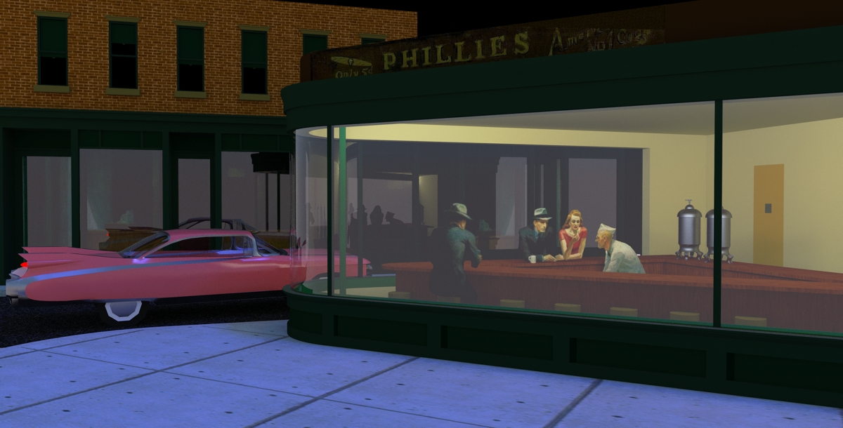
any tips to clear up the glass? i think you know which renderer i'm using
-
Use architectural glass > no shadow from the Templates. That should make it (or you can go to library > Architectural_... and select either of the architectural glasses (although warped would no have real use here as that would be good for reflections when it's lighter outside)
-
seems to be no difference. i had shadows unchecked in the common glass too. if thats the same thing?
maybe i'll ask at the support forum.
-
@al hart said:
Is this model on the 3D warehouse so we can all use it instead?
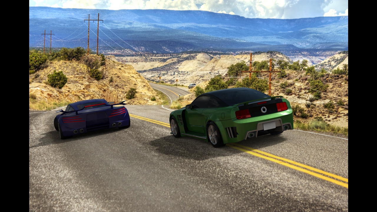
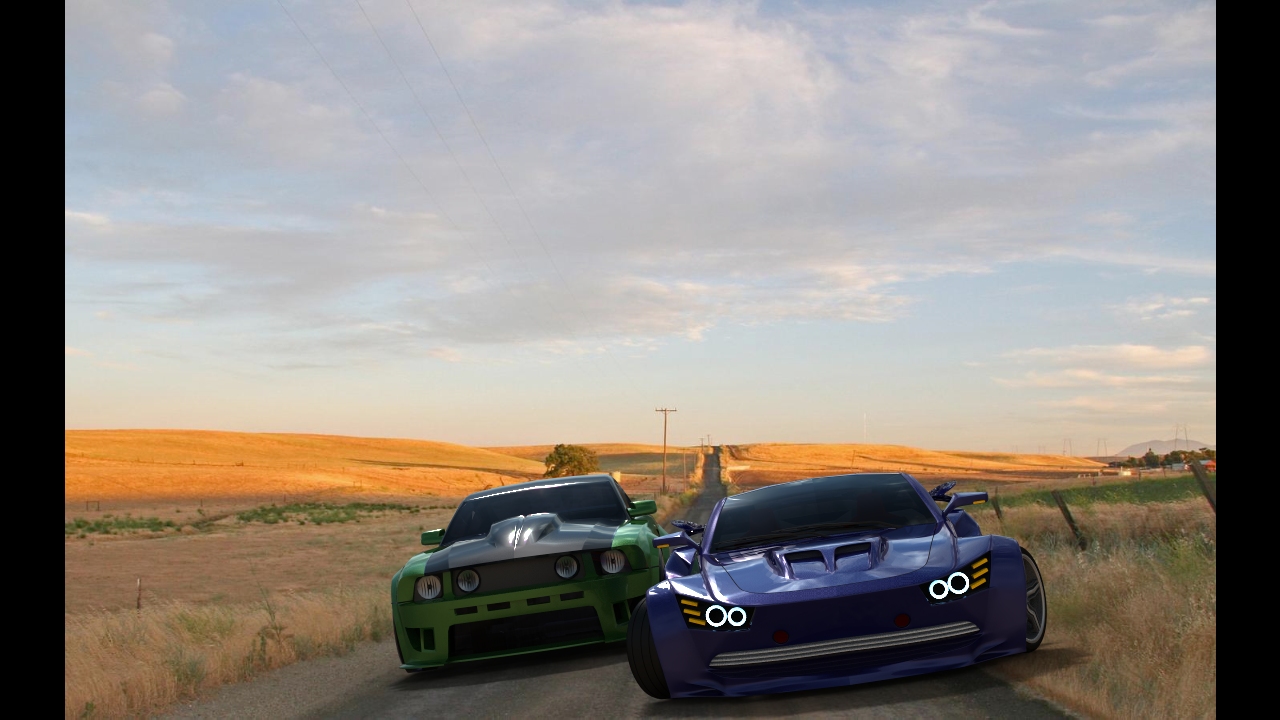
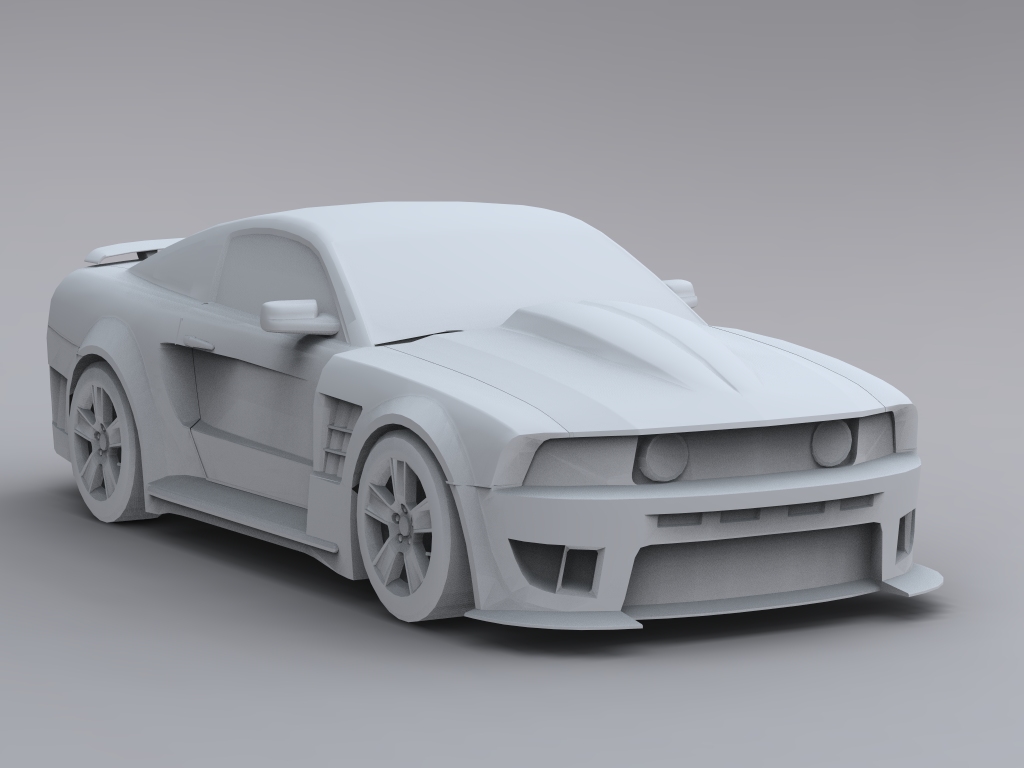
Yes! Here u go http://sketchup.google.com/3dwarehouse/details?mid=197ebf15c84a3b87de39b2ff1721305b.
-
Just an aside as I see you adding cars to to the Hopper pics
Notice anything familiar in this Ford promo video (39 seconds in)
http://www.youtube.com/watch?v=WOJ-pX3v4S4&feature=relatedIn fact the first few seconds are also, let's just say derivative
-
The Lotus in its natural habitat (Modo 401)

-
I was deleting the intermediate files of a video I finished yesterday, but I think these four look nice together. They bring back memories from the iMac era:
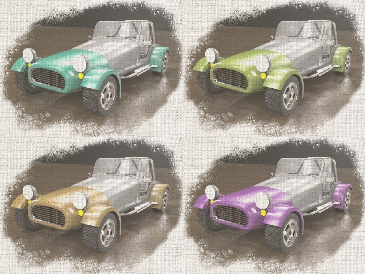
Here's the video:
http://www.youtube.com/watch?v=Lq-JTKF5Kxg
[flash=640,505:2zo5thic]http://www.youtube.com/v/Lq-JTKF5Kxg&fs=1&hq=1[/flash:2zo5thic]
And the thread with more info on how it was done. -
The cars have been fun. Obviously we all spend some time rendering cars when we don't have anything better to do.
For the next workshop, I am proposing some exterior house scenes. See Rendering Workshop - Exteriors - Houses
-
Al
I was thinking that most folk here have a basic idea of how to set up an exterior view, most of the times the view is determined by the client anyway, I was thinking rather something that many folk struggle with. How about setting up a studio for product rendering, how to construct a studio, how to light a studio.
-
@solo said:
Al
I was thinking that most folk here have a basic idea of how to set up an exterior view, most of the times the view is determined by the client anyway, I was thinking rather something that many folk struggle with. How about setting up a studio for product rendering, how to construct a studio, how to light a studio.
I was planning basic studio lighting for displaying an object - a watch, or jewelry - with backlighting, etc. - but I decided to slip exteriors in first. Rendering an object was a lot like some of these renderings for cars (that is what made me think of it), so I wanted to do something different first.
Also, I felt (based on some comments about interior renderings - that people don't do them often), that a lot of people to do exteriors, and I wanted to see what some people could do.
So we will do the presentation of an object next week, and let the exterior proceed for this week.
Also, there may be a lot of people doing exteriors who would like to learn about techniques that you and others have already learned. Most new users don;t know where to get plants, how to do a good jopb with windows, etc.
-
I think a tut on setting up a studio would be great. This took quite a bit of trial and error but I am quite pleased.
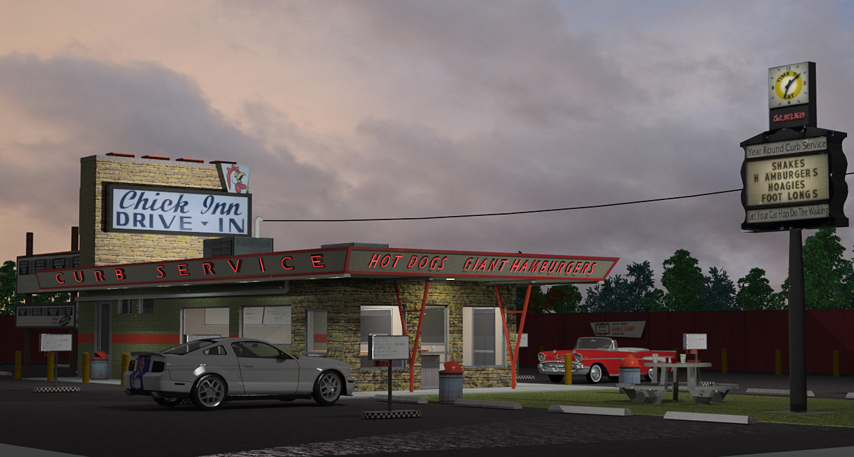
Click through for a larger image, can't seem to embed it right.
-
@unknownuser said:
This took quite a bit of trial and error but I am quite pleased.
Nice image.
It does have a car in it, but in keeping with the spirit of this weeks workshop, you could have a closeup of the car pulling into the drive inn - in the background.
But I appreciate your combining some of your modeling and rendering skills with this weeks challenge.

The car shows some nice reflections. Good work.
-
@unknownuser said:
I think a tut on setting up a studio would be great.
I've been looking through some Rhino tutorials on setting up studio lighting.
They use a nice object for rendering, and are trying to place it in a good studio setting. A shiny, popular product would be good. Hopefully with some glass, and perhaps an illuminated area. Say a watch, phone or jewelery.
But I am having a hard time finding a 3D Warehouse model of something we could use for the workshop.
The best I have found so far (but far from optimal) is this 3D Challenge trophy:
But I could sure use some help finding a model. Or maybe someone has a model they could provide either on the 3D warehouse, or for the Workshop?
-
I suggest creating a still life type setup, with maybe some glass, chrome, plastic, waxy type object, maybe even something that emits light also that way we can get a real feel for a whole range of items and how they relate to a studio stup.
-
@solo said:
I suggest creating a still life type setup, with maybe some glass, chrome, plastic, waxy type object, maybe even something that emits light also that way we can get a real feel for a whole range of items and how they relate to a studio setup.
That's a darn good idea! Also, it takes away from the prejudices any real item may have.
Maybe that's why artists work with these king of objects, rather than radios, etc.
Maybe this bowl, with a metal salt and pepper shaker.
(If I change the material on this to a metal, it might work well)
-
Pretty much that sort of idea, maybe a place mat, wine glass, cuttlery, porcelain plate, apple/fruit, candle, etc as a table place setting.
I would also encourage it to be pretty detailed as such products would need to be smooth for accurate looking renders especially if they are to have any reflection. -
Ok. Lets try this Still Life Workshop at: Rendering Workshop - Still Life
Hello! It looks like you're interested in this conversation, but you don't have an account yet.
Getting fed up of having to scroll through the same posts each visit? When you register for an account, you'll always come back to exactly where you were before, and choose to be notified of new replies (either via email, or push notification). You'll also be able to save bookmarks and upvote posts to show your appreciation to other community members.
With your input, this post could be even better 💗
Register LoginAdvertisement


