Rendering Workshop - Model Cars
-
For this weeks Rendering Workshop, I have chosen some cars to render. Take one or more of these cars, put them in or on something, and render them.
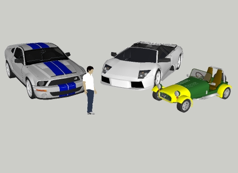
The cars are from the 3D Warehouse:
2006 Lamborghini Murcielago... by JORDIGuidelines
These Workshops are not a contest. People new to rendering can use them to experiment and get feedback and advice from other SCF readers. People with more experience can show us what they can do and demonstrate interesting techniques.
This Workshop is about rendering, not modeling. You can modify the model, add other geometry, add other 3D warehouse items, etc. But keep in mind that we want to see what you can do to make these existing models more presentable.
This is about all aspects of rendering - SketchUp, external add-ons, post processing, PhotoRealistic, and Non-Photorealistic. Feel free to try anything.
Upload you images, your questions, your ideas. Lets see what we can do.
-
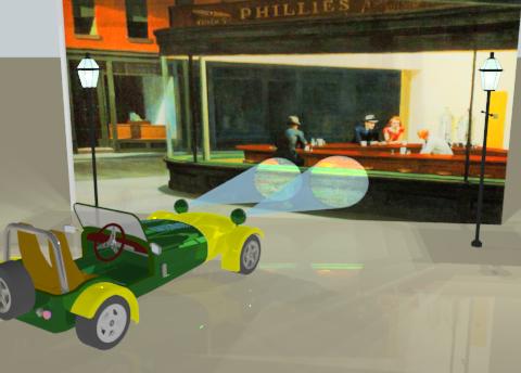
This took a little longer than I thought it would.
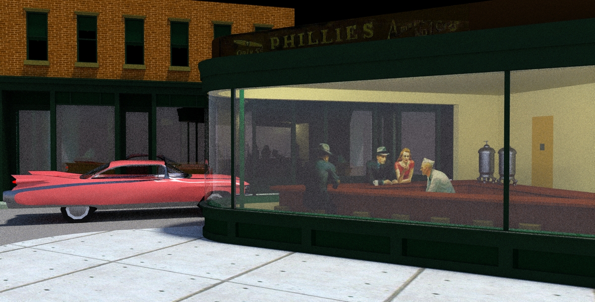
The trick was to "Distort" the Nighthawks image onto a vertical, plane to get it to look right. You can load the original picture as an image, but then the perspective already in the image makes it difficult to position to car properly. By distorting the image onto a perpendicular face, I was able to place the car perpendicular to the plane, which made the headlamp beams much easier.
With a little more work, I could extend the Nighthawks image more to the left, by mirroring the original image in PhotoShop and applying it to a larger surface.
-
After completing the previous image I realized that I should have searched the 3D Warehouse to see if someone already had a Nighthawks model.
Sure enough, there is one. But the author didn't include the people.
However, if I had carefully placed the image of the people inside of the model, then I could have had the headlights and streetlamp illuminate the entire scene.
-
i think that would make a cooler challenge than the cars! can you post a link to the scene? it would be cool to use a 60's pink Cadillac in front.
-
Here's the Nighthawks model, Rocky:
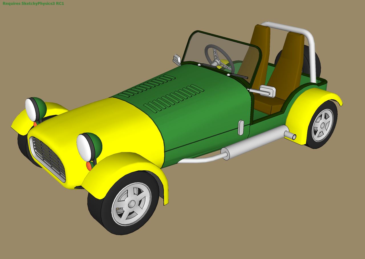
http://sketchup.google.com/3dwarehouse/details?mid=beda9462040cef37cbd8a6bab27abef3&prevstart=0By the way, the yellow/green car had been imported from another modeler and thus had a lot of stuff to be purged. Tons of layers, duplicate content without using components, lots of similar materials not being used or used only in tiny parts, missing faces, etc. Here is a cleaned up version. Reduced from 3.22MB to 1.74MB and then zipped to 678KB, 20% the original size.

Oh, and I added a SketchyPhysics motor to each wheel for added fun.
-
@xrok1 said:
i think that would make a cooler challenge than the cars! can you post a link to the scene? it would be cool to use a 60's pink Cadillac in front.
Here is the original link to the image.
Hopper Nighthawks Take a shot at the Cadillac. It will fun to see what you can do.
-
@ecuadorian said:
Oh, and I added a SketchyPhysics motor to each wheel for added fun.

Nice work, and nice wheels.
-
Thanks, Al.
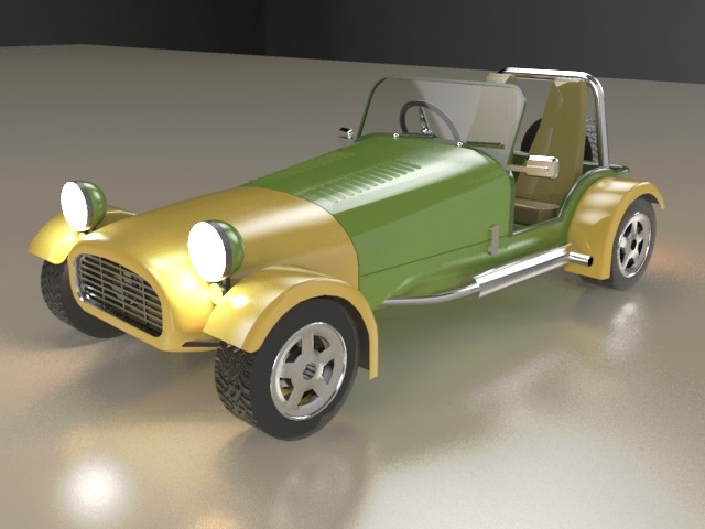
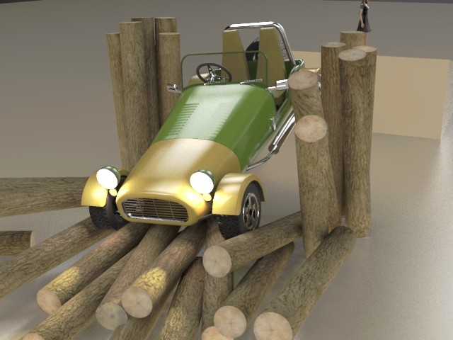
Ok, I decided to go for a "toy" look, so I applied a shiny plastic template to almost everything in the model, except the wood. I'm trying to capture the childhood fascination of crashing your toy cars.
-
just gotta fit that chick in there didn't you?

nice job. render specs please!
-
i'll let this cook overnight and see what we get! i have a feeling the lights too bright in the cafe??
-
@ecuadorian said:
...In the meanwhile, here's the bump map for the wheel so anyone can use it for their renders...
Oh, That's a cool one for shininess map as well!

-
I'll post the file tomorrow with a short animation (if my cat doesn't turn off my PC tonight). I have to go out early in the morning an I'll be returning in the afternoon, so I'll post it then. In the meanwhile, here's the bump map for the wheel. The background HDR is from this Deviant Art collection, it's the #21. Oh, and the girl will be a mechanical doll in this animation.

-
An old Fiat 500! I owned one when I was younger. Great car and great render Kwist.

-
@massimo said:
An old Fiat 500! I owned one when I was younger. Great car and great render Kwist.

Then you should see this topic:
http://forums.sketchucation.com/viewtopic.php?f=81&t=10793@kwistenbiebel said:
To my feeling this thread belongs to the Gallery section and not here...
I generally (or rather "sometimes" - when I am not sure yet) let some topics cook for a while to see where they are winding and where they should eventually belong.
So keep posting and we'll see.

-
Thanks Gai, missed that one. Some incredible renders there.

-
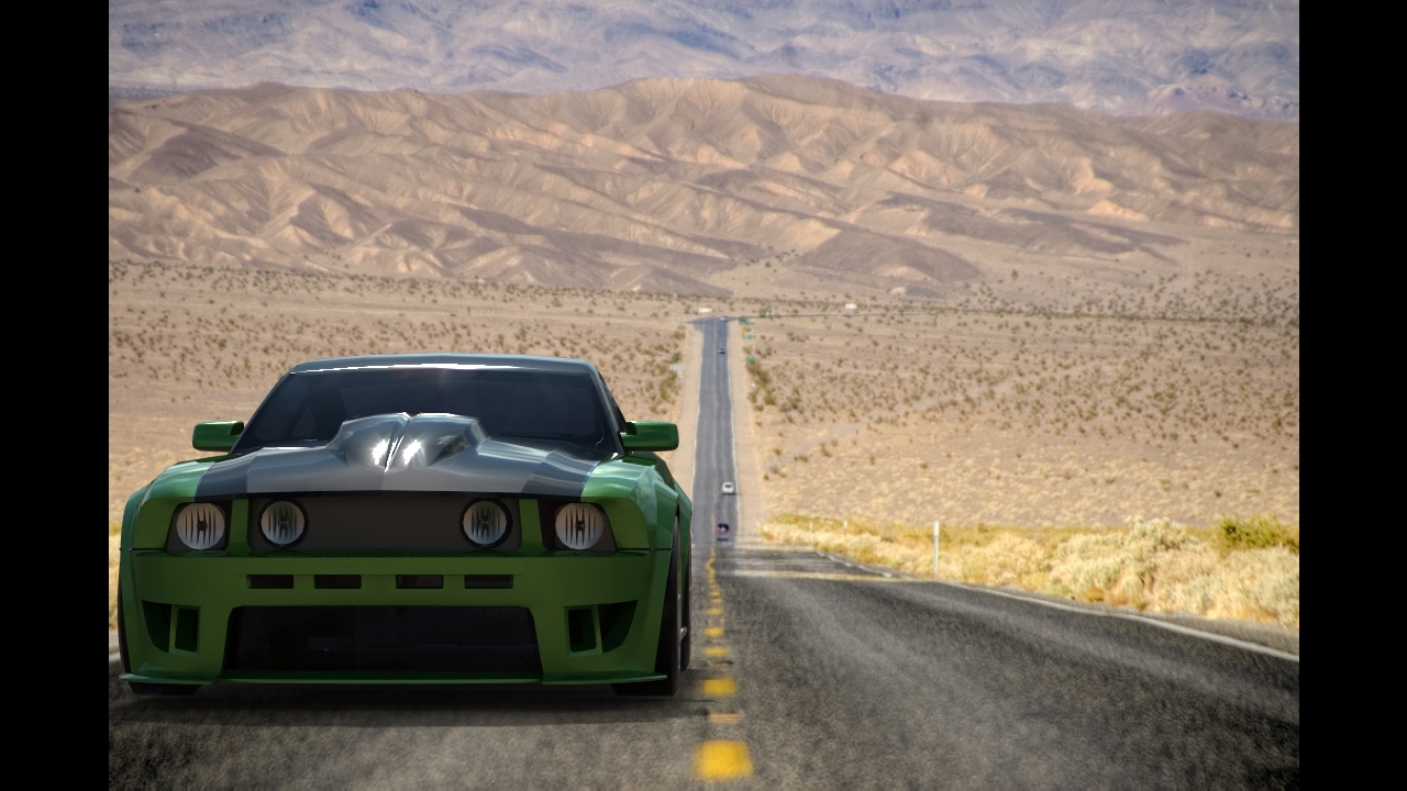
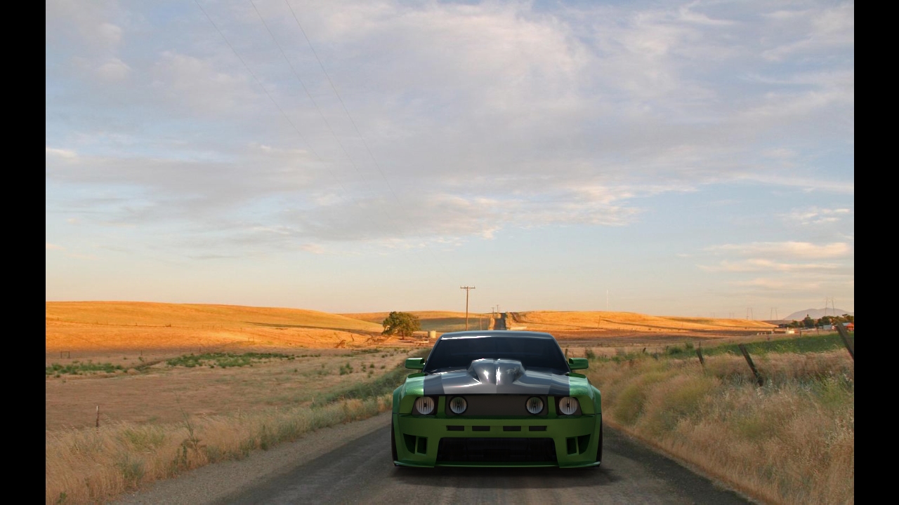
I hope is no problem i change the mustang..that one was messed(missing faces etc)
-
To my feeling this thread belongs to the Gallery section and not here... but let's play.
Lit by two big vertical planes left and right, one with a warm emitting material, one with a somewhat colder emitting material.
The ground surface curves up towards the background.Skindigo:
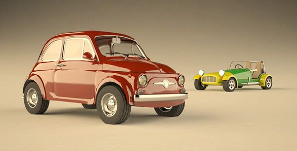
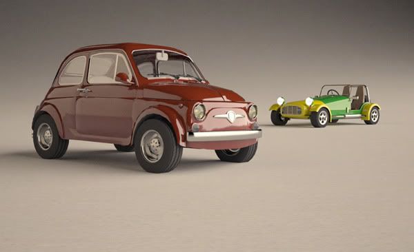
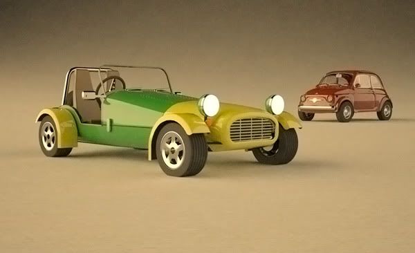
-
@ely862me said:
I hope is no problem i change the mustang..that one was messed(missing faces etc)
Is this model on the 3D warehouse so we can all use it instead?
-
There are so many cars and tastes. I like these Ford T models for instance (and the youths like the mustangs nowadays).
Here is one as it looked when my grandpa bought it:
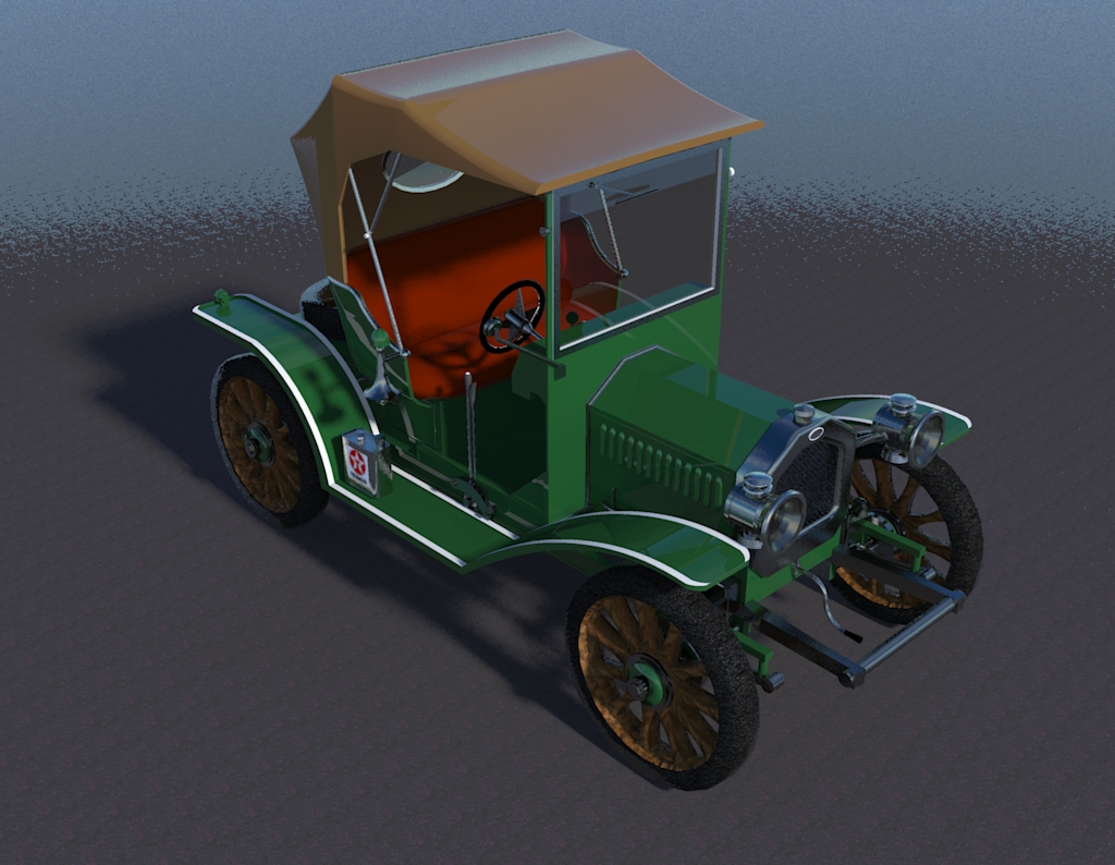
...and as it'd look nowadays: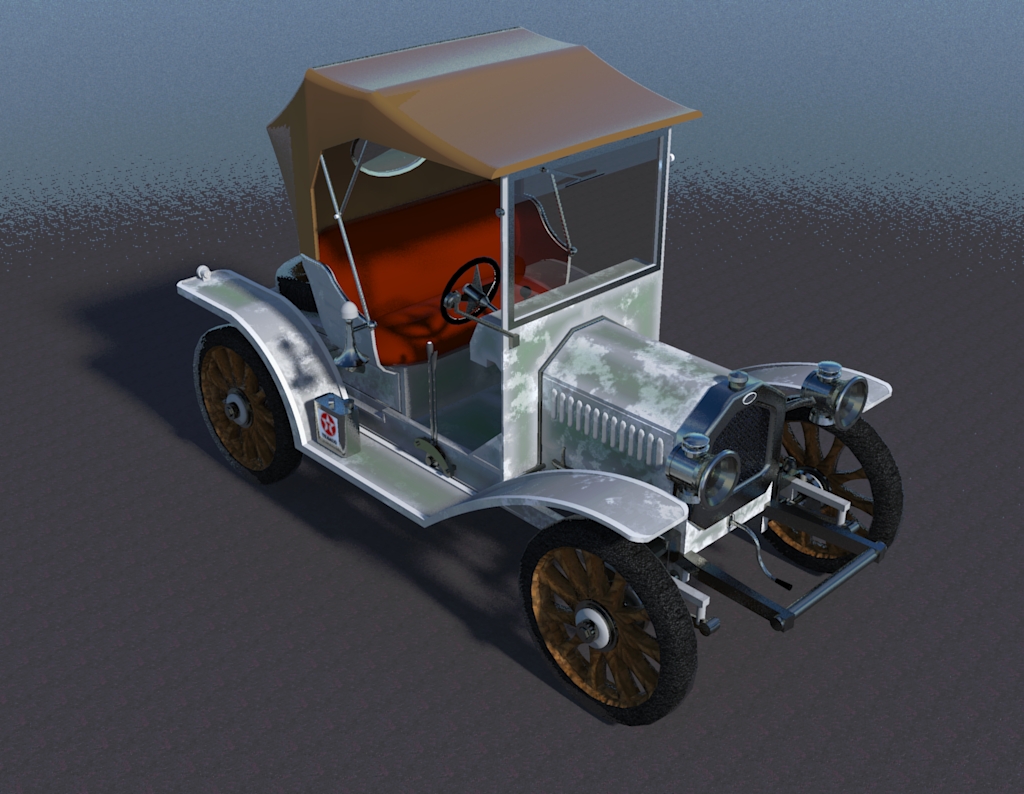
BTW this guy Stanisław Ludwiński (aka "Bubus") - has some incredible amount and probably quality (at this first sight at least) of old car models. They are such beautiful than modern cars that they are also much more fun to render about with.
http://sketchup.google.com/3dwarehouse/search?uq=16762529089732234857&scoring=m -
@kwistenbiebel said:
The ground surface curves up towards the background.
Skindigo:Nice lighting effects.
@ecuadorian said:
Thanks, Al.
Ok, I decided to go for a "toy" look, so I applied a shiny plastic template to almost everything in the model, except the wood. I'm trying to capture the childhood fascination of crashing your toy cars.
This is also good.
I was hoping we would get some good examples of how to showcase a product.
I think these two postings might have "set the bar too high" and will scare off people who can't do as good a job. I feel the need to add something on the lower end of the rendering spectrum so that people who are newer to rendering.
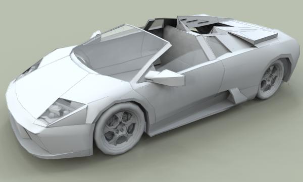
This is a "clay rendering". For a clay rendering, you make all the materials flat and white. It is designed to highlight the quality of the model, without the distraction of colors, textures, etc.
Hello! It looks like you're interested in this conversation, but you don't have an account yet.
Getting fed up of having to scroll through the same posts each visit? When you register for an account, you'll always come back to exactly where you were before, and choose to be notified of new replies (either via email, or push notification). You'll also be able to save bookmarks and upvote posts to show your appreciation to other community members.
With your input, this post could be even better 💗
Register LoginAdvertisement


