Photoreal or Artistic ?
-
@unknownuser said:
Is it only me or do you find that quite often the weakness in potentially great renderings is the entourage?
Many a great render is ruined by the use of entourage, very few artists can pull it off right, and I'm not one of them.
-
That's what I find. Although looking through the "Amazing and Inspiring 3D Renders" thread, there were some renderings with people that really worked. Whenever I have to introduce a lot of people I slink into post production.
-
@drewpoeppel said:
I'm an architect. I find that with my attempts at Photo realistic renders the clients, and sometime myself, get too hung up on the entourage and don't focus on the building, which is almost always the most important. My skills at render programs sucks, so that doesn't help. With going a more artistic or straight sketchup route I'm better able to focus the client and myself on whats important.
I went away from rendering a long time ago for just this reason, I'm not an architect so its my job to produce the materials my boss needs to communicate his design. My/our models are used to show the design of the building, the layout of the spaces etc.
This is a typical (though unfinished) model that I knock out, the building is a refurb, thus the awkward layout:


Clarity is the key point with these models, its easy to see the circulation, offices etc. The colours are so deliberately wrong that nobody ever asks 'Are the offices going to be bright blue?' they only say 'so that's where the offices are going'.
If I was to render this, I'd have to fill all the rooms with appropriate furniture, colour all the walls white or a range of off white colours, light each space and most importantly wait hours for each image to render. When the rendered images are shown to the client for discussion; instead of talking about the layout the conversation invariably turns to 'are you planning on green carpet in there?' or 'what kind of light fitting is that?'. The render distracts instead of informs.Now don't get me wrong, I love a good rendered image and if you've seen my recent church renders you might wonder what the hell I'm going on about, to be honest they're just tests, there was and is no requirement for them on the project, I only did them to see 'if I still could' and I've now proved to myself that 'I still can' so unless a need comes up I won't be rendering my work unless I have some spare time and a suitable building.
-
Your work is awesome Paul, and as I stated earlier, and therefore agree with you that Clarity is the key, because it is all about communicating an intention, and the drawing should reflect this. But, how would you handle it if you were asked to do a public market or nightclub, where people really complete the scene?
-
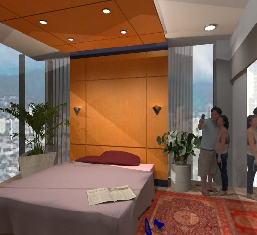
Solo your stuff is great. I don't think that an illustrator that comes with a background in presentation would have too much of a problem with entourage unless they are deliberately trying to create an impressive, artistic rendering. The attached "in time" render is as far as I go with illustration. For me it is quick, easy, and communicates. Not a great render in comparison to others who post here, but I think it tells the story (the wood wall, and ceiling cloud) without distraction from the entourage.
addendum: Bed, and newspaper thanks to Solo

-
You can also use 2D symbolic people instead of photos, like Alex did in this night club scene here:
http://twilightrender.com/phpBB3/viewtopic.php?f=16&t=692&p=5293#p5293 -
That's true, Miguel, but there is still PR rendering in that scene. Imagine it without lights and "flat" SU materials!

Otherwise I totally agree with Paul on the examples he brought up. And I think what is in PR rendering even today and even for us who see relatively many of them (compared to "puny humans") is that magic as it comes to life.
Certainly not every of us =(including me of course) is a magician however.
-
@dale said:
But, how would you handle it if you were asked to do a public market or nightclub, where people really complete the scene?
Ummmm, Ok you got me, I'd probably end up with about 90% of the images being straight SU with the remaining 10% rendered.
I imagine that there would be 1 or 2 renders in the initial pitch, straight SU during design and development and 1 or 2 again prior sign off.
As for people I personally hate photo cutout cars and people in a rendered scene, unless the building and all its fittings look as real as the people look they stand out like a sore thumb, the image Miguel linked is how I'd do people in a rendered image. -
Hi Paul, I suppose that if I had your skill, my bar would be set accordingly. Your firm is fortunate to have you on staff.
-
@stefanq said:
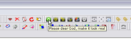
...but I pray every time I push the render button
 (please dear God, make it look real)
Have you tried this button?

-
@pixero said:
Have you tried this button?
Damn you Jan, I spat my coffee all over my keyboard when I saw that image!
I'm sorely tempted to try and edit the TW rubys so that it actually say that!
-
Hi Pete,
I must contradict you, you're a good craftsman and artist. Both is important.
My opinion on the photo-realistic representation of a model. It makes sense if a project is visualized to get an idea of how it will look in the future reality.
But for us as amateurs it is simply fun to see how far or close our own construction is to
reality i think.Karlheinz
-
@pixero said:
@stefanq said:
...but I pray every time I push the render button
 (please dear God, make it look real)
Have you tried ths button?
[attachment=0:21nt7jyt]<!-- ia0 -->render.jpg<!-- ia0 -->[/attachment:21nt7jyt]
Damn, I don't think thats available for Mac
So general consensus I seem to be seeing so far is that people (like me) are shooting for realism.
I came across this paper this morning by Runndy D Ramilo titled Photorealistic vs. Non-Photorealistic Renderings, (good timing) http://www.phaar.org/index.php?option=com_content&view=article&id=141:photorealistic-vs-non-photorealistic-renderings&catid=27:submittedarcticles&Itemid=44
Here is a quote from it."Schumann et al. (1996) demonstrated that Non-photorealistic renderings (NPR sketch-rendered design qualitatively improves the dialogue between architects and clients, in contrast with dialogues elicited from Photorealistic renderings (PR) images. Psychologically, sketch-rendered designs maintain different affordances (Gibson 1977; Munz 1989), wherein sketched images appear preliminary, unfinished, and therefore open to change. Thus, the client is more likely to consider and suggest changes to the design. NPR can also be employed to guide behavior. Halper et al. (2003) demonstrates that increased levels of detail can effectively influence both navigation and exploration behaviors, wherein subjects asked to choose a path to explore or reach a goal in the distance tend to select the path with the higher levels of detail PR images. Potentially, subjects view in an increased level of detail PR is more interesting for exploration, relative to lower level of detail NPR. "
Food for thought.
-
I love NPR renderings. In fact the only reason I wouldn't start using a computer to produce renderings was because I thought PR was "too perfect". I continued my research for quite a few years trying to find a way to use the computer to create a rendering that had the expression of a traditional gouache painting. In my opinion, traditional rendering is more romantic and for me, evokes so much feeling. This is not to take away from the talented, and unbelievably stinkin' awesome PR renderings out there, I'm just focusing on my love for NPR.
-
For NPR (non photo realistic) rendering I havent seen anything better than Freestyle. http://freestyle.sourceforge.net Not production ready but extremly good anyway.
There seem to be a ongoing development to incorporate it with Blender: http://maximecurioni.com/freestyle/Here are some images made with Freestyle.


And a video.
P.S. At the project page under people I found the name Frédo Durand. Is that OUR Fredo?
-
-
I think that the missing elements from PR rendering is license and interpretation. When you look at some of the architectural illustrations done 30-40 years ago it was more about expresion of mood and capturing the essence of the design rather than the accurate rendition of the building in terms of form and materials. The loose watercolour impressions also allowed individual interpretation by the viewer almost like Rorschach inkblot tests generates ranging responses to the same image when viewed by different poeple.
I do not think that it is a question of NPR or PR but rather what is appropriate at what stage of the design process. When the design has been developed to a certain level rendered images have real value in terms of testing the design prototype in terms final configuration.
It is a shame however that hand sketches and architectural illustration has become somewhat of a lost art during the early design stages. -
One of my first lessons in illustration was to draw a straight, freehand,pencil line. I could go from "a" to "b" OK, but the line squiggled. The harder I tried, the worst it got, until my professor told me that it didn't matter how uneven my line was, as long as the unevenness was consistent. Still I noticed that some of us could draw, and others couldn't. Of course, there are grades of acceptability between the extremes.
The use of Cad rendering software, has sparked the expectation that a machine will do it for us. Well, it doesn't work that way, some of us still can while others can't. Among those who can, some will become great, and others OK. Perhaps because I am not great, I argue for ok
 And, as beauty is "in the eye of the beholder", even that is questionable. However that being the case for many (being OK), I would argue that Architectural illustration is a not lost art. Perhaps pencil sketches are a lost form of illustration, but "cut and paste" cad rendering has risen in its place.
If there is a problem with ray-tracing software, it is that the process is not "wysiwyg". Some like Paul elect to stop at SU's output. Others go on to some form of post processing. If you want nuanced reflection, ray-tracing can't be avoided. But, all of this is off subject. Photoreal as a goal, is not the same as good illustration. Not all photographs tell the story in a pleasing way.
-
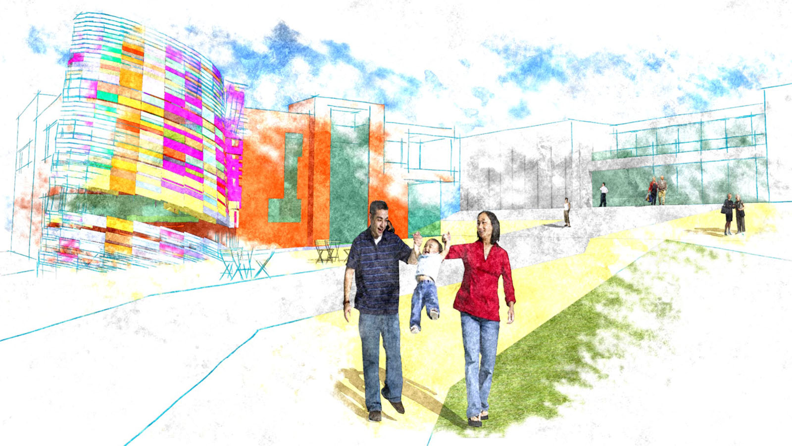
Interesting thread, I am increasingly going for NPR as I am crap at rendering, probably not great at NPR stuff either but I find I can do something quick which I'm happy with.(I used part of one of Fred Bartels sculptures in the 3dW in this one - just an example for a class I'm teaching).
Pixero, is freestyle a standalone app or strictly a blender plugin? I see you have to compile it yourself at the moment.

-
@honoluludesktop said:
Photoreal as a goal, is not the same as good illustration.
Quoted for agreement.
Hello! It looks like you're interested in this conversation, but you don't have an account yet.
Getting fed up of having to scroll through the same posts each visit? When you register for an account, you'll always come back to exactly where you were before, and choose to be notified of new replies (either via email, or push notification). You'll also be able to save bookmarks and upvote posts to show your appreciation to other community members.
With your input, this post could be even better 💗
Register LoginAdvertisement


