Photoreal or Artistic ?
-
Now here is a link to the website of Kirk Fromm Prova, I saw his work at the American Society of Architectural Illustrators site. This work which is a digitally painted SketchUp model, I think exemplifies the best of an artistic digital crossover. It is also in my opinion very much more expressive than much of the Photoreal work I have seen. I thought about why this is, and what I came up with is that it just doesn't look computer generated.http://www.kirkfromm.com/featured_work/feature1.html
-
-
Perhaps because Architects focus on designing buildings, The photo real rendering is often seen as a tool to communicate. Don't know when a work is primarily artistic. I suppose that final judgement is "in the eye of the beholder". Given the design of a model, the render itself is a exercise in selecting the right view, filling the spaces with accessories, color and texture. The cad tools use to prepare the render are often more like cut, and paste then painting, or sculpting. All the basic skills I studied in "art" class; proportion, line, composition, etc. come into play to arrange the final render.
So for me, judging by the process we go through, the photo real render is after all, an art form.
-
I'm an architect. I find that with my attempts at Photo realistic renders the clients, and sometime myself, get too hung up on the entourage and don't focus on the building, which is almost always the most important. My skills at render programs sucks, so that doesn't help. With going a more artistic or straight sketchup route I'm better able to focus the client and myself on whats important.
-
@honoluludesktop said:
Perhaps because Architects focus on designing buildings, The photo real rendering is often seen as a tool to communicate. Don't know when a work is primarily artistic. I suppose that final judgement is "in the eye of the beholder". Given the design of a model, the render itself is a exercise in selecting the right view, filling the spaces with accessories, color and texture. The cad tools use to prepare the render are often more like cut, and paste then painting, or sculpting. All the basic skills I studied in "art" class; proportion, line, composition, etc. come into play to arrange the final render.
So for me, judging by the process we go through, the photo real render is after all, an art form.
I certainly agree, and those who do it well are artists. I actually had the feeling when I started this thread that the renderings that stepped outside the photoreal were getting the odd bad comment, and I wondered why some thought they were less valid.
To me what is produced should be direct result of what is trying to be portrayed,(in the real world mix of client demands) which makes the napkin sketch, the clay render, the PS post work piece, and the photo real all valid. -
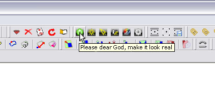
I'm always after photo-realistic look. I need that to show to my clients how the materials will look, how the furniture will fit in...you should see their faces when they find something "common" in my images, like their floor, the tiles etc...But I'm far away from photoreal...but I pray every time I push the render button
 (please dear God, make it look real)
 -
@unknownuser said:
if i show you a picture of a place and then you actually go to the spot, you'll get totally different impressions.. photographs lie.
trying to make renders look like photographs is weird to me because of that..
might as well get creative with it imo.There's a golden nugget in what Jeff said: A render can be, at the same time, artistic and photoreal if you use the same tricks photographers use to make a space (and people) look better: Carefully choose the location, put extra fill lights, add some nice entourage, put on some make-up (by altering the materials), retouch in post-production, etc. Hollywood actresses's portraits in magazine covers are the living proof that there's a whole lot of artistic work behind taking a simple photo. Have you seen how they look without all those wonderful locations/fill lights/makeup/fancy accessories/photo-retouching?
-
Is it only me or do you find that quite often the weakness in potentially great renderings is the entourage?
-
@unknownuser said:
Is it only me or do you find that quite often the weakness in potentially great renderings is the entourage?
Many a great render is ruined by the use of entourage, very few artists can pull it off right, and I'm not one of them.
-
That's what I find. Although looking through the "Amazing and Inspiring 3D Renders" thread, there were some renderings with people that really worked. Whenever I have to introduce a lot of people I slink into post production.
-
@drewpoeppel said:
I'm an architect. I find that with my attempts at Photo realistic renders the clients, and sometime myself, get too hung up on the entourage and don't focus on the building, which is almost always the most important. My skills at render programs sucks, so that doesn't help. With going a more artistic or straight sketchup route I'm better able to focus the client and myself on whats important.
I went away from rendering a long time ago for just this reason, I'm not an architect so its my job to produce the materials my boss needs to communicate his design. My/our models are used to show the design of the building, the layout of the spaces etc.
This is a typical (though unfinished) model that I knock out, the building is a refurb, thus the awkward layout:


Clarity is the key point with these models, its easy to see the circulation, offices etc. The colours are so deliberately wrong that nobody ever asks 'Are the offices going to be bright blue?' they only say 'so that's where the offices are going'.
If I was to render this, I'd have to fill all the rooms with appropriate furniture, colour all the walls white or a range of off white colours, light each space and most importantly wait hours for each image to render. When the rendered images are shown to the client for discussion; instead of talking about the layout the conversation invariably turns to 'are you planning on green carpet in there?' or 'what kind of light fitting is that?'. The render distracts instead of informs.Now don't get me wrong, I love a good rendered image and if you've seen my recent church renders you might wonder what the hell I'm going on about, to be honest they're just tests, there was and is no requirement for them on the project, I only did them to see 'if I still could' and I've now proved to myself that 'I still can' so unless a need comes up I won't be rendering my work unless I have some spare time and a suitable building.
-
Your work is awesome Paul, and as I stated earlier, and therefore agree with you that Clarity is the key, because it is all about communicating an intention, and the drawing should reflect this. But, how would you handle it if you were asked to do a public market or nightclub, where people really complete the scene?
-
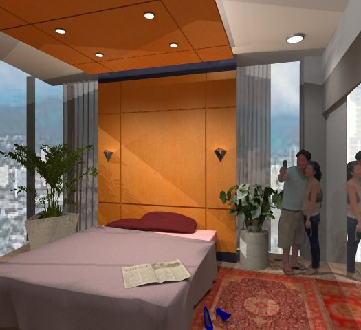
Solo your stuff is great. I don't think that an illustrator that comes with a background in presentation would have too much of a problem with entourage unless they are deliberately trying to create an impressive, artistic rendering. The attached "in time" render is as far as I go with illustration. For me it is quick, easy, and communicates. Not a great render in comparison to others who post here, but I think it tells the story (the wood wall, and ceiling cloud) without distraction from the entourage.
addendum: Bed, and newspaper thanks to Solo

-
You can also use 2D symbolic people instead of photos, like Alex did in this night club scene here:
http://twilightrender.com/phpBB3/viewtopic.php?f=16&t=692&p=5293#p5293 -
That's true, Miguel, but there is still PR rendering in that scene. Imagine it without lights and "flat" SU materials!

Otherwise I totally agree with Paul on the examples he brought up. And I think what is in PR rendering even today and even for us who see relatively many of them (compared to "puny humans") is that magic as it comes to life.
Certainly not every of us =(including me of course) is a magician however.
-
@dale said:
But, how would you handle it if you were asked to do a public market or nightclub, where people really complete the scene?
Ummmm, Ok you got me, I'd probably end up with about 90% of the images being straight SU with the remaining 10% rendered.
I imagine that there would be 1 or 2 renders in the initial pitch, straight SU during design and development and 1 or 2 again prior sign off.
As for people I personally hate photo cutout cars and people in a rendered scene, unless the building and all its fittings look as real as the people look they stand out like a sore thumb, the image Miguel linked is how I'd do people in a rendered image. -
Hi Paul, I suppose that if I had your skill, my bar would be set accordingly. Your firm is fortunate to have you on staff.
-
@stefanq said:
...but I pray every time I push the render button
 (please dear God, make it look real)
Have you tried this button?

-
@pixero said:
Have you tried this button?
Damn you Jan, I spat my coffee all over my keyboard when I saw that image!
I'm sorely tempted to try and edit the TW rubys so that it actually say that!
-
Hi Pete,
I must contradict you, you're a good craftsman and artist. Both is important.
My opinion on the photo-realistic representation of a model. It makes sense if a project is visualized to get an idea of how it will look in the future reality.
But for us as amateurs it is simply fun to see how far or close our own construction is to
reality i think.Karlheinz
Hello! It looks like you're interested in this conversation, but you don't have an account yet.
Getting fed up of having to scroll through the same posts each visit? When you register for an account, you'll always come back to exactly where you were before, and choose to be notified of new replies (either via email, or push notification). You'll also be able to save bookmarks and upvote posts to show your appreciation to other community members.
With your input, this post could be even better 💗
Register LoginAdvertisement


