Robot Photo Match [Updated]
-
Here's my latest photomatch!
The cyborg is from a game called Halo 3 if anybody knows it. He's called Master Chief (Spartan 117).
Thought I'd place him in a typical UK street scene for sheer contrast!
Rendered in Podium with some Photoshop. Model from 3D Warehouse.
Let me know what ya think!
Sketchup Views:
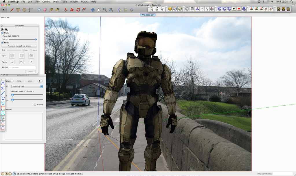
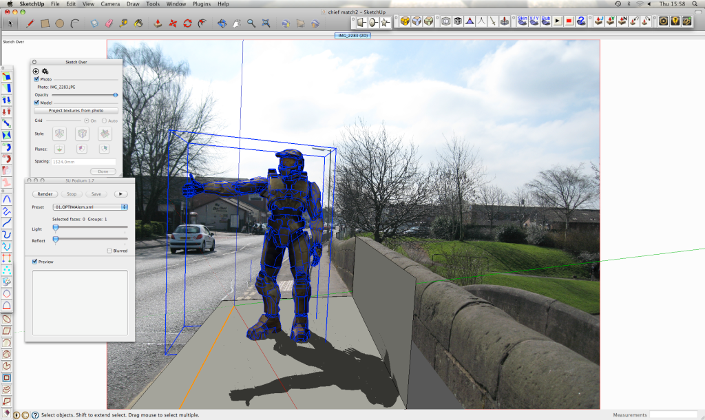
Final Image 1:
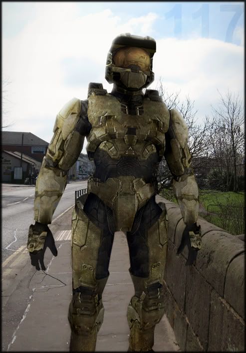
Final Image 2:
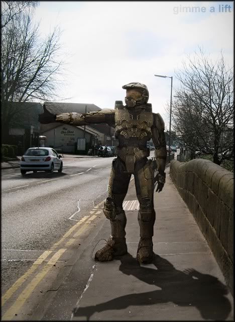
-
hi olishea
I have to be honest there's 3 thing that i don't like in the picture, the position (the master chief postion is to stiff and unnatural), the lack of interation with the surroundings (no shadows or reflections on him or the floor) and beeiing to closed to the camera with the legs croped make hime look like something pasted in photoshop.
Sorry for the harsh critics...
 hope you don't take it in a bad way but as a constructive critic.
David
-
O,
I do like the 117 in the Jack bird clouds.
I've done the dance with Halo -- sticky.
Durant "look into the water" Hapke
-
Glad you didn't take the critis bad
 .
.Anyway try to model some planes to receive shadows replacing the ground and others objects of the surroundings, then render everything in passes and start playing in photoshop (in this kind of stuff photoshop it's much more important than any 3d model).
I did a experience just like that some time ago that also need a lot of rework especialy in the shadows that it's to strong and crisp for my taste (but i used sketchup shadows and not the render shadows so can't ask for miracles lol).
anyway here's the pic and the original post if you want to see it
http://forums.sketchucation.com/viewtopic.php?f=81&t=14346BTW if you have any pose tips for sketchup you could share it would be great (because it's one of the worst thinkgs to try do in sketchup for me).
David
-
yeah man its fine, it was just a quickie.

The shadows are coming towards the camera so you would only see them around his feet (thats why i cropped it to be honest, i didnt wanna spend too much time on it)
its a posable figure so will play around a bit more with his stance. Please crit away its constructive and helps!
-
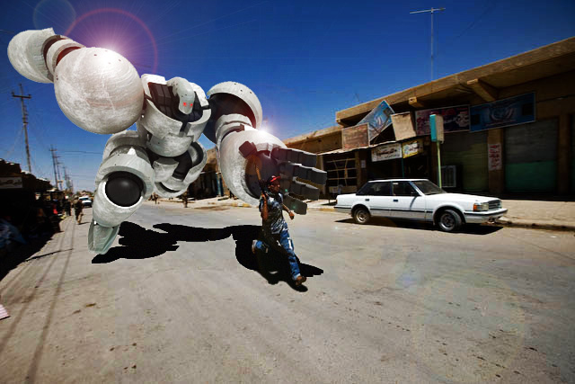
What an image!! so dynamic! epic
I have no idea about posing models etc because this is the first figure I have played with. Normally I just do architectural modeling etc.
However, that radial bend tool for the FreeScale / FredoScale plugin (cant remember which one) is fantastic. Other than that, just group every limb separately.
I think the hardest thing is matching the tone,hue and resolution of the background photo

Thanks Durant, poured one

-
Thanks for the tip with the radial blend! That must be great ofr posing more organic models.
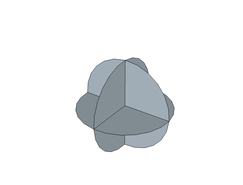
For robots and other types of machines i normally also so what you said, group everything, but i also atatch some help faces in the places that are supost to have be the joints of the robot (see the picture above). That help faces have to allow me to rotate correctly in any direction thats why i use a 3 faces joined at the center.Oh and in photoshop remember that you don't have to make everything match the background photo, it's better if you find a mid point between the render and the background picture, so don0t be afraid to change and edit a lot the background

-
thanks, i understand, helps a lot.


-
Hahaha, the robot soldier is on the wrong side of the road. He doesn't realize he is in England.
-
its a one way street!!

-
haha...this update is awesome! pose and shadow are great....
is it safe to assume that he is pretty much 2d? since you used photomatch... it definitely comes off as 3d, just wondering..
-
HAHAHHAH!!

That's great olishea!! You gave me the first laught of the day.

Congrats on a great evolution, a nice image composition and a very cool ideia
 .
.David
-
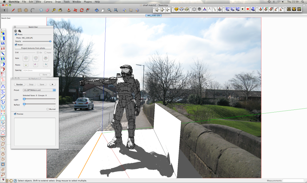
no no no. its a textured 3d model, but yeah the photomatch scene is 2d. (see screen grabs)
The render needed a lot of work cos the colours didn't match too well. Also the model is texture baked (from 3d warehouse) so the shadows needed faking a bit. good bit of fun!
I would post the skp but its 7 MB.
Cheers David, your crit helped me improve the image and find my faults. I used your technique for posing, worked v well.


thanks very much for comments

-
"Gimme a lift" is a hoot-and-a-half! Nice work, Oliver!
-
Really cool, indeed!
If I may - just a minor crit; the shadow under the car looks much shorter (the sun being much more above) than the shadow of the robot. Since nowhere else the shadows are too apparent, I guess "correcting" the shadow of the car in PS would be the easiest way to fix this.
-
yeah but the shadows to the railings behind were quite long so I tried to find a compromise. I set the time and date to the exact time/date/location the photo was taken but its still not quite right.
thanks for pointing it out, might correct it now actually cheers
-
How about this.
I call it "gimme a lift"
Imagine seeing that at the side of the street. Question is.....would you give him a lift?

-
alright..i'm a zombie....not sure what i was thinking....haha...too many all-nighters! great stuff.
-
really nice image. I am impressed, how well the colours of your soldier match the ones in the photo. how did you do it? match-colour function in photoshop?
-
no...i wish.
well i used match colour (background image as source) at first to get a general hue of the background photo, with v low opacity.
then was just a case of curves, levels, hue/saturation, contrast, colour balance. selective colour, gradients, sharpness, high pass filter, offset grunge overlay for better texturing. playing with different belnding modes helps a lot
I always make sure to use adjustment layers as clipping masks too so you can fade them in/out.
once the shadows and general colour was right I flattened the image and worked on the photo and render together to add more warmth, sharpness, god rays (v pale), depth, saturation and finally a vignette at the end.
the actual render was very off in colour (very yellow and saturated) and stuck out like a sore thumb cos its texture baked from in-game images.
Hello! It looks like you're interested in this conversation, but you don't have an account yet.
Getting fed up of having to scroll through the same posts each visit? When you register for an account, you'll always come back to exactly where you were before, and choose to be notified of new replies (either via email, or push notification). You'll also be able to save bookmarks and upvote posts to show your appreciation to other community members.
With your input, this post could be even better 💗
Register LoginAdvertisement


