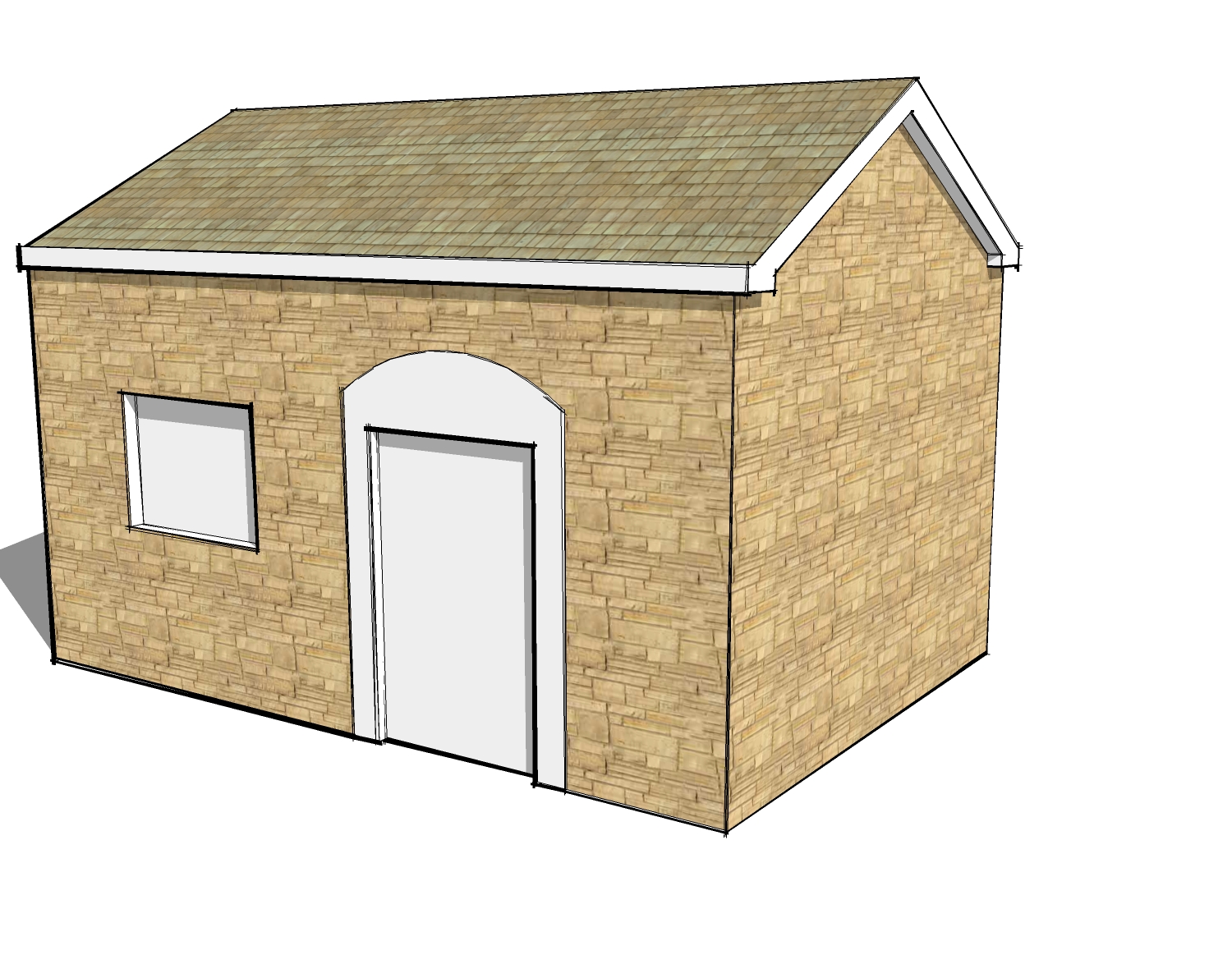
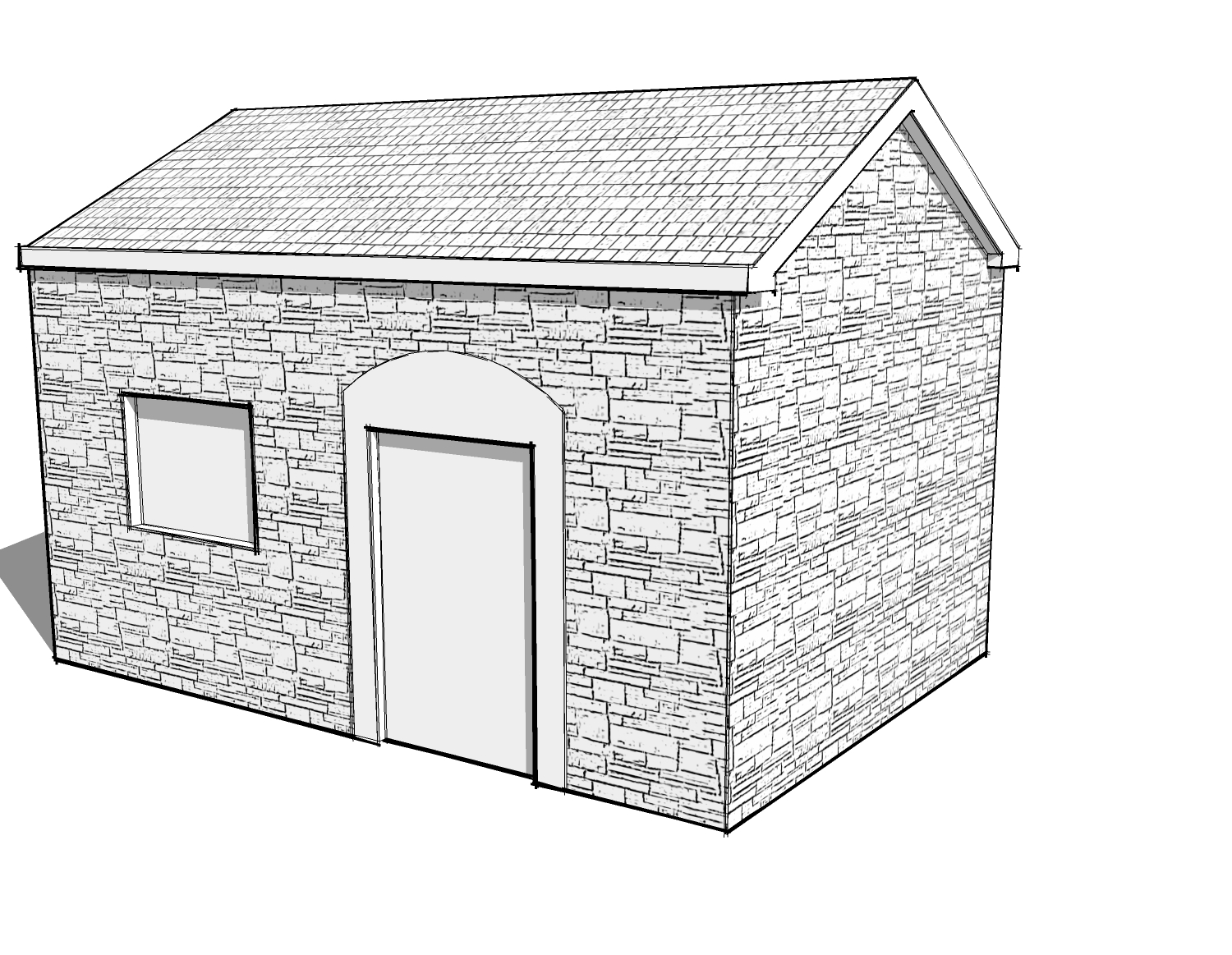
.quick house. updated**
-
updated** bottom of page 1 and page 2
yet another exercise in speed modelling...I probably spent no more than 2-2.5 hours on this one... hour and a half last night...and maybe an hour today quickly finishing for a client's meeting. looks way more complex than it is and only things visible from this view were modelled...would've loved to have put the proper detail on the eaves/fascia's, but had no time.... hopefully they'll go further with this one in the future (the big chunk to the right, is an addition)
i think i've got to rush rush out another house tonight! stressed.


-
Great work as usual Jason.
-
Great work indeed!
In the film industry the saying is "If its out of the frame, it doesn't exist!" meaning, nothing, NOTHING gets built that is out of the camera frame. That is why the industry picked up on Sketchup - it helps them determine exactly what will be in the frame of a set, so they know exactly how far to build.
So no Bruce, you are not alone. Its an unfortunately wise thing to do, even though for those of us who enjoy 3d models, it feels painful to leave things undone.
Chris
-
If this is a quick house i dont imagine how good can be the slow houses


-
This is gorgeous. Just right for the type of building imo. I'd love to know how you managed the stone texture? Is it a combi of two images in photoshop?
Regards
Rob -
Jason, that is a great image. exactly the right amount of detail (I find myself modelling in higher detail quite often, only to discover, that it doesn't really look good - too many lines) the whole image really works.
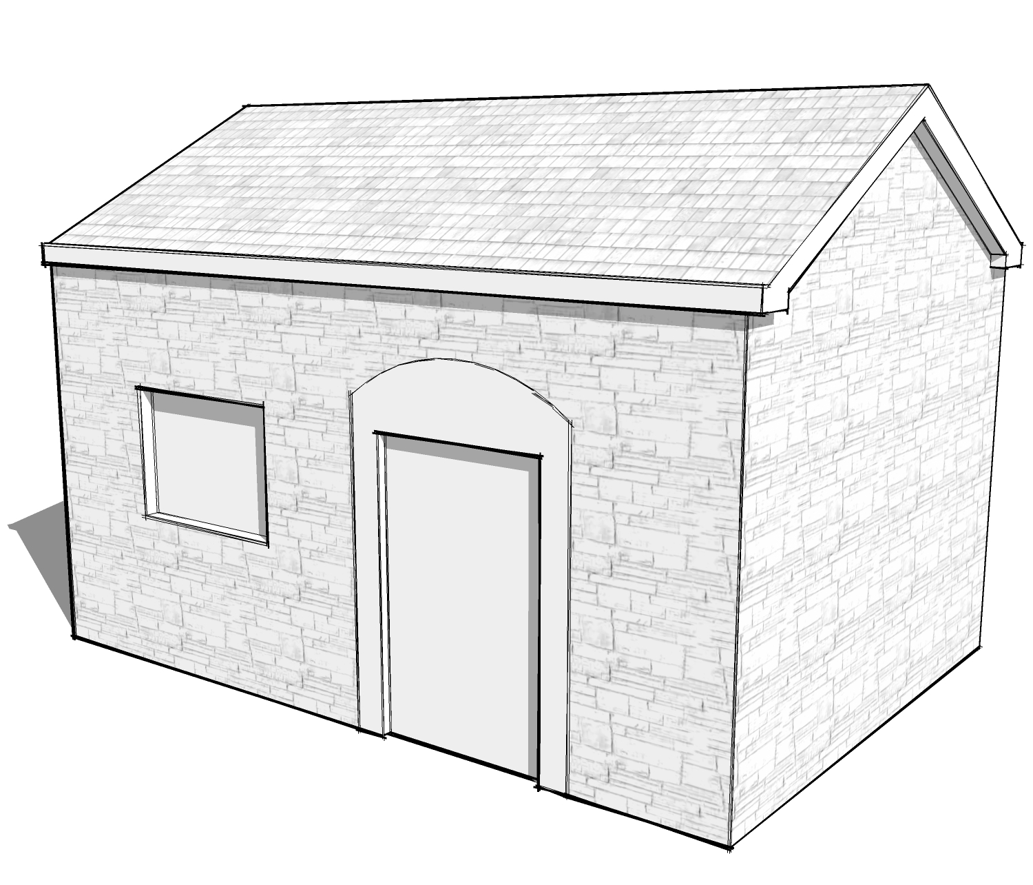
would you do me a favour and post an untextured image (I know, painfully honest, such an image - but really interesting) -
Jason
that look amazing. just as your stuff always looks -
Shoot, I think that looks great! Is this all SU, or some PP? Great technique, too.

-
I find myself saying the same thing about your work every time I see it, it's fantastic! You really blew through this one and it looks great. I hope your client thinks you worked on it all night long.
-
appreciate the comments again, guys!
again, nothing special here.... Rob, i cant recall where i originally got the stone texture, but I just added a watercolor filter in pshop...maybe some grain, i forget....and adjusted the RGB in sketchup to get the right 'lightness'...these are direct from sketchup... always have to do that with these guys because they ask for a million changes at the last minute, and there's no time to take everything into pshop...
-
Hi Jason
I just had a quick go at your method using SU's own textures. Is this how you did it?

And after the adjustments you mentioned:

-
pretty much... but really, for the most part you can adjust the texture 'in' sketchup... just edit the texture and go to RGB and make it anywhere from 50, 50, 50 to 255, 255, 255 depending on how light or dark you want it. this will remove the color + lighten or darken it. much easier than using an external editor....the only reason i used one on that stone, was because it was a little 'too' detailed for the image..
-
I see what you mean. Thanks for the tip!

-
ok..this project moved along... not that i had much more time to work on it..
building off the existing model i had already built...i updated the addition, added the rear of the house... and did the interiors.... this is the result one long night, one all-nighter, and pretty much all day today... some compositions and people, trees, etc could be better...but i was under the gun....


-


-
Great work Jason
 ,and a pretty slick website too
Hello! It looks like you're interested in this conversation, but you don't have an account yet.
Getting fed up of having to scroll through the same posts each visit? When you register for an account, you'll always come back to exactly where you were before, and choose to be notified of new replies (either via email, or push notification). You'll also be able to save bookmarks and upvote posts to show your appreciation to other community members.
With your input, this post could be even better 💗
Register LoginAdvertisement


