INDIGO STUDY INDOOR SCENE
-
@pibuz said:
I'm going on modifying the things i'm not satisfied with; next step: replace the plant!!!
This is a small update: done a fantasyless postpro work with PS, and testing a whatsoever "definitive" layout...I like the second set up a lot.
Almost there. Try to use the 'rule of thirds' to make the composition even more perfect.As a note, did you expect that much people giving it a go themselves? (...at the risk of a serious hijack though).
It is a nice scene and we all can learn from it.
Would be a cool that once and a while someone posts a working scene we all can try out.Thanks for sharing!
-
exelente examples
 unwittingly was raised a little comparison of different programs
-
@kwistenbiebel said:
Would be a cool that once and a while someone posts a working scene we all can try out.
Thanks for sharing!I think this is the essence of learning, concerning GI, and I've always thought so!
I tried to drop the idea somewhere(here on sketchy forum or on kerky's or on Vray's); result: a lot of agreements, but not a scene shared..
I really think that sketchUp can help a lot, with its structure and way of managing files.
And comparisons between render engines using the same base scene isn't hijacking at all, for me: so I invite you all guys to keep on rendering the poor scene I posted, and to share one among your best ones so that anybody can try! -
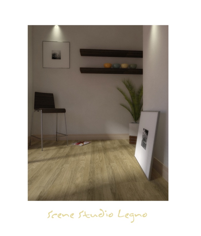
A quick test I just did...

In this scene I used the same materials as in the original, but I will try some others and also - inspired by Kwistenbiebel - some different camera posisions...
-
I used vray 1.50sp1.


-
"SCENE STUDIO LEGNO"
thank you for the italian translation


-
Hello there,
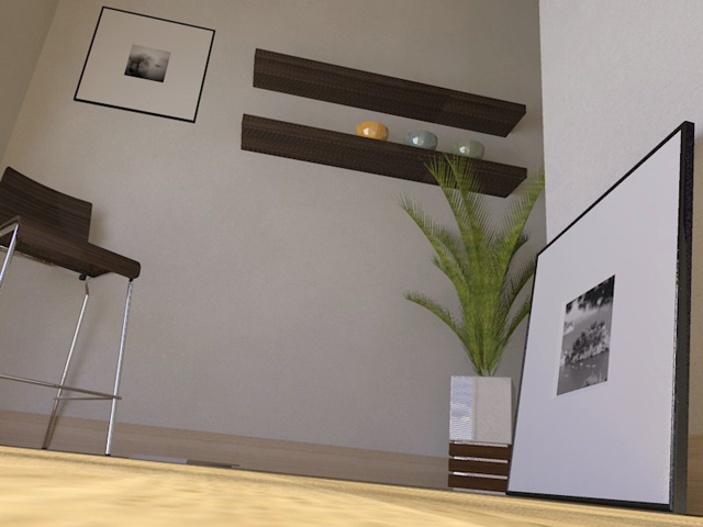
Here's my render test, I'm not that top notch in rendering but meh..
It's my best render so far and I've learned a lot of it! So thanks anyway :]Btw, Before I forget... Rendered in KerkyThea with Photonmapping Fine + AA
-
-
Looking good King.

-
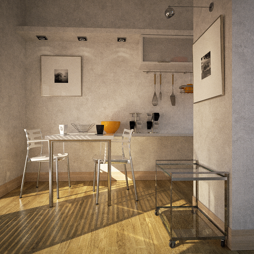
Hi guys! I feel like this is not a floor test scene anymore..
I'm kind of affectionated to this scene!So, I'm still planning a few changes: the spot light on the right is a little annoying and doesn't even seem to be turned on, the right picture is too big, the cart is empty..
Next challenge is the fruit vase: i'm gonna try to fill it with oranges, let's see what comes out!
Then I'll add a piece of furniture on the far right, under the table againsta the wall, and perhaps some objects over the high plasterboard shelf.5 hours of calculation on a Q6600, 4GB RAM, WinXP
No post process, apart from a very subtle sharpening.As always, any suggestion would be much appreciated!
-
I like where that scene is going Pibuz!
Maybe some cupboards above that upper shelve on the back wall?
-
-
This is a rather cool scene...i just wish indigo wasnt so damm slow!
-
Remus: truly slow, indeed.. But sometimes it DOES worth the wait!
Solo: Hi man! Very interesting POV! I'll give it a try myself when this whole project is over!
Kwisten: All right! Something on the shelf! I was thinking about a couple of decoration vases i found on the warehouse indeed, but they don't seem to fill the shelf too much, so it keeps on looking a little empty and useless... Still thinking...
Earthmover: Very nice feeling! It feels so warm, mine is a little cold....
Thank you all guys for your feedbacks!
-
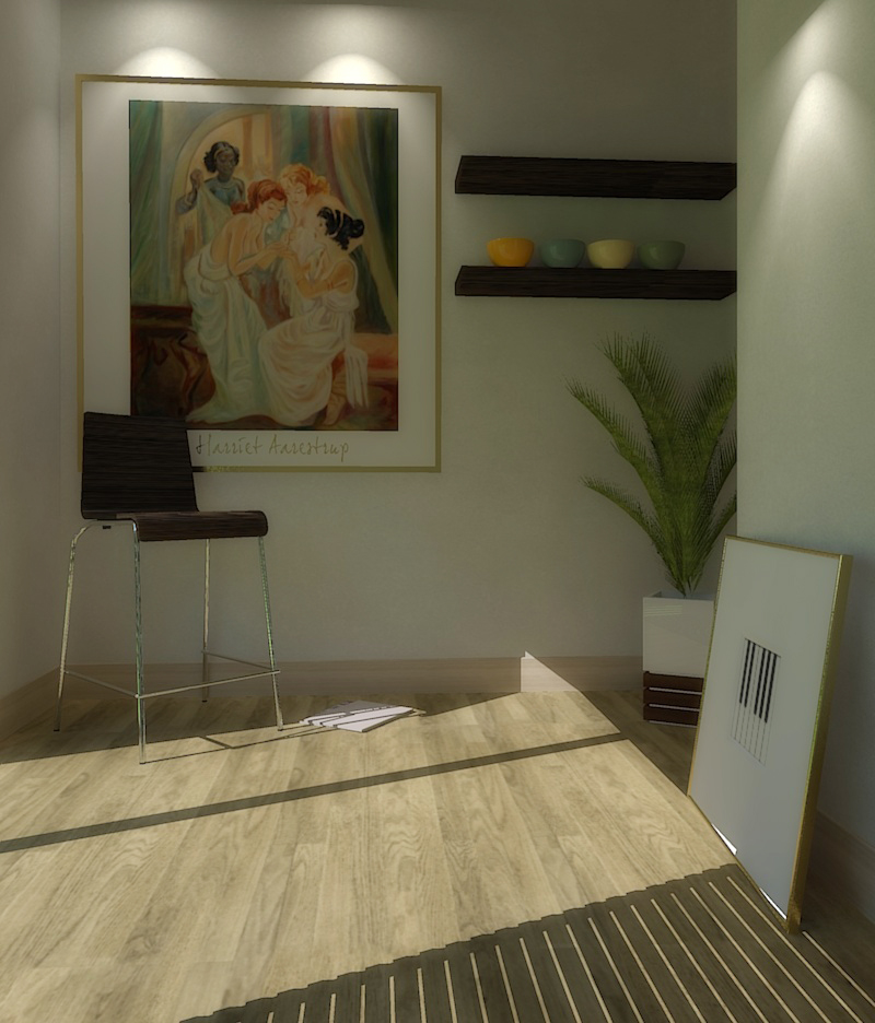
Just trying another image, another ies-light and with a HDRI background...
Added a touch bloom in post pro...
Render time: app. 9 minutes...
-
What a fun little project....it's great to see all the different results. Perhaps we should all go back and edit our posts to make sure they reflect machine size and render times, for comparison purposes. I think today I'll give the scene a go using Modo.
It would be nice try a similar thing with a shared exterior scene. Anyone got one?
- Awesome video Kwist!
-
Hi Pibuz,
...An animation containing your scene.
Hope you like it
(I used a shitload of rubies to get the animation go smoother than the default SU output. Way too tedious)
I gave you credit in the titles.Here it is:
http://youtube.com/watch?v=vEZm-20dVKE&fmt=18[flash=800,533:ltuk2qzp]http://vimeo.com/moogaloop.swf?clip_id=2954360&server=vimeo.com&show_title=1&show_byline=1&show_portrait=0&color=00ADEF&fullscreen=1[/flash:ltuk2qzp]
. -
Thanks Pibuz!
This has been a cool little community effort. Here is my go at it - played a little with the lights and materials. Straight Kerkythea output, 11+ min. for the # 6 default setting on a Q6600 quad core.
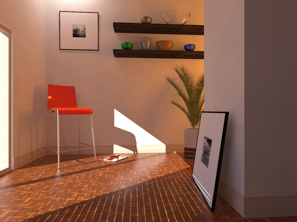
-
that good lighting and texturing was the thread, and that's good to see so many programs rendering participating.
This is a clear example of the integration with the various programs with sketchup -
Beautiful Pibuz.
I had a go with your scene using Vue 7's Radiosity engine. Quad core Q6700 - 50 mintues on Ultra with quality boost set to 2.5.
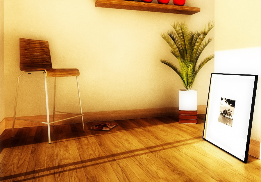
Hello! It looks like you're interested in this conversation, but you don't have an account yet.
Getting fed up of having to scroll through the same posts each visit? When you register for an account, you'll always come back to exactly where you were before, and choose to be notified of new replies (either via email, or push notification). You'll also be able to save bookmarks and upvote posts to show your appreciation to other community members.
With your input, this post could be even better 💗
Register LoginAdvertisement


