My own kitchen
-
This is the 2nd design i've made using SketchUp
It shows my own kitchen (nothing much exciting, but its a start)
Here you only see 2 walls - for layout purposes
It still needs some details - but i do have the impression that the "real" factor is missing ... any ideas ?
Your other comments on it are also highly appreciated - i'm here to learn from my mistakes
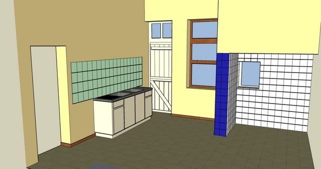
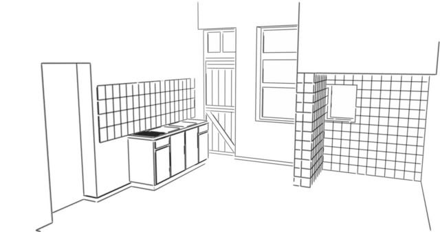
-
I will start an experiment with Kerkythea on this project
I want to make it look "real"
-
..just remember, the key to making things look 'real' is detail detail detail... without detail, it doesnt matter how great a rendering program you've got.. great start, keep at it! good luck

-
There is not much detail left unfortunately
We are busy removing all of the equipment so that we can start renovating the kitchen

-
Maxx
have you got a picture/photo referance of the kitchen?
I will see if i can get some textures for you to apply (goes a long way to realism if your texturing is good)
-
Here is a picture of me in my kitchen before we started renovating
Please don't mind the mess
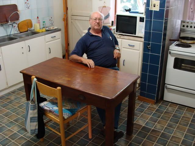
-
hi maxxdistri,
"Please don't mind the mess"
Hey, that's just what details are, making it looks like living, with a little bit of mess
Patrice
-
I'd look at changing your wall tiles to a texture rather than all of the line work
-
Maxx, found it :`)
I'm gonna leave it to the interior masters, but first off: Shadows! You can see them (subtle, yes) in your pic and need them for your model exports to seem real-er.
-
based on advice of some members, i fooled around with PS a little bit and got a nice effect
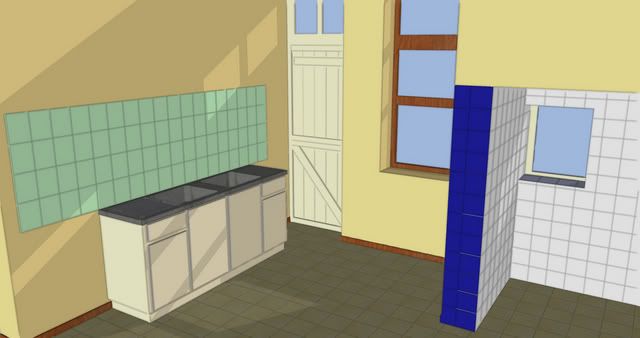
-
Do you want to make a new design of your kithcen or do you want to draw you current kitchen?
If you want to draw your current kitchen, then you could dowload some component library's so you can add table's and other stuff.
You can find those componente library's here and they are free to download ( there is also a material bonus pack here, so you've got more texture's
http://sketchup.google.com/bonuspacks.html
If you put these components in your model, it will look a lot more life like, and realistic. You can of course also draw those details yourself but that is a lot of work.posted by Gforce
-
waw - thanks a lot man
-
@unknownuser said:
Please don't mind the mess

My grandmother always used to say: "A house has to be clean enough to be healthy and messy enough to be comfortable"
I agree with the comment on details. We don't live in a blue-print. We live with the chairs un-evenly spaced around the table on which the kids left a glass half full of orange juice because they had to run out and the door was left slightly open. So you see, details isn't just a question of components. It's also a question of placement. -
I thought I'd illustrate the point about placement.
I made a simple table and placed chairs next to it.
In the one picture I placed the chairs next to the table in a precise almost mechanical manner. Doesn't look very real, does it.
In the second picture I moved the chairs as though each were moved by a different person. Looks better already.
In picture three I added a small piece of cloth and a bowl of fruit.
Notice that the cloth isn't smack in the middle of the table and parallel to it's edges. Looking even better.
So you see, where and how you place objects has a great deal to do with how real your model looks.
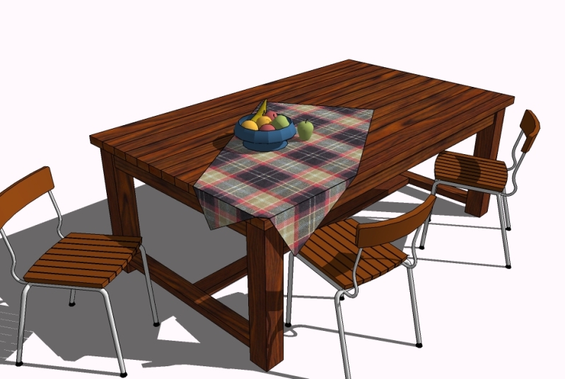
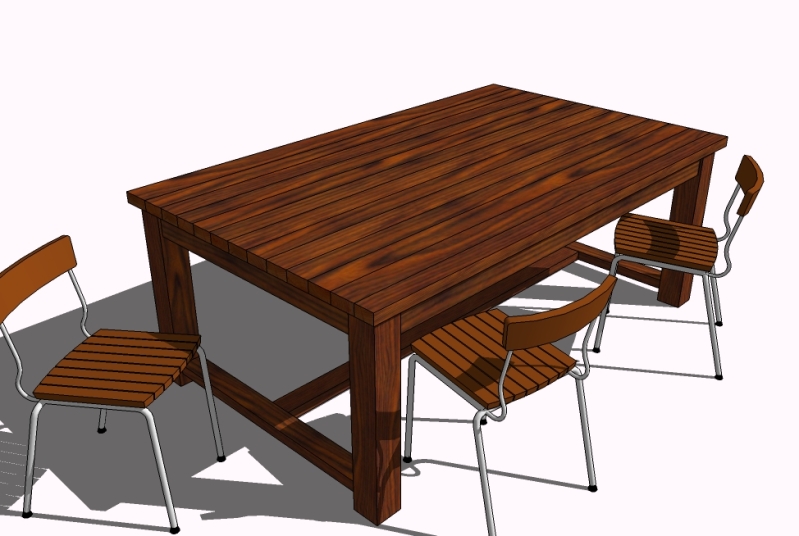
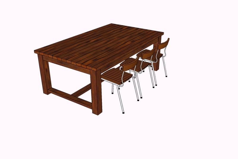
-
Well, apparently the attachments are positioned in a backward order in the posts - so start with the bottom one...

-
its the small imperfections that make it real!!!
good one gidon!!
Hello! It looks like you're interested in this conversation, but you don't have an account yet.
Getting fed up of having to scroll through the same posts each visit? When you register for an account, you'll always come back to exactly where you were before, and choose to be notified of new replies (either via email, or push notification). You'll also be able to save bookmarks and upvote posts to show your appreciation to other community members.
With your input, this post could be even better 💗
Register LoginAdvertisement


