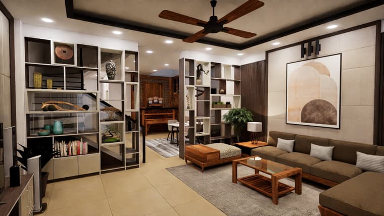
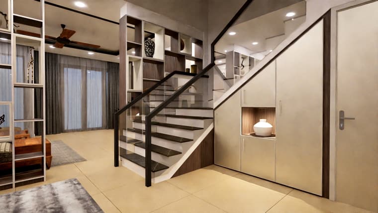
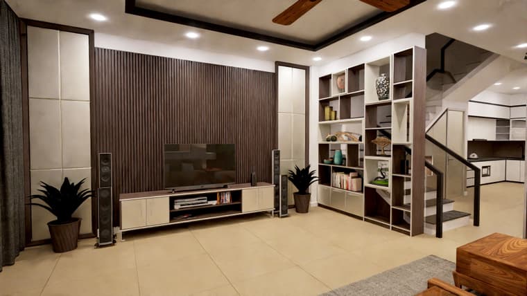
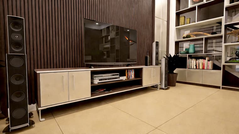
Many projects
-
@jo-ke Rendering in such tight spaces is so hard to pull off because of focal length.
Its a good use of space. I presume this has tons of internal storage? Is it a walk in wardrobe?
For something that takes up a sizable footprint its doesn't look intrusive. Nicely integrated and looks much better than a traditional builtin wardrobe.
-
@Rich-O-Brien thank you
yes, I can share the latest version. (it will be build in September this year...)
we did some slight modifications....
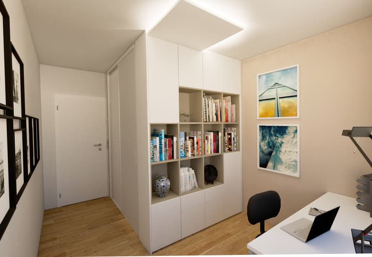
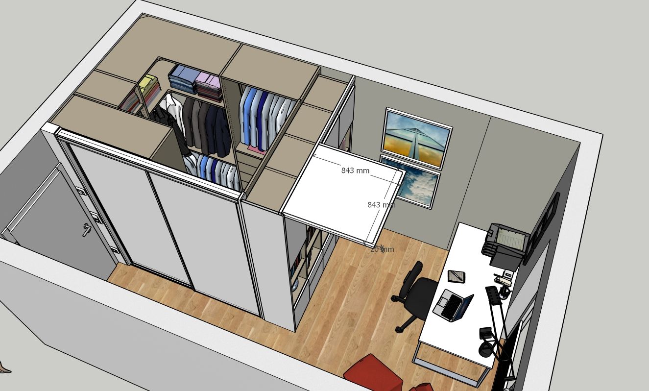
-
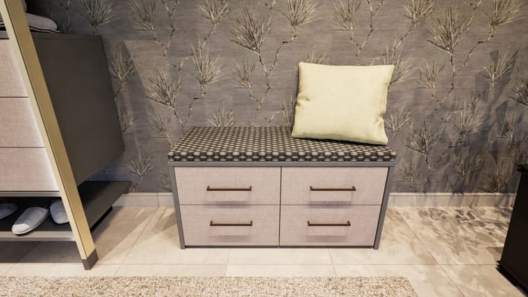
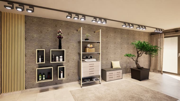
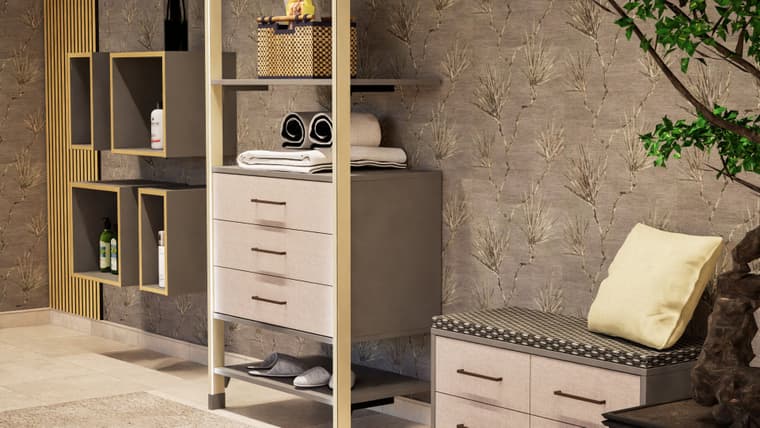
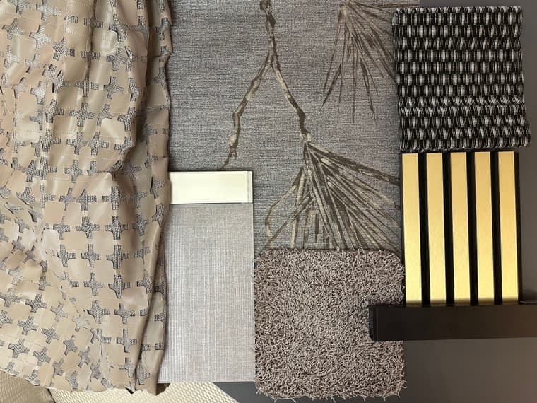
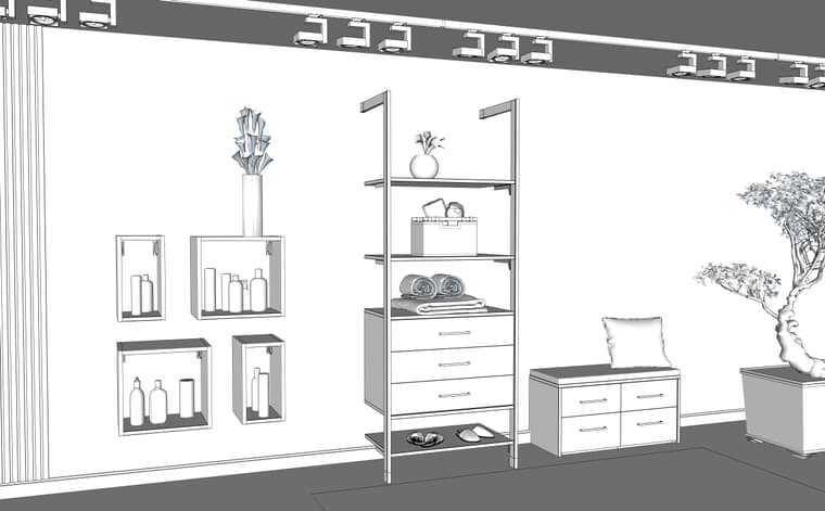
new project for advertising:
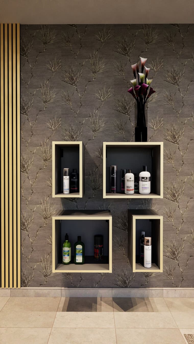
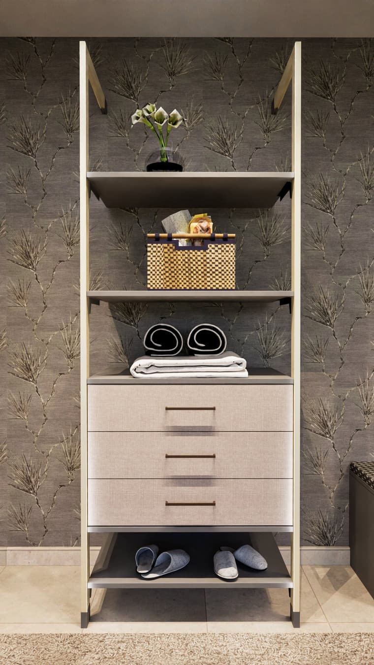
-
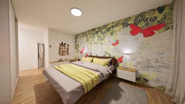
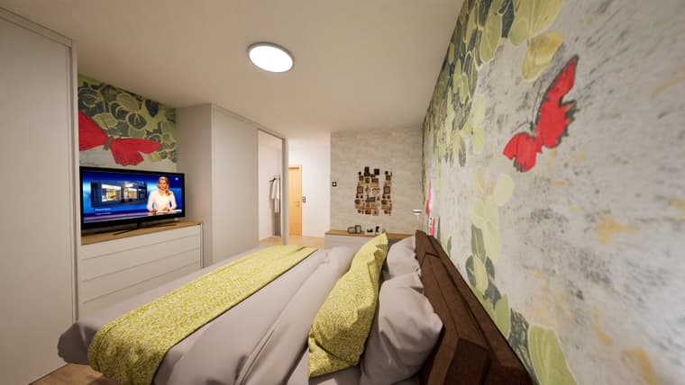
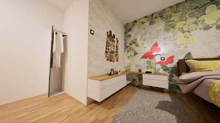
some changes of a current project
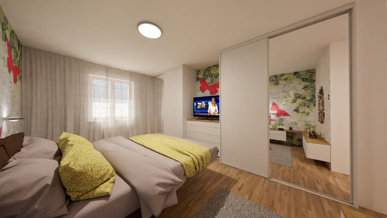
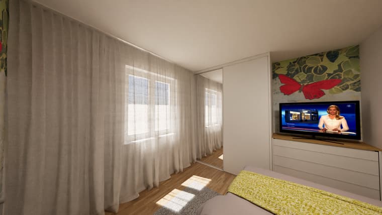
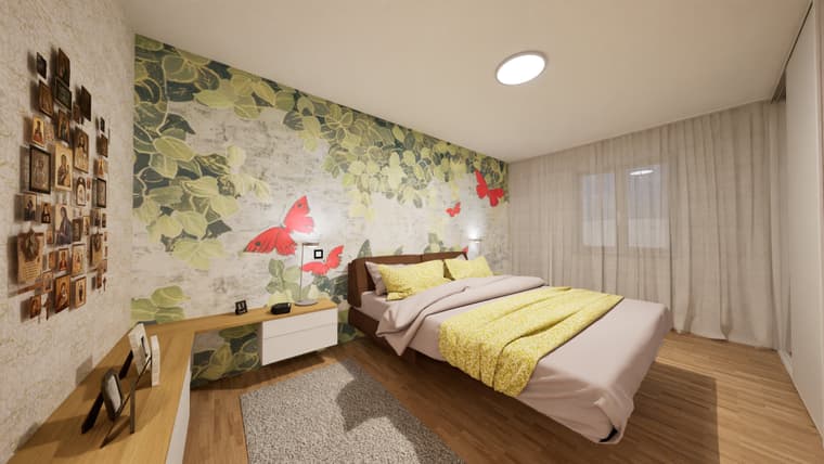
-
new project:
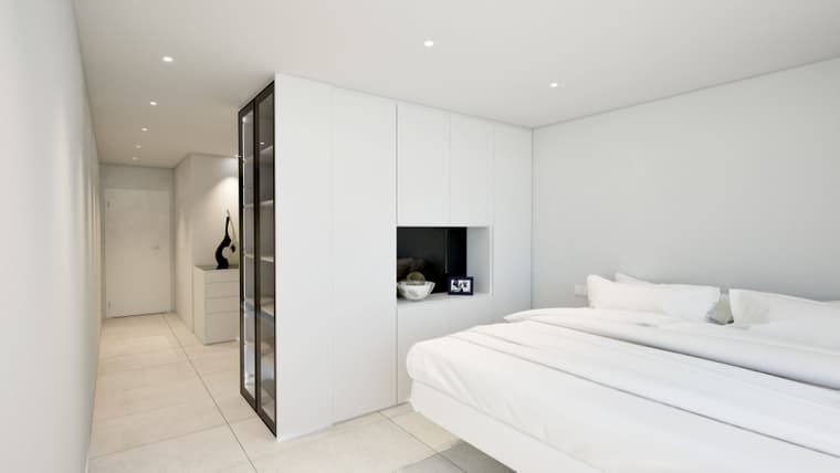
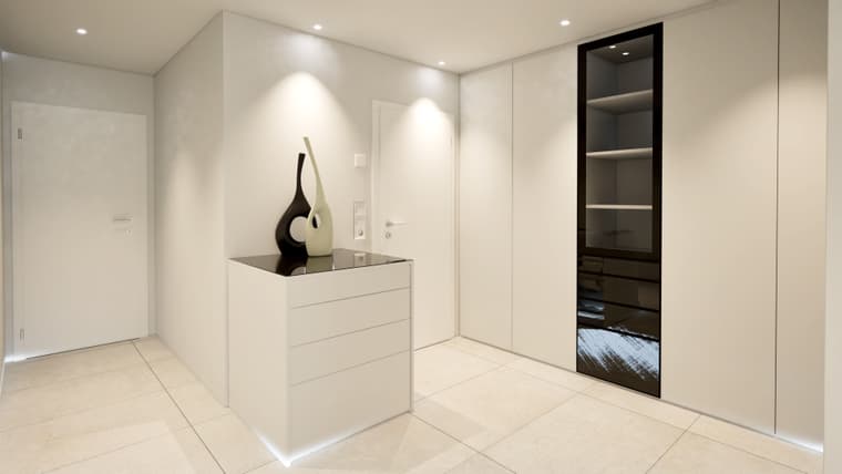
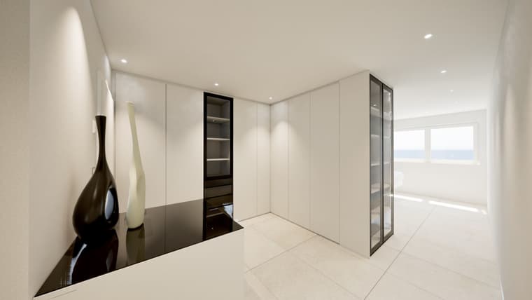
-
-
same client:
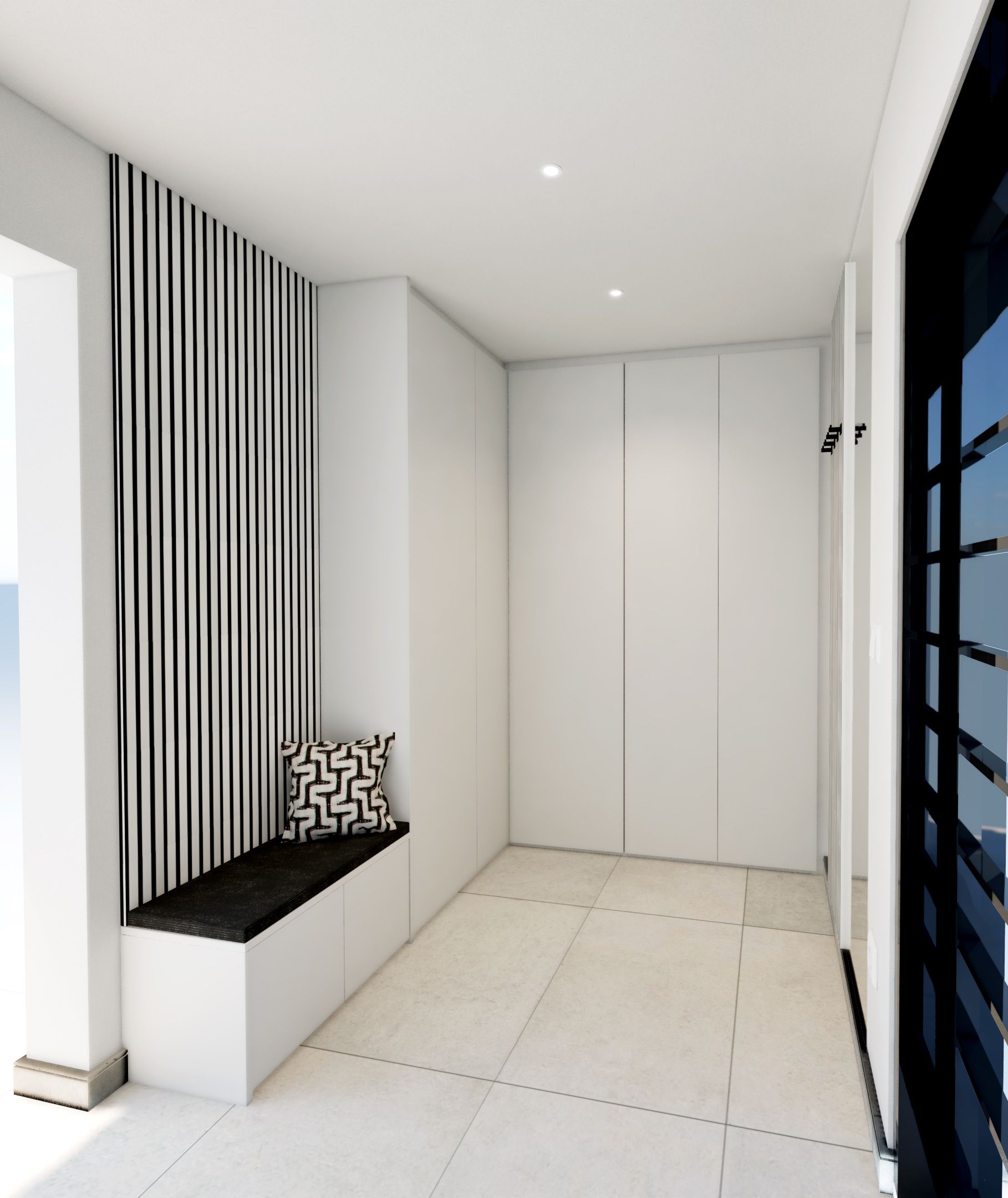
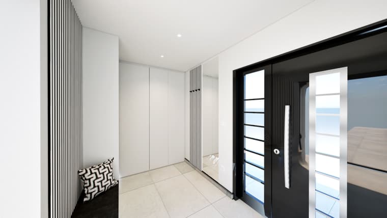
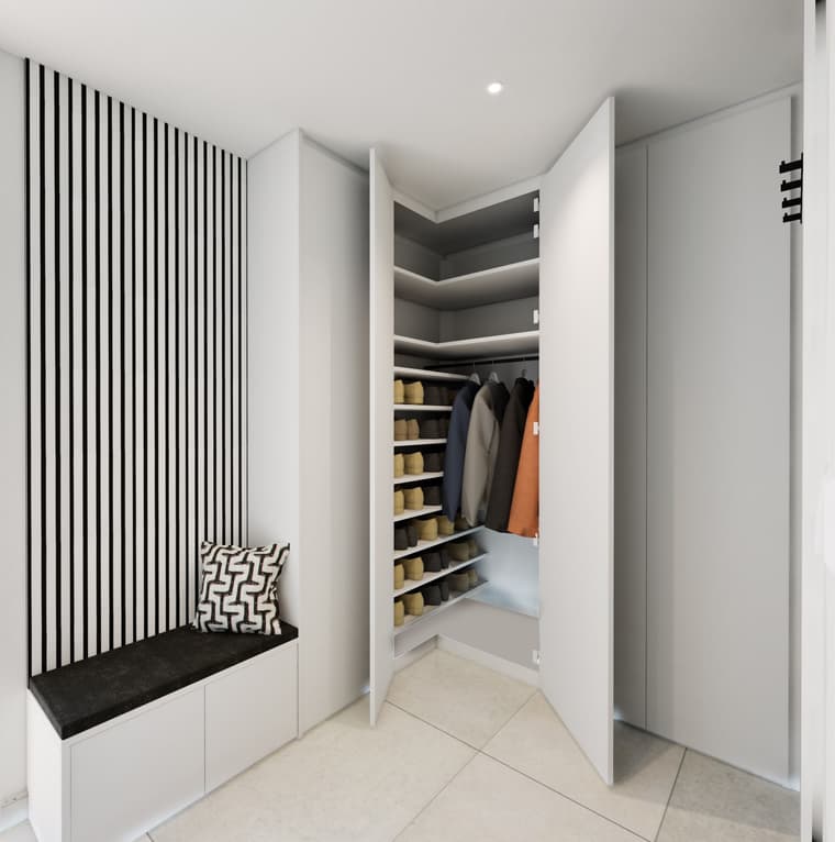
-
new project:
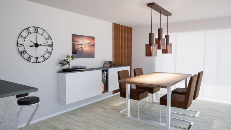
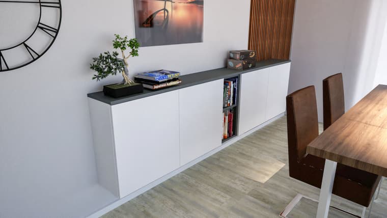
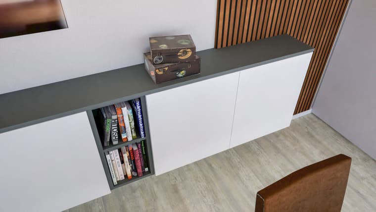
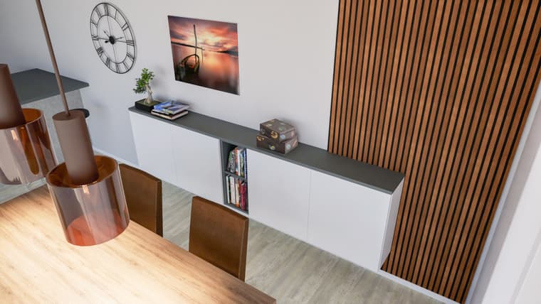
-
Excellent as always!
-
and a new one....
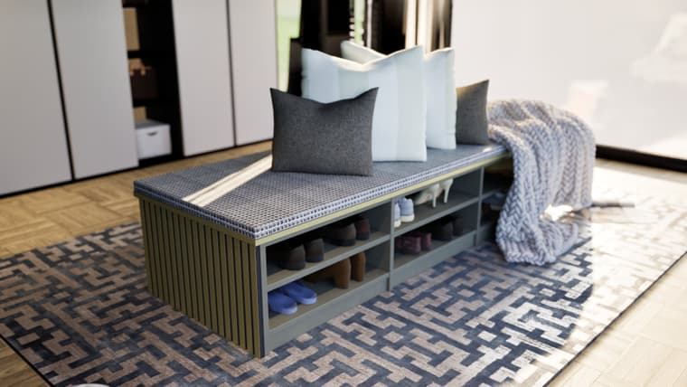
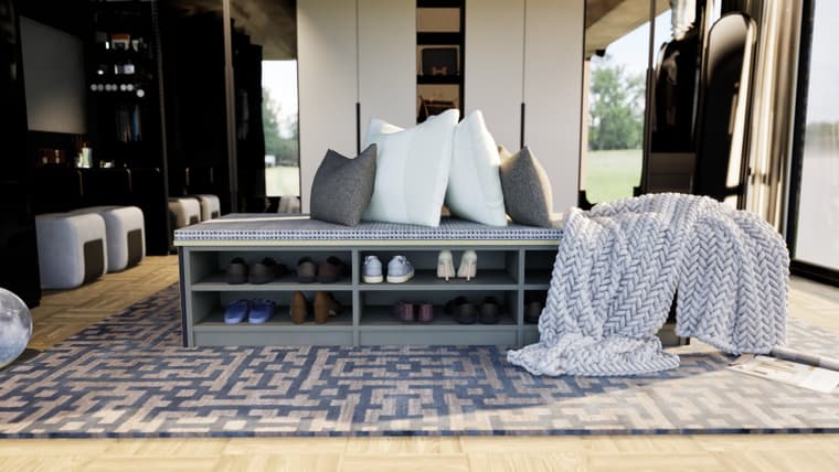
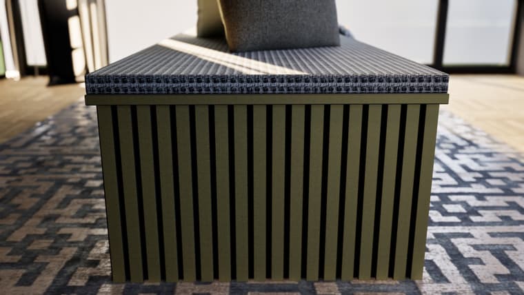
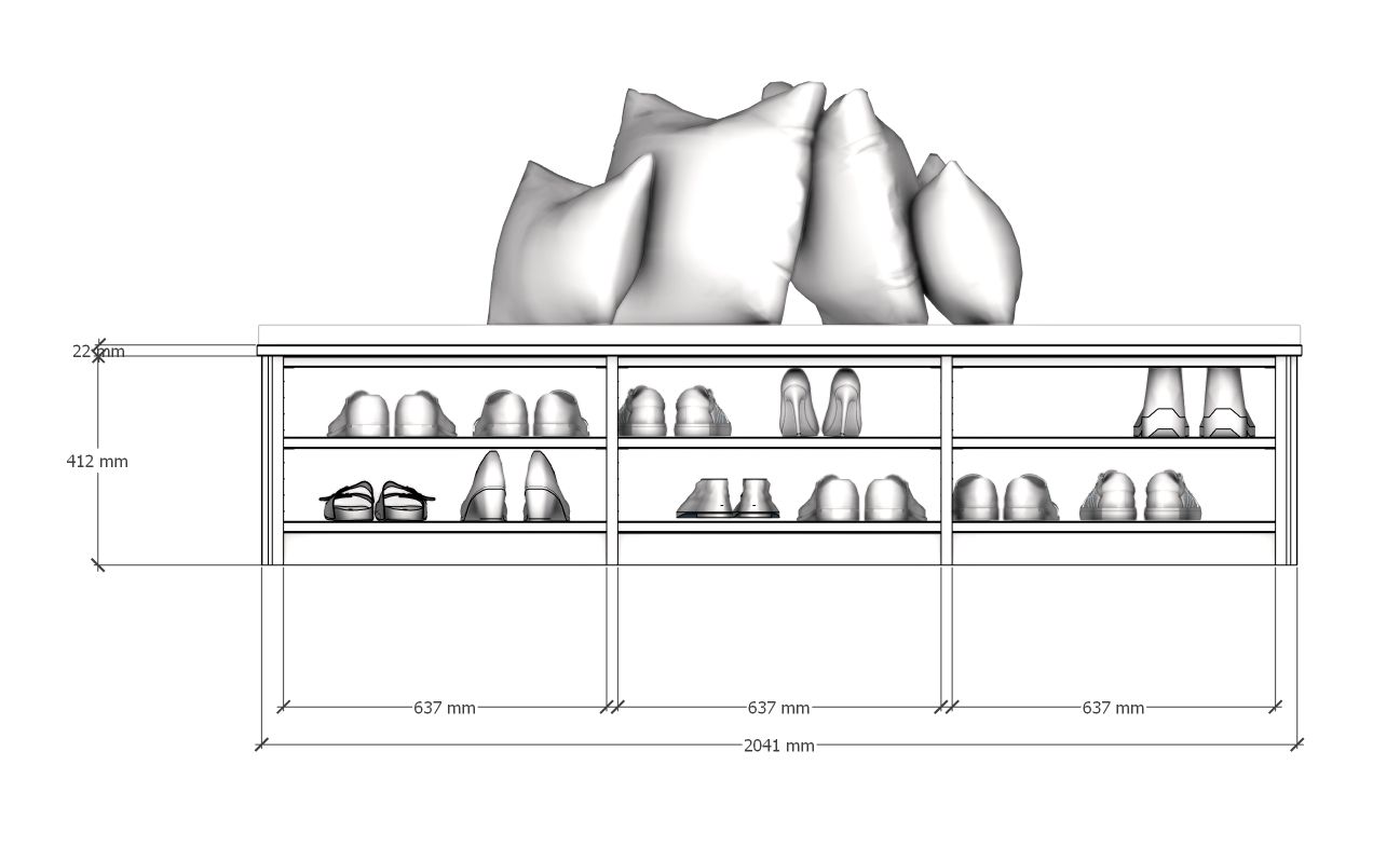
-
and a nice experiment:
added a posed Twinmotion-girl.
enhanced with KreaAI,
Faceswap with stablediffusion.
merged in Photoshop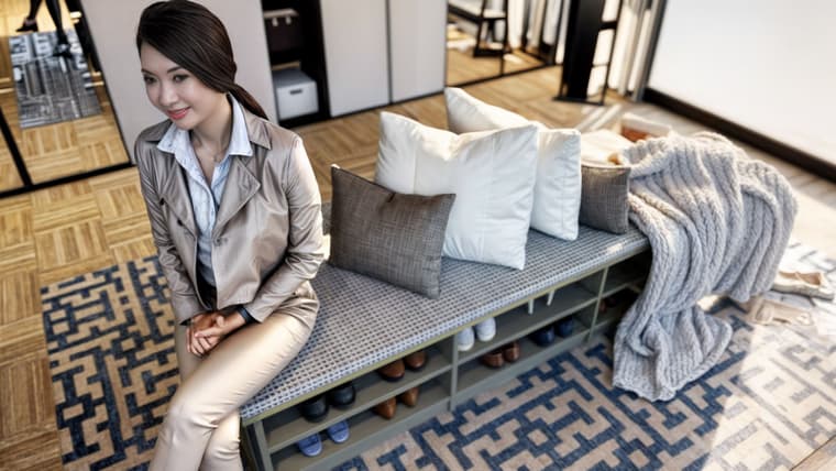
and another version:
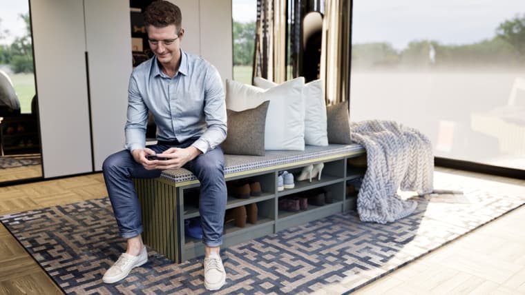
-
-
@jo-ke I always enjoys exploring those panos. Wish I could go upstairs.
-
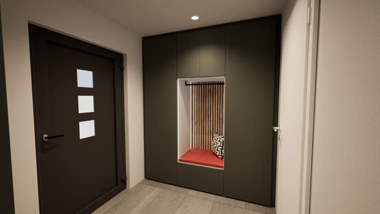
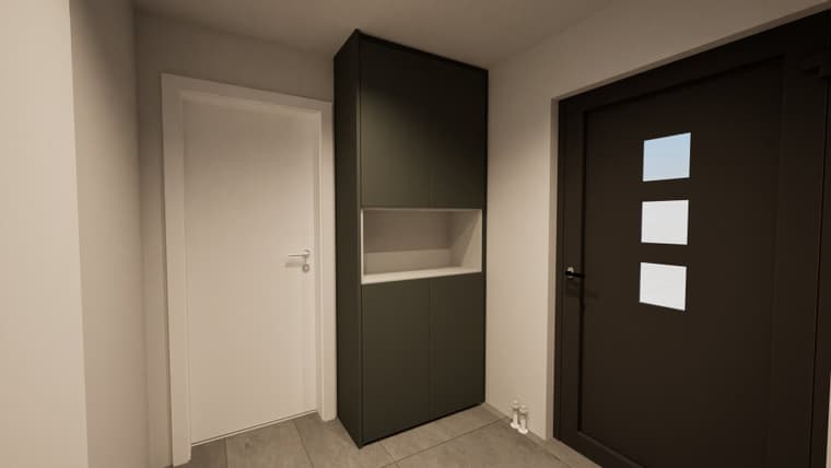
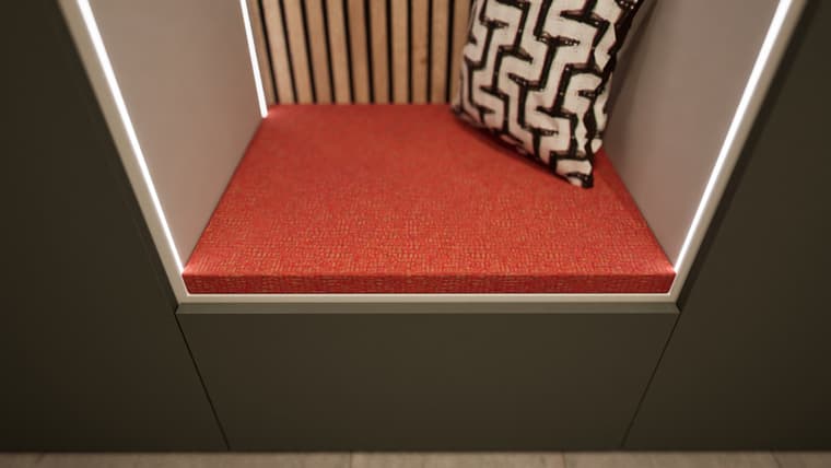
-
Excellent work as always!
-
Nice

-
and another one finished. Su, render, and real pics in video:
su:
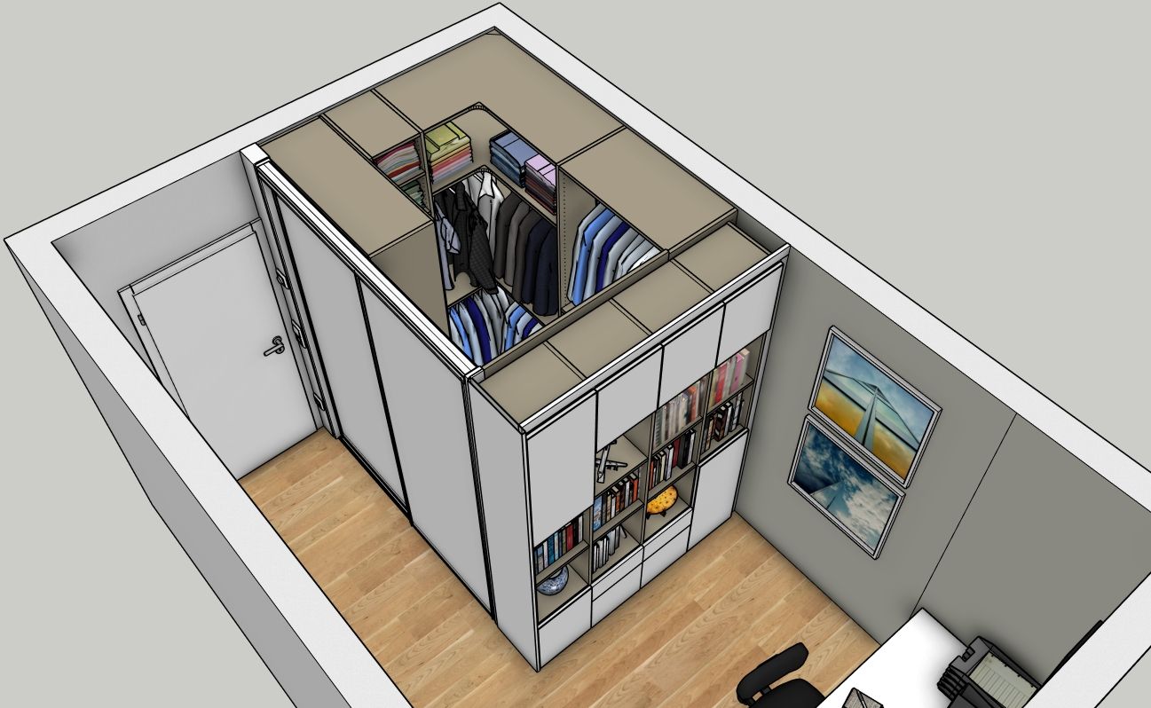
render:

reality:
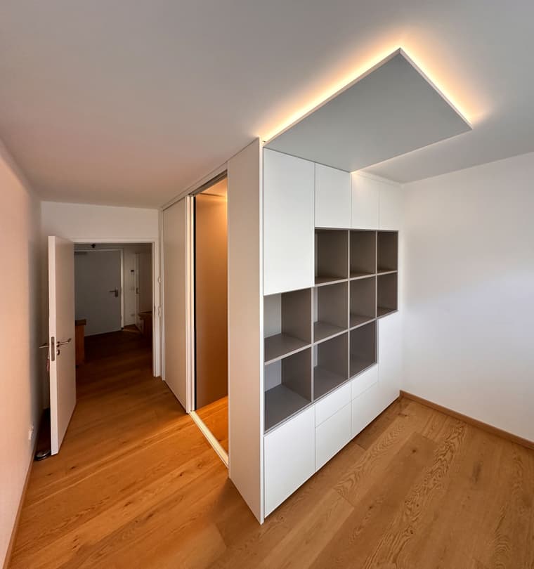
Panoset:
-
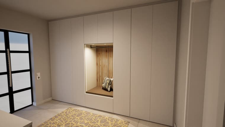
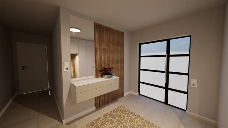
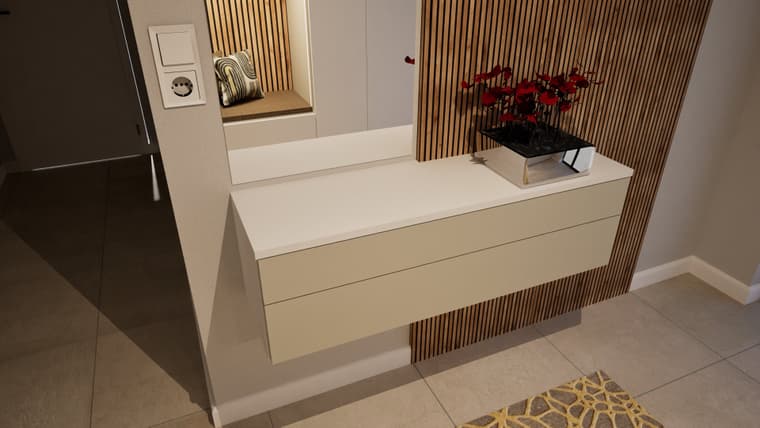
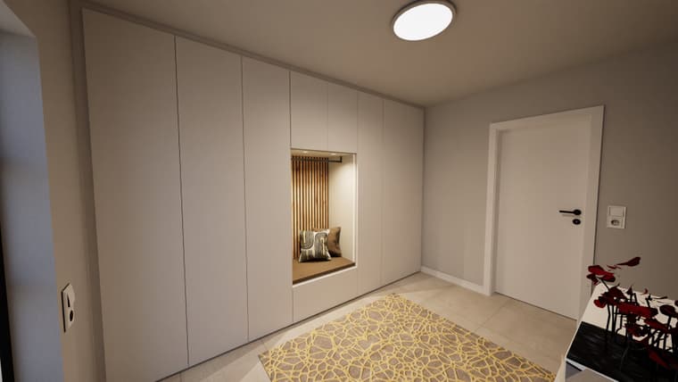
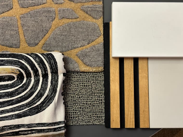
next one: (will be built in December....)
-
panos:
-
Top notch as always!
Hello! It looks like you're interested in this conversation, but you don't have an account yet.
Getting fed up of having to scroll through the same posts each visit? When you register for an account, you'll always come back to exactly where you were before, and choose to be notified of new replies (either via email, or push notification). You'll also be able to save bookmarks and upvote posts to show your appreciation to other community members.
With your input, this post could be even better 💗
Register LoginAdvertisement

