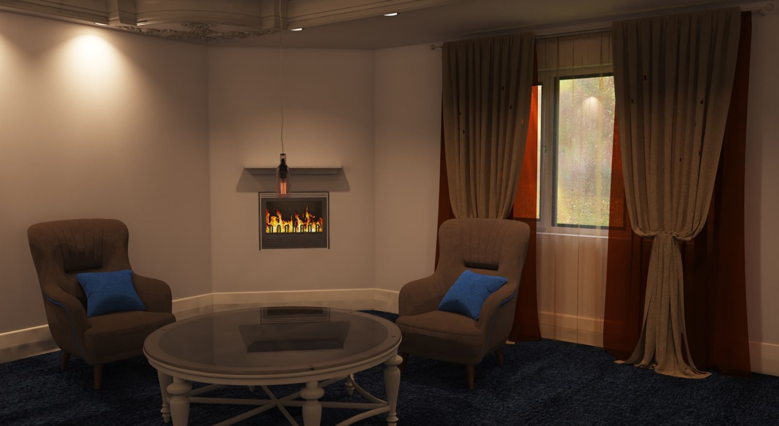
Reading or music room, autumn.
-
A cosy room with a fireplace for reading or listening to music, whatever.
Apart from losing the moth's and simplifying the ceiling drop this is a case of one alteration at a time.
-
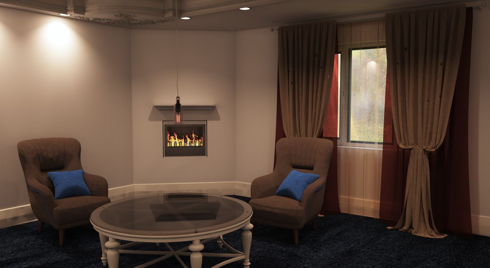
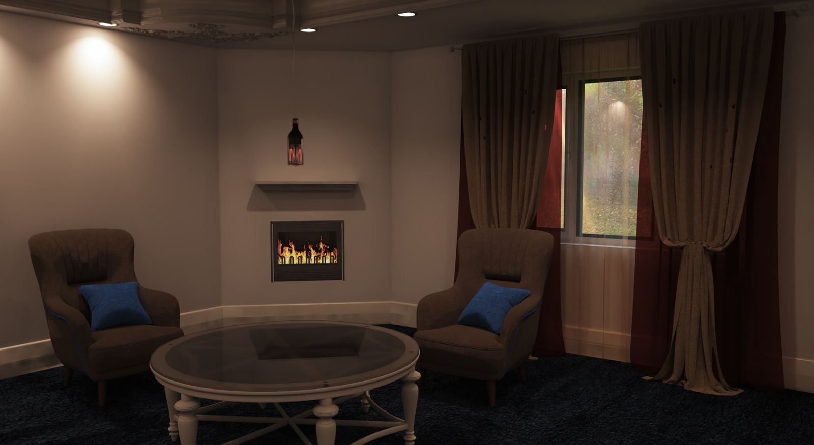
Developmental adjustments.
-
Looking good!

-
Thanks mate, struggling with light settings again, there must be a decent balance in there somewhere. Probably rolled under the Sofa.

-
@mike amos said:
Thanks mate, struggling with light settings again, there must be a decent balance in there somewhere. Probably rolled under the Sofa.

Hi Mike,
I do not know your background in rendering so sorry if this instead advice ends being patronizing.
So what I preach to all of my students is to take one step at a time:- If you have outside light that contributes to your scene lighting you should start with that one first.
Use your real-world sense for that light, it is not the same in the morning, mid-day, or sunset. Get as many real photo references. - After you are satisfied with the first light you get to your fil light in your room, like a ceiling lamp (not spotlights/directional).
It should be what you expect from that kind of light source, flood space with light, not too strong in this case since you go with that fireplace mood.
- And last, accent lights like those spotlights, should get interesting localized shadows and put objects in focus if that is the intention.
- That fire should get some warm light in space and spill some of that onto the floor and near objects.
- Since I do not like light portals (extra light setups) like in real-world interior photography for magazines and alike I skipped that part.
All of my students are Interior Designers and those setups are not true to the space they design for clients.
All that together or some of that combination should get you to the point where your story is told in words you chose.
Light Is the first and last thing that gets tweaked.Hope I helped with this sermon of mine.

- If you have outside light that contributes to your scene lighting you should start with that one first.
-
Thanks mate, that is what I do anyway but sometimes the muse is on a day off. I usually get reasonable results but a new graphics card (Complete pc failure) and a system not really running on all cylinders yet is hampering my style.
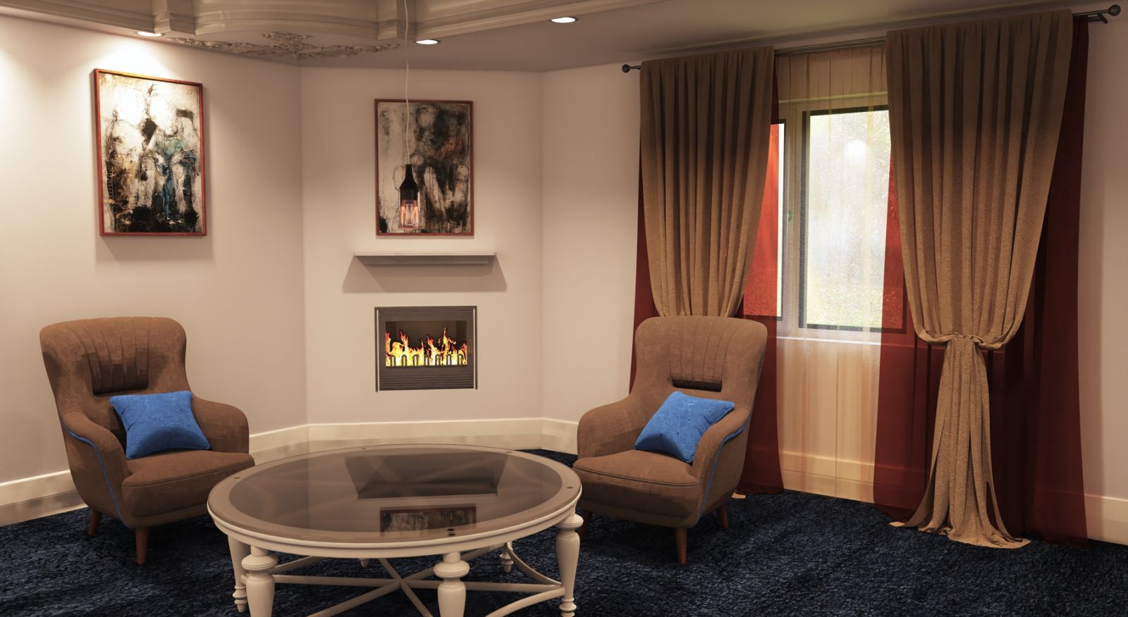
This render here relies on the interior being the muse rather than the mix I had earlier.
-
That is definitely far better!

Nice!
-
Thanks, I tried something different with the ceiling but it's not working but it was worth trying.
-
@mike amos said:
Thanks, I tried something different with the ceiling but it's not working but it was worth trying.
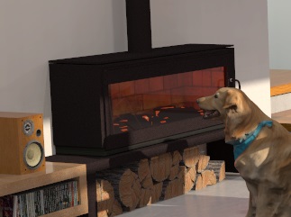
Experimentation is what it is all about. The fireplace looks flat. I did a similar thing a while ago and it looked flat also. I built the fire with geometry and made sone randon "coal" shapes painting most of the surfaces black and making other surfaces warm colours like red and yellow and made then into light enitters, can't remenber if I added another light in the fireplace with a very warm colour or not. Your latest render was a huge improvement
 Keep going mate. It is all about light just like photography and the length photographer go to for the best lighting.
-
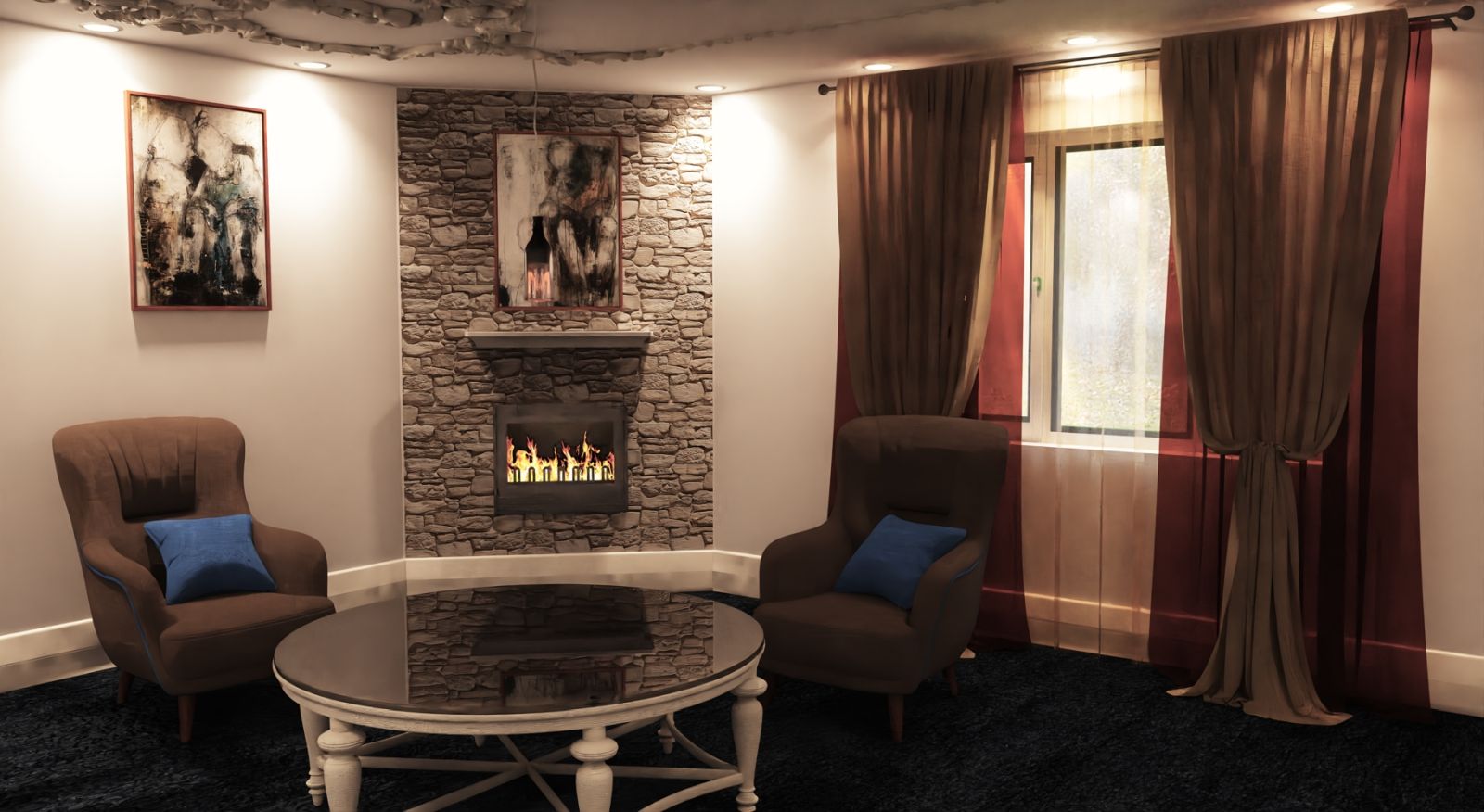
Thanks mate. Part of the ceiling has gone which led to a falling off my chair moment as the new ceiling turned into a big mirror.
Oh how I laughed at that one........
Moved the lights to and they will need to move again but getting some movement quality wise The new stone wall texture is great but I have noticed a slight flaw with the execution. Can you folks see it?
Once you realise you will kick yourself because it really is obvious when you catch it.
This is a mere three passes of Twilight V2 pro but with the denoise addition already shhowing good results.
-
IMO - Much nicer.


-
Oh yes! Quite cozy now!

-
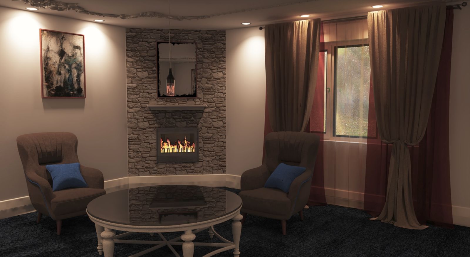
Thanks folks, I think the scene dressing can go ahead properly and I will reduce the hdri level a bit to bring the garden into sharper relief.
-
A little more progress, as hoped the hdri reduction brought the background into sharper relief. Simplified the ceiling moulding again and cleaned a few things up.
-
That looks great!

Hello! It looks like you're interested in this conversation, but you don't have an account yet.
Getting fed up of having to scroll through the same posts each visit? When you register for an account, you'll always come back to exactly where you were before, and choose to be notified of new replies (either via email, or push notification). You'll also be able to save bookmarks and upvote posts to show your appreciation to other community members.
With your input, this post could be even better 💗
Register LoginAdvertisement


