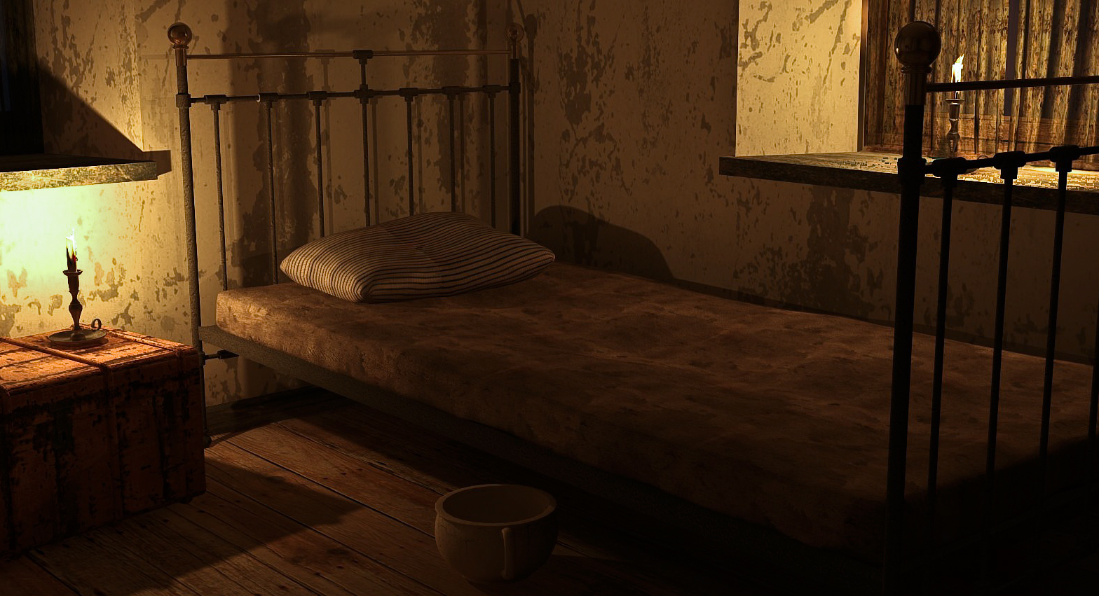
A cosy retreat
-
Prompted by Mike Amos's recent 'Grunge living room' post, I venture to submit a render from an exercise done some time ago. Its far from perfect but was an attempt to create something that wasn't clean and sparkling.

Rendered in Podium V2.5
-
@shawb said:
...an attempt to create something that wasn't clean and sparkling
... which turned out really perfect

-
Goal achieved.

-
nxtdave & HornOxx. Thank you both for your kind and generous comments!
-
It certainly works as a dingy dirty disheveled image

 However I think Mike was working with the "grunge Fasion" which is quite different different and a sub-culture of fasion and music. I could be wrong but mike nailed "grunge" in his stylish image exept for the floor material.
-
That is a great render, shawb, run down and a poorer part of a city but lived in. Nailed, well and truly. Thanks L i am.
-
Thank you for the comments guys. I must try and keep up with the latest descriptors! I appreciate that Mike's render was what I would have termed 'shabby chic' but the terminology has obviously moved on. Essentially, it was the wall texture that reminded me of my own past project and moved me to post.
-
Fair point but perhaps 'shabby chic' and "grunge" are perhaps interchangeable in some repects. But suffice to say both aprouches are very different
-
Please post more renders, looking forward to seeing them.
-
Happy to oblige. These are from the same project including a close-up of the 'Guzunder'. Although impoverished, the occupant of the room is well-off enough to own a pot to p*** in!
-
Up to the age of twelve, we had no bathroom and one exterior 'privy' which froze in the winter. That house still stands but has been much modified. Designed by the developer Alfred Heaver it was built in 1870 in the Falcon brook part of Battersea. The design has two floors with four different levels. Each main floor has two rooms, each would have housed a family with one shared scullery and one shared kitchen for two families on each main floor. The maximium width of the house is 18 feet, while I was around there were still two huge Aga type oven/hob units but they had long since ceased being used.
Yes, we too afforded a pot to pi55 in. A lot of blast from the past in those images.
-
Great pictures
 - in the past everything was better... but back to SketchUp - which software (modeling, texturing, rendering) did you use?
 -
All modelling was done in SU Pro (2017 I think). The only item I did not model myself was the Bentwood chair. This came from Podium Browser, which ships as part of the Podium render app. I use the Pro version which gives a far greater selection of materials, backgrounds and 3D content. The textures were from Podium, Sketchup Texture Club (member for hi-res texture versions), native SU textures and my own images. I process textures in Gimp (from within SU) or Photoshop when starting from scratch. I struggle with anything other than bump maps in textures. Fredo6's ThruPaint is the go-to for UV application, a big thank you to him and to all the plugin authors who make life easier.
Actual rendering was done in Podium, I find it relatively easy to use although it needs (I need!) a lot of test renders to get the effect I am looking for. Post processing is completed in Photoshop CS3 with the Camera Raw plugin which is a very powerful set of tools for image adjustment all in the one work-space.
As for that foreign country which is the past, are things really better in the present? Different, yes but better? A debate for another occasion I think. Oh the winter wonderland joy of icicles on the inside of the windows and a tasteful layer of newspaper on the concrete floor.
-
Oooh, nice, looks like a set for a horror movie!
-
I thought it appropriate for a spy on the run from a government agency, forced into the seedier parts of towns while laying low. It is great for a lot of uses like this.
-
Thank you both xayzer and Mike. Haven't been able to visit the forum much of late but the comments are greatly appreciated! My original title for the model was 'Student Accommodation'.
-
Well done! Cosy indeed.
Hello! It looks like you're interested in this conversation, but you don't have an account yet.
Getting fed up of having to scroll through the same posts each visit? When you register for an account, you'll always come back to exactly where you were before, and choose to be notified of new replies (either via email, or push notification). You'll also be able to save bookmarks and upvote posts to show your appreciation to other community members.
With your input, this post could be even better 💗
Register LoginAdvertisement


