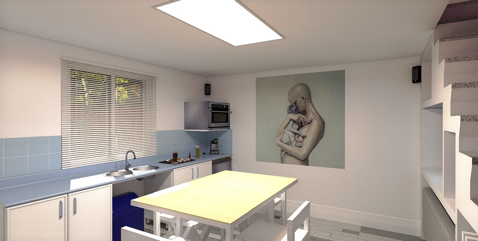
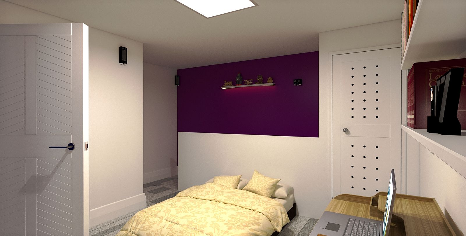
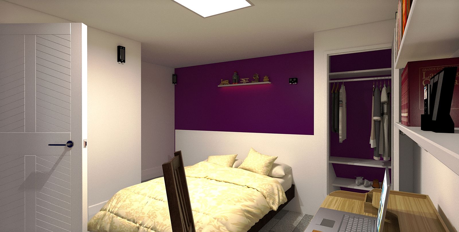
16' 2 Apartment.
-
cool concept
 .
. -
Thank you, I lost more hair due to that group.
-
Dining room setup, table and chairs unfolded and sofa moved under the stairs.

-
Reverse View upstairs towards the stair well.

-
Upstairs view 2 final.

-
Nice work Mike, both the renders and design for such a small footprint
 I like the purple and other colours, this may be subjective but I think the blue is way too heavy
-
Thanks, I agree with you on the blue curtains in particular, they are a focus in themselves and I have learned from that. Perhaps white or a more subdued colour in future.
-

 also a really good case study fitting on current megatrends minimalization and tiny house movement - I like it (and also its presentation here) very much and thanks for sharing!
 -
Thanks mate, I tend to err towards the smaller property, a bit of a challenge which I like.
-
Looking damn good!
-
Thanks Bryan.
Hello! It looks like you're interested in this conversation, but you don't have an account yet.
Getting fed up of having to scroll through the same posts each visit? When you register for an account, you'll always come back to exactly where you were before, and choose to be notified of new replies (either via email, or push notification). You'll also be able to save bookmarks and upvote posts to show your appreciation to other community members.
With your input, this post could be even better 💗
Register LoginAdvertisement


