Recent Layout Presentation
-
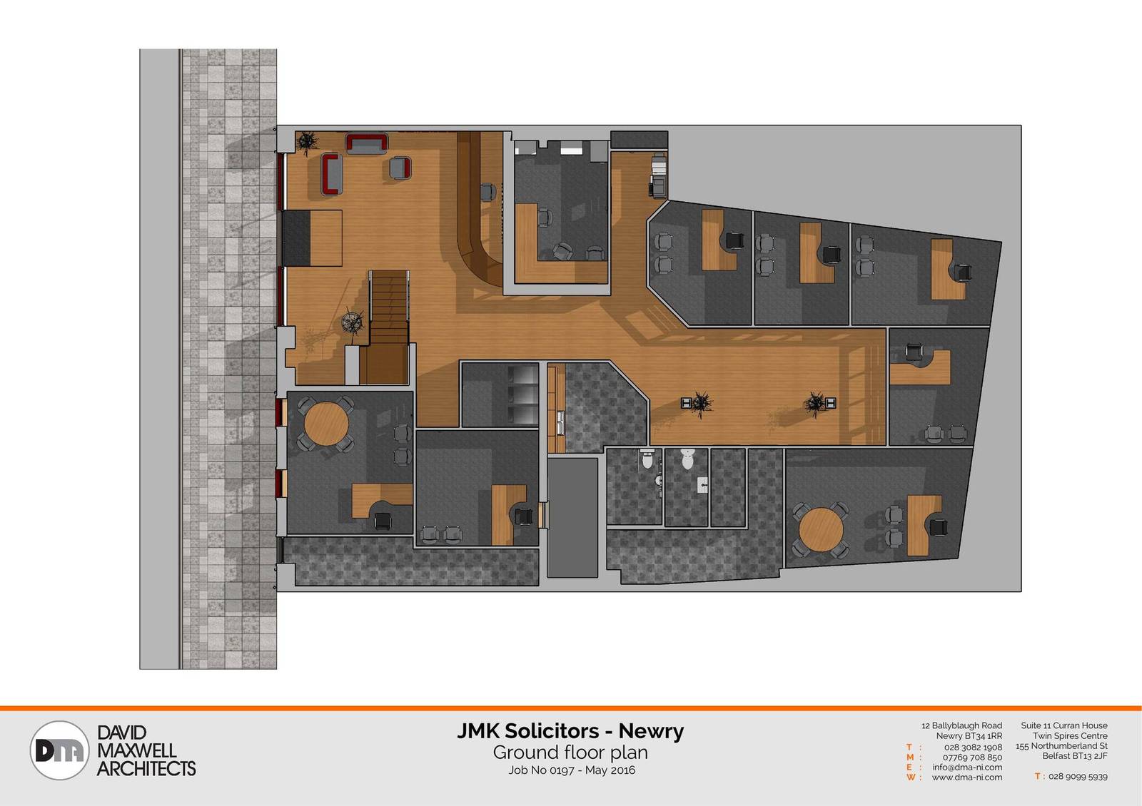
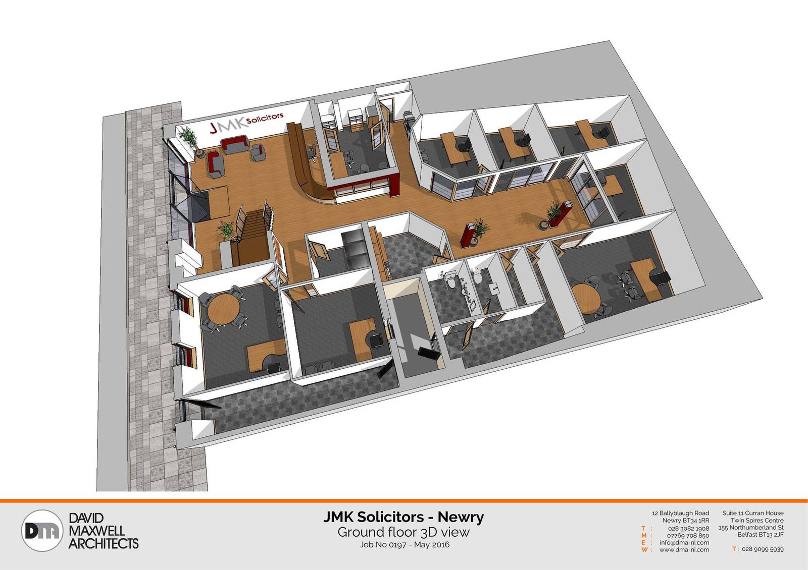
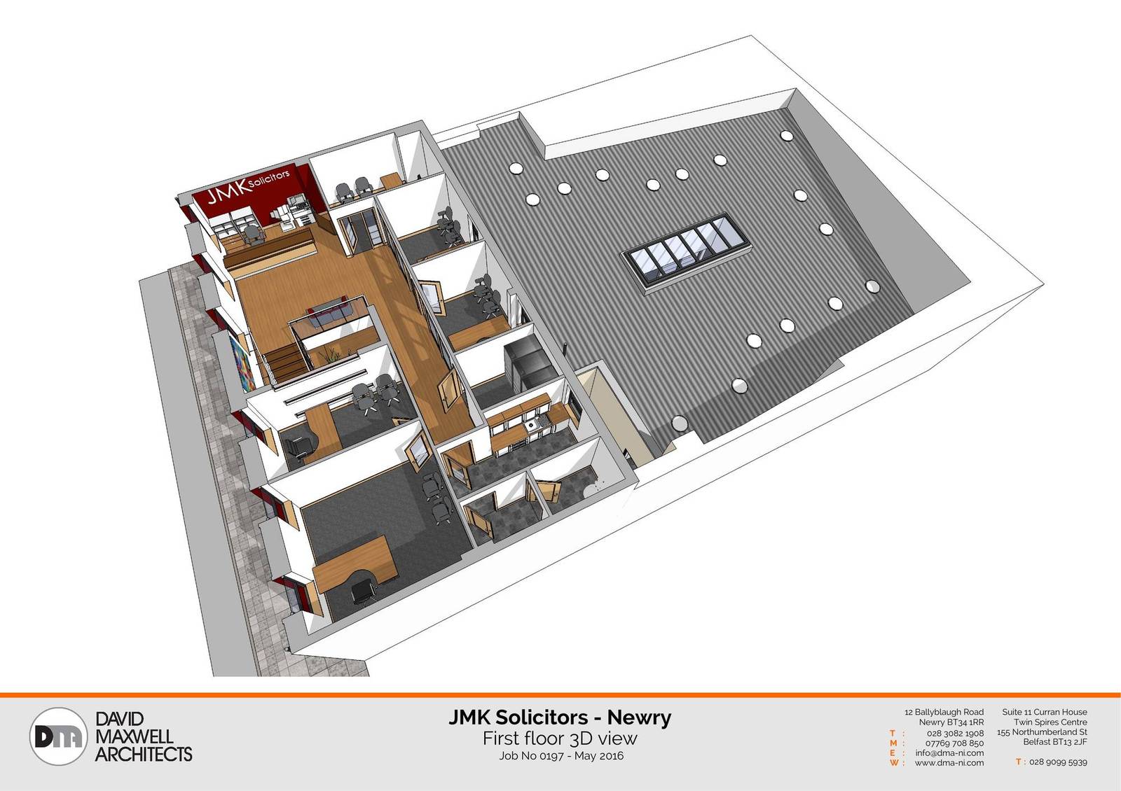
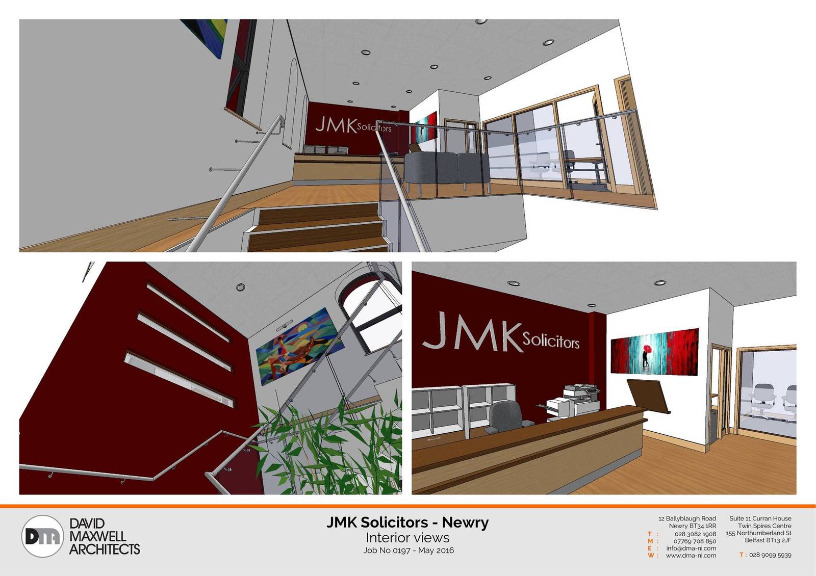
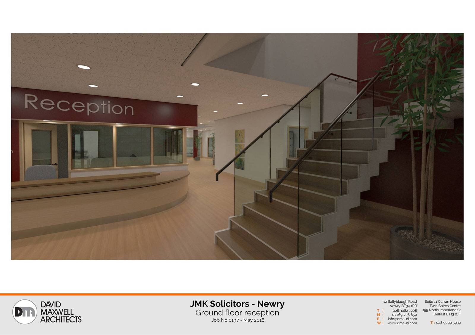
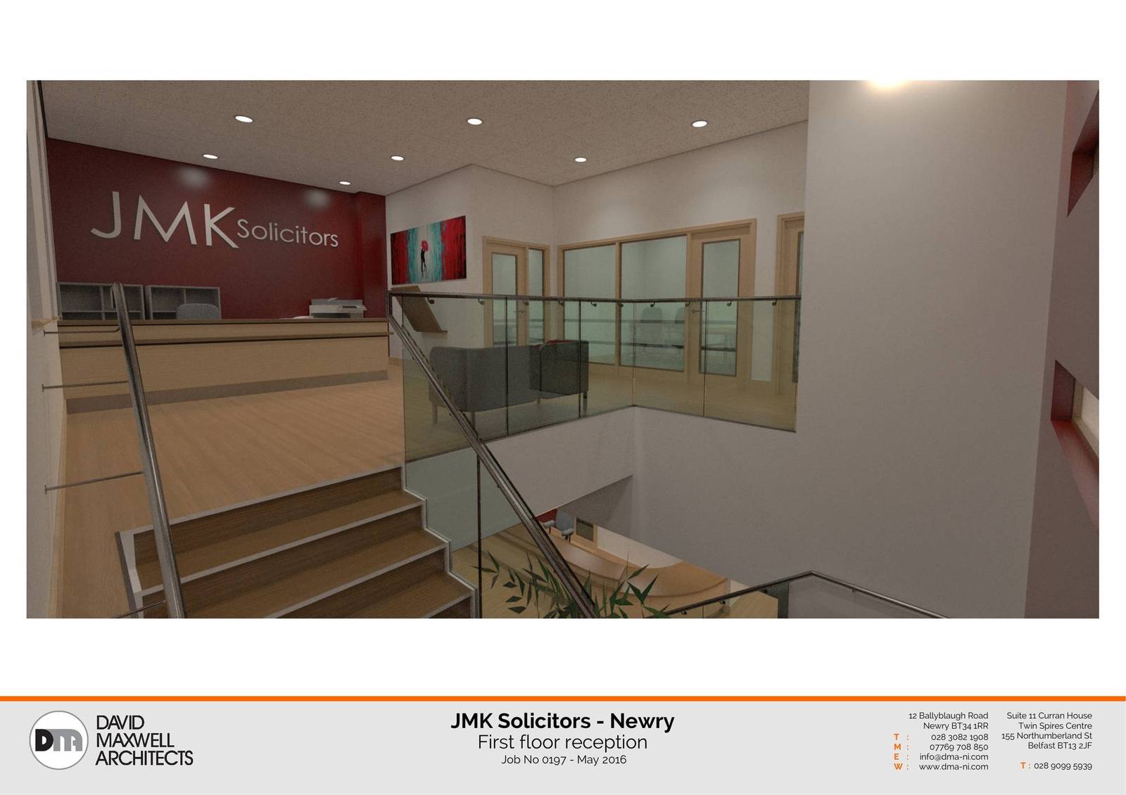
Heres some pages from a recent project, this is the 1st time I've used Layout in anger .... colour me impressed.
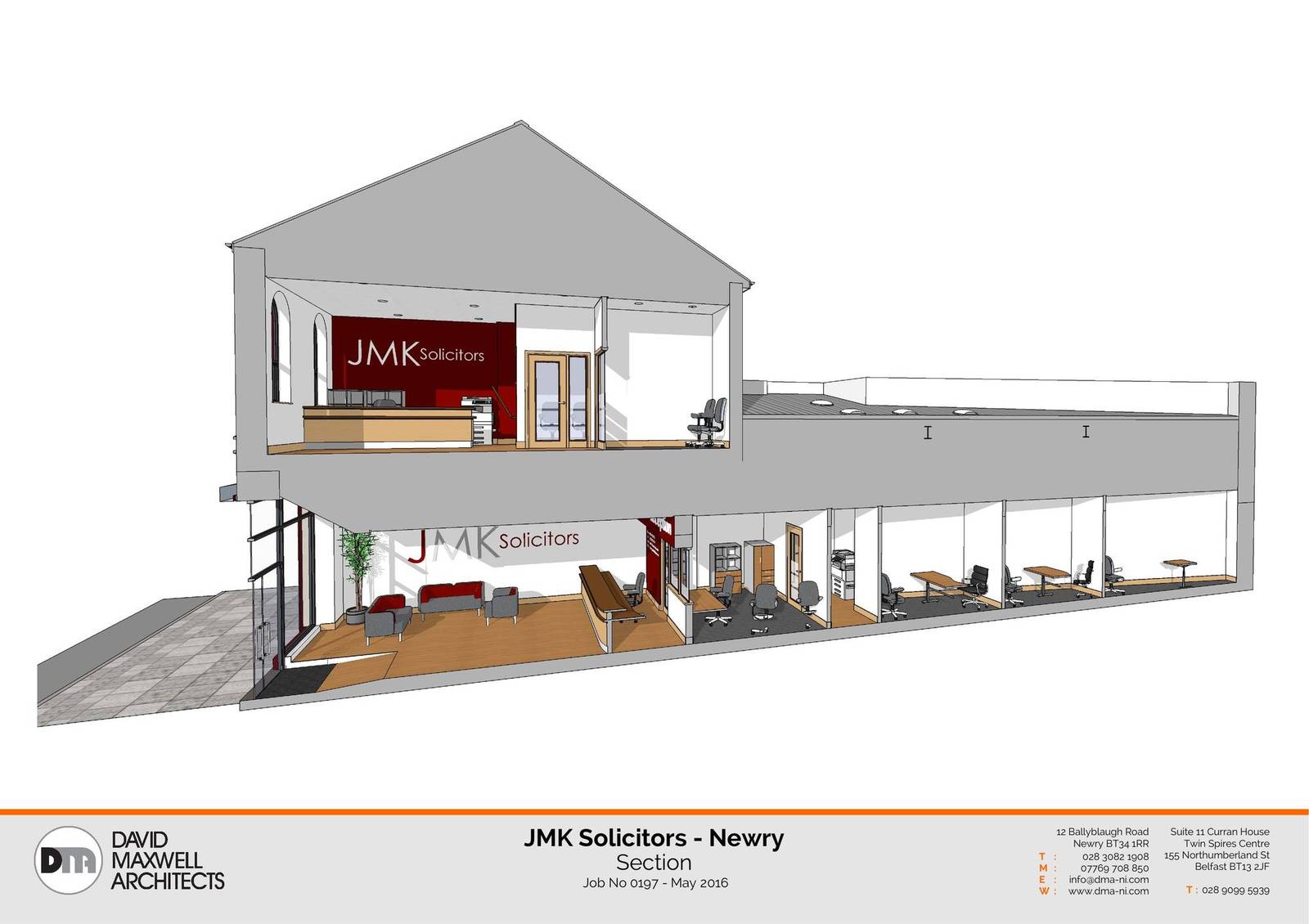
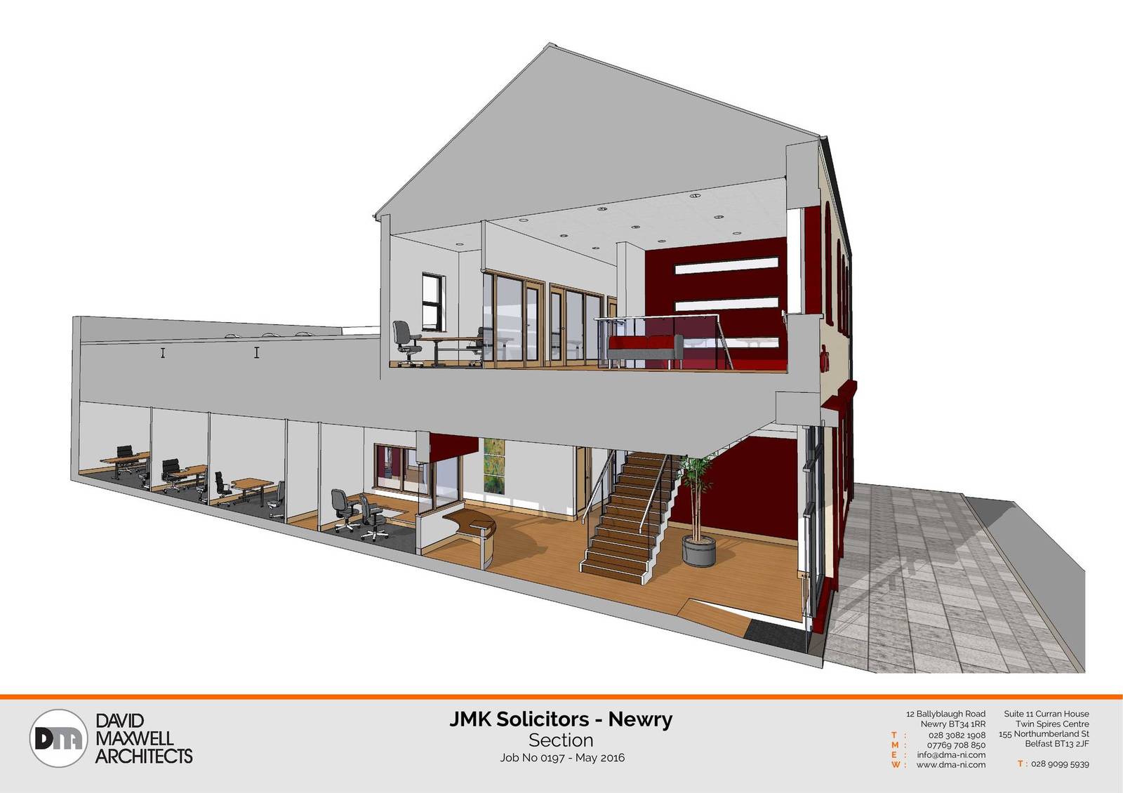
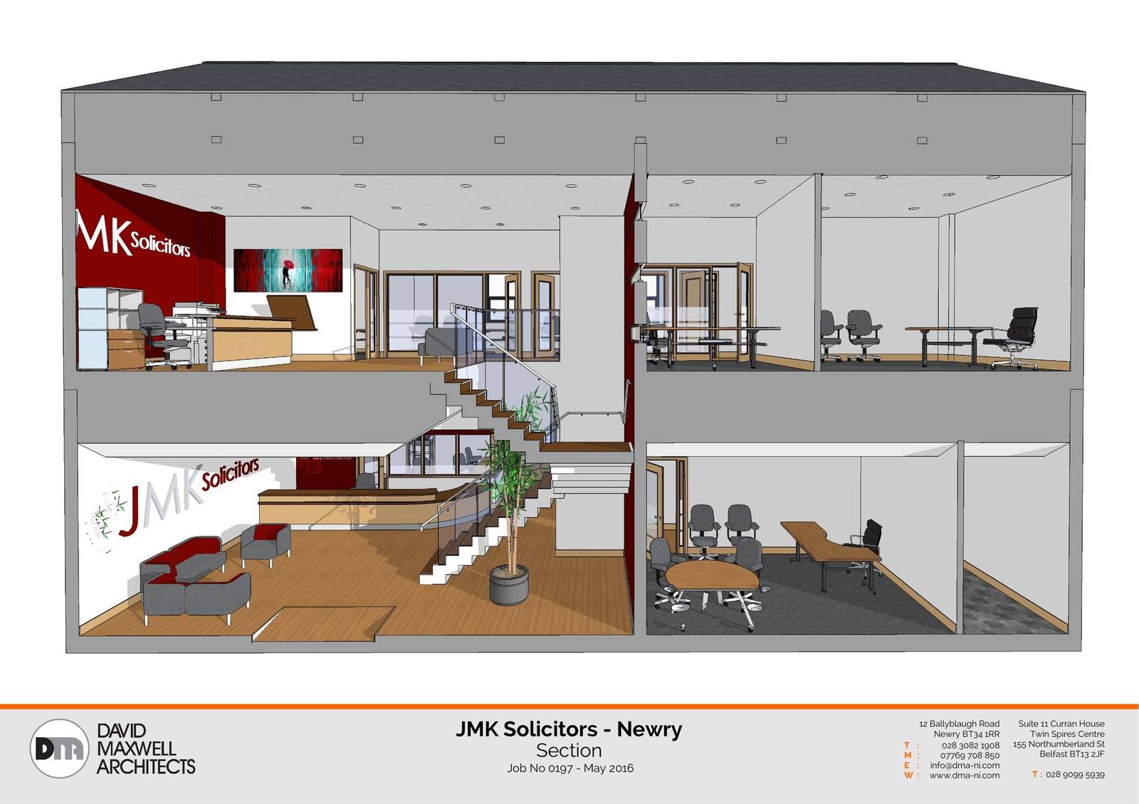
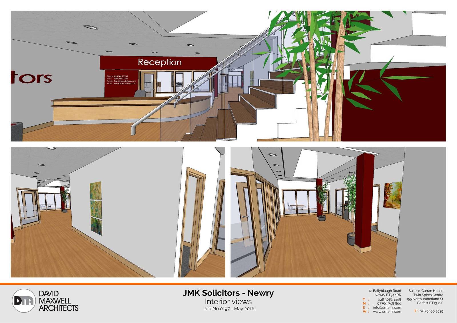
-

-
Very nice.
I think the renderings need a little Postpro to look better.
-
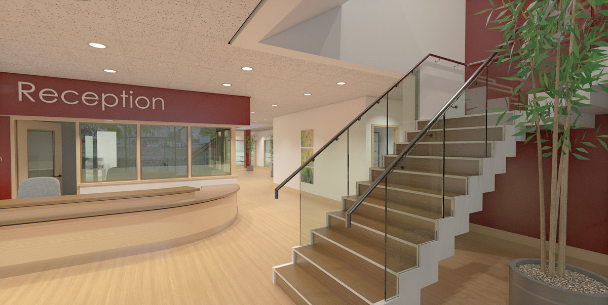
Rerendered them last night, with better settings and spent a little more time post processing them, much better I think.
I forgot to say that they are done with Twilight.
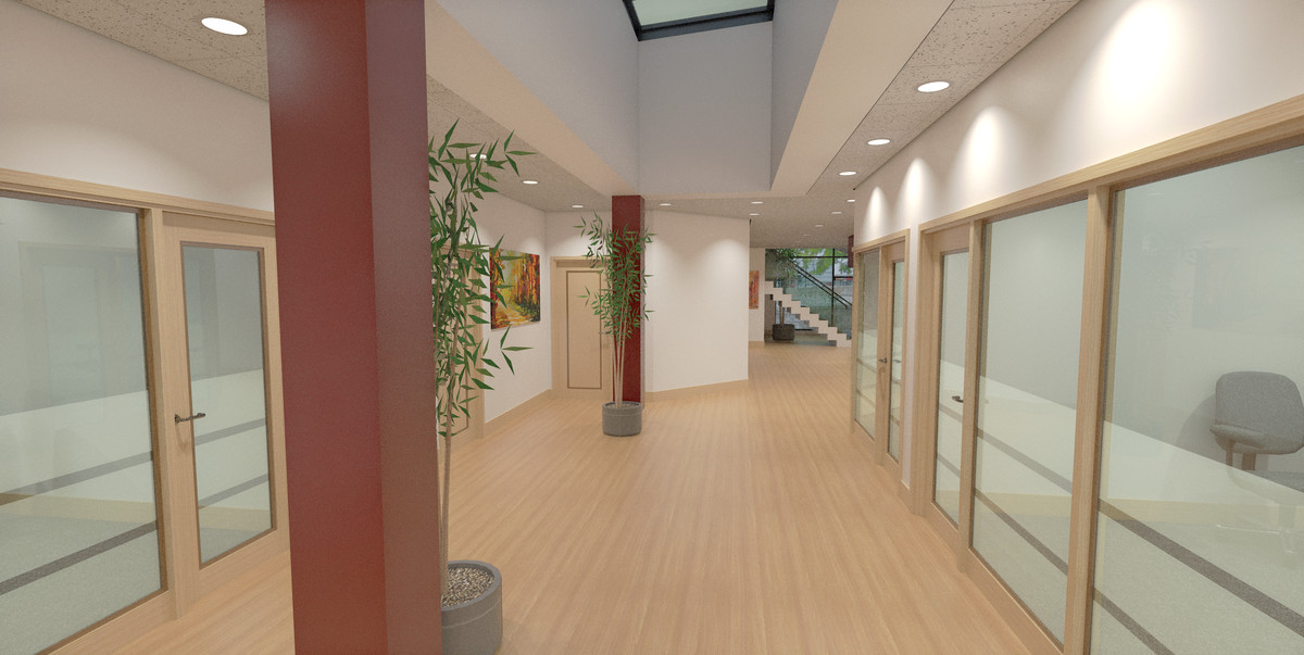
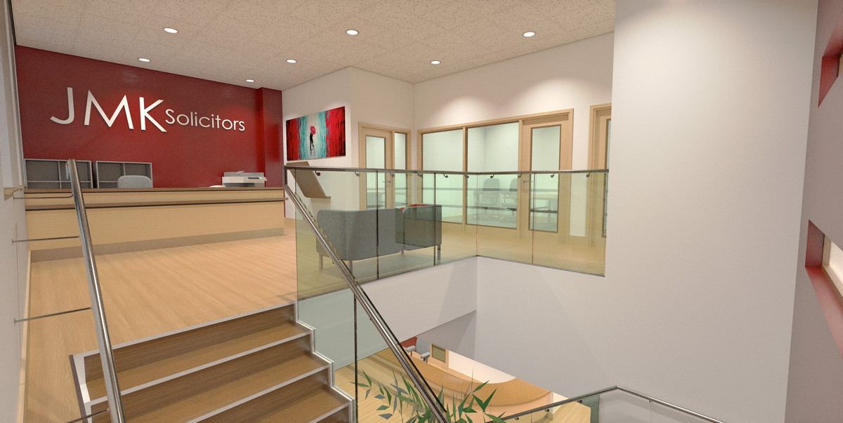
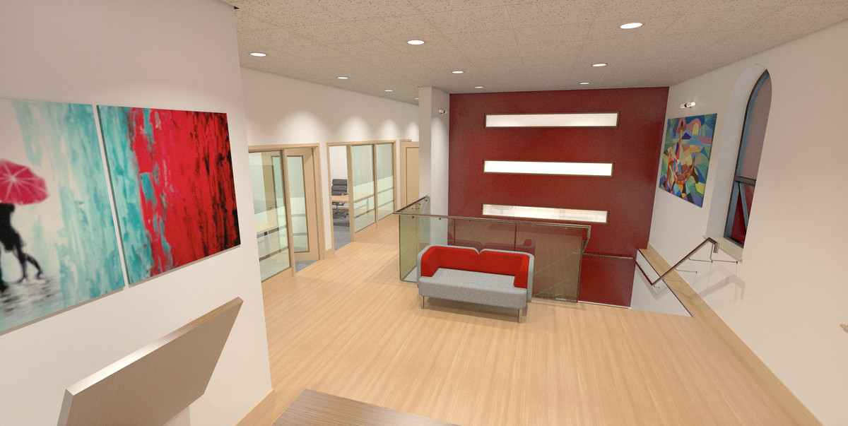
-
You do some impressive work.......I HAVE to learn how to use a renderer.
-
looks much better.
Now I would pay attention to the verticals. A little correction and will look perfect.
-
Very nice. Great to see what some people can do with LayOut! I think, though, with your great renderings you don't need the SU perspectives (interior views)--but keep the SU plans and sections.
-
Those look great and the updated renders really make a difference.
-
if your post processing program has levels adjustment I would recommend adjusting levels ever so slightly to get rid of that haze. It feels like we are looking through dirty glass kind of.
-
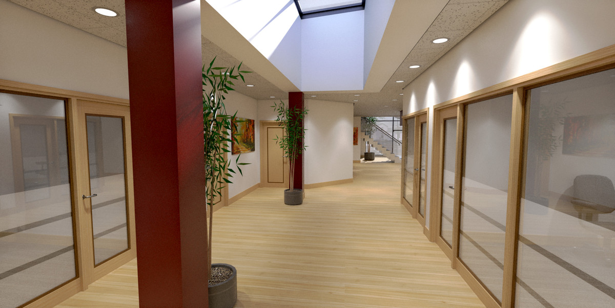
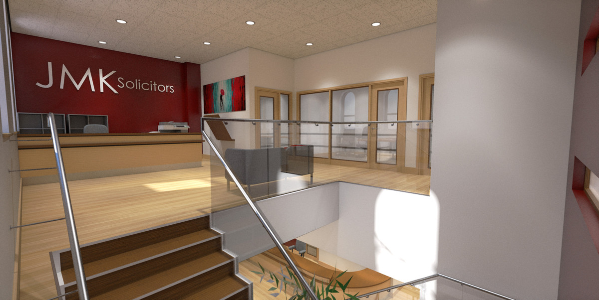
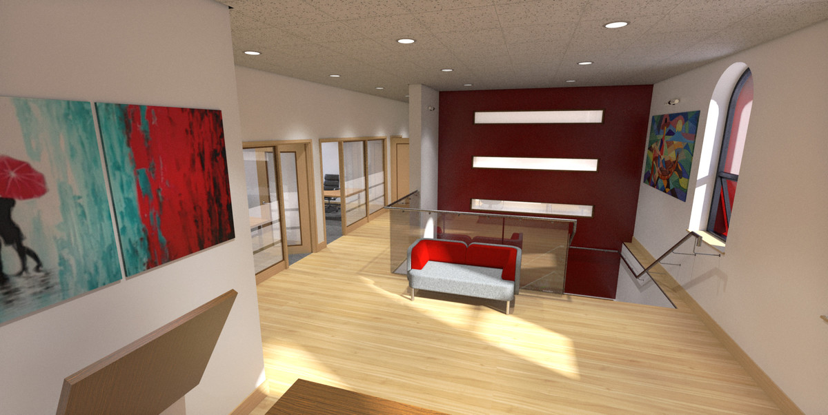
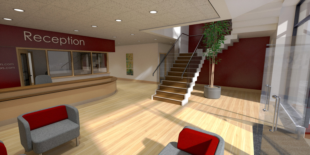
I did a bit of studying at the weekend and actually taught myself something about rendering!, I revised materials, lighting and environment and got these.
The previous set required a fair bit of levels work post process as I got my initial renders so wrong, these required very little.
They're still a little dark but I quite like the 'moodiness' of them.
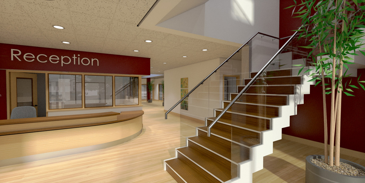
-
These feel much better. better contrast and the air is clear.
-
Nice work, Paul. The only thing I would suggest would be to add some people.
-
Like the new renders! When can I move in? Can I get a private office for $500 / mo.? Oh, do I have to work for the solicitors?
-
Nice work again Paul, though when you put images or renders onto a page you can see why maintaining verticals vertical is important. I'll say this again, that it only seems to be the SU community that break this industry convention.
-
Richard,
I am curious......do you mean use 2 point perspective(s)?
Thanks,
Charlie -
@unknownuser said:
Richard,
I am curious......do you mean use 2 point perspective(s)?
Thanks,
CharlieWell yes but not by forcing them with SU's camera. Just set it up that way.
I know many here will argue that this isn't important, though the simple challenge - open any good architectural magazine and try to find one photo off vertical. If you do, checkout who was the magazine's art director for that issue, then check the next issue - likelihood is they've been replaced.
-
@richard said:
@unknownuser said:
Richard,
I am curious......do you mean use 2 point perspective(s)?
Thanks,
CharlieWell yes but not by forcing them with SU's camera. Just set it up that way.
Can you explain what you mean by "just set it up that way".
I often fuss with SU camera FOV and save my scenes.
(getting things as vertical as I can)
Is this what you mean by forcing SU's camera?Thanks,
Charlie
-
@unknownuser said:
@richard said:
@unknownuser said:
Richard,
I am curious......do you mean use 2 point perspective(s)?
Thanks,
CharlieWell yes but not by forcing them with SU's camera. Just set it up that way.
Can you explain what you mean by "just set it up that way".
I often fuss with SU camera FOV and save my scenes.
(getting things as vertical as I can)
Is this what you mean by forcing SU's camera?Thanks,
Charlie
Ok I should probably explain better. If just for NPR then I'd suggest the two point perspective camera can work fine. If rendering - any heavy forcing can make things look a bit weird, like an excessive crop.
Hello! It looks like you're interested in this conversation, but you don't have an account yet.
Getting fed up of having to scroll through the same posts each visit? When you register for an account, you'll always come back to exactly where you were before, and choose to be notified of new replies (either via email, or push notification). You'll also be able to save bookmarks and upvote posts to show your appreciation to other community members.
With your input, this post could be even better 💗
Register LoginAdvertisement


