Need help creating a curved face
-
Hello everyone,
I'm quite new to 3D modeling, so there's probably a pretty easy solution to my problem. Yet it seems I can't figure out the right questions to get the answers.
So here's what I'm trying to do.
GOAL
I want to create a number of images of air combat maneuvers. They should look like this one:
APPROACH
Take the defender's flight path: A simple turn with about 60° of bank.
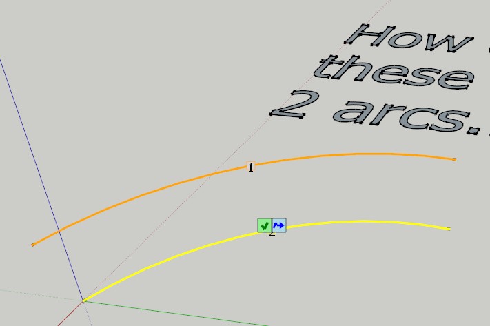
I would like to create this flight path by drawing two arcs from each wingtip at time 1 to each wingtip at time 2 and close the geometry with two straight lines (which are hidden after the job is done).PROBLEM
Since these two lines and arcs are not in the same plane, I have to manually add several lines and manually hide them afterwards. This additional work costs a great deal of time.SOLUTIONS?
I hope that there is some sort of method or plugin that can automatically create the faces needed to complete the flight path. I'd be very grateful for any suggestions.
In order to speed things up, I attached a file where i drew and filled a flight path manually. If there's any further explanation needed, please ask for it and I'll do my best to give you the information needed.
Thanks in advance!
P.S.
I'm using SketchUp Make 2014
-
Hi Mandell,
erase the left and right edges and use curviloft.
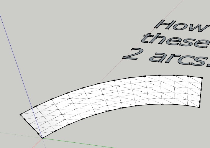
-
Check messages.
-
Tig's Extrude Edges by Rails would be another one.
You'll probably find Fredoscale useful too for twisting and bending your paths. -
Whow - thank you all very much for your help!

I tried my luck with Fredo6's plugins and so far I'm quite happy. I can now create the flight paths fast and in an intuitive way. There's only one thing that I don't quite understand.
I wanted to create the flightpath for a Roll maneuver, so I used the FredoScale's Twist-function. Looks very neat so far:
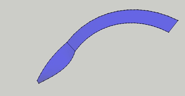
However, when I set the camera's angle near the long axis of the flight path, I get some unwanted lines:
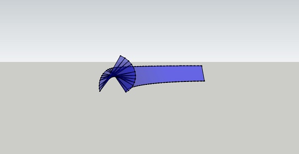
As far as I understand, these lines correspond to the automatically generated geometry, i.e. they are the segments of the rolling path. It turns out that I can't interact with these lines (select them or change them in any way), they seem to be some graphic error which unfortunately show up in the exported 2D images, too.Any thoughts on how I could solve this issue? SKP file is attached. Many thanks in advance!
-
Just disable all Edges Style!

-
Hi.
Based on your picture, you can smooth soften those lines singly with Ctrl+Eraser tool, or globally with Window>Soften edges. Fredo's tools create logical subdivisions of the surfaces during modification.
Sketchup is not a nurbs modeler, like Rhino. -
If you turn on hidden geometry, you see the single faces and lines. If you look through 2 or more transparent faces, the tranparency is reduced accordingly and it looks darker. One possibility to reduce the overlapping parts is shown in this screencast...
[screenr:qn1nakwk]j4KN[/screenr:qn1nakwk]
-
Carsten is showing you an excellent way of working with this, but it sort of highlights how simple and complex your question is. There is a simple answer to making the curve but that answer doesn't work for every situation. Much like anything, learning as much as possible about the different ways to do things will help you look around the corner to see how the wall is constructed.
-
How about something like this for the method?
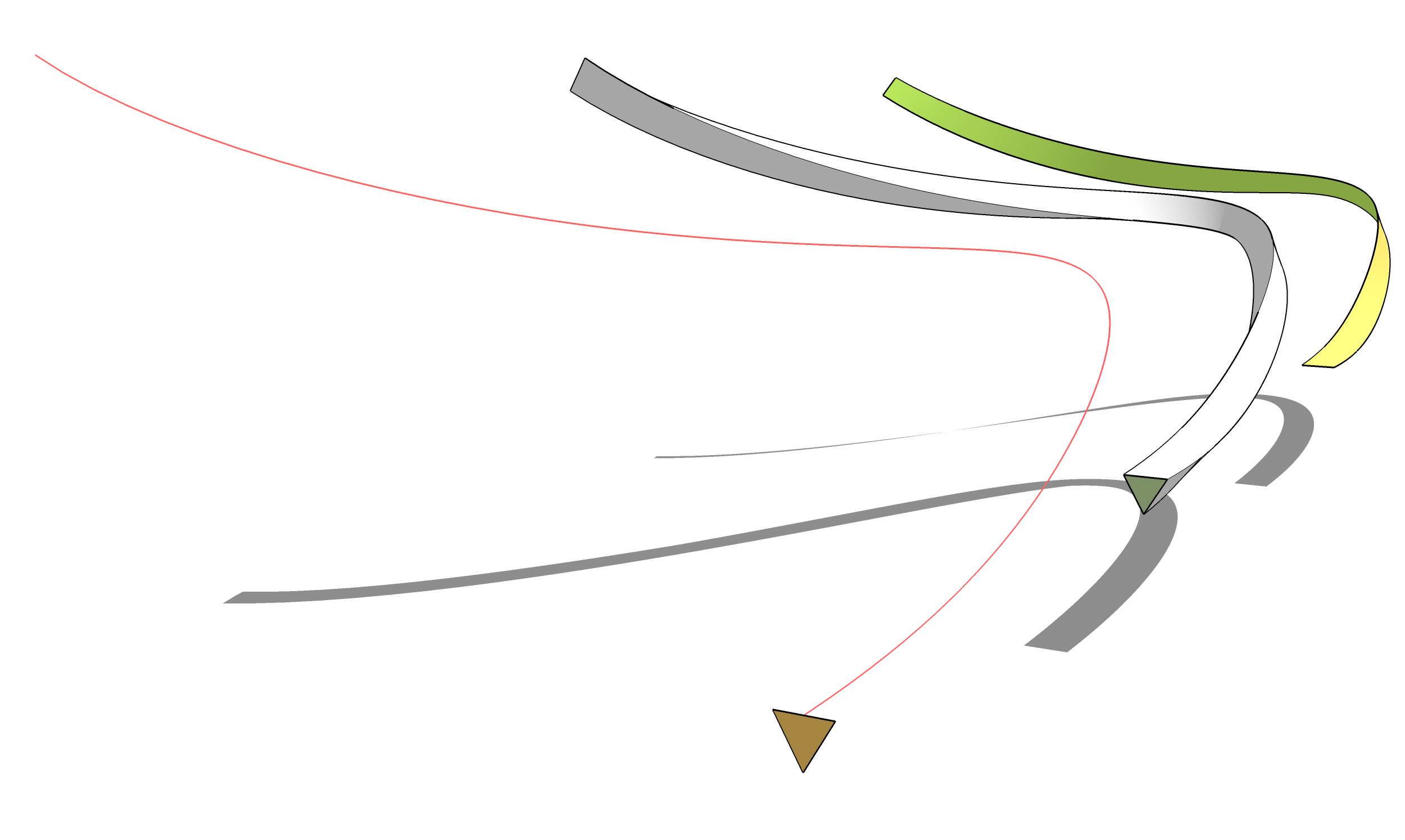
-Draw a curve for the centerline of the path of the airplane. I used a Bezier curve with 90 segments.
-Use the Polygon tool to draw a triangle. The upper two corners represent the airplane's wing tips.
-Select the curve and the face of the triangle.
-Run Follow and Rotate. I set the angle to -2.0 and left the scale at 1.0. So that creates a roll to the right of 2 degrees per segment for a total roll of 180 degrees along the length of the path. If you wanted a full 360 degree roll you might make the curve with 180 segments and with 2 degrees of roll per segment.
-Open the resulting group for editing.
-Select all of the geometry and use Soften/Smooth.
-Correct the face orientation as needed.
-Delete the two unneeded surfaces and their shared curve leaving the twisted ribbon. -
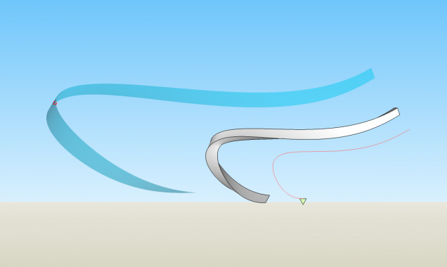
Nice and elegant solution, but it will have the same problem with transparent colors.
-
What problem with transparent colors? I don't see why the color being darker when you're looking through two faces is a problem. It seems appropriate to me.

-
I've marked the problematic part with a red circle in your image

-
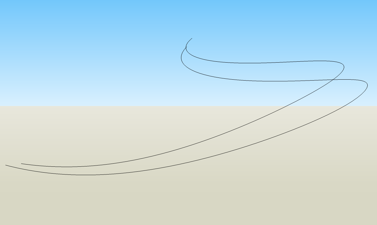
What's wrong with that? Why is that a problem? In a 3D world, there should be a darker area where you are looking through two surfaces. In a 2D image it's a visual cue that this is a 3D shape. There are a couple of alternatives that come to mind. Eliminate the surface so you only have the edges or draw it in 2D to begin with.
-
Don't you get the unwanted effect from the second image if you zoom in?
-
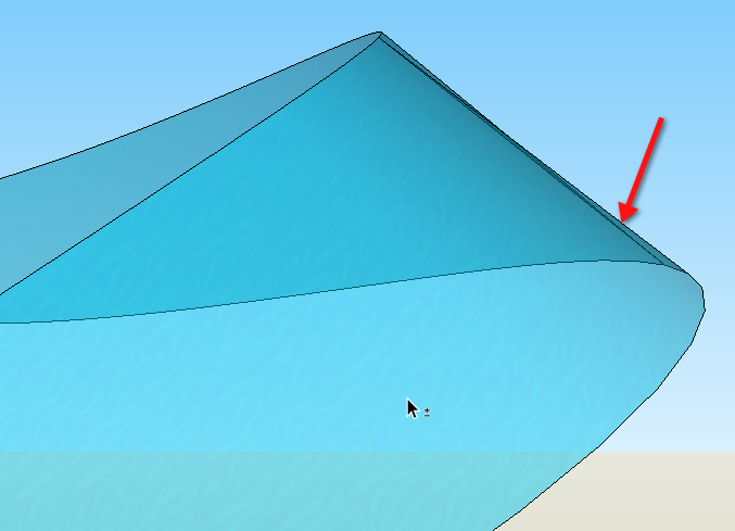
I think you'll find the unwanted effect is caused by too few segments in too tight a curve. You have to be realistic about what the geometry can cope with.
-
@unknownuser said:
Don't you get the unwanted effect from the second image if you zoom in?
No.
And there isn't a line where your red dot is.

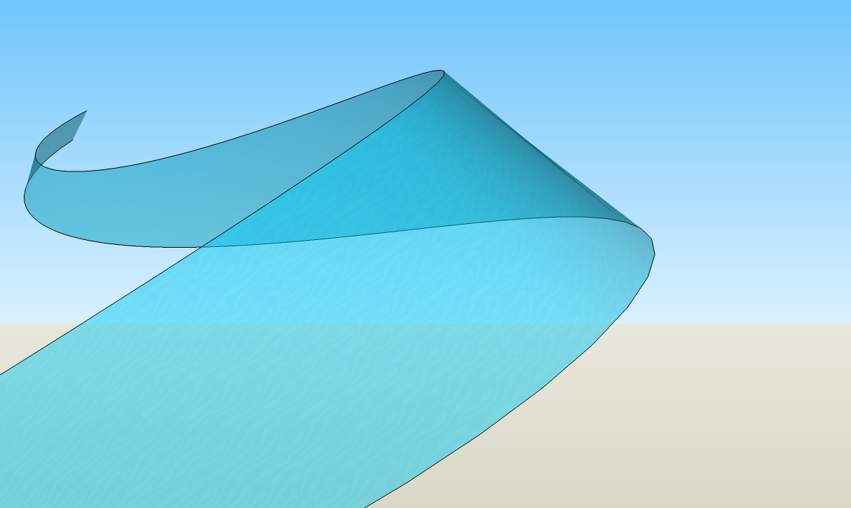
If you turn off Profiles, you don't get those edges.
With Profiles on you get those edges but with enough segments in the curves...
-

Hello! It looks like you're interested in this conversation, but you don't have an account yet.
Getting fed up of having to scroll through the same posts each visit? When you register for an account, you'll always come back to exactly where you were before, and choose to be notified of new replies (either via email, or push notification). You'll also be able to save bookmarks and upvote posts to show your appreciation to other community members.
With your input, this post could be even better 💗
Register LoginAdvertisement


