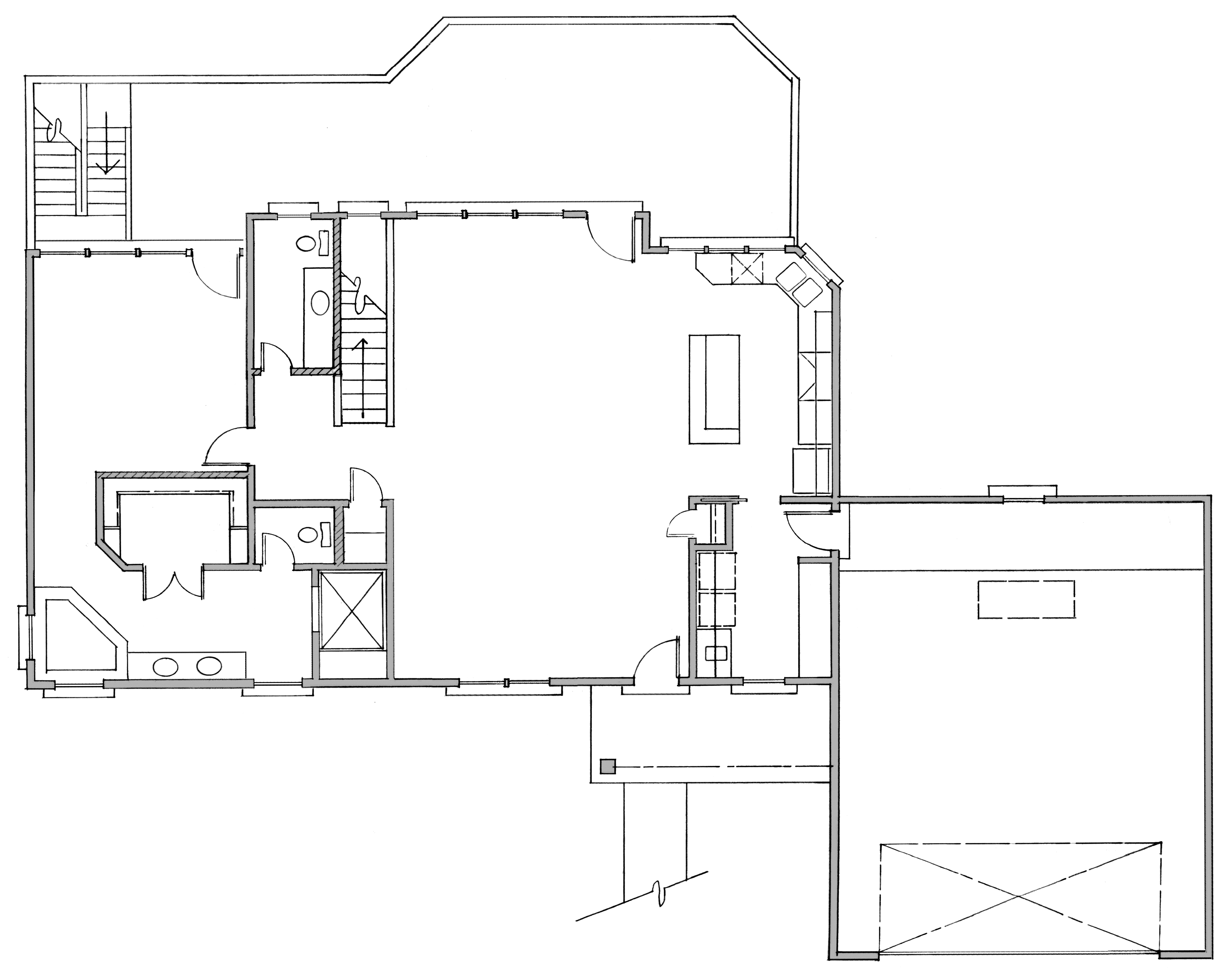
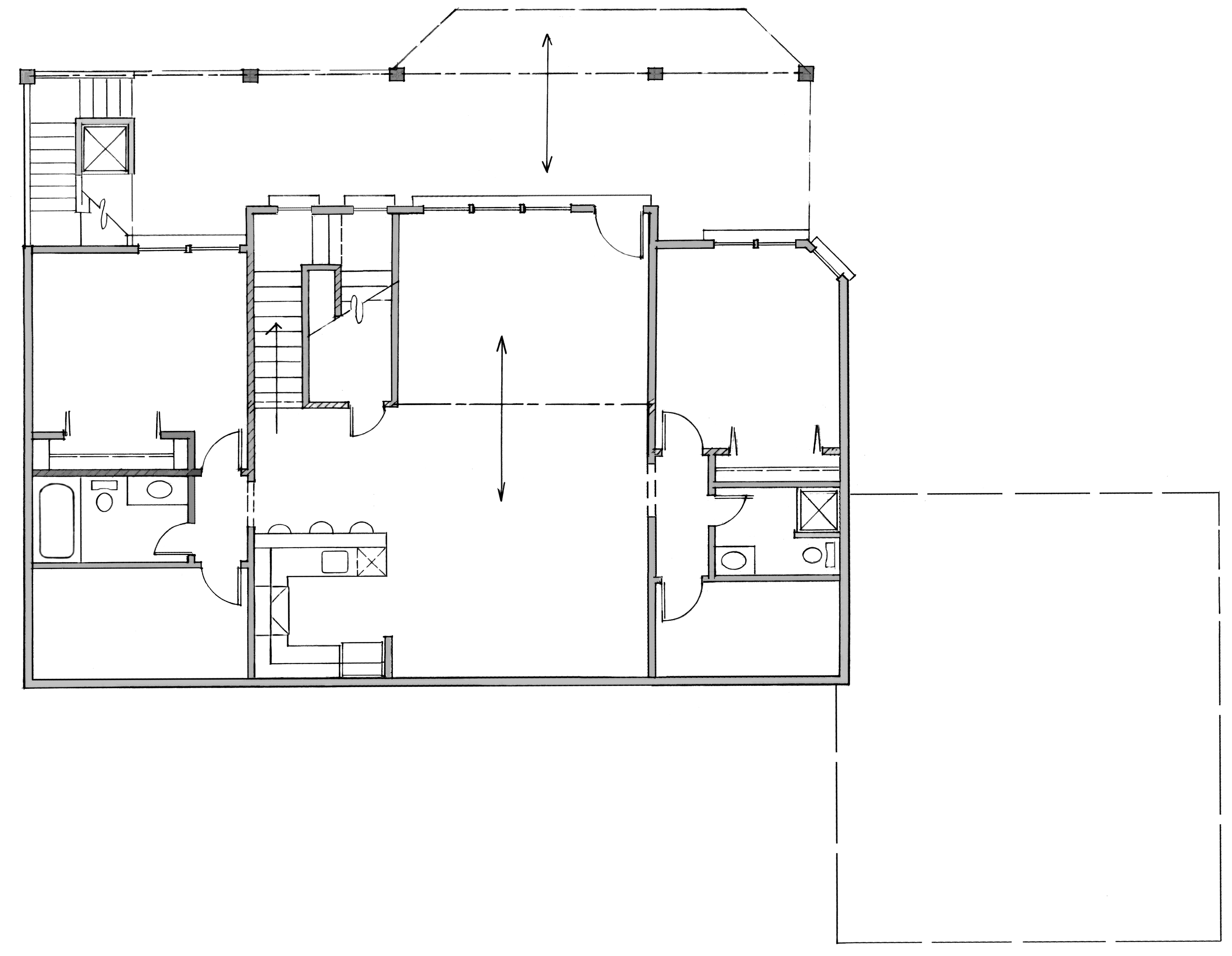
Fuzzy Textures showing in Layout.
-
You're correct, that is how I did it... The reason is to scale the image using the typical SU scaling method. Texture resolution should be the exact same in Layout as in SU.
that's how I ended up getting the proper resolution was by just insert the image.
-
The resolution of that image in SketchUp isn't all that great, though. It looks pretty close to me.
Do you have Use Maximum Texture Size selected in SU?
You could scale the image in LayOut after inserting the image file directly so it would be the right size.
-
It's not close enough... far too fuzzy. it looks to me as if it's a 50% degradation of ppi.
Yes, I do have max textures in SU.
Yes, with an exploded image I would be able to size the image directly to the su insert.
This is a hand draw plan from my mother of a clients horrible ideas.
-
Well, since I haven't got the original image I can't compare but from what I can see, you might get better results if you sharpen up the image and increase the contrast.
Could you trace the image in SU so you can have vector lines to put into LO?
-
The first link is the original image. I could trace it but she doesn't want me to because it's already been done and she sees that as double work. She's old school and won't convert to computer aided...
-
That image is huge! So when you reduce it to fit onto the page, you're reducing the width of the lines by the same amount so they hardly show up. They are also pretty light so that's another strike against you. Can you get a smaller version of the image?
This is a screen shot of a section as displayed in an image editor at full size.
This isn't a fault of SketchUp or LayOut.
-
Take a look at these files. It may not be perfect but it's a lot better than before. I bumped up the contrast and reduced the lighness of the image and then I cropped it into two images. I imported the images as you did in your SKP file. On the first page of the PDF and LO file are the viewports for the two scenes I made in the SKP file. The second page has just the images inserted and roughly sized to match those on the first page.
This could be better if the original image file wasn't so large/high res and if it was darker.


-
It was supposed to be 24"x36" and checking it, it seems to be. that's standard architectural size. although I see it's 300ppi which is pretty intense. i see what you're saying about being so large that it shrinks the view, but a 24x36 image on a 24x36 layout file should show up correctly.
-
I used the paper size you had selected in your LO file. I just deleted your content. I didn't change the paper size.
I think we're going round and round here. Evidently I'm not able to help.
-
The work around works... I just want to know why the file doesn't covert over with the same resolution in SU to Layout. I can see it fine in SU. then in Layout it gets blurry... I think this is a layout issue. Not a process issue.
-
Ahhh... That's very good Charlie. Thanks.
-
Krisidious,
If I may........offer a (better/~~precise??)method for scaling an image.....in LO.Set Sheet (Page) size.......this case 24"x36" (ArchD)
Display Grid....set major grid lines to 1" & minor grid lines to 4 (¼") for ¼" Scale
Select tickbox to display grid on top.Insert image (floorplans)...scale (shift/constrained)roughly to scale.
Align an edge of a "known" entity's edge to a Major Grid Line.......re-scale up/dn.....if/as..........re-position "known" edge to Major Grid Line.......refine......if/as.
Yes......a bit cumbersom (perhaps 2 to 3x the effort) as compared to SU native functions to scale imported image.......but equally accurate...........and for your concern.......sharper output.(in my opinion)
Please review/comment on attached.
Best,
Charlie
LO File W/Imported (croppped .png)
-
I said at the beginning that you'd get better results if you just inserted the image and scaled it.
-
@dave r said:
I said at the beginning that you'd get better results if you just inserted the image and scaled it.
Dave,
It's not clear to me if you are speaking to me or the OP.If me, I was attempting to share a method for scaling an image in LO using the Grid.
Charlie
-
And that's what I did Dave... If you look at my first reply to you... That's what I said in the end of my first post and in my reply to you.. But that's a workaround. The point of this is not how to get it done. I'm a fairly resourceful guy. I can get stuff done. I just want to know why the texture that shows up fine in SU is blurred and fuzzy in Layout. It shouldn't be... Whatever image or texture shows through SU should show exactly the same in Layout. scaling by for lack of a better term "pushpulling" an image in increments is not a viable or proper method of scaling for architectural drawings.
I told Charlie that was good because it is a plausible workaround I had not considered, and he didn't allude to the issue of SU and Layout not communicating correctly.
-
Don't think I don't appreciate you Dave... You're one of the most helpful people I know.
Hello! It looks like you're interested in this conversation, but you don't have an account yet.
Getting fed up of having to scroll through the same posts each visit? When you register for an account, you'll always come back to exactly where you were before, and choose to be notified of new replies (either via email, or push notification). You'll also be able to save bookmarks and upvote posts to show your appreciation to other community members.
With your input, this post could be even better 💗
Register LoginAdvertisement


