sketchucation logo sketchucation
    • Login
    โ„น๏ธ Licensed Extensions | FredoBatch, ElevationProfile, FredoSketch, LayOps, MatSim and Pic2Shape will require license from Sept 1st More Info

    New sketchucation HERE @LAST

    Scheduled Pinned Locked Moved Corner Bar
    102 Posts 22 Posters 11.6k Views 22 Watching
    Loading More Posts
    • Oldest to Newest
    • Newest to Oldest
    • Most Votes
    Reply
    • Reply as topic
    Log in to reply
    This topic has been deleted. Only users with topic management privileges can see it.
    • pilouP Offline
      pilou
      last edited by

      New icons are very more smart for the eyes! ๐Ÿ˜Ž

      Make the same inside the Text editor and that will be perfect ! ๐Ÿ‘


      toobold.jpg

      Frenchy Pilou
      Is beautiful that please without concept!
      My Little site :)

      1 Reply Last reply Reply Quote 0
      • GaieusG Offline
        Gaieus
        last edited by

        +1 ๐Ÿ˜„

        Gai...

        1 Reply Last reply Reply Quote 0
        • massimoM Offline
          massimo Moderator
          last edited by

          -1...
          Nooo, what you did with the icons? ๐Ÿ˜ฎ
          Are ugly now. (now i think Gai will love me...) ๐Ÿ˜„


          Cattura_2.JPG

          1 Reply Last reply Reply Quote 0
          • pilouP Offline
            pilou
            last edited by

            Many more less ugly than the previous! โ˜€

            Frenchy Pilou
            Is beautiful that please without concept!
            My Little site :)

            1 Reply Last reply Reply Quote 0
            • massimoM Offline
              massimo Moderator
              last edited by

              Ok, after pressed ctrl+F5 as Gai taught me I have a complete mess.
              P.S. Still not agree, Pilou. ๐Ÿ˜„


              Cattura.JPG


              Cattura-2.JPG

              1 Reply Last reply Reply Quote 0
              • Rich O BrienR Offline
                Rich O Brien Moderator
                last edited by

                Empty your cache and reload

                Download the free D'oh Book for SketchUp ๐Ÿ“–

                1 Reply Last reply Reply Quote 0
                • massimoM Offline
                  massimo Moderator
                  last edited by

                  Thanks Rich, that worked. ๐Ÿ‘ Miss the previous icons... ๐Ÿ˜ž

                  1 Reply Last reply Reply Quote 0
                  • Rich O BrienR Offline
                    Rich O Brien Moderator
                    last edited by

                    So, do I but I was beat into submission ๐Ÿ˜ž

                    Download the free D'oh Book for SketchUp ๐Ÿ“–

                    1 Reply Last reply Reply Quote 0
                    • massimoM Offline
                      massimo Moderator
                      last edited by

                      We can do a coup then? Or at least a poll? ๐Ÿ˜„

                      1 Reply Last reply Reply Quote 0
                      • massimoM Offline
                        massimo Moderator
                        last edited by

                        Well just noticed that you added a tiny asterisk to the icons with "your posts". Thanks. ๐Ÿ˜„ ๐Ÿ‘

                        1 Reply Last reply Reply Quote 0
                        • GaieusG Offline
                          Gaieus
                          last edited by

                          Yeah, I was urging him to do that (I remembered someone asking this - maybe it was you).

                          Gai...

                          1 Reply Last reply Reply Quote 0
                          • massimoM Offline
                            massimo Moderator
                            last edited by

                            Yeah it was me. ๐Ÿ˜‰

                            1 Reply Last reply Reply Quote 0
                            • pilouP Offline
                              pilou
                              last edited by

                              @Massimo
                              Bold icons are difficult to read and hurting eyes! ๐Ÿ˜ฎ
                              First and foremost on a such "Bright white thema" of background! ๐Ÿค“

                              "Unbold" icons are quiet, relaxing and not disturbing! ๐Ÿ˜‰

                              http://www.topenville.com/wp-content/uploads/2011/07/TOPMAG-SOR-039-FOTO4-2011-27.jpg

                              Frenchy Pilou
                              Is beautiful that please without concept!
                              My Little site :)

                              1 Reply Last reply Reply Quote 0
                              • massimoM Offline
                                massimo Moderator
                                last edited by

                                Pilou, you don't need to "read" icons. Icons are symbols for quick reference. They have to communicate with a quick glance. The new icons are "weak". IMHO

                                1 Reply Last reply Reply Quote 0
                                • leedeeteeL Offline
                                  leedeetee
                                  last edited by

                                  Hi everyone,

                                  I'm in the middle of moving house so have missed all this news! Looks great - well done to everyone involved with the new site - it's really taken it to the next level. Although, I am now going to need a new avatar, as mine simply won't do on here now!

                                  Just wondering if there is an 'announcement' thread or the like which describes the changes to the new community and the new features/benefits of premium membership etc?

                                  Many thanks,

                                  Lee

                                  1 Reply Last reply Reply Quote 0
                                  • R Offline
                                    rv1974
                                    last edited by

                                    I have constant 403 error on my office desktop (win7 X64).
                                    What should I do?

                                    1 Reply Last reply Reply Quote 0
                                    • Rich O BrienR Offline
                                      Rich O Brien Moderator
                                      last edited by

                                      Logout, clear your cache. Try again from the homepage.

                                      Download the free D'oh Book for SketchUp ๐Ÿ“–

                                      1 Reply Last reply Reply Quote 0
                                      • pilouP Offline
                                        pilou
                                        last edited by

                                        @Massimo

                                        you don't need to "read" icons. Yes

                                        Icons are symbols for quick reference. Yes

                                        They have to communicate with a quick glance.
                                        Yes but the old one did't communicate anything because eyes were repulsed by the Bold states!

                                        The new icons are "weak". Maybe but they are communicating with a quick glance easily! ๐Ÿ˜‰

                                        Frenchy Pilou
                                        Is beautiful that please without concept!
                                        My Little site :)

                                        1 Reply Last reply Reply Quote 0
                                        • michaliszissiouM Offline
                                          michaliszissiou
                                          last edited by

                                          New thinner icons are much better.
                                          This bright UI still burns my eyes. As the old one did.
                                          A grey dark UI with white-grey text could be better.

                                          1 Reply Last reply Reply Quote 0
                                          • beginnerB Offline
                                            beginner
                                            last edited by

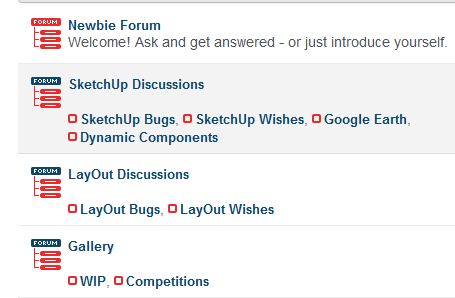
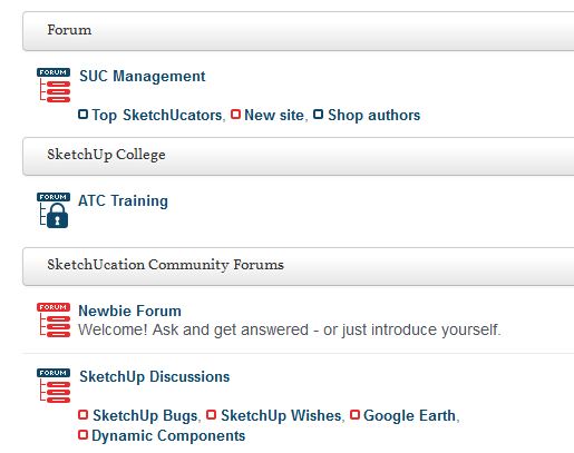
                                            The index page icons looks great - in my humble opinion. ๐Ÿ‘
                                            Some of the other icons are quite 'busy' for me at the moment.

                                            Regards, SU 'beginner'

                                            1 Reply Last reply Reply Quote 0
                                            • 1
                                            • 2
                                            • 3
                                            • 4
                                            • 5
                                            • 6
                                            • 5 / 6
                                            • First post
                                              Last post
                                            Buy SketchPlus
                                            Buy SUbD
                                            Buy WrapR
                                            Buy eBook
                                            Buy Modelur
                                            Buy Vertex Tools
                                            Buy SketchCuisine
                                            Buy FormFonts

                                            Advertisement