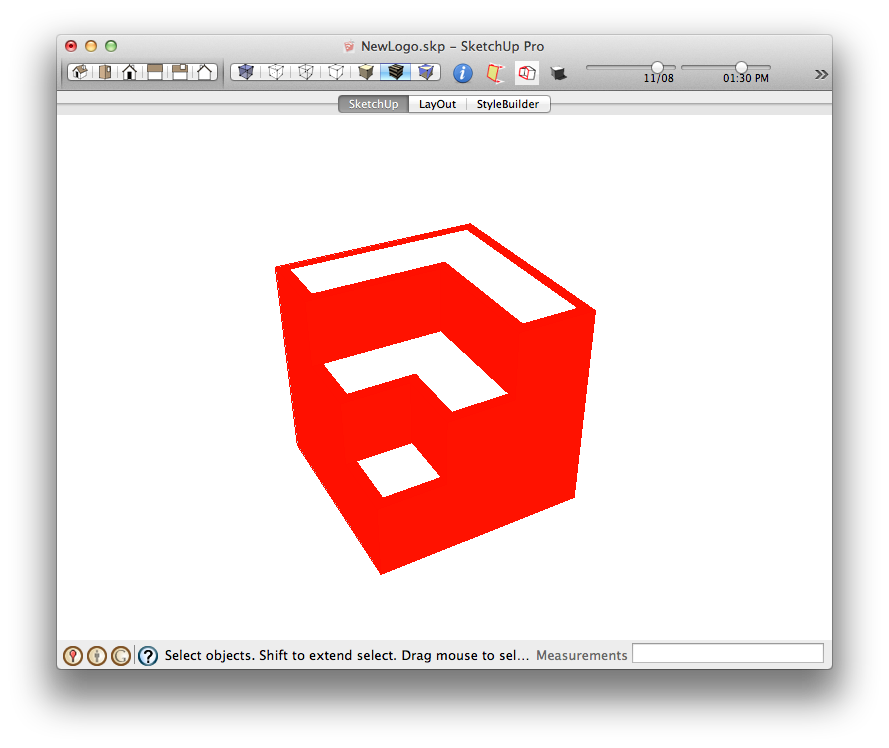
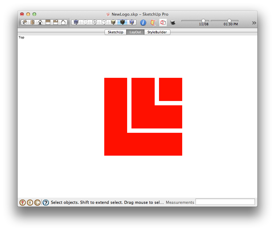
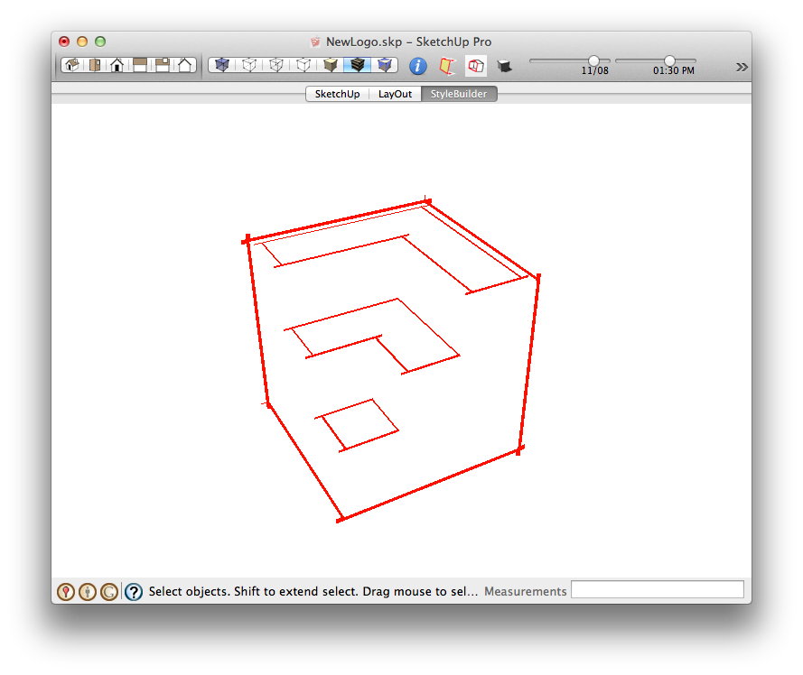
[Poll] What do you think of the new SketchUp logo designs ?
-
-
I think that is close, but based on mike breakdown, I don't think it can be models purely in 3d.
-
I think the previous logo was a little toy like. A change of image is good i think.
-
@unknownuser said:
I think that is close, but based on mike breakdown, I don't think it can be models purely in 3d.
They did make tweaks in post.

-
When I use small icons in my explorer folders, it is hard to distinguish between SU and LO. It did inspire me to create an avatar though.

-

Who cut the cheese ?
-
**Hey, we passed the 100 vote mark!

**Don't forget to vote in this poll also:
 [Poll] What do you think of the new SketchUp logo color ?****
. -
it is natural for people to feel uneasy about any innovation. we get attached to things which are familiar to us. I confess feeling that way when I first saw the new sketchup icon but it slowly grew on me and now I quite like it.
to be perfectly honest I always felt the sketchup icon to be a bit silly, with its pencil and little house. so much so that I changed it for the one you see below.
however, I do not think the Layout icon is as successful as Sketchup's. I find it too flat in a literal as well as figurative way.

-
I'm with Edson. I was a little put off at first, but I think that I am enjoying it much more, now.
It really is a corporate logo, rather than a desktop icon. It is strong and simple, and it "fits" alongside the Trimble logo.
-

SAD! 100,000 members and only than 137 votes.
-
In the combined polls, I think "I don't have an opinion" is leading so...
-
If it was made using Sketchup any old doodle would do. If it was handed over to their corp artist and made elsewhere? Says a bit about the union. An intelligent CEO would have his artists embrace Sketchup as the sole tool for this.
Hello! It looks like you're interested in this conversation, but you don't have an account yet.
Getting fed up of having to scroll through the same posts each visit? When you register for an account, you'll always come back to exactly where you were before, and choose to be notified of new replies (either via email, or push notification). You'll also be able to save bookmarks and upvote posts to show your appreciation to other community members.
With your input, this post could be even better 💗
Register LoginAdvertisement


