Construction & Working Drawings - Discussion
-
So I thought I would share a little of my quest to work without CADD. One big thing for me was having to give up automated Door and Window Schedules and Room Finish Schedules fed by objects in the model with attributes assigned.
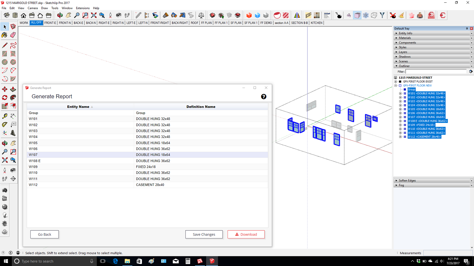
So The Door and Window schedules are created by just isolating the objects and then numbering them sequentially with the help of the outliner. And then run the report generator save the cvs file and import to layout. In layout the label tool reads the instance number so the plan reads out the correct number and it is linked to the model. The reason the door labels are on the door knobs is because you don't have a problem selecting the door instead of the section cut.
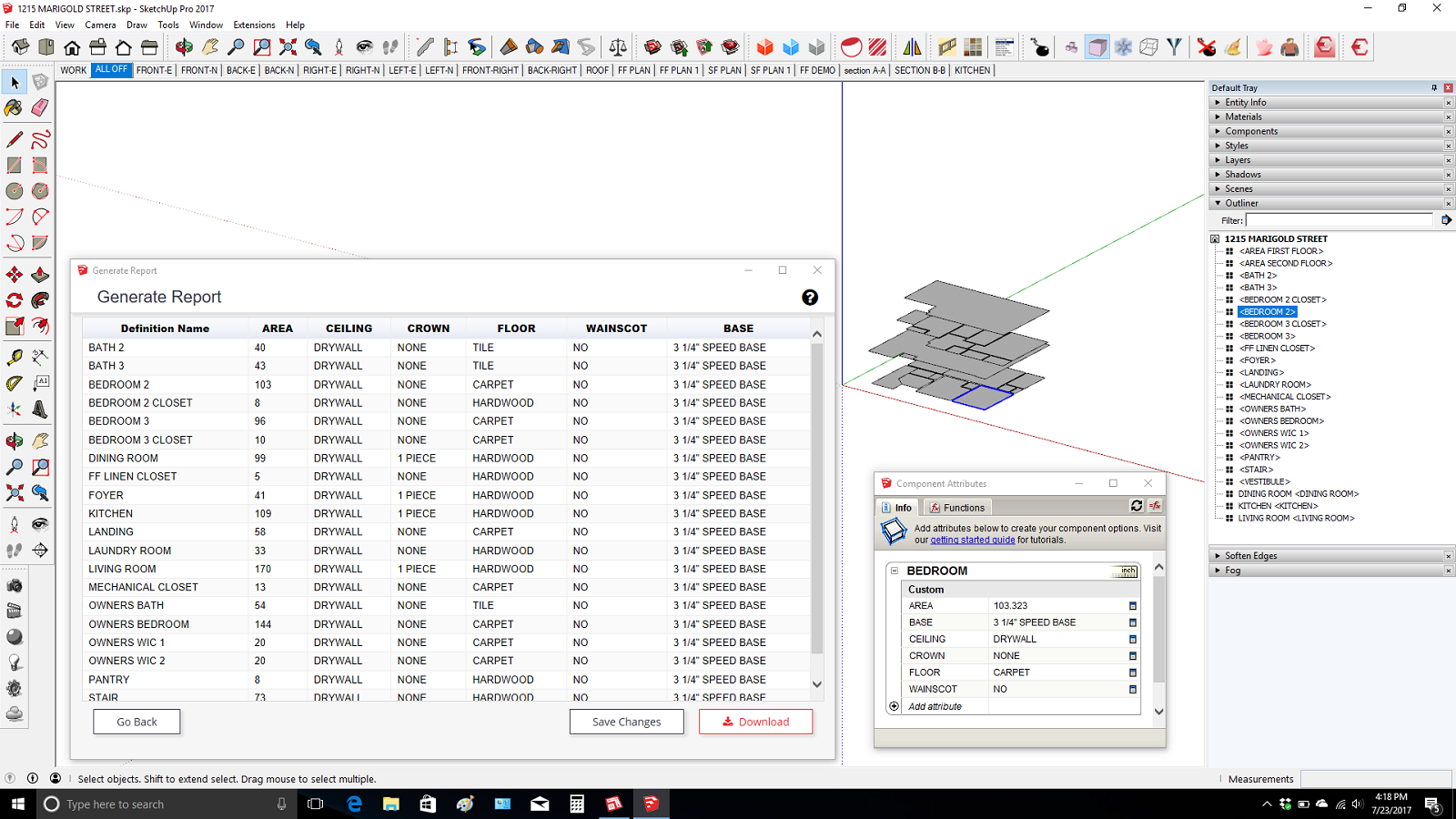
The Room Finish Schedule is generated by Isolating a set of components. One for each room that is painted with a material called "AREA" I just copy the component with the attributes and make unique and then edit the face size. You can paint the hidden side so it does not interfere with your floor color because the formula only picks up the area of the "area" material.
Also all the dashed lines are directly in the model on the 2d layer and are created quickly using Profile Builder 2.
I know it's rudimentary but it's pure Sketchup and layout and it is all linked to the model. And I know most architect types will be looking for symbols around the Door and Window numbers. You could just scrapbook some in. I decided I like just the bold font. I'm very lazy.
Love to hear some feedback Thanks!


-
Hi,
Looking for scrapbook templates:
drafting symbols
electrical symbols
Could someone help me find them ?
thank you -
@2liv said:
Hi,
Looking for scrapbook templates:
drafting symbols
electrical symbols
Could someone help me find them ?
thank youa search of Sketchucation gives this first result. You might find other things in the search too.
[UPDATED] My LayOut Scrapbook for Architectural Drawings.
-
Thanks! It's really useful information.
-
Technical images for a manual.
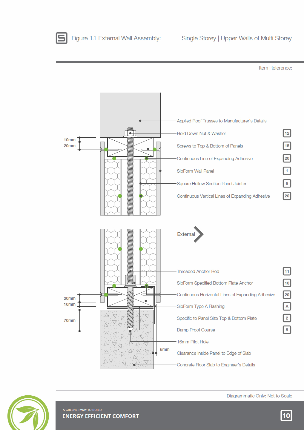
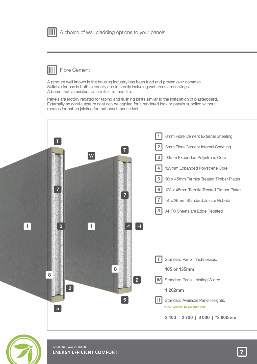
I rarely have ever been asked to prepare technical style drawings for clients (they know I avoid them). These are for a technical manual for the use of their panelised building system.
Wall section exported from Layout:

Another typical page of artwork exported from sketchup and rendered with maxwell:

-
Following on from SketchUp's Section Tools improvements, I've released a follow on to my previous book on this subject. Construction Documentation Using SketchUp Pro 2020 is light years ahead of it's predecessor released in 2012.
https://sketchucation.com/shop/books/intermediate/227-sketchup-for-construction-documentation-2018
The book contains a course based around a building project that I designed and project managed years ago. I chose this project as it's the right balance of simple/ complex- You spend the least amount of time getting the maximum experience.
I've been writing this book on and off for 2 years, preparing the concept and polishing the models to make them user friendly. Each of the 120 or so pages is carefully put together to make the steps easy to follow.

I'm going to be doing a few videos from it shortly. I'm still working on the website to place some cool resources on it. The idea for the website is to focus on construction documentation and BIM.
In the meantime, here's a short extract from the book for you to download- My 5 killer shortcuts. Hopefully it will download OK.
https://viewsion.ie/wp-content/uploads/2020/01/5_Killer_Shortcuts-for_SketchUp_Pro.pdf -
@fionmacool said:
Following on from SketchUp's Section Tools improvements, I've released a follow on to my previous book on this subject. Construction Documentation Using SketchUp Pro 2020 is light years ahead of it's predecessor released in 2012.
https://sketchucation.com/shop/books/intermediate/227-sketchup-for-construction-documentation-2018
The book contains a course based around a building project that I designed and project managed years ago. I chose this project as it's the right balance of simple/ complex- You spend the least amount of time getting the maximum experience.
I've been writing this book on and off for 2 years, preparing the concept and polishing the models to make them user friendly. Each of the 120 or so pages is carefully put together to make the steps easy to follow.

I'm going to be doing a few videos from it shortly. I'm still working on the website to place some cool resources on it. The idea for the website is to focus on construction documentation and BIM.
In the meantime, here's a short extract from the book for you to download- My 5 killer shortcuts. Hopefully it will download OK.
https://viewsion.ie/wp-content/uploads/2020/01/5_Killer_Shortcuts-for_SketchUp_Pro.pdfHas SketchUp Pro 2020 been released? Did you have early access to SUP2020?
-
Maybe 2020 refers to the version of the BOOK not the SW.
-
@pbacot said:
Maybe 2020 refers to the version of the BOOK not the SW.
I also thought of that, but the lack of punctuation infers otherwise.
-
@pbacot said:
Maybe 2020 refers to the version of the BOOK not the SW.
Hey thanks for asking that question. Yes the book refers to the year not the software.
However...
The updates to 2020 will be covered on my website http://www.sketchup.expert
-
Look forward to seeing when its ready to be released, fionmacool!
-
-
Can anyone recommend the Sketchup Construction Documents book from first hand experience?
Advertisement


