A Thread for Fine Design
-
-
May be a bit whacky, but Really deserves a visit.
-
-
-
(At the risk of looking a little thematic)
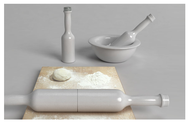
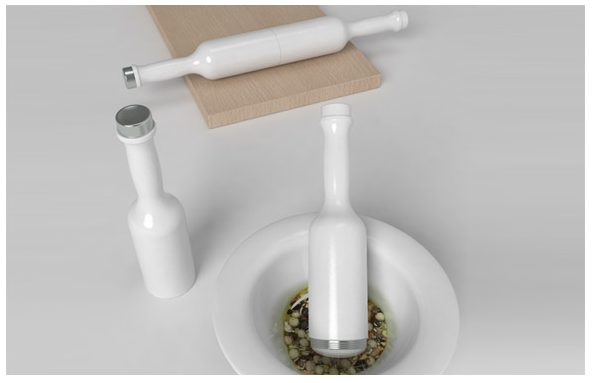
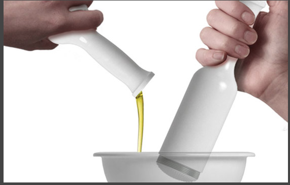
Multifunctional kitchen roller prototype that can be split in two halves, each with its own unique function. The Roll & Mix has one half that is an oil bottle and the other a mortar for grinding and mixing. The parts can be threaded together to be used as a roller. -

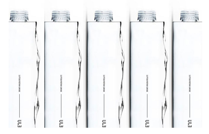
Inspired by Jeju’s nature and charm, the scene of Jeju’s beautiful fresh water is captured and applied to a modern and minimal block-shaped bottle. This design was awarded the grand prize at the Jeju Premium Water Bottle Design
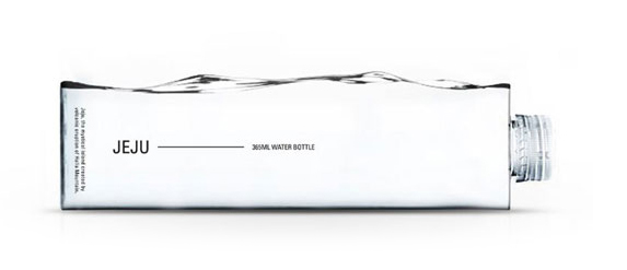
http://cloudand.co.kr/water-block/
-
Hi, Dale:
The preceding series is exquisite, and I appreciate greatly your posting them here. Inspiring stuff. Like you, I do appreciate the minimalist expressions. I think sometimes it takes great restraint not to overstate an idea. -
@mitcorb said:
Hi, Dale:
The preceding series is exquisite, and I appreciate greatly your posting them here. Inspiring stuff. Like you, I do appreciate the minimalist expressions. I think sometimes it takes great restraint not to overstate an idea.Thanks Tim. I am very impressed at the way many of today's designers hone in on the "idea", and then work through it to come up with such elegant solutions, and as a consequence such functionally beautiful objects.
-
Dear Dale,
Your Thread is for me a nice (about) daily "rendez-vous" (I must admit with also Some Funny Pics. )
)Today, my contribution:
(see the link for more in this series)
http://www.thisiscolossal.com/2012/04/ridiculously-imaginative-playgrounds-by-monstrum/


++ *s
-
-
Simon
Your posts (in themselves always interesting) always lead me down "link lane" to more amazing things.
Thanks!
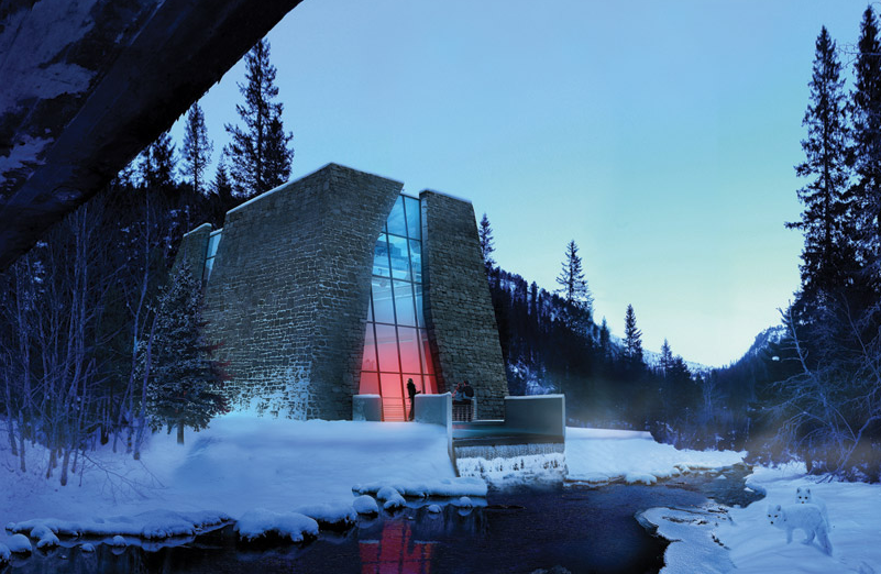
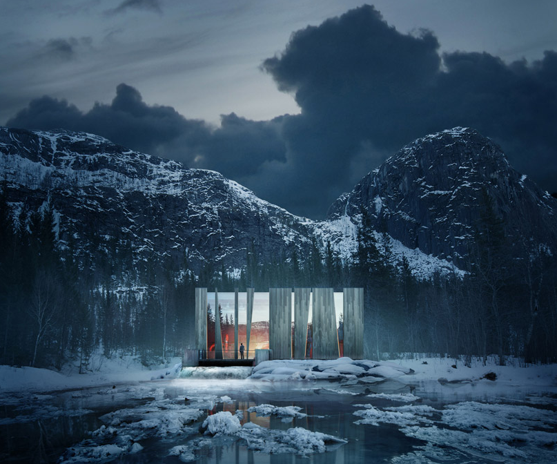
http://www.shaas.no/kurs/These are small Run of River style power generation stations each capable of 30 GW power generation (enough power for about 1600 residences)
Where I live, these are common, but are usually strange looking small dams, and 1000's of meters of obtrusive pipe.
Good on the Norwegians.
-
-
@thomthom said:
That's a really good reminder that enriching one's aesthetic experiences is an important function that should influence the form of a design. All too often designers are concerned with function, function, function and forget that form is itself a function.
-
They where in the news here in Norway last year when we where having a big debate about new planned power lines going across the country. Most people are oppose to them because they are so brutal - this suggestion for an Icelandic competition came up and I thought it was really great! I'd be perfectly happy with powerlines with this design. I mean - they are huge and you cannot get away from that - so why not make something out of it. They will be seen - so let them look good!
-
I think I have already hinted at it, and as the examples in this thread show, I think there is something extraordinary going on in Norwegian architecture and design.
I have a friend who is a sculptor, and he lives on the prairies, because he says that in the mountains, artistically, "everything has already been done".
He goes on to say that on the prairies, if you erect a grain elevator, its shape and volume have such a presence, simply because of the lack of such on the prairie landscape.
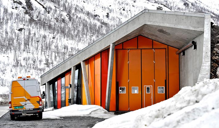
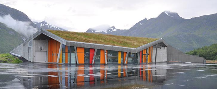
From what I am seeing, Norway has recognized what it takes to create (sometimes in the most mundane structures, such as, power stations, power line towers, truck inspection stations, tourist lookouts) buildings etc, that really enhance the landscape, but also make you take notice.Truck inspection station http://www.jva.no/ + Jarmund/Vigsnæs Arkitekter
-
Some friendly push-back on the decorative power lines... Amusing images, meant to make one smile. Is the form so different from the original or really of the same general impact with a bit of whimsy, to be paid for dearly? And to become stale? I'd prefer the 'purely' functional, and elegant in its direct simplicity and reductive nature. 'Sleek', minimal, efficient, less expensive, un-staling, engineered beauty. We are admittedly tired of the 'big electric cats', but I don't see big electric fe/male shapes to be any kind of viable alternative.
Please keep it up, and thanks, Dale.
-
Brookefox
I appreciate any and all feedback, as this thread is just meant to stimulate, it is always in the realm of possibilities that it will stimulate negative as well as positive, (and some just for fun)http://www.ilbagnoalessi.com
The Elegant "Tuna"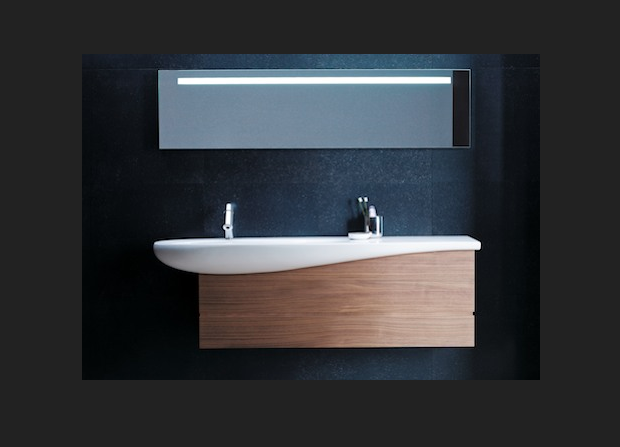
-
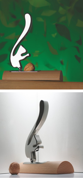
Also Alessi
I thought this was an interesting use of Metaphor
-
Playing follow the links....
http://www.paulinedeltour.com
Part of Pauline Deltours collection for Alessi.
What I found interesting is when I saw these, I immediately thought Waste Paper Basket.
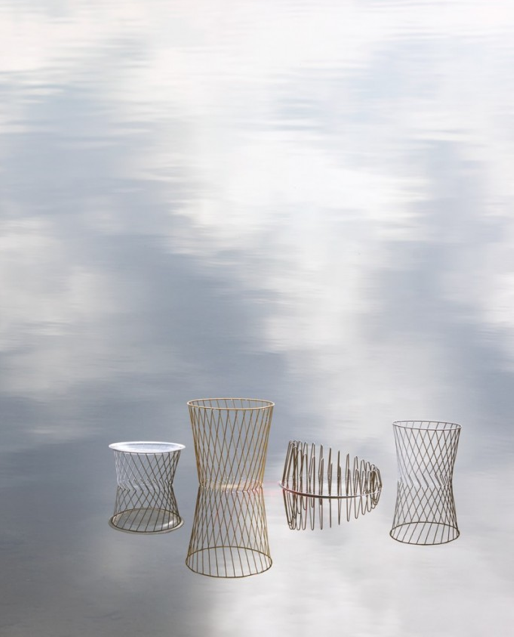
But the designer thought...
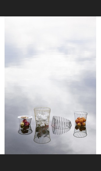
or maybe...
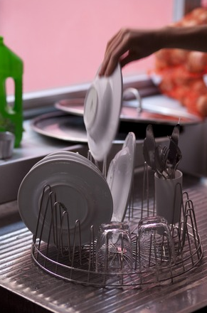
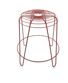
But when I saw this I thought "Fan Cage" (for better or worse)

-
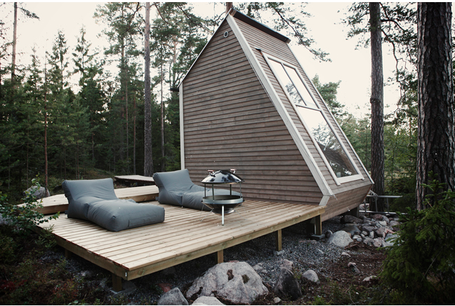
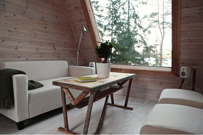
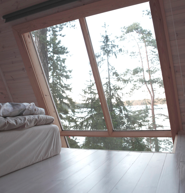
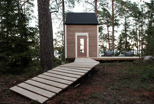
Designed to take advantage of the fact you don't need a building permit for a building under 98 sq ft in this area of Finland, this came in at 96 sq ft.
Hello! It looks like you're interested in this conversation, but you don't have an account yet.
Getting fed up of having to scroll through the same posts each visit? When you register for an account, you'll always come back to exactly where you were before, and choose to be notified of new replies (either via email, or push notification). You'll also be able to save bookmarks and upvote posts to show your appreciation to other community members.
With your input, this post could be even better 💗
Register LoginAdvertisement
