Need a 3d professional critic
-
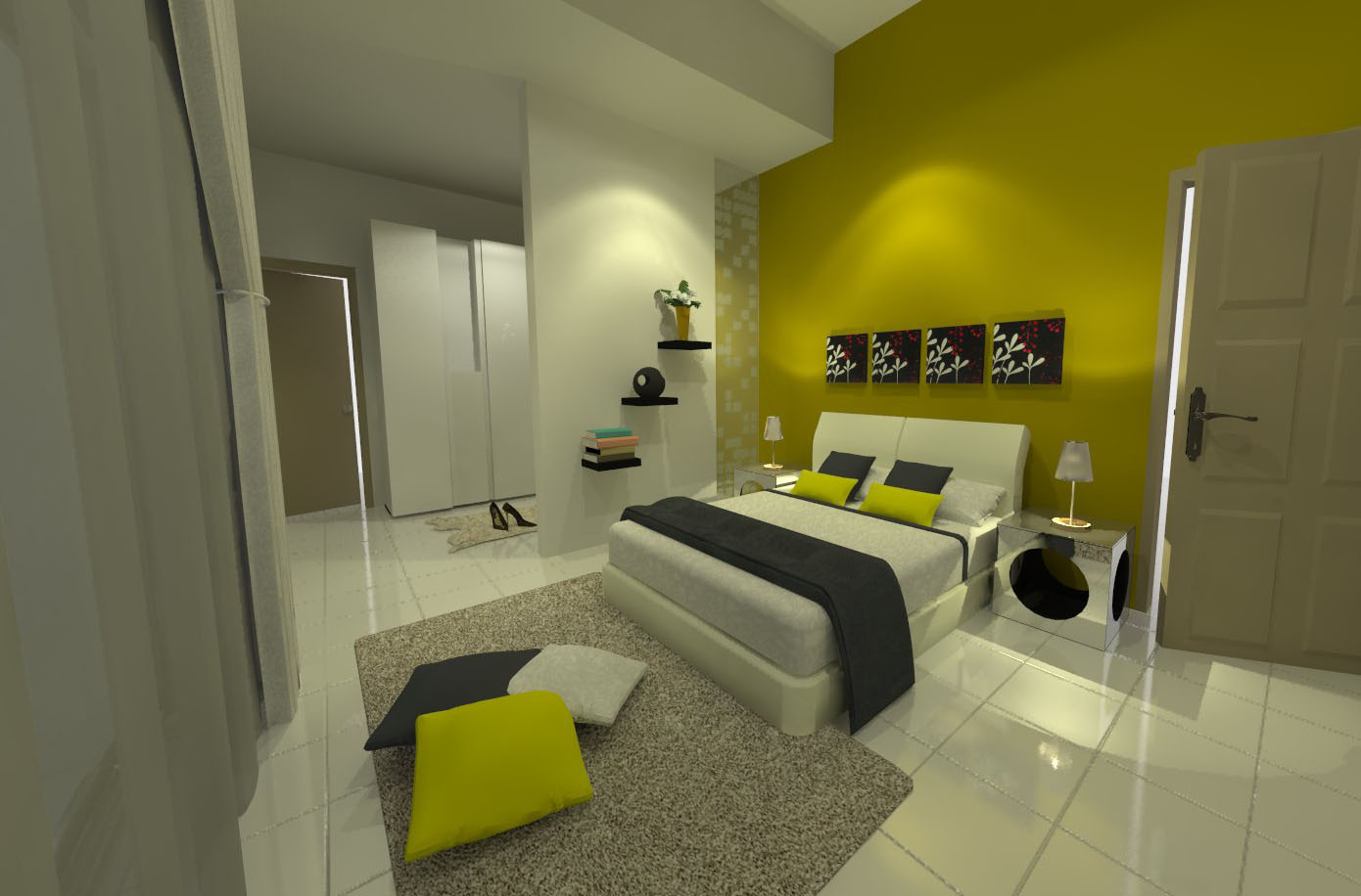
hi.. i'm quite new with suvray.. i'v done a 3d rendering but i still unsatisfied with the quality.. its still not good and unrealistic.. so i need ur critic and mayb some idea/ suggestion.. is it because of the lighting? angle? material? mayb some tips from 3d masters here! thanks..
sketchup pro 8, vray 1.48.89

-
what make it un realistic, in my humble opinion and being far from master in rendering, is the light sources!!! You use some lights but I cant see where they burst out from! Once you model the lights you must make them switch on so the feeling of lightning can give a warmer feeling!
Ideas!
-
@cantonis said:
what make it un realistic, in my humble opinion and being far from master in rendering, is the light sources!!! You use some lights but I cant see where they burst out from! Once you model the lights you must make them switch on so the feeling of lightning can give a warmer feeling!
Ideas!
hey! thanks! i forgot to put the light source! hahahaha.. other than that? is it the angle?
-
I think you don't really want a 3d critic, you want a render critic. I am neither that but will for a moment wear the hat.
Looks pretty good. For my tastes, a little soft, diffuse. Two doors cracked: somewhat distracting. No windows, no natural light, no air, no plants. Maybe that's the reality. The door hardware is out-sized. Maybe one large painting instead of 3 of similar; there's reps in the book shelves.
-
I'm no Vray master but have done a few renders, In my opinion I'd start with the camera, it's very unnatural try correct the FOV, I know it's a small space and many folks extend the FOV but it just is not reality.
The textures need working on, the wall looks bland, try a plaster texture with some bump. They say the devil's in the details, so try adding some more detals to model like electric switches and outlets, air vents, etc.
Your materials look bland and dull, is there some fresnel parameters to play with? or even use micro-bumps.As far as lighting goes, I see you used IES profiles but cannot see the lights, what's outside? white rooms?
I dunno, play around, have fun and before you know it you will figure it out.
-
@solo said:
I'm no Vray master but have done a few renders, In my opinion I'd start with the camera, it's very unnatural try correct the FOV, I know it's a small space and many folks extend the FOV but it just is not reality.
The textures need working on, the wall looks bland, try a plaster texture with some bump. They say the devil's in the details, so try adding some more detals to model like electric switches and outlets, air vents, etc.
Your materials look bland and dull, is there some fresnel parameters to play with? or even use micro-bumps.As far as lighting goes, I see you used IES profiles but cannot see the lights, what's outside? white rooms?
I dunno, play around, have fun and before you know it you will figure it out.
ahha! thanks alot.. i've never thought of adding switch, plugpoints and other small details.. micro-bumps? how to do it? any link for the tutorial?
-
@brookefox said:
I think you don't really want a 3d critic, you want a render critic. I am neither that but will for a moment wear the hat.
Looks pretty good. For my tastes, a little soft, diffuse. Two doors cracked: somewhat distracting. No windows, no natural light, no air, no plants. Maybe that's the reality. The door hardware is out-sized. Maybe one large painting instead of 3 of similar; there's reps in the book shelves.
haha.. thanks for ur suggestion.. but this isnt my design.. i juz do the 3d for her.. her taste not really good right? hahaha...
 i'm juz the visualizer for her idea.. but also my weakness in rendering is obvious! *sighhh
 -
No, really looks pretty good...
Some folks leave doors open, and lights on.
-
Things that make a better rendering -
(1) - great model - the better the model, the better it renders. Example - Nothing in the real world has sharp corners so get that round corner plugin and that helps a great deal.(2) great materials - almost everything in the real world reflects. I know its painstaking but add some reflection to all of your materials and that will help tremendously among other things.
(3) great view - Rendering is photography essentially. Try a couple of different came positions and be careful of your field of view as suggested by the others before me in the post. Too much and the become really distorted and weird. My best advice is to check out Houzz and look what pro photographers have done when setting up shots. Essentially this is what we are trying to achieve for true realism. http://www.houzz.com/bedroom
-
Cool site valerostudio, thanks

regards,
-
Wow!thanks A LOT valerostudio.. A very good tips! I will practise more! Hehe
-
Great site. Helps with kitchen FOV also.
Hello! It looks like you're interested in this conversation, but you don't have an account yet.
Getting fed up of having to scroll through the same posts each visit? When you register for an account, you'll always come back to exactly where you were before, and choose to be notified of new replies (either via email, or push notification). You'll also be able to save bookmarks and upvote posts to show your appreciation to other community members.
With your input, this post could be even better 💗
Register LoginAdvertisement


