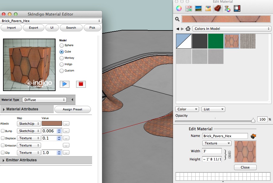
What makes a good render app GUI?
-
That's not a wrong way of thinking, however it does overlook the question of what is possible...
Another example of a place where the SketchUp devs could make the program much more render engine friendly is the "Entity Info" dialog -- currently you can specify many attributes of any selected SketchUp entity which is great... but if Plugin Developers could add their own custom entity attribute into the existing "Entity Info" dialog (expanding on its existing functionality) then the end-user could easily use a tool they already do for much more than it currently allows for.
There are opportunities all over the SketchUp UI exactly like that, where the native tools could be adjusted to allow for custom additions by developers to make them serve multiple functions -- which would then allow the SketchUp UI to actually be the only UI the user would need to know for any and all plugins.
Best,
Jason. -
@jason_maranto said:
There are opportunities all over the SketchUp UI exactly like that, where the native tools could be adjusted to allow for custom additions by developers to make them serve multiple functions -- which would then allow the SketchUp UI to actually be the only UI the user would need to know for any and all plugins.
I am of the understanding that there is purpose (by SU developers) not to let too many things into the native SU interface. (To avoid the danger of bloating the software.) I could picture someone who uses two or three or ten render apps would get very annoyed to have to wade through several sets of entity properties for each different render plugin... I am of the opinion that it's better to manage those per plugin rather than globally through SU. (I actually do something like that now, I turn off render extensions that I don't actively use, so I don't have to load yet another toolbar...)
-
@jason_maranto said:
That's not a wrong way of thinking, however it does overlook the question of what is possible...
I am surprised regularly by the ruby gurus

-
Right, so what if there was only one toolbar (aside from the native ones) that either enabled or disabled the various add-ons effects on the native UI (one icon for each plugin)?
Bloat is easy to avoid with smart design.
The Developers reasoning here is either faulty or lazy -- this can be done, and be done very well, but it puts the burden of managing it on SketchUps shoulders and I don't think they want to deal with that... which is part of why I have become so disgusted with the direction of development of this application. With such a large user base and being backed by a major corporation the "we lack the resources" excuse rings hollow.
Best,
Jason. -
@jason_maranto said:
With such a large user base and being backed by a major corporation the "we lack the resources" excuse rings hollow.
I said intentional simplicity, not excuse, as far as I understand. I agree to a point with both sides, but in any case, this is what we have to work with, and afaik, that's what all plugin developers are working to. When that changes, we can have a different discussion.
-
I'm sure if the SketchUp Dev team were to invite plugin developers into the the process they could assemble a large "free-labor" workforce quickly -- because I believe most plugin developers would be more than happy to contribute time and effort to help make SketchUp easier to develop for.
Best,
Jason. -
@unknownuser said:
I am surprised regularly by the ruby gurus
About the design
In this case Icones' buttons were drawn by the ruby iself it's not images
-
Hi Pilou, I was referring to what rubies can do to extend the functionality of sketchup (for example UV editing) not to the toolbars themselves. (This was in response to Jason's point about limitations of the Sketchup plugin interface.) That could be a whole other discussion about Ruby toolbars good and bad. Sorry if my example was confusing.

-
No problem

-
@andybot said:
@jason_maranto said:
There are opportunities all over the SketchUp UI exactly like that, where the native tools could be adjusted to allow for custom additions by developers to make them serve multiple functions -- which would then allow the SketchUp UI to actually be the only UI the user would need to know for any and all plugins.
I am of the understanding that there is purpose (by SU developers) not to let too many things into the native SU interface. (To avoid the danger of bloating the software.) I could picture someone who uses two or three or ten render apps would get very annoyed to have to wade through several sets of entity properties for each different render plugin... I am of the opinion that it's better to manage those per plugin rather than globally through SU. (I actually do something like that now, I turn off render extensions that I don't actively use, so I don't have to load yet another toolbar...)
even with multiple rendering plugins installed, it would be nice if ,say, the material browser could allow for something like jason is talking about.. maybe you could open the standard material browser which looks normal except if you have a certain checkbox (indigo for instance) ticked then the material attributes for said render app would be available in the normal location.. other wise, you often have to work on the same material from two (or more) different locations.. that's a not-so-good UI implementation in my opinion.. and it can be faulted to the sketchup devs for not allowing the render devs to tie into features already in sketchup.. the render devs have to recreate another place within sketchup do give the user access to controls they need..

-
@andybot said:
One prominent example I'd like to throw out there is the Maxwell plugin "Fire" RT window. There is no obvious button to start the render, but instead gives you what looks like a title in the upper left corner. You just have to guess how to start the thing. It looks nice, but to me, it's mystery meat navigation at a quite critical place in the app.
The design you refer to was arguably logical in the context in which it originally appeared; the button used graphics matching those used to start Maxwell Fire in Maxwell Studio, such that any Maxwell user would immediately have understood its purpose. Indeed, though, it made far less sense in the context of the standalone plugin.
So in light of that, I made two major changes in the first update after the introduction of the standalone. First, I added an option, enabled by default, for directing the window to auto-start the export/render upon opening the window. Second, seeing that the majority of users would now likely have no idea what goes on in Maxwell Studio, I redesigned the entire window:

That's what it now looks like when first opened; if you have not disabled the auto-start option, then once the model has been exported, those graphics & links in the main area slide away. I hope you think this is an improvement.
-
@andybot said:
(To avoid the danger of bloating the software.)
about this..
i don't think bloated software is such a bad thing.. IF the bloating is done at the discretion of the user..sure, if sketchup included every feature under the sun upon a fresh install then that = bad..
if i can customize via my own chosen additions then that = good..the way it's set up now though is that when customizing sketchup, you are in fact bloating it in ways that seem unnecessary..
if i want a 3pt arc tool for instance then i feel i should be able to attach it to the already existing arc tool.. instead of creating an entirely new tool (when applicable)..
i feel i should be able to click/hold the standard arc icon and all of my customized options would be grouped with it.and scenarios like this play out over and over throughout sketchup..
so while we can customize sketchup, we don't have much say so over how the sketchup UI will be affected upon doing so
-
Well said Jeff, I agree 100%.
Best,
Jason. -
JD - that's sweet!
 Sorry I haven't updated my maxwell plugin, um, lately...
That looks quite nice to have a simple splash screen on start-up, I'll have to take a look when I have a chance.Jeff, great points about tying in to the basic sketchup tools. That is very much a frustration when things that should logically be grouped appear in different menus, contexts, etc. Like Jason says, it looks like that is something that would need to be fixed on the SU developer end of things before that can be implemented.
-
Bad GUI?

-
 thanks for that example Pete, I think it's missing some toolbars...
 -
In light of the recent revelation maybe SketchUp will finally get some more powerful UI customization options for plugin creators... this would indeed be a good thing.

Best,
Jason. -
Yeah , good point - I imagine with Trimble's other software, proper UI integration is likely to be a high priority. My guess is that we will have to pay for it though. That's not a bad thing for me personally as I use this software professionally, but I would see it as serving to stifle the community based development that has been going on with ruby scripting.
-
@jd hill said:
So in light of that, I made two major changes in the first update after the introduction of the standalone. First, I added an option, enabled by default, for directing the window to auto-start the export/render upon opening the window. Second, seeing that the majority of users would now likely have no idea what goes on in Maxwell Studio, I redesigned the entire window:

That's what it now looks like when first opened; if you have not disabled the auto-start option, then once the model has been exported, those graphics & links in the main area slide away. I hope you think this is an improvement.
JD - Happy Friday! Finally had a chance to install the current maxwell render plugin - Awesome job!!!
 I like the UI improvements, but the render improvements are huge!
Hello! It looks like you're interested in this conversation, but you don't have an account yet.
Getting fed up of having to scroll through the same posts each visit? When you register for an account, you'll always come back to exactly where you were before, and choose to be notified of new replies (either via email, or push notification). You'll also be able to save bookmarks and upvote posts to show your appreciation to other community members.
With your input, this post could be even better 💗
Register LoginAdvertisement


