Engraved sign maker, technique, or plugin
-
Or use a PNG with a transparent background.
Add it as an Image.
Use my ImageTrimmer to make it a cutout.
Simplify the edges to avoid too much 'pixelation' steppiness.
Explode it to merge with the 'block' geometry... -
To center the text you could also use TIG's CenterPointAll on both the surface where the text will go as well as the text. Then just grab the center point on the text and move it to the center of the face. I would imagine the center of the text's bounding box might not always be the real center of the text, though.
-
Good one Dave! What I did just now (this has become an temporary obsession)
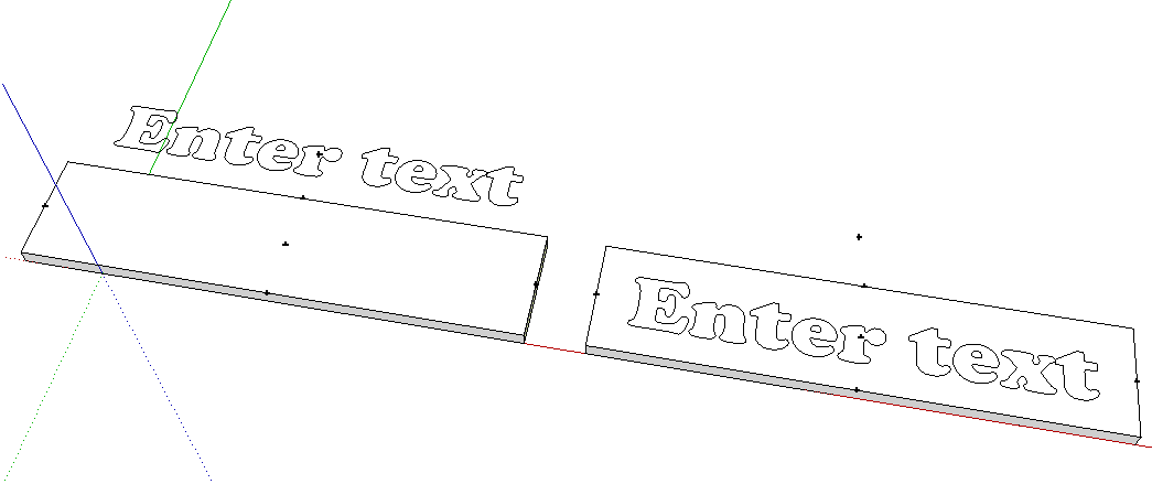
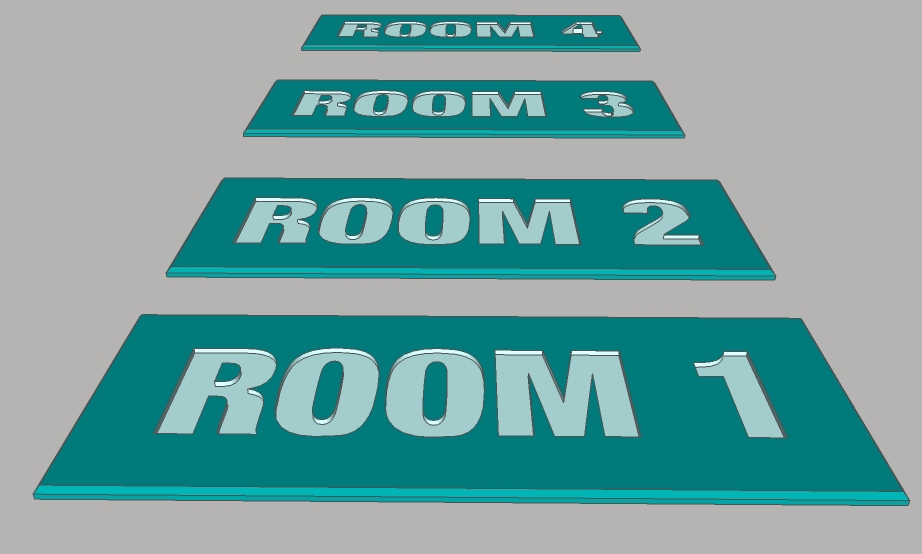
I made my blank 3"x8" sign 1/16" thick, I did the text and used the tape measure tool to place guides at the center-point of the sign blank. then used my most used script centerpoint to place a guide point on the text, which was not as you observed the actual center of the text then moved the center of the text from a side and centered it top to bottom. I then exploded the text object went over a few edges, with the pencil tool. The I pulled up face of the blank another 1/16" to make a nice 3x8x1/8" engraved sign. I will post a pic later today, right now I need to go to work. -
I wonder if there'd be a graphic/scriptable way of determining the visual center of the text. It's been a long time since I did any typography. I'd need to do a refresher on that. I expect you could get it close and then eyeball it from there.
-
What reasons are there, for the text's Bbox center not being the center of the actual text ??
I tried adding whitespace (extra spaces after,) but the tool ignored the spaces.
Then added spaces before the text, the tool seems to include the extra space.
You can see it if you double-click the text before exploding it.
-
Dan, in the case of a word with only ascenders such as 'babble", the center of the bounding box would be shifted a bit higher and a word with only descenders such as 'paper' would have have a bounding box with a lower center than a word such as "man" that has no ascenders or descenders. Those are odd examples and mostly likely there'd be enough letters with both that might average out. Some fonts have much taller upper case letters than lower case ascending letters which could shift the center a bit. Some fonts have descenders that drop lower than their ascenders go up. This would also tend to shift the position of the center of the bounding box.
-
Dave I don't follow your reasoning.
The center of a text object is it's center. Of course it's actual height may be dependant upon whether it has ascenders, descenders, or none, and may dictate how much text is above or below the center.
But, it's center, is still it's center (taking it's overall height into account.)
And then there is the, situation when you create multi-line text objects. (The issue of ascenders & descenders is even more irrelevant.)
So.. obviously any tool needs to get the text block's overall height and width, before exploding, it.
-
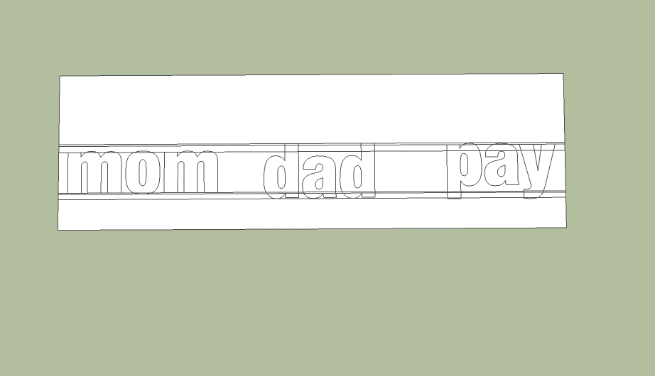
Yes, the overall center is the center of the text box. My point is that using that center to place the text may not place the text correctly. As an example, place the following three words (inserted as three separate components) in a row with their centers on the same line: mom, dad and pay. I think you'll see the baseline of each word is at a different height.
-
Dave is right but it might be font dependent. The font shown here is Basic Sans Heavy SF (a Shyfonts font)the text is 1-1/2" high, there are at least 3 different "baselines". The centers of each component is centered using the original centerpoint plugin, centered along a guide (removed).
-
Thanks for posting the example. I didn't have access to SU at the moment or I'd have done it. Probably in many cases, things would average out and it wouldn't be a problem but there's still the possibility of alignment issues. So the best thing would be to locate the text by its baseline instead of the center of the text's bounding box. The baseline would be at the bottom of letters that aren't round. i.e. r, h, k, f, etc.
-
@dave r said:
As an example, place the following three words (inserted as three separate components) in a row with their centers on the same line: ....
NOW WAIT !! You are changing the conditions of the original problem.
Why would anyone in their right mind want to place text using all separate words ??? ... Of course that will cause problems.
1) Use a single text object consisting of multiple words, or sentences, and all of the words will be properly aligned vertically with each other.
2) It's Google's fault because "center" is not really center, nor is it baseline center, it's actually bottom center extents. (Sometimes I shake my head in bemusement, at the way the Google coders did things.)
3) After placing the 3d text component. Choose the Move tool. Notice how Google gave us temporary rotational points, but none is a center point ??
SO ??
We need to ask Google to fix the 3dTextTool, by:
(a) making center the true center,
(b) adding "baseline left", "baseline center" and "baseline right" options,
(c) make a Capital, ascender, descender, independant standard for the Height attribute (so that the letters are always the same size per any given "Height" attribute.),
and
(d) add more MoveTool temporary "grab" points including a baseline center, baseline left, baseline right, extents corners, extents midpoints, and extents center.
-
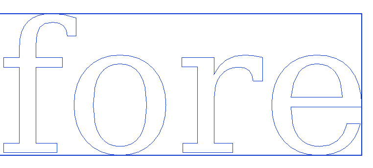
@dave r said:
The baseline would be at the bottom of letters that aren't round. i.e. r, h, k, f, etc.
Not true ...
-
Ok guys, no point getting irritated. My suggestion is not that important. It falls in the "would be nice to have category".
In a nut shell, I have 5 lines of text, I have a face I want these 5 components, aligned/centered evenly distributed on. In inkscape to do this you make a group of each line of text, and your face is also a group, you select all six objects, click the align center, up down button, then you click the align left right button, all the text blocks are evenly distributed, and centered on the face. -
Why not just type ALL FIVE lines of text into the 3DText dialog, and then they are all within a single component ??
-
Multiple lines of text can be aligned left/right/center.
This alignment does not affect the resulting text-component's insertion-point which is always make bottom-left corner of the geometry's bounding-box.
You can simply select the instance of it and right-click context-menu change-axes, and relocate the 'baseline' [red/X-axis] to align where you want - e.g. the base of 'square' characters rather that the bounds-minimum which is pushed down by 'rounded' characters, which is most typefaces are dropped/exaggerated slightly to give the illusion of all characters aligning at their bottom edges.
Using some guide-lines/points and snaps/axis locking etc you can easily relocate text and/or reset its axes as desired.
After all you can snap onto any part of the 3d text and move it to any desired new location...To try and code something to mimic a graphic-app text-editor when making a 3d object could be very complex, and all but impossible once the geometry is made in 3d - as there is no connection with the original 'text' and the new geometry...
-
Dan, as far as I know you cannot use different letter heights in the text box.
For example TSPCo (my company) is in a two foot height. And Conceptual Design (a division)is in 1 foot high letters. So maybe an ability to use different height letters in the 3D text dialog, is all I want. That may be easier. -
@dan rathbun said:
@dave r said:
The baseline would be at the bottom of letters that aren't round. i.e. r, h, k, f, etc.
Not true ...
[attachment=0:28fm8x47]<!-- ia0 -->baseline.png<!-- ia0 -->[/attachment:28fm8x47]
The baseline of the text is at the bottom of the f and r. The o and e drop below the baseline.
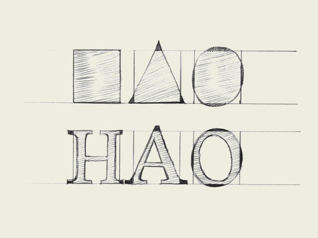

Certainly, if all of the text is to be the same size, you could enter it in as a single block although I can think of cases where even with the text being the same size you might want it to be in separate components for placement purposes. I wasn't changing any conditions. I was just trying to illustrate my original point that the center of the component's bounding box may not be the best reference point for placing 3D text.
-
Here we are confusing the text's baseline [the bottom of non-cursive characters - the line on the sheet of paper if you will], with the 3d-text component's 'base-line' which is its boundingbox's 'minimum' edge - so with 'TEX' it's the bottom of both characters, with 'COT' it will be the bottom of the C [or O], but with lowercase like 'Coy' it will be well down at the bottom of the 'y' !
As I just said you can relocate the components axes so they align wherever you like...An alternative to text that includes mixed fonts or heights, subtle alignments etc is to make a large PNG of the text 'set out' using a suitable app, give the background full transparency, then use it as an Image in a SKP and use my ImageTrimmer to make a 'cutout'; accepting simplification of the edges to avoid pixelated steppiness.
Then edit the component to remove unwanted materials and perhaps unhide the edges, and if needed explode/merge and PushPull the outlines into a 3d object... -
Here are my signs, interestingly enough I thought the real versions of signs like this were cheap...wrong. Selling as high as $36 each, as low as $8.95 each. I am in the wrong business. The margin (profit)on these must be quite large.
-
How big are they?
The place I work has their own sign shop which, at the rates you quote, is probably a very cost effective thing.
Hello! It looks like you're interested in this conversation, but you don't have an account yet.
Getting fed up of having to scroll through the same posts each visit? When you register for an account, you'll always come back to exactly where you were before, and choose to be notified of new replies (either via email, or push notification). You'll also be able to save bookmarks and upvote posts to show your appreciation to other community members.
With your input, this post could be even better 💗
Register LoginAdvertisement


