Mixing hidden and softened edges
-
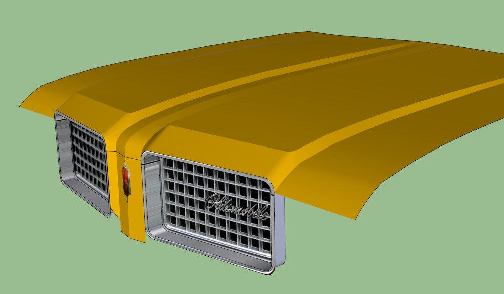
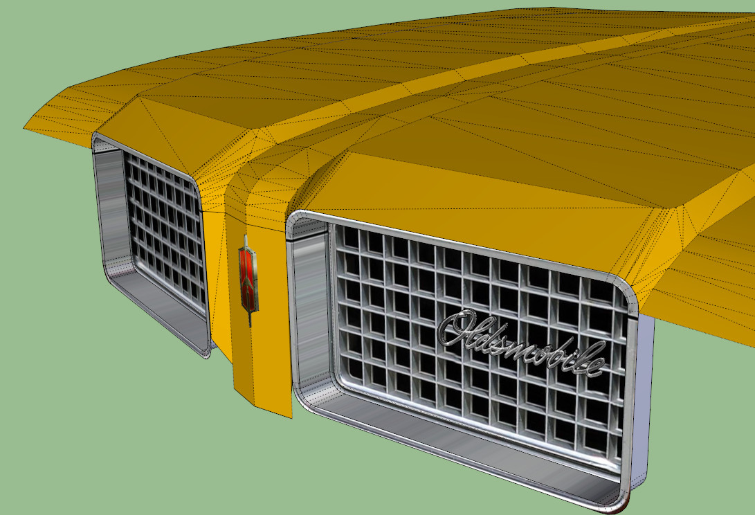
I've got a silly little problem that is giving me ulcers. Building a Vista Bruiser that I used to own about 35 years ago, and to get the look I need for the hood I have to mix some hidden edges and some softened edges. The problem is the "shaded" look this gives me on the front of the hood. Looks fine when looking at it from straight ahead, but at an angle it looks like crap. I've indicated in the third photo which edges I need to have hidden, the others are all softened. Of course I've encountered this before but have always been able to work around it to get the look I want, but this time I just can't seem to work it out. I know that mixing edge types can give you some interesting shaded effects, but that's not what I need here. I've included a photo to show what I'm going for, and I've included the file if you want to look at it close up and personal. Thanks in advance.
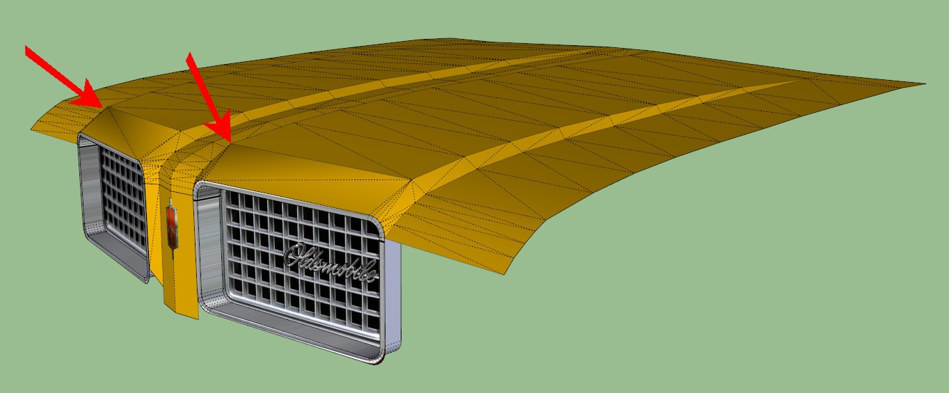
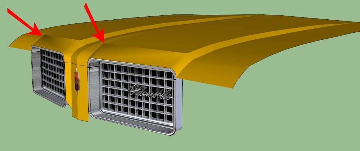
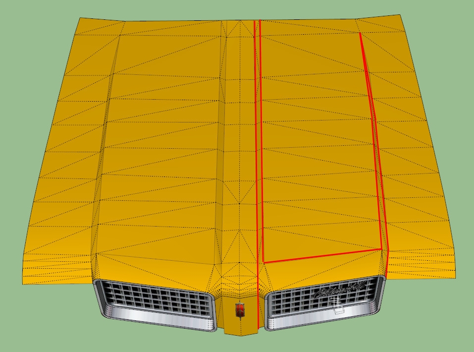
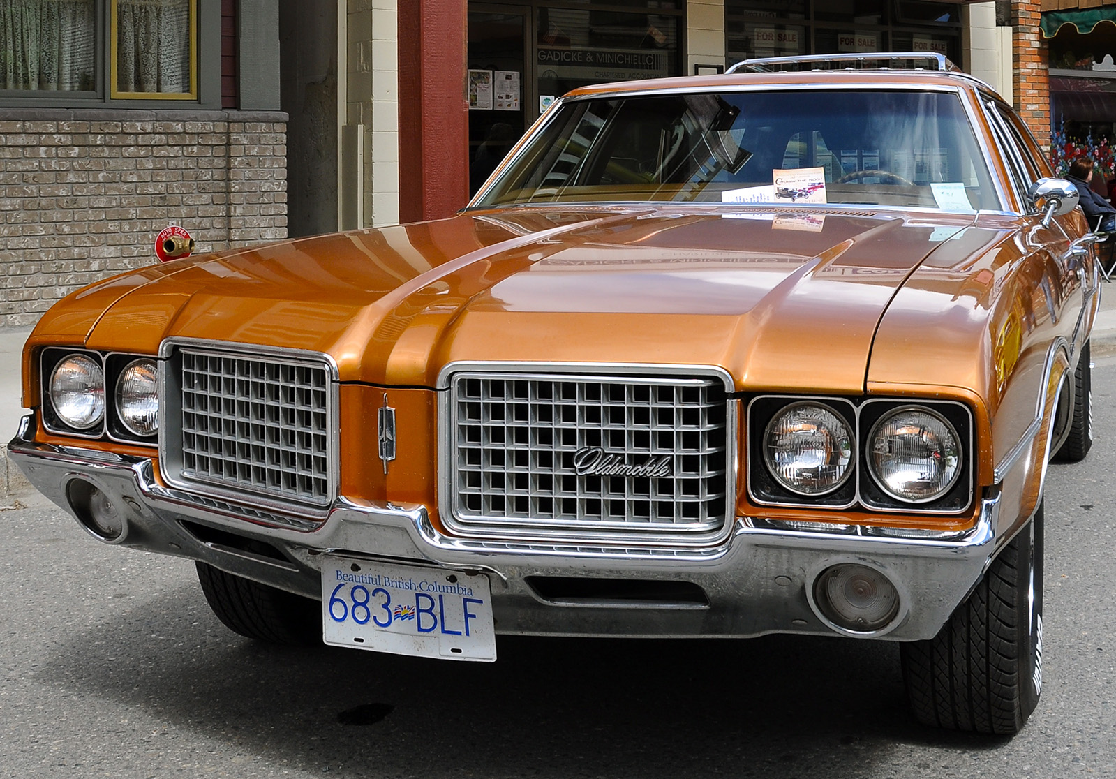
-
You're referring to where it gets dark at the upper corner? You might turn on Use Sun For Shading and play with the Light and Dark sliders. Keep the sliders close together and I think you'll see it evens out a bit.
-
Soft makes the adjacent faces be treated as a Surface and hides the edge.
Smooth is what blends the shading of the adjacent faces, but does not hide the edge. (SU's Soft Edges tool and Erase tool both set these properties at the same time so many people thinks of them as the same thing, but Soft and Smooth are distinct properties doing different things.)I think that you might have to add a small fillet to make the surface smooth. I know it adds more geometry which you probably don't want, but it seems that the faces are at a such an angle that the shading SU applies goes a bit funky.
-
And I'm not 100% sure if it matters, but it might be that the number of triangles that connects to that same vertex might affect the shading... not sure though how the OpenGL shading in SU works...
-
I appreciate your suggestions. Unfortunately, I've tried them all, and it looks no better. Another model bites the dust.
Thanks again. I'm going to bed
-
Long shot and I didn't try it but what if the two triangles on that slope were divided into smaller triangles? I wonder if that would smooth out the color shading. In the photo, the ridge at the top of the slope doesn't look quite like a straight line after all.
-
Well, I think I might have solved the problem. Not completely there yet, but I think I'll get it there eventually. A little convoluted, but what the hey, it's the end result that counts, right?
Hello! It looks like you're interested in this conversation, but you don't have an account yet.
Getting fed up of having to scroll through the same posts each visit? When you register for an account, you'll always come back to exactly where you were before, and choose to be notified of new replies (either via email, or push notification). You'll also be able to save bookmarks and upvote posts to show your appreciation to other community members.
With your input, this post could be even better 💗
Register LoginAdvertisement


