Home 13 KITCHEN REMODEL
-
@sir said:
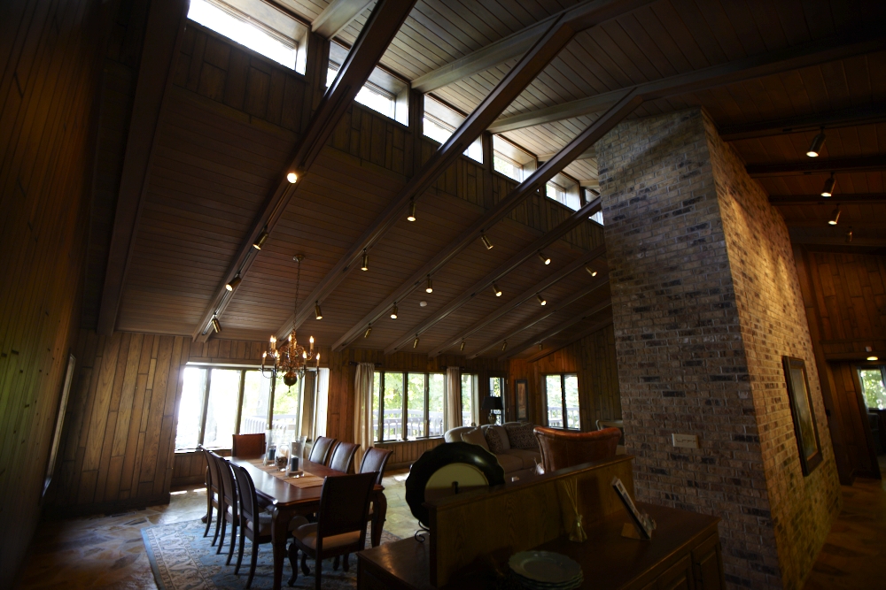
the original is trule horrendous!
I wouldn't go that far, but it is surely not my favorite style.
Color is coming soon.@unknownuser said:
I repeat...that does not reflect on my feeling about your renders...good job!!
It is nice of you to separate your personal tastes from your assessment of the work
I have done. That is not always easy to do. Thank you.@publied said:
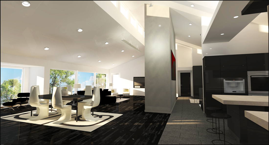
nice job. very nice rendering, but IMHO the top may be are to haevy.
If your talking about the air beam I think the size and weight are just about right. One thing
the images do not portray very well is the volume of this space. It is a large vaulted area
with high windows connecting the kitchen, dining room, foyer, and living area with a very
large fireplace in the center. When viewed in context the air beam does not feel overly heavy.
Thank you for your comments.p
-
Beautiful design and rendering. Big improvement on the existing.
-
Thanks Daniel. Very kind of you to say.
p
-
Hey Paul! We featured you on The Daily CatchUp!
Kitchen Remodel by Paul Molson
http://news.sketchucation.com/kitchen-remodel-by-paul-molson/
Mike
-
@mike lucey said:
Hey Paul! We featured you on The Daily CatchUp!
Kitchen Remodel by Paul Molson
http://news.sketchucation.com/kitchen-remodel-by-paul-molson/
Mike
Cool! Thanks!

My name by the way is
Paul M. Olson -
Apologies Paul, it has beem rectified. No harm done i hope?
-
I would be ashamed to do this. I had to download the pictures, because nobody would believe me.
-
@jarynzlesa said:
I would be ashamed to do this. I had to download the pictures, because nobody would believe me.
Ashamed is a strong word. I do not take offense.
 A dramatic change in style is bound to
cause strong reactions. I am not ashamed at all for working with our clients in tranforming their home to fit their vision. The owners
of this home have a very clear idea of where they want to go with the design.
Personaly, I like the new far more than the existing. To each their own...Thanks for you honest reaction jarynzlesa.
paul
-
@unknownuser said:
Apologies Paul, it has beem rectified. No harm done i hope?
Not a problem what so ever!
palu o. omsln
-
No problem Lapu

-
I am really glad you kept professional distance. For this and similar project can be used Latin proberb - De gustibus non est disputandum (there's no accounting for taste).
-
This may be the last image for this job. The clients have
decided to use us for this remodel job but the budget
may not justify any further modeling/rendering.On a daily basis sketchup & podium and the help that can
be found on these forums proves to becoming more and more
essential to our companies ability to communicate with our
clients, sub contractrs and each other.Thanks for all your comments.
Paul


Hello! It looks like you're interested in this conversation, but you don't have an account yet.
Getting fed up of having to scroll through the same posts each visit? When you register for an account, you'll always come back to exactly where you were before, and choose to be notified of new replies (either via email, or push notification). You'll also be able to save bookmarks and upvote posts to show your appreciation to other community members.
With your input, this post could be even better 💗
Register LoginAdvertisement


