Home 13 KITCHEN REMODEL
-
pmolson's HOMES
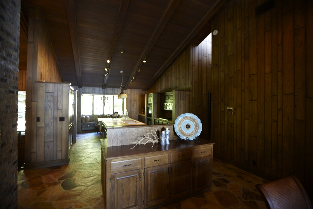
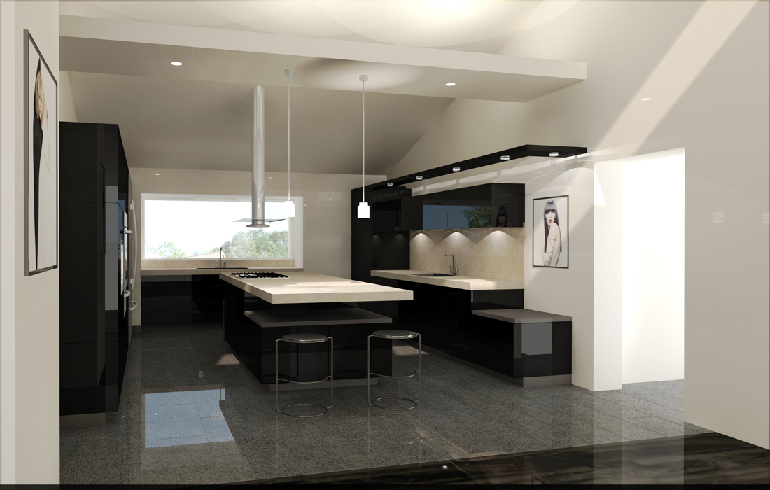
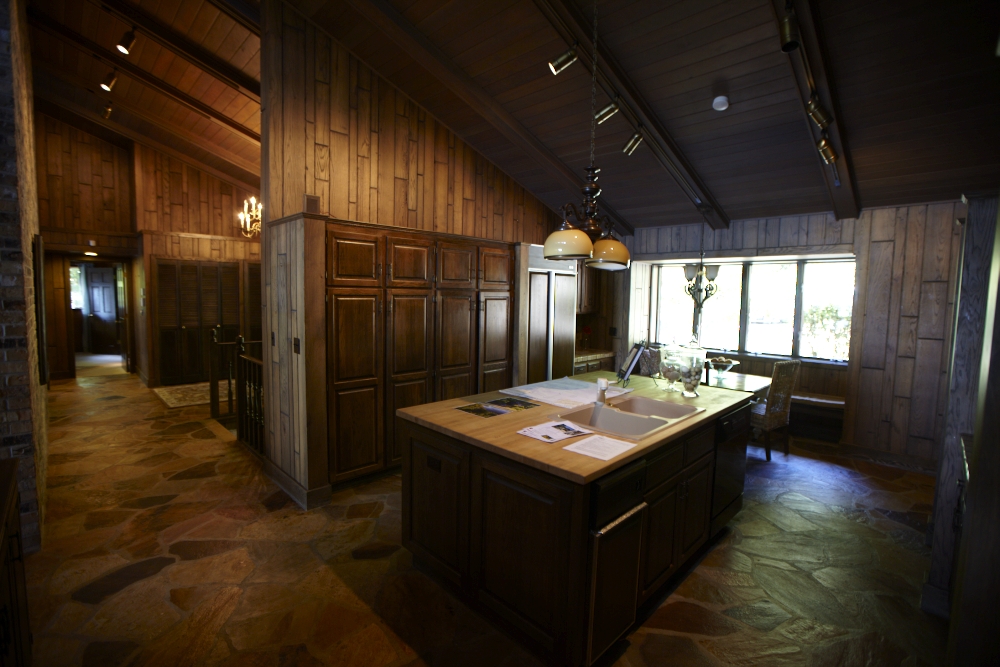
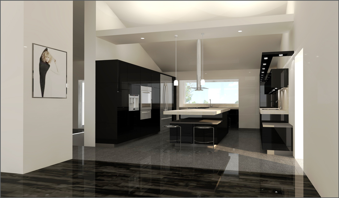
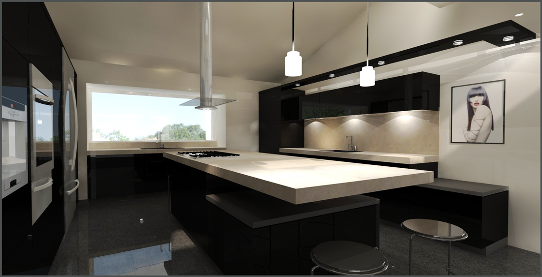
(Above is a link to other pmolson homes)These images were used to show a potential client
what their kitchen could look like. We presented
this past Friday. It went well. We should find out
shortly if they will be using us to do this project for them.These are works in progress as far as I am concerned because I was not able to spend
more time refining them and working out the lighting issues.The bottom line though is that they really seemed to like the design and were a bit wow'd
by the renderings.I hope to have time to refine these images.
Comments and criticism welcome.
Su 8 pro - Podium v2 - Photoshop elements 7Thanks
Paul
-
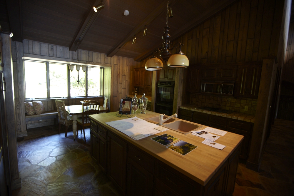
Please explain, the wood is the current (photo) and the white is the proposed (render)?
-
Sorry, thought is was self explanatory.
-
It was, I just wanted to make sure I had it straight.
I really like the flagstone floor of the old kitchen, anyway to incorporate it into new modern kitchen, or was the client adamant to get rid of it?
-
@solo said:
I really like the flagstone floor of the old kitchen
I thought the same thing. It would be a shame to rip it up. With proper sealing, it could be quite functional. Albeit, the brownish flagstone would not work with the B&W theme of the new kitchen. I'm also guessing the whole first floor is getting renovated, as the wood panel and flagged flooring theme seem to carry throughout. What is spec'd for the new flooring? In the render it is a bit too shiny to really tell. Other than the floor, the rest of the render looks very nice.
-
Wow! Those are some great pictures of 1970s "high style".
The new concepts look great. Really brightens the place up.
-
@solo said:
It was, I just wanted to make sure I had it straight.
I really like the flagstone floor of the old kitchen, anyway to incorporate it into new modern kitchen, or was the client adamant to get rid of it?
A must go. We do however use a reclamation service so the stone & wood will end up being used again.
@earthmover said:
Albeit, the brownish flagstone would not work with the B&W theme of the new kitchen. I'm also guessing the whole first floor is getting renovated, as the wood panel and flagged flooring theme seem to carry throughout. What is spec'd for the new flooring? In the render it is a bit too shiny to really tell. Other than the floor, the rest of the render looks very nice.
Yes, it is to be a whole house remodel. We are competing for the job, and the kitchen design and rendering were used as an example of where we would go if we were
to be awarded the job. There will be much further design If....When!...we get the contract.The floor is very shiny concrete tiles. Don't take it too literally, I was just shooting for shiny & grey.

@unknownuser said:
Wow! Those are some great pictures of 1970s "high style".
The new concepts look great. Really brightens the place up.Thanks! You know, I was not sure what to call the existing style, but 1970s High Style fits perfectly.
p
-
Good luck getting the project Paul. The renders should really be a good selling point for any client.
-
Cool re-design and render images, congrats...
 A radically change of style...
-
@earthmover said:
Good luck getting the project Paul. The renders should really be a good selling point for any client.
Thanks for your comments, I always look forward to hearing what you have to say.
@fymoro said:
Cool re-design and render images, congrats...
 A radically change of style...
Thank you very much. I have quietly watched your work on these and other forums and based on those observations your
comments carry weight.p
-
A good render and a bad photograph are not a good comparison. However, it does help to sell the project. Properly lit and with the random owner artifacts replaced with thought out accessories used, I wonder what the space would look like?
-
@roger said:
Properly lit and with the random owner artifacts replaced with thought out accessories used, I wonder what the space would look like?
Ummm...better.
 Still dark & dated though.
The fact that the existing images were taken with a wide angle lens for listing by the
Realtor doesn't help either. I stood in the spaces and it is dark with all that wood so
I think we would still have a pretty good contrast.
It was not my intention to deceive with staged existing photos that were less than flattering.p
-
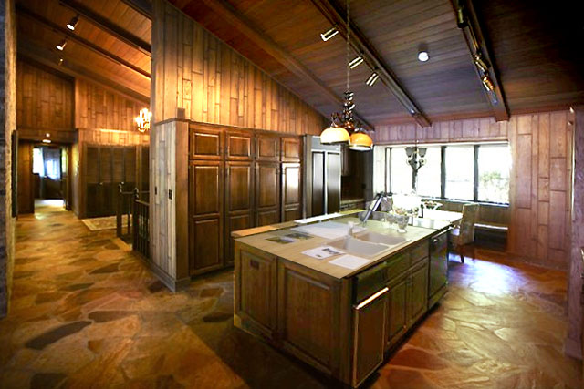
It was not my intention to suggest that you were engaged in any sort of intentional misrepresentation. My comment was more to the point that i suspected that the photography, as done, was not as representative of what existed as the rendering was of what could be. Should we go on and add some planting and clean up some of the surfaces, there is some charm to the original albiet not strikingly modern. I do think, your design is well done.
-
I understand what your saying Roger.
Thanks for the comment on design.Fortunately for us the new owners are not looking
to freshen up with interior design,(which I agree with you that a ton of improvement
could be made just by that alone)but are looking to dig a bit deeper.p
-
I think the best thing about the new design is the ceilingish kind of object with the lights shining up, which allows for indirect lighting, and, as such, makes the entire space look roomier. But on the whole, the atmosphere is very designy. I can't ever imagine anyone saying "oh isn't it cozy inhere?!" It reminds me of a dutch commercial we had a number of years back, with just such a kind of space... A broker showing people the house, and them saying just those words... and then an advert for coffee...
not to say it isn't beautiful. it's just not my taste. I prefer the old setup. With some plants. Lots of plants. And coffee, as well.

-
Pyroluna,
Thanks for your comments. It is true that this style is not for everyone and we were not shooting for cozy.
I wonder though if we add some "stuff" plants, books, area rug, etc., if it would not warm up a bit.
I actually wanted to do that when creating these scenes but the principle designer wanted a scene
free of glitter as she felt the clients liked uncluttered spaces somewhat to the extreme.Thanks again for your thoughts
Paul
-
Some of what you have to work with reminds me of our house, and my project. You intentionally start over; I like the solid, honest materials I have so I'm ditching the paneling but exposing and working with the solid wood decking and beams above. I appreciate the clean and white, especially when contrasted with the clean and not-white and not manufactured in a factory, so there will be solid wood (structure) and manufactured surface material (facing).
Like Pyro, I'm a huge fan of indirect lighting. Hopefully and probably you had some strong cues from your clients that they were comfortable with a 180 degree turn in style, otherwise my guess is it would be too radical, though the rendering itself is 'impressive.' There is also the danger that the severity of the style shift obscures the other innovations which may otherwise be in plain sight.
-
brookefox,
Thanks for the thought out comments.
I agree with you that exposing and or using some existing structure or less
contemporary existing features would work well in this project. One such item
is the existing brick fireplace that due to designer and client wishes is being
covered. I think the contrast of the original brick with the new clean lines
would be striking. Some exposed timber could then be brought in....and...then I would
not be listening to the principle designer and the client. If & when we move forward
with this project these and other thoughts will be brought up again just to make sure
we are not throwing the baby out with the bath water.Thanks again.
p
-
the original is trule horrendous!
but dont be afraid of a bit of colour to brighten the place up
good work tho

-
nice job. very nice rendering, but IMHO the top may be are to haevy.
Hello! It looks like you're interested in this conversation, but you don't have an account yet.
Getting fed up of having to scroll through the same posts each visit? When you register for an account, you'll always come back to exactly where you were before, and choose to be notified of new replies (either via email, or push notification). You'll also be able to save bookmarks and upvote posts to show your appreciation to other community members.
With your input, this post could be even better 💗
Register LoginAdvertisement


