Twilight Render Glass Conservatory + External
-
This is a project I've been frantically working on!
I used the round edge plugin on nearly every single edge....result is a 100mb file

 so I suggest we use this plugin only where necessary haha
More images to come, this is just the first interior shot. Haven't done a proper interior render for months now so I'm happy to get back into it.
Cheers
warmer version
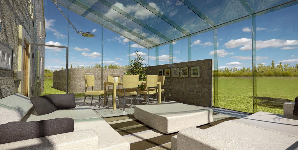
more contrast
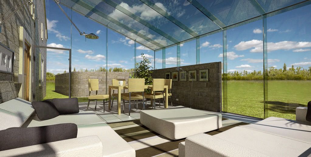
-
Hi Oli, pretty awesome interior wip.

I think the preset really work well for the shot.
Just thought the enviroment is a little too much for the interior, I mean the GI.
And probably a couple of issues with some reflections, esp for the metals.
Anyway it's looking great...keep posting!
-
Thanks for commenting.
I agree dspace.... environment looked much better with interior presets but I had to use exterior because I had rendering problems. However, I kept some of the green hue because it made the glass look better....closer to the reference photos I have. its a bit cold though isn't it....I will add some warmth. cheers for pointing it out.
Yeah the metal looks a bit weird especially where it touches the floor, but i've got no time to change it unfortunately.

Gonna leave another image cooking overnight I think.
-
Hello,
I like it - as a render noob I can hardly suggest anything, but I am curious about the "number of segments" option in the plugin dialog box. How many did you use? -
it was 8 segments. 4 segments for less noticeable surfaces. I will post the sketchup hidden geometry views tomorrow....pretty intense!!

cheers
-
Nice composition but it is bit green for my taste.

-
still?!! you shoulda seen the raw render it was VERY green!
i just cant get color balance right! Although I still wanted the glass to cast some green into the room....i like it like that!
please PP it if you fancy I wont be offended!

-
Oli, looks good, I may tone down the bump a little on the furniture.
As far as the IBL/hdri goes, can you adjust the intensity? if yes then about 25% less would give a great result.
-
thanks pete.
I'll give it a go when I render some more tomorrow.
I updated original post with a warmer version, is it better?
-
here is a tester, gonna leave it rendering over weekend.
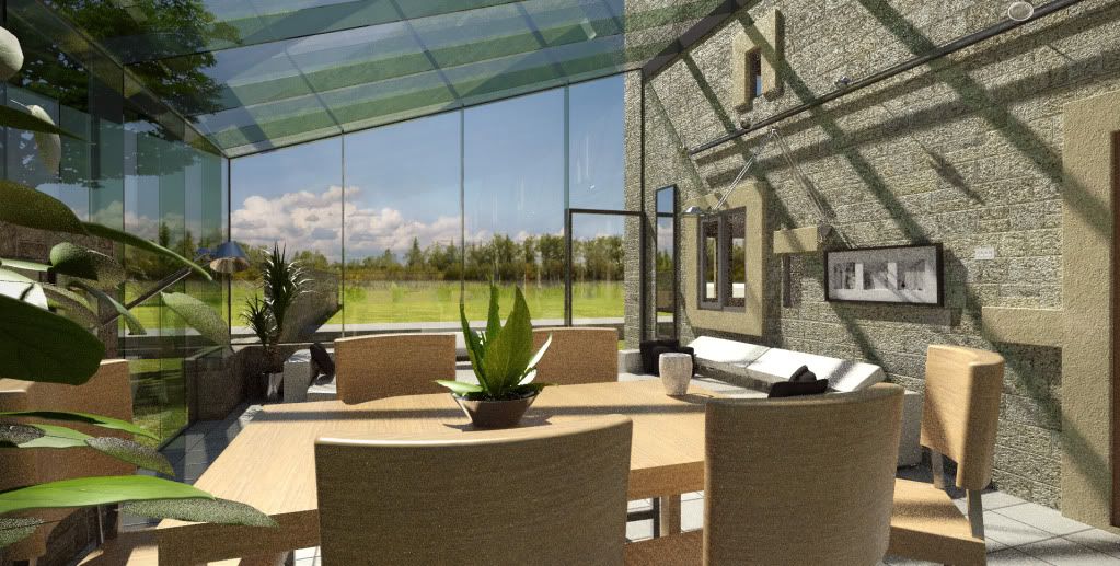
geometry:
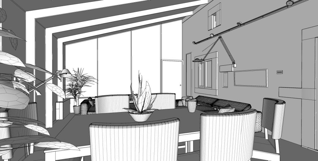
geometry+ render =
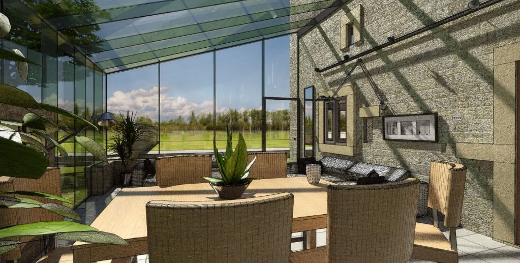
THNAKS TO SOLO FOR THE PLANTS, THEY LOOK GREAT! AND VERY SKETCHUP FRIENDLY!
-
wow! excellent space and very nice render oli.
-
Awesome render, looks pretty cleaned!

Btw...does it shows caustics?
-
These are great renders oli.


A so peaceful feeling, that really good. Not greenish (well just a bit). Some, just a little, magenta on highlights maybe.....
-
thank you very much for all your kind words, your critical eyes keep me trying harder with each new project!!

-
The last one looks very convincing. How about night render to use all that lighting you have in there and maybe some from outside.
-
Thank you Sid and good idea!! Not done many night renders so it'll be a challenge!! Will look great all lit up....
More images to come, got another cooking overnight

-
These are very good images and I think progress is really showing.
A few crits though...the foreground plant is too close to the camera. It could certainly work in the scene, but it is not detailed enough to be that close to the camera. I think the bump levels on some of your materials are a bit high and that combined with the noise on some of the images creates a graineness that is a bit distracting. The only other thing is the glass....morely the joints..it seems like there should be some sort of frame. I could be wrong but that system seems like you would need some sort of frame or connector pieces for it to work and I think that would help add to the realism. But you also may have a system that is as your illustrating.?
Anyways, keep up the good work and id like to see a night scene as well.
-
This last one has an amazing "airy breath". I like it very much!
 Only those pillars and roof beams made of glass (

 ) worry me a bit.
-
thanks steelers. im not going into all the structure im just the monkey. there is a frame can you not see it. the only part of the structure I didn't show is the joints between the structural members, they are not continuous as ive shown it.
the foreground plant should be blurred but not got round to it yet.
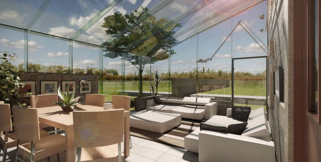
new one, bump reduced
-
i know i know, but like i say im just the monkey!!
airy breath!! nice! cheers
I updated previous image with DOF blur to foreground foliage....
Hello! It looks like you're interested in this conversation, but you don't have an account yet.
Getting fed up of having to scroll through the same posts each visit? When you register for an account, you'll always come back to exactly where you were before, and choose to be notified of new replies (either via email, or push notification). You'll also be able to save bookmarks and upvote posts to show your appreciation to other community members.
With your input, this post could be even better 💗
Register LoginAdvertisement


