Rendering Workshop - Studio - still life
-
By popular demand I have replaced the Exterior Houses Workshop for this week with a still life.
(You can still upload your Exterior renderings to the other Workshop if you have made one)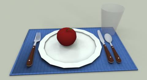
For this weeks workshop we want to treat the model like a product we want to present and highlight in a product marketing or advertising environment.
You may change colors and materials, add lights and reflective properties, but should not add things to the place setting itself. (Imagine the developers had created the product and that it was your job to create an image for marketing)
(Also, if you fix obvious problems in the model, you may want to upload a new one for us to use)
This may involve special lighting and background effects. Give us some tips on what you did and how you did it.
You may add a table, base, etc., or other objects to help promote the product. But remember we are trying to learn about how to present objects in general - not just this specific place setting.
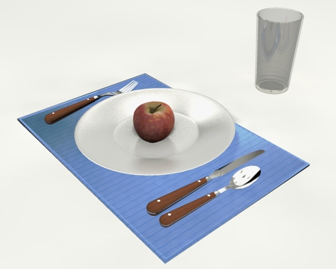
I have taken a 3D Warehouse model by carmil_vampire and added an apple. See what you can do with it.
[Edit: Pete has uploaded a better model. Use this one: Better model]
Guidelines
These Workshops are not a contest. People new to rendering can use them to experiment and get feedback and advice from other SCF readers. People with more experience can show us what they can do and demonstrate interesting techniques.
This Workshop is about rendering, not modeling. You can modify the model, add other geometry, add other 3D warehouse items, etc. But keep in mind that we want to see what you can do to make these existing models more presentable.
This is about all aspects of rendering - SketchUp, external add-ons, post processing, PhotoRealistic, and Non-Photorealistic. Feel free to try anything.
Upload you images, your questions, your ideas. Lets see what we can do.
-
Al
I do not wanna mess too much with your scene but I had to make a few changes, firstly the model will never look realistic as it is a weak and low poly model.
I have changed the plate for one I had, the apple for one from Michalis, the glass from one Crazy eyes made for the WH. the cutlery looks fine as well as place-mat as many folk will probably use their own textures and bump maps.
The model is slightly heavier, but for the difference in realism the gain overweighs the poly's, and even the weakest of machines will still be able to zoom through it.I have zipped the model which was saved as a SU 6 version (that way most folks can use it)
![still-life[1].jpg](/uploads/imported_attachments/TpGn_still-life1.jpg)
-
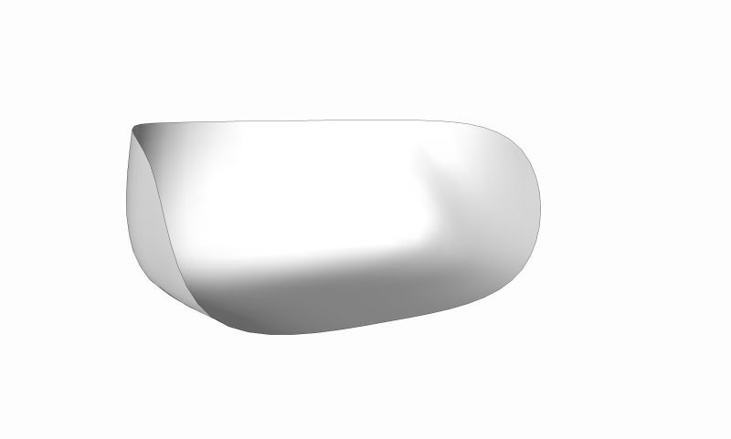
Additionally for those that want to use a studio, here is a basic studio setup if needed, I actually use this very simple setup for many of my commercial productions, sometimes simple is best.
Play around with this setting up your camera angles, then adding lighting as needed.
Remembering that too many lights will give overlapping shadows which can ruin a studio setup.
-
@solo said:
Remembering that too many lights will give overlapping shadows which can ruin a studio setup.
Some photographers use a 3 point light setup to achieve overlapping -but soft- shadows.
Supplementary they use big reflectors to soften the shadows even more.
It depends on what the subject and the goal of the studio setup is I guess
. -
You are right Chris, they also use filters on the lights so not to create sharp shadows, there are many render apps available that can mimic this by setting the shadow opacity as well as intesity, but for those render apps without this feature one must be careful.
-
i was about to ask if anyone had any advice on a studio setup.
you guys here are mind readers!
cheers!
pav
-
IMAGE BASED LIGHTING
Okay, I found a few minutes between project phases to do a quick 1st test.
I have used Vue for this as I'm sure there will be many Twilight versions and if I don't use Vue nobody else will.
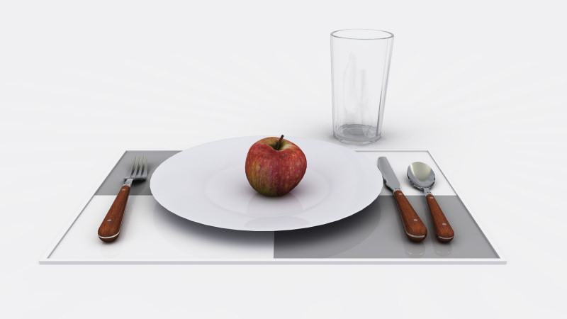
Remembering this is studio rendering so the point is NOT to have a distracting background as only the subject needs presentation. I have chosen a flat white studio with no reflection values.
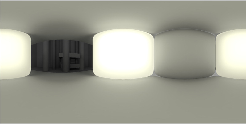
I have for this test decided to use no lighting, I opted for Image based lighting instead using a HDR image. This will give the softest shadows normally (without manipulation of light values in certain renders) It will also give you image based light sources which can be very difficult to control in some render apps.
There are many reasons for using an HDR image, besides the softer shadows it also presents an image for all reflective surfaces to reflect without having an image or geometry present to obscure the scene.
Here is an image of the HDRI I used, notice it has a mustardy color to it, that color will be projected in the render, so choose your HDR according to the results you require.
I did not get to creative or detailed with my texture setup for this, just some basic presets.
There is NO post editing.
-
going to be thick here, but i don't understand the first image solo, it's a HDR, i get that much, but i don't get how it relates to the rendered image, it looks kinds abstracted.
please forgive my ignorance!
pav
-
3 POINT LIGHTING
As Chris mentioned above, this is probably the most common studio render setup, a pretty simple way to get an acceptable result.
I have chosen omni lights (point lights) instead of spots, I did not use IES values as that I'm sure will be covered in a future workshop (too much effort to explain now)
I used a spherical image for reflections (an HDRI can be used too)
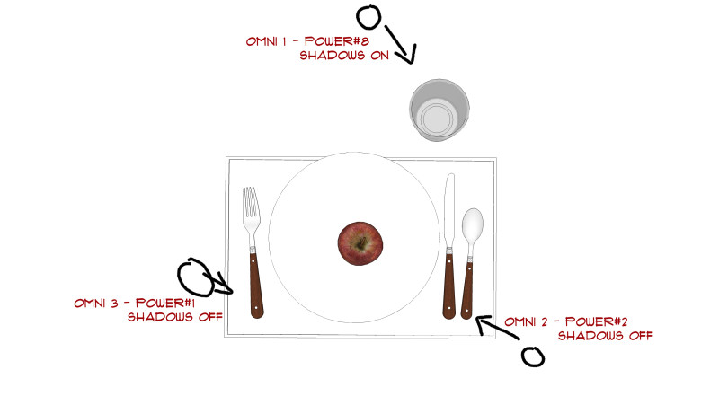
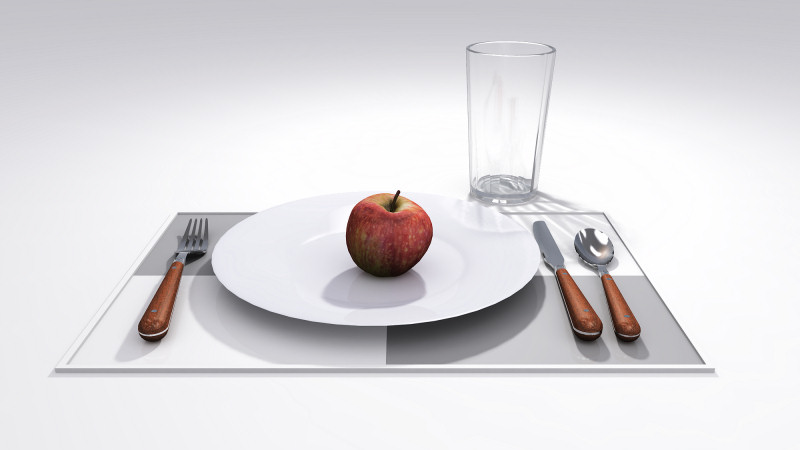
As you can see from diagram I made sure only one light had shadows selected and other two not, the reason for that is when there is three light sources there will be three shadow sources and they can ruin a studio render IMO, however some folk like that look, so it's different strokes for different folks in this regard.
The reason three lights are used and not one is if only one light was used the shadows would be darker and shaded areas will display less detail, remember this is a studio setup and NOT a real world scene, the idea is to give as much detail presentation to a product.
The image below does not show the angles very well but omni#3 is set higher (further from still life)no post editing.
-
Luci, most render engines have an option to use a High Dynamic range image (HDRI) in place of any physical lighting as the HDRI format has all the lighting values in the image (another technical explanation that will wear fingers down). many folk use HDRi as background images as well as a lighting source, they occasionally supplement the lighting as well.
But as you will notice I am using a studio mesh, so you cannot see the background image as the studio blocks it, thus all you will get is the reflection and lighting from it. Some apps like Vue, Vray and I believe Twilight (if I missed anyone please mention it) can use just the lighting or just the image from a HDRI giving you more control over the scene. -
What is the first: Adam or Eve?

Cool render
-
Hi Guys
Forgive my ignorance but I am completely lost here - I am starting from level -10 and I do not see the relationship between a black and white image (HDR ) with different levels of luminance coming off the squashed cubes and the picture of the plate. You then talk about omni lights - what is the connection? I am lost - its me guys not you. Can you point me in the direction of an article / book on this subject as I dont want to waste your time asking really infantile questions from masters like you (SOLO, etc) I will then come back and break your hearts with more educated infantile questions!!!
-
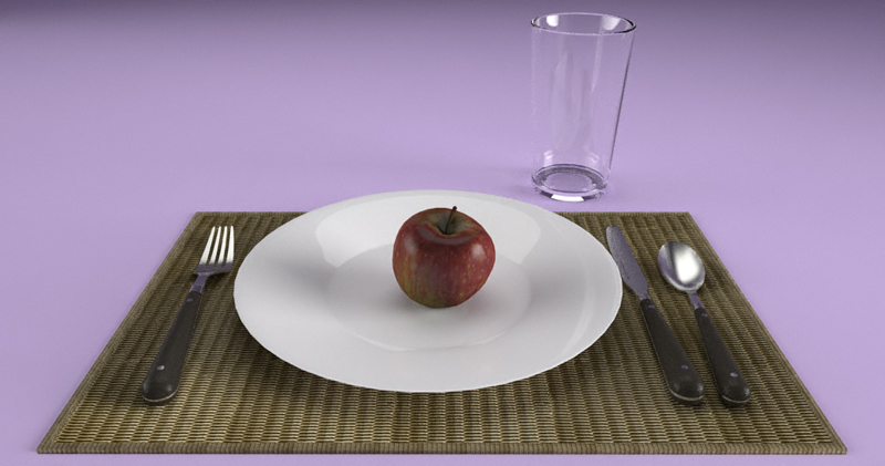
This is my try. No HDRI, but three IES emitters with a studio setup.
Raw output...
and after a quick tonemapping.
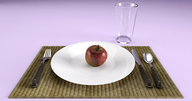
Thanks Al, Solo and Michalis for the models.
-
In the "learning to render better" theme, I can't help but repeat the sage advice I've heard on these forums many times - "A good render starts with a good model." The first thing that drew my eye in Al's render was the low-poly plate. Although the render wasn't bad, the polygonal plate ruined the whole image IMO. Just an observation from a far-from-perfect render noob

@dermotcoll, I too wish for a "HDR for Dummies" manual! However, from what I understand, Pete's HDR is a stitched-together panorama of a room. In the render program, it is "placed" around the model like the actual room from which the original picture was taken. Some weak lighting is achieved from the image, but mostly it is used for reflections, which you can see clearly in Pete's spoon. It is (at least for me) the easiest way to light the model, and usually(always?) results in soft lighting and shadows. This is why Pete added omni lights in his second render, that way he got stronger shadows, brighter colors, and caustics from the glass.
Pete, please correct me if I'm wrong!
Here is my first try. Studio setup and HDR background - sunlight off. Just some simple tone mapping when the render was complete.
-
Pete already uploaded it in his post above:
http://forums.sketchucation.com/viewtopic.php?p=198656#p198656(Cutlery is from Gully Foyle I believe)
-
@dermotcoll said:
Hi Guys
Forgive my ignorance but I am completely lost here - I am starting from level -10 and I do not see the relationship between a black and white image (HDR ) with different levels of luminance coming off the squashed cubes and the picture of the plate. You then talk about omni lights - what is the connection? I am lost - its me guys not you. Can you point me in the direction of an article / book on this subject as I dont want to waste your time asking really infantile questions from masters like you (SOLO, etc) I will then come back and break your hearts with more educated infantile questions!!!
HDRi gets quite confusing. And, although I use it a lot, I am only just starting to understand it.
HDRi technology
One the one level, HDRi images (the HDRi phrase comes from the fact that the images contains an illumination channel in addition to the RGB (red, green, blue) color channels. As a result two parts of the HDRi image which are the same - say 255,255,255 - white can be marked to illuminate the scene differently. (One can be a flat, white wall while the other is a bright white cloud). In the real world this is accomplished by taking three separate images from the same camera position - one normal, one under exposed and one over exposed. By comparing the pixels in the three images, you (or the computer) can determine how bright things were. In my example above, the white wall would get dark in the underexposed image, but the bright cloud would stay lighter.)
Underexposed image (Note the bright sky is still white - and can't really get any "whiter" in the normal and overexposed images)

(See this tutorial: Beginner's guide to HDR and Tone Mapping
HDri images do not have to be black and white. They can be colored as well.
HDRi Skies for backgrounds
One use for HDRi images - because they are complete 360 degree images, is that they can be used for backgrounds - both providing the background and providing illumination. See this example:

HDRi for illumination only
Another use for HDRI is for illumination only. By letting the HDRi image reflect (for reflective highlights) and illuminate, but not be visible, it creates some good lighting effects.
For instance this HDRi image of a forest (called rnl_probe - and used by a lot of rendering folk), is low resolution and does not provide a good background, but does provide good illumination for studio lighting settings.
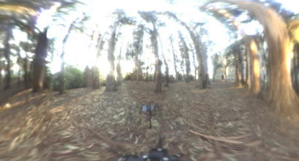
This model was rendered with the forest HDRi -

It provides interesting reflections and illumination without messing up the background.
Creating HDRi images
Purists, go out and create images with cameras, and a lot of nice images are available online.
You can also create an HDRi image by rendering your model in Panoramic mode. For instance you can place lights, buildings, or something interesting all around the camera and then use it to render an image and save it as a HDRi.
I plan to try that later when as I work on renderings for this Workshop.
-
@d12dozr said:
In the "learning to render better" theme, I can't help but repeat the sage advice I've heard on these forums many times - "A good render starts with a good model." The first thing that drew my eye in Al's render was the low-poly plate. Although the render wasn't bad, the polygonal plate ruined the whole image IMO. Just an observation from a far-from-perfect render noob

I agree. I just started rendering this model this A.M. and both the plate and the glass (with single face thin - rather than thick glass) are troublesome. Can someone upload a new model for us with a better plate and glass?
[Edit: Ignore this post. Pete had already uploaded a Better model], but I didn't see the attachment.]
-
@gaieus said:
Pete already uploaded it in his post above:
http://forums.sketchucation.com/viewtopic.php?p=198656#p198656(Cutlery is from Gully Foyle I believe)
Thanks. I placed the link to the new model in the first post.
I wanted to get him to create the model for me in the first place. But he didn't grab the hint. Next time I'll be less subtle and just ask.

-
cheers for the clarification solo!
legend.
Al, these render tips are proving very useful, they seem to spark a lot of positive discussion which we can all learn from, so thank you very much!
pav
-
Great thread. Thanks to all. This will take time to digest.
Hello! It looks like you're interested in this conversation, but you don't have an account yet.
Getting fed up of having to scroll through the same posts each visit? When you register for an account, you'll always come back to exactly where you were before, and choose to be notified of new replies (either via email, or push notification). You'll also be able to save bookmarks and upvote posts to show your appreciation to other community members.
With your input, this post could be even better 💗
Register LoginAdvertisement


