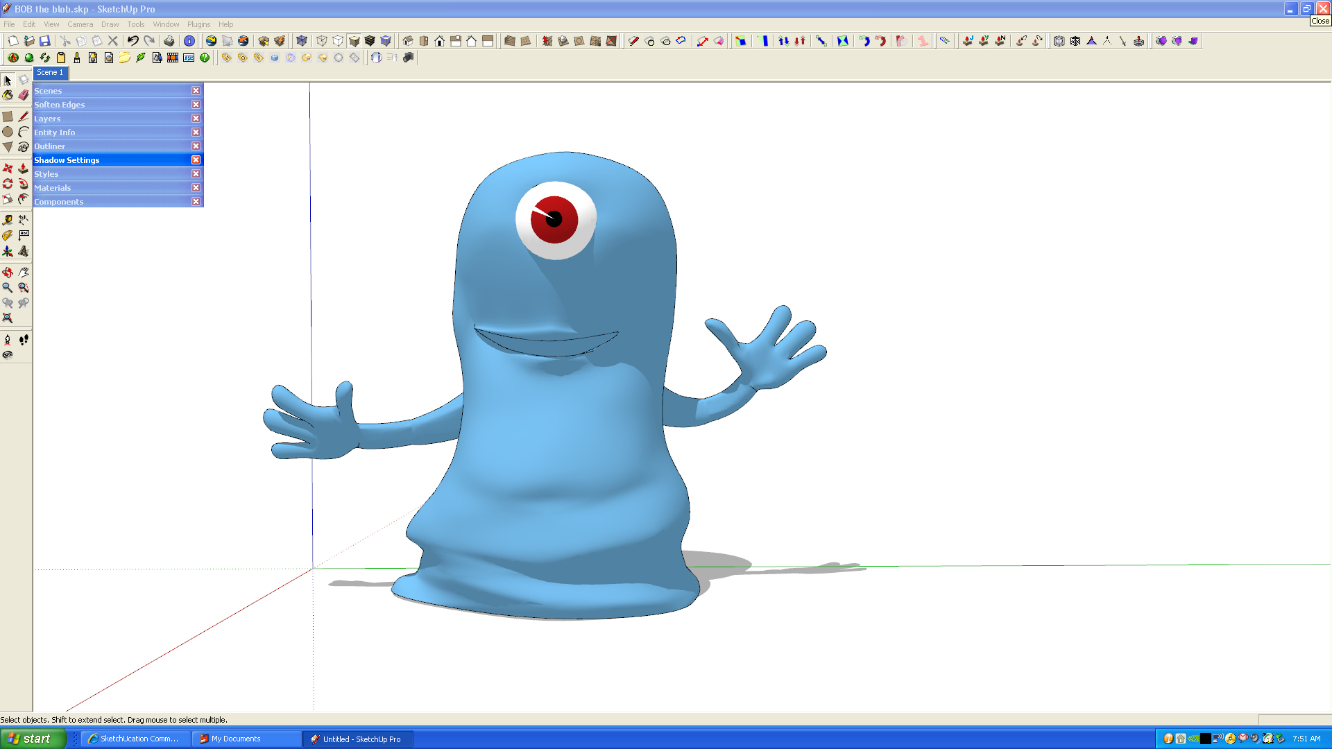
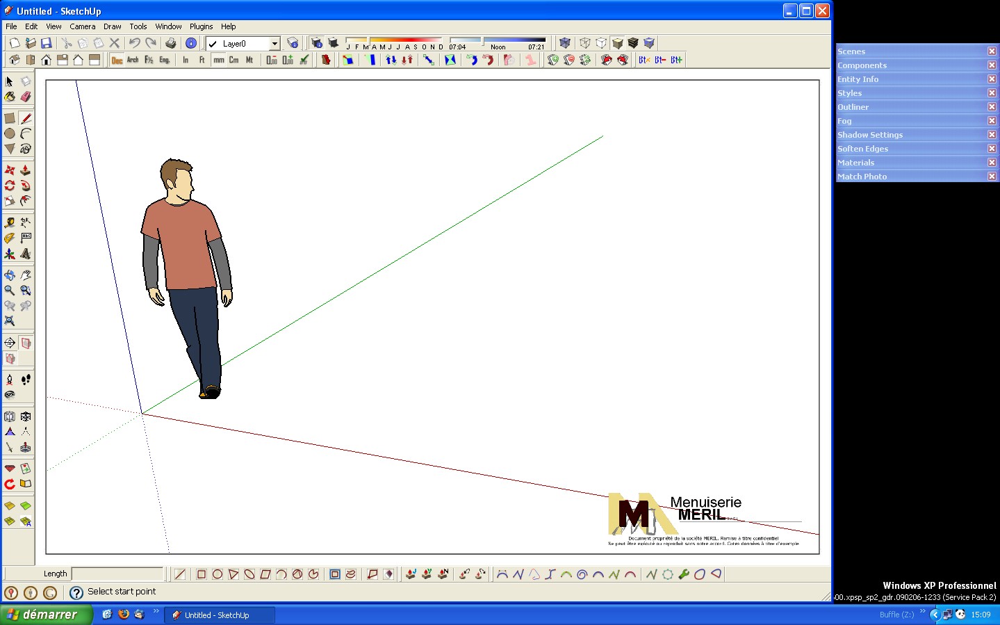
REQ: Palette docking
-
Alternative: Dual Monitors

-
hee hee already working on 2
At office 22 wide and 19 inch normaland at home 26 inch and 19 inch, but i must say. i had a 32 inch tv hooked up..worked for 6 months on that...a bit low res, but when i got my 26 inch screen....it was heaven. wish i had another 26 inch hee hee.
Bigger screens helps a lot! I can fit all my toolbars and palettes easily in one column and have so much space. -
And if we create a toolbar with one icon per window, to show and hide them?
-
Actual sizeDual monitors is a great solution but one huge monitor is the best solution.
Most new video cards support digital outputs and thus using LCD HD flat screen TV's is now perfect, as opposed to the previous VGA out that really looked crappy on a TV.
I use two flatscreens, one 42" and the other 36" (not on same computer) and my image is very sharp and a pleasure to work with.
I dock my windows in the righthand corner and due to size of screen it does not in any way impair my workspace.Click to enlarge for actual size.

-
I prefer two monitors over one large. Because with two monitors it's easier to spread multiple running applications side by side. And with Windows7's new snapping feature it's even a smoother operation.
At work I have two 20". At home I have one 22" and a 17" connected to my main computer. Then I have a third 17" monitor connected to my old computer which is now an XP/Vista/Ubuntu test rig, controlled from one set of mouse and keyboard.
-
I do like this with windows:
 Windows are not positionned on top of the work space.
 -
I also do what Matt does on my 25" monitor. I prefer the shape of the drawing space over the very wide one I get if I use the full screen.
-

-
But the Idea about Tabs is very interesting, for plugins too.
-
Can someone explain to me why we don't have pallet docking and toolbar locking....we are on version 7 now. I think its about time. When I re-size the SU window and then make if full screen again all the tool bars go wacky. This should not be the case. I mean this is fairly sophisticated software and one would assume that a more controllable GUI would just be standard.
-
exactly

-
Im guessing it hasnt been sorted out yet because designing and implementing a GUI is a lot of work for relatively little gain.
As an example, imagine SU8 came out and the major new 'feature' was an improved GUI. There would be a lot of angry people.
To put it succintly, i think there are more pressing things to deal with than the GUI.
-
I think i understand what you mean, kinda thought so too, thats why i thought if there was a way someone could write something to make this happen, so those who likes it...can use it and those who dont like it dont need to use it. Or, another guesture, but i think it wont happen, to make this happen in su 8, but you can toggle it to use the old interface or the new one. just a happy thought.

-
@remus said:
To put it succintly, i think there are more pressing things to deal with than the GUI.
The toolbars are a major usability problem. I'd say it's a pressing problem. And separating the UI from the working SU processes so we can have fully working progressbars with cancel button is also something that would help greatly.
Then there's things such as the material window always pops up ever time you activate the paint bucket.I'd be very happy if SU8 focused on stability, bugfixes, GUI and UI improvements pluss more ruby power.
-
Personally i dont find any of those things severely limit my ability to model things in SU, the same cannot be said of the poly limit though.
I certainly wouldnt complain if they stopped the UI freezing up when SUs thinking, or stopped the toolbars shooting off all over the place, but i dont want that to happen to the detriment of overall performance.
-
@remus said:
As an example, imagine SU8 came out and the major new 'feature' was an improved GUI. There would be a lot of angry people.
Thats effectively what happened with SU7 (woohoo DC's!!!...and layout???), so if in 2 years Google releases another version i wouldnt be surprized if the only upgrade was pallete docking, google's catering to "everyone" not 3d artists trying to compete with bigger apps... besides what do u need pallete docking for when ur exporting ur block models to google earth???
-
You know what would be great
SCF opens a post, where we can add what we really want in su, after all this website is sketchups jewel.
then when its perfect, we send it off to sketchups headquarters and tell then the community wants this in the new version. I know what makes su great is its flexibility to add plugins..but stuff you cant alter is things we are discussing now. -
@thomthom said:
I'd be very happy if SU8 focused on stability, bugfixes, GUI and UI improvements pluss more ruby power.
I totally agree with you thomthom. Fix the core problems - we can always count on this community to develop cool new features!

BTW - I used one 20-inch monitor with SU for a long time and have recently gone to two 22-inch widescreen LCDs at home and must say it is wayyyy more enjoyable now since I can really spread out and put all of my palettes on one monitor and model in the other. Never going back!
Hello! It looks like you're interested in this conversation, but you don't have an account yet.
Getting fed up of having to scroll through the same posts each visit? When you register for an account, you'll always come back to exactly where you were before, and choose to be notified of new replies (either via email, or push notification). You'll also be able to save bookmarks and upvote posts to show your appreciation to other community members.
With your input, this post could be even better 💗
Register LoginAdvertisement


