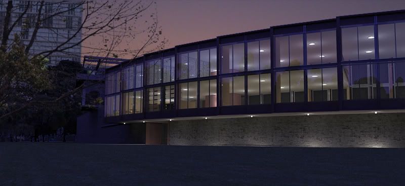
Chilean Embassy Addition (WIP) - updated Dec19
-
thanks, dzine and ross.
i am curious as to why the podium vegetation looks better in some renders than in others. there must be an explanation for that.
-
Maybe the direction of light? They are 2D trees, aren't they?
-
@gaieus said:
Maybe the direction of light? They are 2D trees, aren't they?
probably. yes, they are.
-
Although you could probably test some easy settings where the sun is shining from behind of the and the onto the face of them, you can surely not avoid certain situations all the time. Light can be a very effective element of a render and well, trees are just there...
Nice renders, BTW

-
Fantastic work Edson. You rendering skills have really come to shine. I agree the vegetation looks great.
Can you share render times/sizes with us?
Scott
-
@unknownuser said:
Fantastic work Edson. You rendering skills have really come to shine. I agree the vegetation looks great.
Can you share render times/sizes with us?
Scott
thanks, scott. i can certainly share this info with you.
top view: 1h41min, 1680x917 (viewport resolution)
middle view: 3h49min, 1680x917
bottom view, 2h8min, 1680x917however, you should note that i used the noisy preset which is a render setting that runs forever (that is, it does not stop when a render is done). thus what i do is set up everything and leave it rendering while i do something else or even go out. so the times i listed above are the time when i interrupted the rendering, not necessarily the moment it was done. for instance, one render of the middle view was fine in 21min but i had to throw it away because the grass was not good yet.
-
Edson, it's always a pleasure seeing your designs. Keep 'em coming.
-
Very nice. I particularly like the second one with the landscape reflection and the overall design of the addition.
My grandfather used to work copper in Argentina.
-
I have just added a 4th view to the ones posted above.
-
Edson,
I have to say, I rarely post and rarely reply but the design is fantastic. A beautiful project and as mentioned by others, your presentation is near flawless.
Best wishes,
Allen
-
thanks gu, daniel, bruce and allen for your kind words.
all i can say is that my progress in modelling and rendering began the moment i joined SCF and, later, the podium forum. with the help of several people i have been able to develop and fine tune my skills in SUp, podium and photoshop. it would take me much longer to advance this much if i did not have this amazing support.
-
my first night render. 24m to render plus 10-15m post processing.

-

Beautiful! I love this project and the renders are top notch.
-
WOW-O-WOW!
-
Very nice, Edson..!!

-
Photo...


-
Hello Edson!
Really nice renders!!
Did you give up on Kerkythea for good?
If yes why? -
@pg09 said:
Hello Edson!
Really nice renders!!
Did you give up on Kerkythea for good?
If yes why?thanks. yes i did (although "for good"is a bit too strong). KT is a great application -- and it is free! -- but we did not get along very well. many people create beautiful renders with it but i had difficulties dealing with it even for the simplest of tasks. later on i realized that i am more confortable with something which is an extension of SUp rather than with a stand-alone app so that all the preparations for the renders are done there.
podium suits me perfectly in that respect -- besides having a very short learning curve -- and with it i am being able to produce decent renders in short time. as renders are a means to the higher end of producing good designs, it is important for me that making them does not take too much of my time.
-
love what you're doing with Podium, edson..these are great... of course, the design doesnt hurt the image, either

-
I agree with Jason. Heck, if I had the time, I'd love to let either Indigo or Maxwell loose on your model. Great stuff.
Hello! It looks like you're interested in this conversation, but you don't have an account yet.
Getting fed up of having to scroll through the same posts each visit? When you register for an account, you'll always come back to exactly where you were before, and choose to be notified of new replies (either via email, or push notification). You'll also be able to save bookmarks and upvote posts to show your appreciation to other community members.
With your input, this post could be even better 💗
Register LoginAdvertisement


