Fiat 500 (animation added on page 3)
-
The last one does it for me .... its got movement

-
Thanks my friends...I enjoy working on this scene I must admit..
@Jakob, it's the Dosh low poly collection. It's been out for some years now (people are dressed 90's style
 ).Polycount is quite hight though even when they are considered to be low poly.
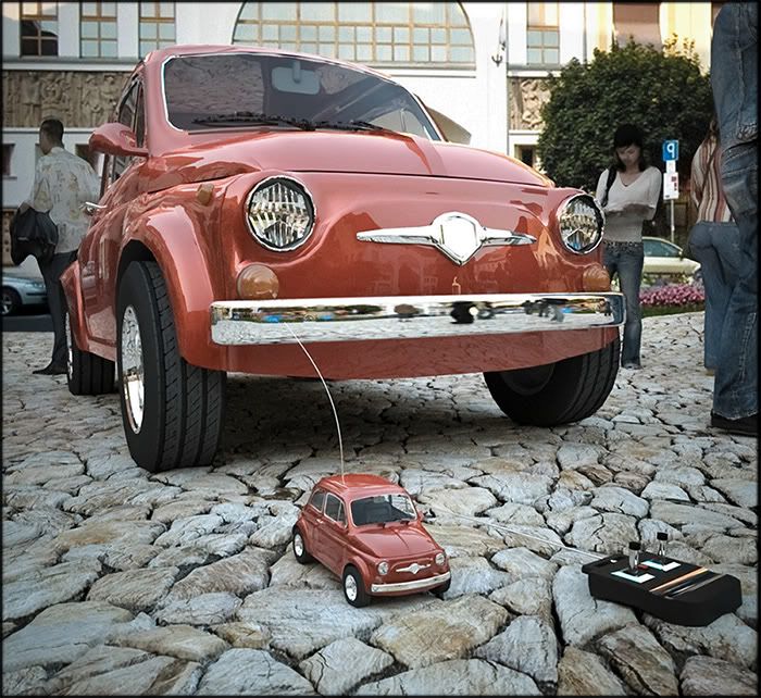
Next one: ' madonna with child '

-
 )
) 
nice
-
I'm intrigued by your stone texture. Is there a parallax map applied to it or is it just regular texture at a convenient angle?
BTW, I love the undersaturated tones of these images. Keep it up.
-
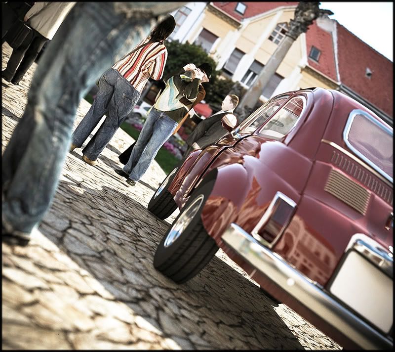
I re-rendered the Indigo version as it was kind of noisy:
(If you see only half of the image..right click and 'save as image' in IExplorer, or 'view image' in Firefox.)
-
Very nice evolution of the scene. Put aside the old Fiat 500, one of my favourite cars, if not the favourite, the dosh people you set are a touch of class.
I love the undersaturated colors too. -
Jon, best wait for kwist to give the full story, but i imagine its a displacement mapped texture.
-
Thanks guys

Indeed I used displacement on the stones in the Fryrender images.
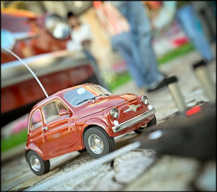
I couldn't get displacement to work in Indigo yet though .It's a brand new feature in Skindigo and I need more time to learn how to use it.The RC version in close-up. (Skindigo):
-
I see that my little toy's address has some utility

-
He he...

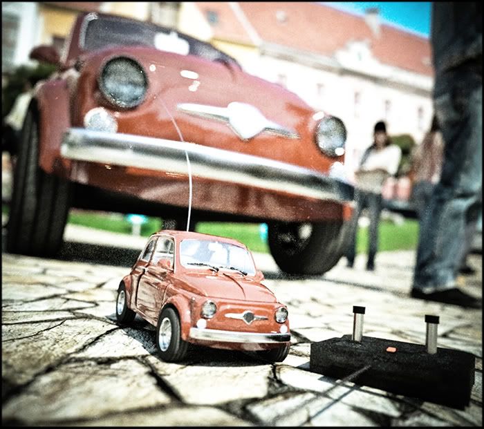
Simulating a bad photo camera from the seventies (you know, the 'Polaroid' one that spits out the photo at the front


-
Those renders are very great

You are the master. You are not only good at rendering / textureing, you also master the ability to compose scenes in a dramatic and surprising way. And on top of it - you master postprocessing - I envy your talent

Thanks for contribution. I think we all can learn alot.
-
Wow...thank you Bo. That is a great compliment.

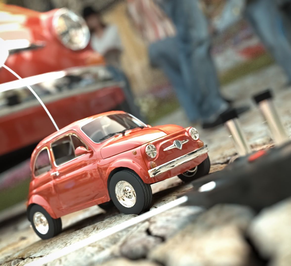
This is the final image (otherwise I get the feeling I am gone bore you all to death


The RAW Fryrender output:
(...right click the image and 'save as image' in IExplorer, or 'view image' and use magnifier in Firefox )
-
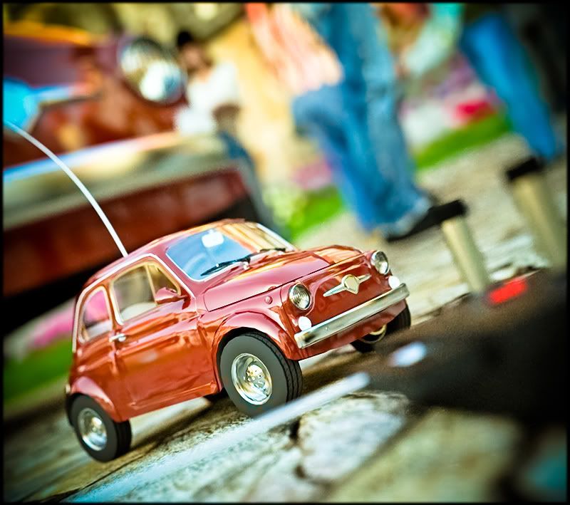
I will be rendering the Indigo version a lot bigger (5000X...) to serve as a poster in my office.
This is the poster design I came up with (Photoshop).
I want it to have vibrant colors:(to view full size: right click...)
-
I LOVE it!!


Damn! I can't think of anything else to say...
-
@kwistenbiebel said:
It seems that Richard (see his low poly car thread) found a good balance between low polycount and good quality. Hopefully he'll share some of his tricks ...
Yeah mate, although you called your thread Low Poly it's still pretty high when the view the lineworked image you've shown!
Mate the tip I can give you is I mapped the detail! Colour, clip and weight! Lenghty process and fair bit of trial and error to date! Had to drop it this week but will continue on soon!
By the way my Low Poly version was 3,500 entities / 600kb file mapped! I'd suggest your Fiat would be up around 20,000+? Mind you I wouldn't be going so close up on my version though that said I'm not aiming to achieve that - they are aimed more for Arch scene fillers not subjects if you know what I mean! The thread http://www.sketchucation.com/forums/scf/viewtopic.php?f=81&t=10730
BTW mate love the renders with the RC car!!!!
-
awesome renders as always! how long is the average render time in fry?
-
your renders are always stunning!
-
-
how cute. the music indicates a deep, everlasting love!
-
Thank you guys

As an update to this thread, I post a little animation of the RC car ,done using Skindigo.
Unfortunately, Skindigo doesn't seem to be capable of animating the 'Depth of Field' (focal point).
The DOF should shift between the big car, the RC car and the RC itself but it doesn't seem to do that...[flash=480,360:2ajqj49i]http://www.youtube.com/v/dDPQmdN9h0M&hl=en&fs=1&ap=%2526fmt%3D18[/flash:2ajqj49i]
Hello! It looks like you're interested in this conversation, but you don't have an account yet.
Getting fed up of having to scroll through the same posts each visit? When you register for an account, you'll always come back to exactly where you were before, and choose to be notified of new replies (either via email, or push notification). You'll also be able to save bookmarks and upvote posts to show your appreciation to other community members.
With your input, this post could be even better 💗
Register LoginAdvertisement


