New icons
-
-
hi ibon,
are the new icons for the bezier group on the last row? they looked pretty good

try uploading the rar in upload attachment.
-
-
that was fast, thanks ibon!

-
Thank you Ibon...
I like a lot the icons of the tools on surface too!
Nice work!!Daniel S

-
-
Dear Ibon,
Could you send the icons in a .zip folder as I do not have the software to extract files from .rar folders. Thanks.
Kind regards,
Bob -
Thank you Ibon!
They are great

Daniel S
-
-
Ibon,
Your icons are great, I like the design.
Could you however make them a little big bigger so that they cover the samll button surface. In Sketchup with 'small' buttons, we do not see enough of the details.
Also, if not too much asking, I would need the cursors (also as png in 32x32) for the cursors, as they are supposed to be inspired from the icons.With your permission, I think of adopting the icons and package them in a next version.
Thanks very much
Fredo
-
Fredo6, It would be an honour for me of course. But there's one thing i don't understand:
When I made the icons i set their resolution at 24x24, because if it was bigger, when i open sketchup they look worse. So if you have "small icons" mode in sketchup won't be more logic to have smaller icons instead of bigger (32x32). It's only a question, I don't know how it works.And well, to make icons i made a sketchup model, exported image, opened it in PS, put out their background and resized them to 24x24. The i erased the sketchup model. So i dont have the original skp file, i cant make then bigger (only with PS). I'm so sorry, i didn't know anyone would like them

-
Ibon,
Actually, this is not the size in absolute pixels that matters, but the fact that you use the full square area. I guess you could just scale up a little bit the drawings, to use more real-estate in the square. In this way, we can distinguish the circle from the polygon, which otherwise are quite small.
For the question of big vs. small icons, I made provision in the code of Tools On Surface (and Round Edge) for icons to be specified both in 16x16 or 24x24.
The naming convention is that the plugins accepts 3 file names, for instance:- TOS_icon_Line.png
- TOS_icon_Line_24.png
- TOS_icon_Line_16.png
The script will look first for the most relevant one if it exists, and otherwise try the other filenames.
In the current version, I was lazy and just design icons in 32x32 to go to the small and big toolbar modes (my opensource icon editor does not support 24x24 and 16x16).
Again thanks for your initiative
Fredo
-
Fredo, i made the icons only for me and that was the only reason i didn't ask permission to you. But if you want i would be glad to make again all the icons and asociated cursors. if you plan to include them in your next release i will work whatever is necesary until i achieve the best result. this time i would send you them instead of posting, and you will decide if they're apropiate or not.
I end my exams at 23 june, so after that i will start working on them. Of course, only if you want. Only tell me, and thanks again

-
Ibon,
Take your time, Tools on Surface is still a quite long story (and requires many more icons and cursors).
Just to be sure I was clear by 'scale up' is simply to use the maximum space in the button, as in the following sample:

Thanks in advance
Fredo
PS for Daniel S: your icons were not bad too, and actually very much in the style of Sketchup, with the brown color.
-
For me the Ibon icons look really good and much better of what I can make.. but I believe that the icons will look better with a brown color on surfaces too. Is something that can be easily changed.
Offtopic, but today using tools on surface I thought that a "scale on surface" would be useful. Not making a request because you have already too many things but I´m telling this because something like that can replace some other future tools. For example, using the circle OS and then using the Scale OS you can make the Ellipse OnS, or with the poligon OS you can make a square and then with the Scale OS make the rectangle OnS. Just a thought
 ...
...Daniel S

-
I agree with you, Daniel S. the wonderful icons look even better with a brown colour (thus blending in to the overal SU icon style).
good luck for your examns, ibon. I am looking forward to your new creation...
"ScaleOnSurface" - what a wonderful idea! I am confident eventually fredo6 will succeed in including inferrences into his marvellous toolset though (so that the rectangle tool will signal, wenn being a square/golden section, and we don't need the scale tool for that anymore).
fredo6, the wishlist for you gets longer and longer... but every time you check off a point on it, hundrets of SU freaks have tears of joy in their eyes! I haven't had that many birthdays a year in my whole life!

-
@daniel s said:
Offtopic, but today using tools on surface I thought that a "scale on surface" would be useful. Not making a request because you have already too many things but I´m telling this because something like that can replace some other future tools. For example, using the circle OS and then using the Scale OS you can make the Ellipse OnS, or with the poligon OS you can make a square and then with the Scale OS make the rectangle OnS. Just a thought
 ...
...Daniel S
Actually, my plan is simply to release a Polygon tool specified by 3 points, which will cover ellipse (with high number of segments), down to rectangle (4 segments) and isocele triangle (3 segments).
Otherwise, the only idea I could see for Scale On Surface, would be to force the Offset in a particular direction, or in radial mode, from a particular point. In the general case, I think you have a better control with the Offset tool. -
but "Scale" would be one of the last tools to add - for having the one "OnSurface" button!

we have allready:
- line
- circle
- polygon
- offset
- push/pull (joint push pull tool)
now its only left:
- rectangle (which already exists with the polygon tool)
- arc
- freehand
- move
- rotate
- scale (which is indeed an offset with contoll in two directions)
- follow me (???)
then we still can use ibon's buttons (if you press the one, the great, the wonderful OnSurface button, all above tools change their icon).

sorry, just dreaming. got a bit carried away

-
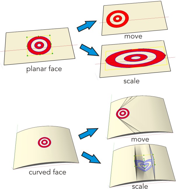
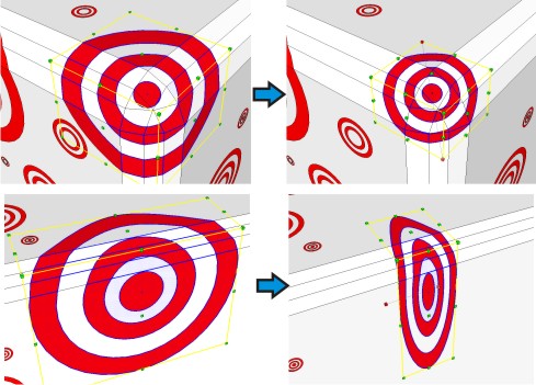
I must admit that the idea of a scale on surface sounds strange.
The idea was to quickly change a draw on surface like a move OnS can easily change the position of the draw OnS.
SU make this very well on planar faces... but in curved faces is very bad.
I attach images only to explain and clarify what i tried to say.Daniel S


-
Where do we place them so we see them on the toolbar?
D
Hello! It looks like you're interested in this conversation, but you don't have an account yet.
Getting fed up of having to scroll through the same posts each visit? When you register for an account, you'll always come back to exactly where you were before, and choose to be notified of new replies (either via email, or push notification). You'll also be able to save bookmarks and upvote posts to show your appreciation to other community members.
With your input, this post could be even better 💗
Register LoginAdvertisement


