Thank you db11, I did try a rendered version but the NVR worked better. I too remember playing with Meccano and realise that it had given me a great start for when I entered the world of work.
Posts
-
RE: Model steam engine
-
RE: Model steam engine
A short animation of the steam engine using the SU native Scenes and Export animation to image set. A little post processing in Photoshop and saved as a GIF. I did try using Fredo6's Animator and although I could get all the parts to move as required I could not get them to work together in sequence, I think the math involved is a bit beyond me! Anyhow, here it is.
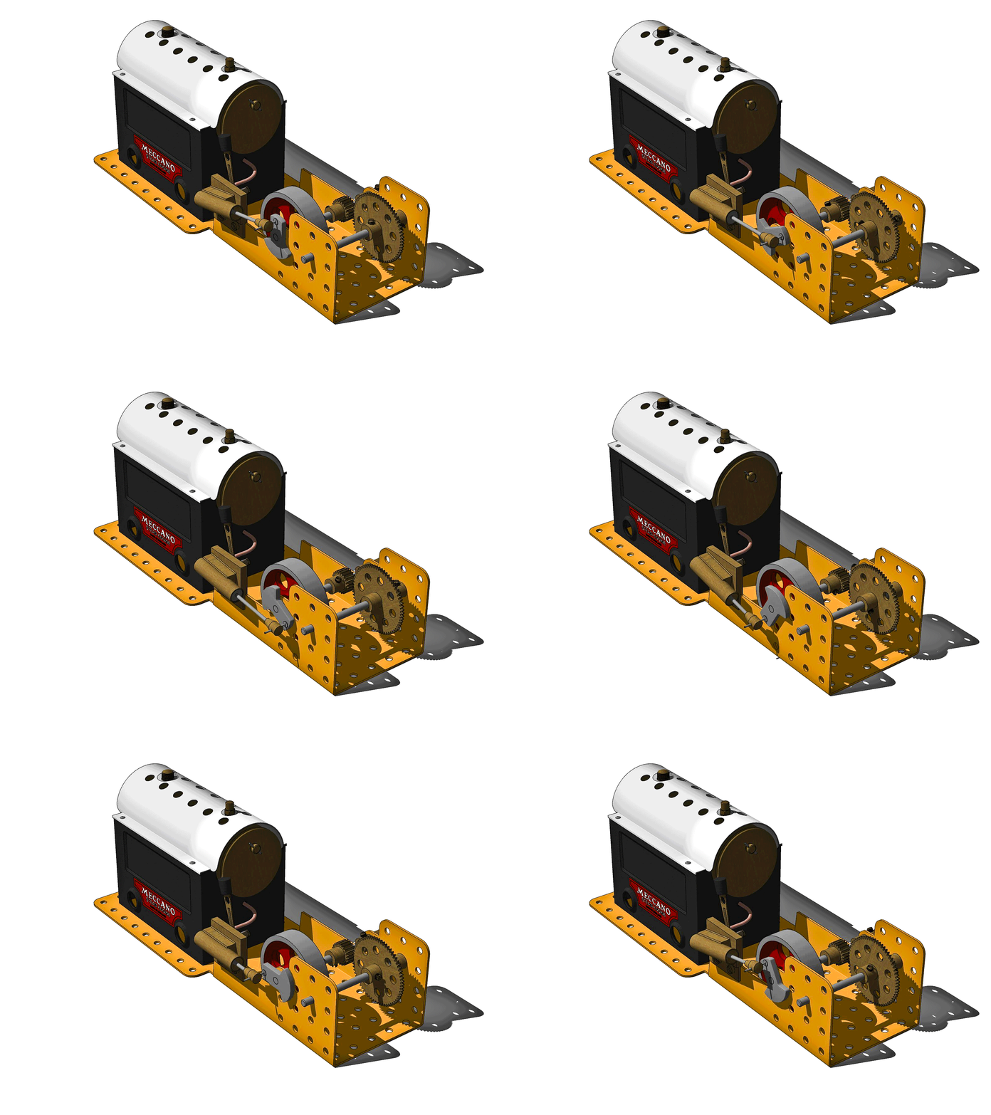
Click on the GIF to view.
A very Happy New Year to all.
-
RE: A cosy retreat
Thank you both xayzer and Mike. Haven't been able to visit the forum much of late but the comments are greatly appreciated! My original title for the model was 'Student Accommodation'.
-
RE: Looking for Command Alias Editor Plugin.
No need for gurus, ruby or otherwise, nor plugins. On a PC go to the Window dropdown menu then Preferences and then Shortcuts. Here you can assign various keyboard shortcuts even using just the one keystroke (just like AutoCAD!) You can also reassign any shipped SU shortcuts including L for line.
-
RE: Isamu Noguchi Clock
Superb render! I just went scrolling past the mesh in the 2nd image looking for the 'real' render until further posts had me backtrack to the start.
-
RE: How to replace face me textures en mass?
TIG's Global Material Change (Plugin Store) might help. I think you would need to adjust the texture in each different FaceMe though.
-
RE: Modelling a tramway
Fantastic detail and quality as always. I wish I could get the shiny rail track that you achieve. I must add that Edingen seems particularly well served by public transport!
-
RE: Grunge living room.
I really like the glass top table and lamp. It gels with the sofa and appears far more stylish than the book lamp in the original render. Floor looking good also, but what have you done to that beautiful and intriguing hole in the wall? I used to pass an old and dilapidated farm building every day. It too had a hole, lower down and with a rusty wire grill. For some, weird, reason I looked forward to seeing that hole and was disappointed if my view was blocked by traffic. It had character, charm and interest. It was a sad day when the owner renovated the building and the hole was gone. Same with the feature in your wall!
-
RE: A cosy retreat
All modelling was done in SU Pro (2017 I think). The only item I did not model myself was the Bentwood chair. This came from Podium Browser, which ships as part of the Podium render app. I use the Pro version which gives a far greater selection of materials, backgrounds and 3D content. The textures were from Podium, Sketchup Texture Club (member for hi-res texture versions), native SU textures and my own images. I process textures in Gimp (from within SU) or Photoshop when starting from scratch. I struggle with anything other than bump maps in textures. Fredo6's ThruPaint is the go-to for UV application, a big thank you to him and to all the plugin authors who make life easier.
Actual rendering was done in Podium, I find it relatively easy to use although it needs (I need!) a lot of test renders to get the effect I am looking for. Post processing is completed in Photoshop CS3 with the Camera Raw plugin which is a very powerful set of tools for image adjustment all in the one work-space.
As for that foreign country which is the past, are things really better in the present? Different, yes but better? A debate for another occasion I think. Oh the winter wonderland joy of icicles on the inside of the windows and a tasteful layer of newspaper on the concrete floor.
-
RE: A cosy retreat
Happy to oblige. These are from the same project including a close-up of the 'Guzunder'. Although impoverished, the occupant of the room is well-off enough to own a pot to p*** in!
-
RE: A cosy retreat
Thank you for the comments guys. I must try and keep up with the latest descriptors! I appreciate that Mike's render was what I would have termed 'shabby chic' but the terminology has obviously moved on. Essentially, it was the wall texture that reminded me of my own past project and moved me to post.
-
RE: A cosy retreat
nxtdave & HornOxx. Thank you both for your kind and generous comments!
-
A cosy retreat
Prompted by Mike Amos's recent 'Grunge living room' post, I venture to submit a render from an exercise done some time ago. Its far from perfect but was an attempt to create something that wasn't clean and sparkling.
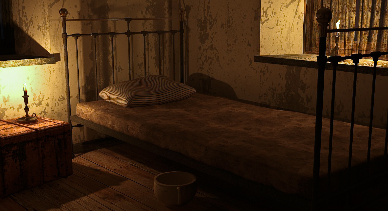
Rendered in Podium V2.5
-
RE: Grunge living room.
Try Architecture/Wood Planks/Old wood boards for the bare floorboards. (Sketchup Texture Club)
-
RE: Grunge living room.
At Euro 12 for a year's access to the hi res versions, Sketchup Texture Club is great value.
-
RE: Work around to open 2018 in SU2017
Eneroth3: 'Open newer version' from the Extension Warehouse does this.
-
RE: Making a shed roof with a diagonal slope
Using SU native tools, would this suffice?
Pic 1 shows shed walls with the roof drawn flat. Make sure the two elements are grouped separately.
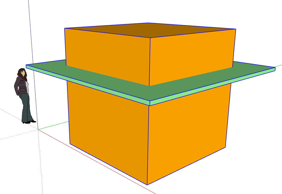
In Pic 02 the roof is rotated on the red axis.
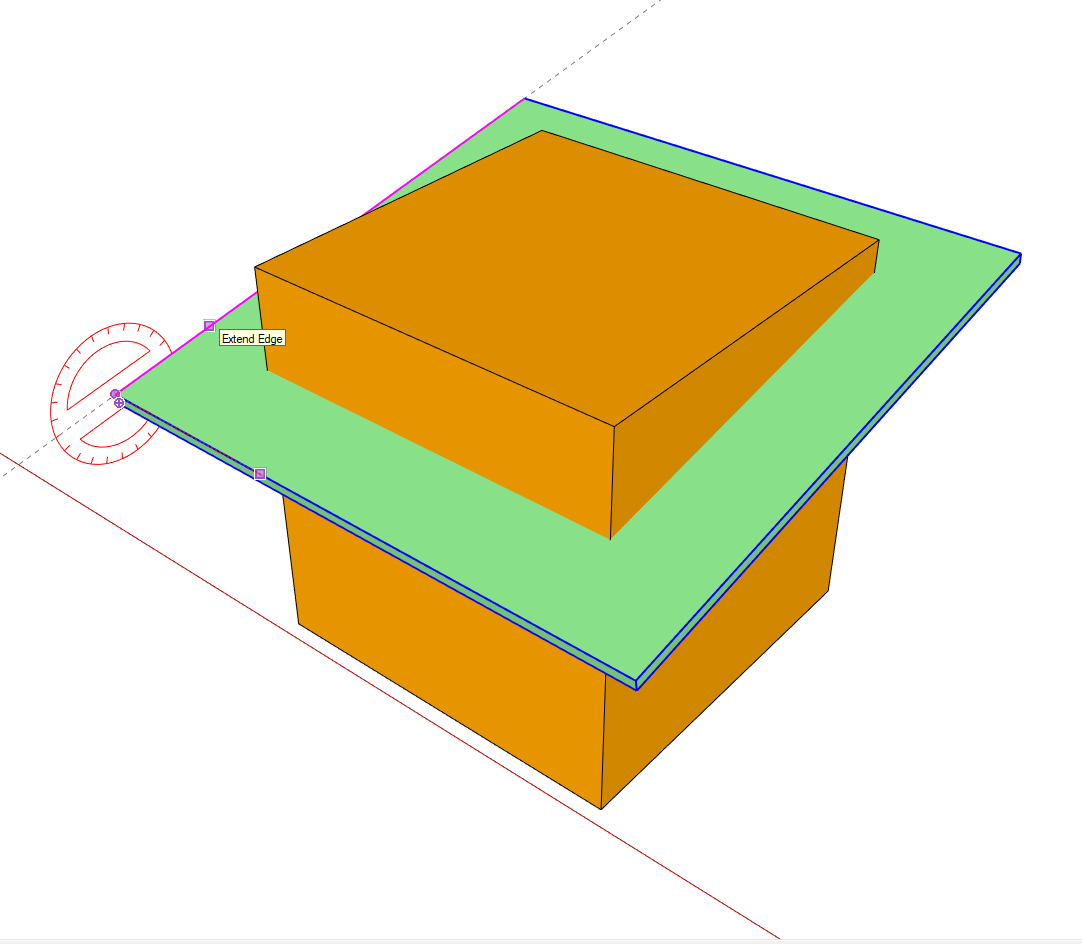
In Pic 03 the roof is further rotated, this time you use an edge at 90 deg.
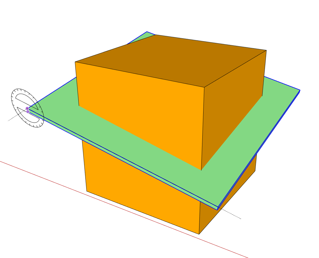
After adjusting the roof height to your requirements, intersect the wall and roof groups and trim off the excess wall. Pic 04 is the finished shed with hidden lines turned on to show each corner at a different height.
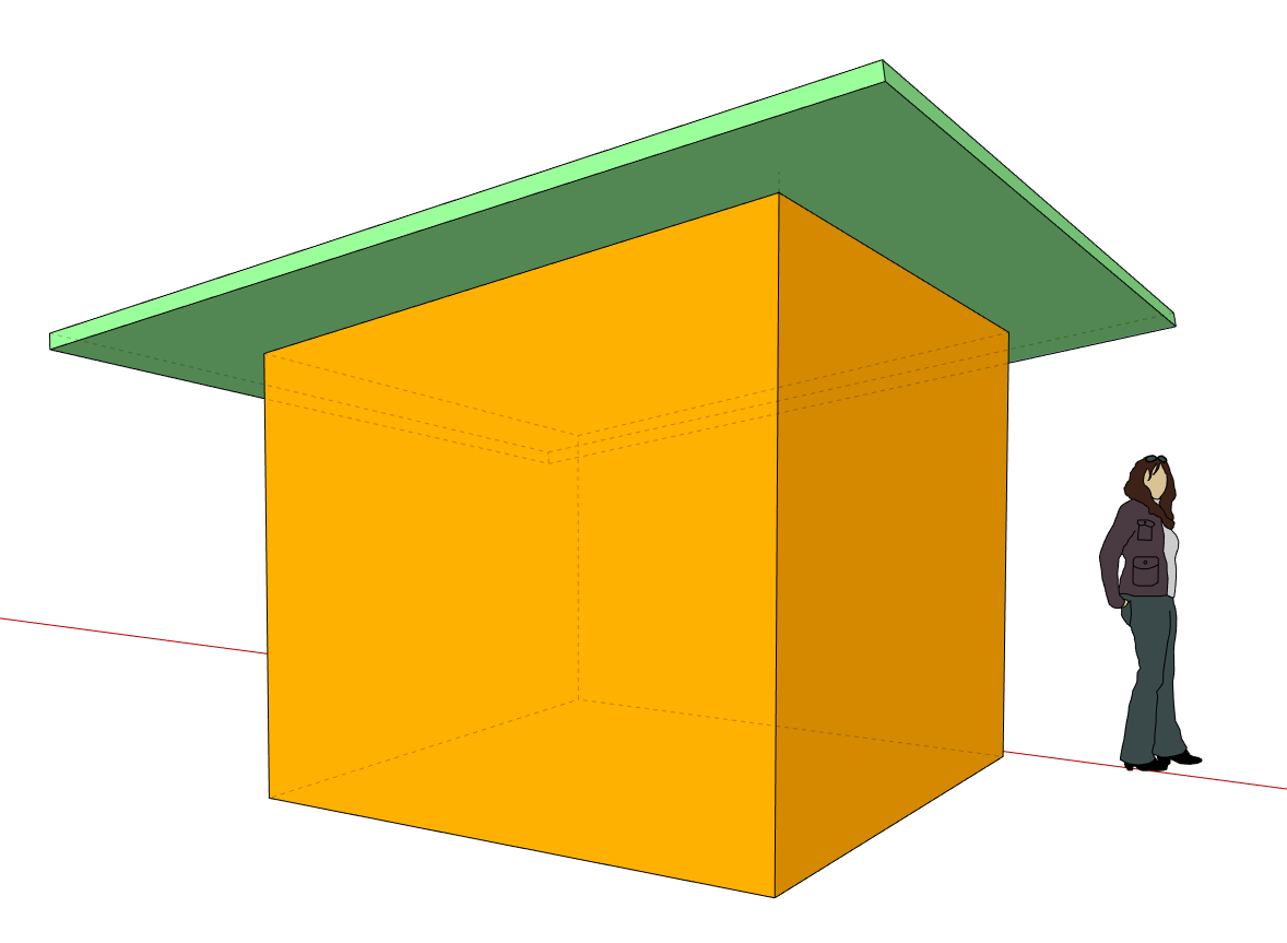
No doubt there are more ways to do this but hope this helps.
-
RE: Edge visibility through glass in Layout
I came across this whilst doing drawing work for a cabinet installer. I found that I had to hide the glass elements in the SU model and overdraw the space in Layout with a semi-transparent shape to represent the glass. Seems to be the only way to get this to work in a 'Hybrid' viewport.
-
RE: Changing dimension template
Did a quick search in the Plugin Store. TIG's Area Formatting could be what you need. I tried it out and it seems to convert the text tag that is selected rather than a global effect.