Phillip:
But of course! Lovely! Thank you SO much!
~Susan
Phillip:
But of course! Lovely! Thank you SO much!
~Susan
Hi Guys:
I am trying to add the OnClick Behavior to the left and right doors of this component. The left door moves away from its hinge position when rotating. And the left door has a mind of its own. I would like one (1) door to open 90-degrees to the left and one (1) door to open 90-degrees to the right.
Kindly help! If you could set the attributes and upload the model that would be awesome! Thank you in advance!
~Susan
Perfection! Where did you get the plans to model the house?
Love the fence/gate in front! Awesome job!
Thank you Philip! Really appreciate you taking the time to help me out!
~Susan
Hi Philip:
Could you add the attribute then upload the model? Now the sides are growing as the component grows. I'm missing something.
Thank you!
Susan
Hi Guys:
I have created a dynamic component of a cabinet carcass and set the X Lens Options to: 30,45, 60, 90 & 120cm wide. As the component increases in size along the x axis, the right side panel does not align with the right side of the component. What attributes am I missing to keep the right side of the 'right panel' face aligned w/the 'door' & 'bottom' as it grows?
Thank you in advance for solving the issue!
Any forum members have an excellent seamless 'Carrera Marble' texture? Been to all the sites and I've yet to find a good one, let alone one that's seamless.
Appreciater!
Susan
Hi All:
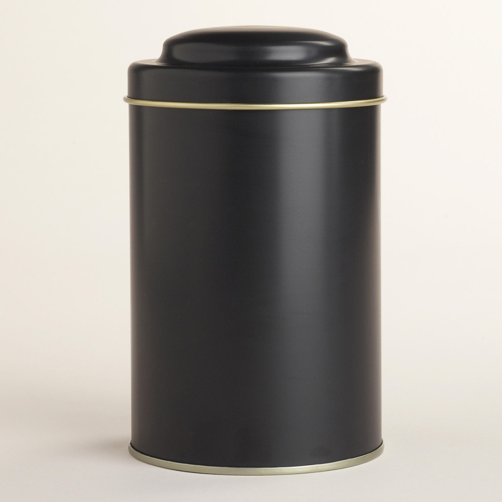
Anyone want to model this tea tin? I need it both w/the photo texture mapped on, as well as a version with two textures (the black on the tin and the gold rim) so I can render it using VRay.
Size: 4x4x6
Much appreciated!
Susan

Absolutely fabulous design! And a great presentation! Bravo serrot!
Oli:
Thank you for all the great tips!
Just created a dropbox folder, so I will share the link w/anyone wanting the model.
Hi Oli:
The desk is 30" high, but it does set back 12'-0" from the face of the outermost bookcase. So the perspective is deceiving. And yes, I did use Gaussian Blur in PS. So it is not the camera settings. I would definitely like to see warmth added to the image. I also think the glass handrails could be better. Thoughts? Anyone wanting to give this scene a go, send me your email and preferred version in a private message and I'll email the file.
Thank you again!
~Susan
Hi olishea:
All awesome crits! I believe the blur is PS post-work. I don't see it, but will probably learn to with time and experience. The Eames desk chair is in fact to scale. I am a stickler for scale and always verify the dimensions of the actual furnishings since more often than not purchased models are not scaled properly. It might be due to the fact that the Tom Dixon wing chairs are over-scaled in actuality. I agree about them appearing like big dark blobs. Don't know what a material template is, but I would like to know and utilize the technique in future renders.
A big thank you for taking the time to help me to perfect my rendering techniques!
~Susan
Nice! Perfect material on the glass handrail in the first image!
Hi Carloh:
Awesome suggestions! The stone on the floor of the project is actually huge, but I don't really like the default floor texture I used, so I agree it could be better. Would love to have had the time to add books and objet d'art to the bookcase. I think it would really bring some life to the image. The intent for this rendering was to get the client to sign off on the design solution and they did. So thank God for SketchUp and VRay! Both excellent communication apps!
Hi olishea:
Would welcome any crits! And thank you for asking.
Hi Carloh:
Image has a lovely feel w/the village lights in the background. It definitely feels like Christmas morning. Comments by others give you excellent direction to improve this scene.
Cheers,
Susan