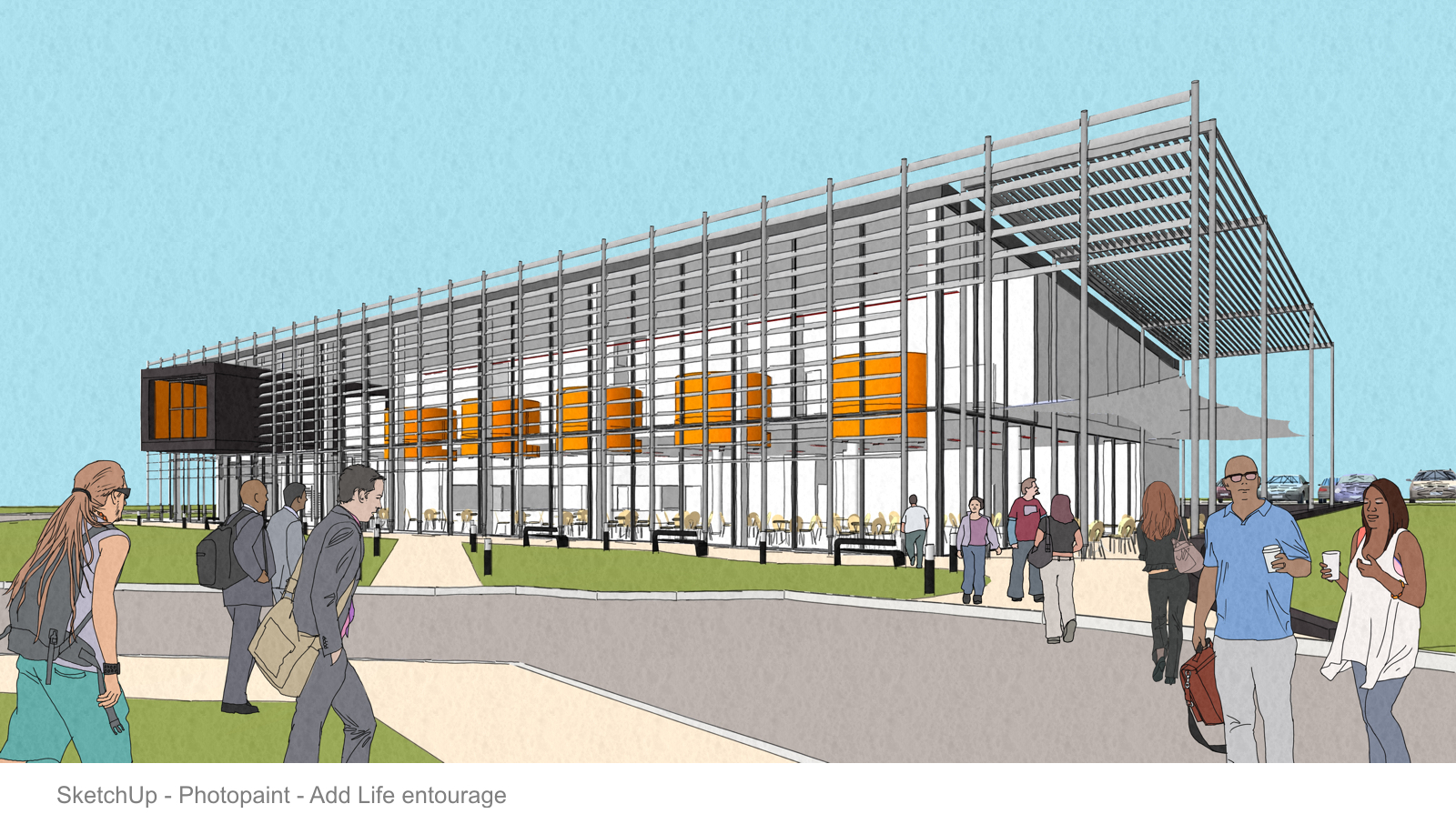
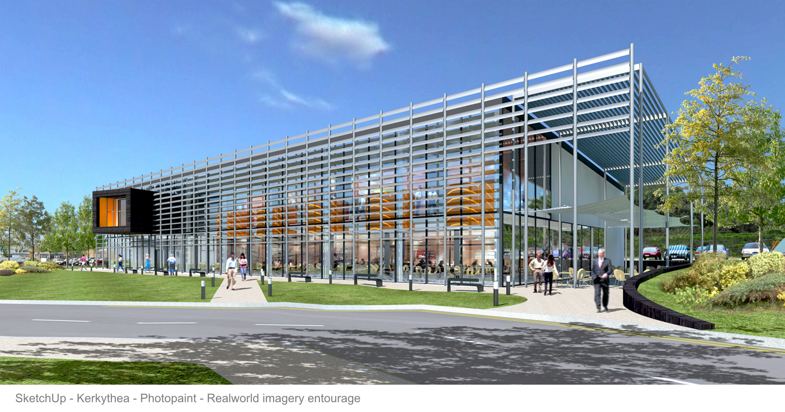
After 6 years of using SketchUp professionally I still think its the dogs doodars (a UK saying I've never understood !!). A simple concept output for initial meets and the final render. Apologies to the photoreal guys this won't be up to your standards....I'm more NPR.
Posts made by Landie
-
NPR to photoreal
-
RE: NPR moved on
For cadmunkey...meant to post this last week to give you a better idea of the close in detail of the figures. They kinda look photoreal when reduced right down but they are digitally hand painted. I've just blended these in a little around the edges to sit them in properly to the rest of the image.
-
RE: NPR moved on
@cadmunkey said:
Great image Landie, could you tell me where you got your people entourage? I notice there are lots of (UK?)asians and Ive never seen a good collection of asian people.
Hi Cadmunkey....The Asian people are from the guys at Add Life and I believe they are posting these up next Monday at http://www.add-life.com. They are all 2D clipart for use in PS and digitally hand drawn, which is great for my concept visuals where I want everything to look loose and painted.
-
RE: NPR moved on
@dale said:
Could you erase the 4 hours part....could put me out of work
Seriously you certainly have done a great job.I wish I could erase those 4 hours and the stress it caused me..!
-
NPR moved on
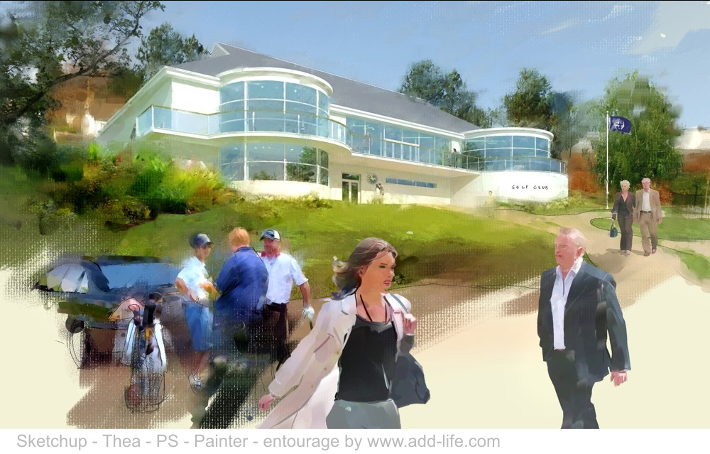
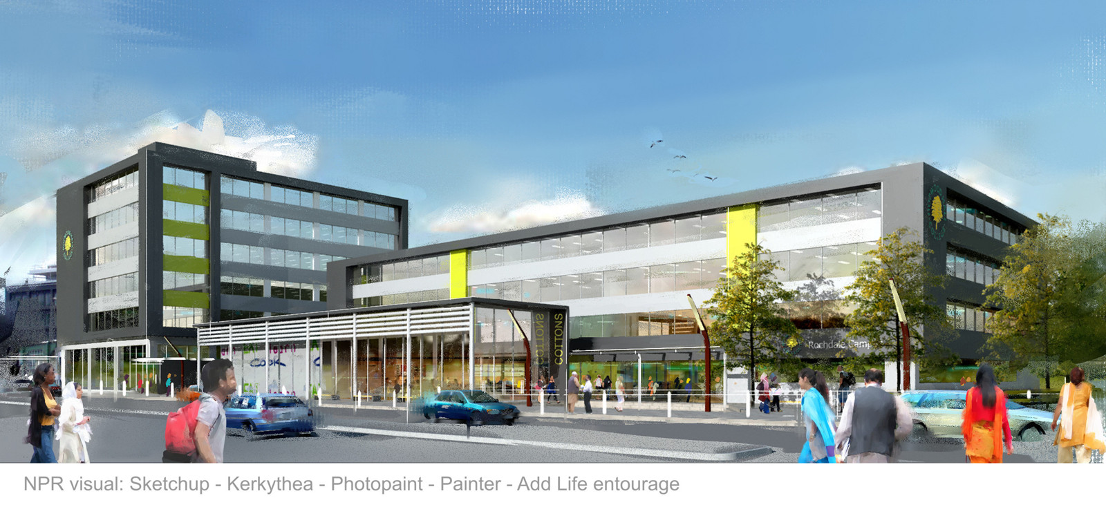
This is a latest visual using my NPR method. This had everything in it: Photomatch modeling, new elements modeled and integrated, concept level information...ie not much at all, and a time limit of 4 hours. I finished in painter for a loose concept feel and popped on the add life entourage to infer place. That was a tough day!
-
RE: NPR Style Method [Tutorial]
@unknownuser said:
Cool workflow
Thanks
@d-space said:
Cool work!
Seems like preset 6 are getting popular for KT, but the "Thea" on the final composite is confusing.Yeah, thats me....confused. You are right of course, should be Kerkythea not Thea
-
RE: NPR Style Method [Tutorial]
@utiler said:
Nice work, Landie.
Just wondering why you chose to compose the scene in PS and not add entourage in SU? File size?I just find that its a bit more with the initial medium....
Thank you. I work this way becouse it allows me a lot more freedom with composition. Especially with the people. I can reposition things until I'm happy, without having to go through the rendering process each time. It is also a lot quicker to amend if later on the client wants extra people or another tree for instance. I also like to keep the 3D clear of people as what works with one view of the building may not with another. I think working 3D is fantastic and I couldn't do without it, but there is still a lot better done 2D
-
RE: Twilight Render - Regas Challenge
Hi Oli. I really like the early morning version. Maybe I'm not up to speed but what is the Regas Challenge?
As for people motion blurr etc, have you seen Iain Denby's work. He put's that to great effect and I think it adds a huge amount to an image. Especially exteriors. For me Architecture is as much about the use as the form. I'd have a party in full swing inside and this guy is a late arrival.
Really good work Oli. -
RE: NPR Style Method [Tutorial]
@andre51 said:
Can you tell us a bit more of what cloner brush/paper settings you use in painter?
I don't know painter that well so any help will be appreciated.Hi Andre. I prepare a flattend psd file 300dpi at about 2200 pix wide. This works well for the brush heads in painter. Too big a file and the brush stroke drags and the marks are a little out of scale for me.
So open the image in painter > file menu > clone. A new image is created called clone of whatever. In the Select menu > All > Edit menu > Clear. The new clone image is gone and you have a blank white sheet. The original image to clone is still on screen behind your blank sheet. Go to the side toolbar and to the square icon for paper selection. Here I usually go for Artists Canvas. now you're ready to paint.
Now I go to the Window menu > Color palettes > Show colors. This pop up has an important button on it in the shape of a rubber stamp. to clone paint the image behind, whatever brush you use this stamp needs to be clicked on.
Now go to the Window menu > Show layers. Leave this pop up on your screen and straight away add a new layer to work on. I would'nt bother with watercolour layers to begin with.
Now choose your brushes from the brush category selector at the top and have fun. I usually mix and match oil pastels, airbrushes, pencil, blenders etc. Add a new layer for each type and build it up.
Let me know how this works for you and I'll post a second explanation of brushes. -
RE: Down the stairs
I'm always impressed by these top end PR images. The lighting quality is beautiful. But for me its the composition and the frame proportion I really like. My eye flows around the image easily landing on the bright spot. No eye catchers in the wrong place.
-
RE: Sketchy presentation visuals
@unknownuser said:
awesome! where can I get those people? I'm quite bored with Sang, Nancy and Bryce...
Hi Martha. These entourage people are something I've created myself and are available at http://www.add-life.com. You can download some free samples and if you don't see what you want or you'd like smaller ranges just let me know. I developed these because like you I was bored of the standard SU people and I wanted the people to be a lot more varied and relevant. Anyhow, glad you liked them.
-
RE: Sketchy presentation visuals
@olishea said:
you should really post this in teh Gallery section, it will get more attention. nice work and style
Thank you Oli, I'll give it a go
-
RE: Sketchy presentation visuals
@rickgraham said:
Those people playing the violin and saxophone - are they playing in the middle of the street?
Rick
Don't worry, the cops will move 'em on soon.
-
RE: NPR styles
Hi, I've just put up a new post to share the NPR method I use. Still on the Gallery forum. Called NPR style method.
-
RE: NPR Style Method [Tutorial]
Thanks Ken...and Pete, you're right.... setting 6 in Kerkythea. It renders very quickly but gives exactly what I need for the later stages.
This is an impressionist style and so no need to push the render too far toward PR. -
RE: NPR styles
@daniel said:
Great work, Landie - the kind of work I'd expect to see from someone who does this for a living.
It's only just a living Daniel. The recession has hit our profession very hard here in the UK. Thanks for your comment. Appreciated.
-
NPR Style Method [Tutorial]
I was asked if I could share my NPR method. Happy to do that. Here it is.
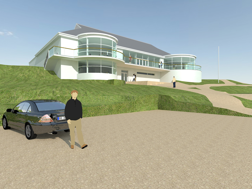
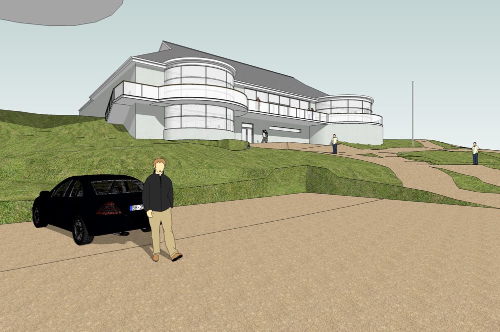
First stage is all Sketchup modelling, lighting and for this visual style some simple materials and colours. This is then exported to, in this case Kerkythea.Second stage is to do a simple render from, Kerkythea on setting 6 at about 2100 pix wide. small and quick. I put a little specularity on a couple of materials and gave the glass a bit of depth, but that was all. Save a png render.
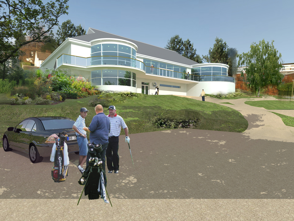
Third stage is compositing in PS working with some alpha masks for the glass and all areas around the building. No need to be too perfect. Save out as a flat PSD ready for overpainting.
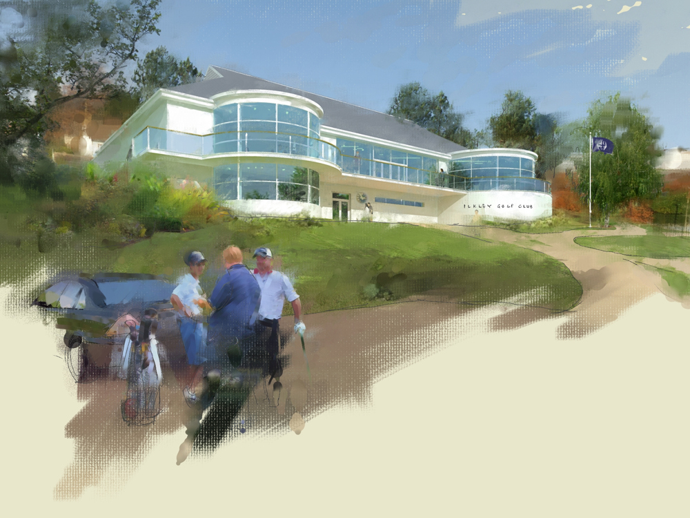
Fourth stage is to bring the image into Corel Painter, set up for clone painting and away you go. It's not essential but it does help to have a graphic tablet and pen for this bit.
Fifth and final stage is to add some extra entourage from the opaque range at http://www.add-life.com, enhance the colours and contrast, and resize to suit.
Well that's what I do If I want a hand drawn NPR look and I've had some great responses to it. Hope you found it of interest.
-
RE: NPR styles
Thanks again for the encouragment. With entourage I find it's worth making the effort. I always apply people in the PS stage. Gives a lot more scope for composition.