Cool new site, interesting the sort of appstore for te plugins 
bummer whit the buttons on the new sketchup version.. I would have preferd if the icons would stay the same.
Greetingz
Dirk
Cool new site, interesting the sort of appstore for te plugins 
bummer whit the buttons on the new sketchup version.. I would have preferd if the icons would stay the same.
Greetingz
Dirk
Great work.. And it was an impressive presentations at BaseCamp  ...
...
btw.. we became fetured user on the frontpage of archello.com with this project.  just wanted to let you know http://www.archello.com/en
Hahah Pilou is this good or bad 
Thanks for the reactions so far I apriciate it..
And if you feel you need to say more please do, I like to learn.
Thanks 
https://www.facebook.com/DirkdeJonghLeerdam
http://www.DWanimations.org
Different design...
I was working on a other design and was wondering what your C&C would be. I know its a design maybe for a specific type of people but I really like to create contrast and also whit a bit of calmness in the colors this time. Please let me know your thoughts..
The work flow is My head  -> SketchUp -> a lot of SU plugin`s -> Vray -and PS.
The system used for the design as wel as the rendering a Dell T7600 Xeon 12core 32gb RAM
Thanks 
https://www.facebook.com/DirkdeJonghLeerdam
http://www.DWanimations.org
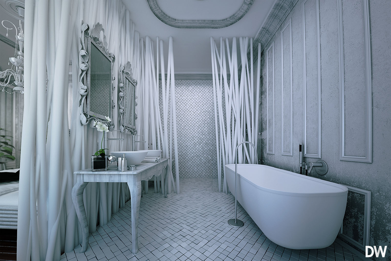
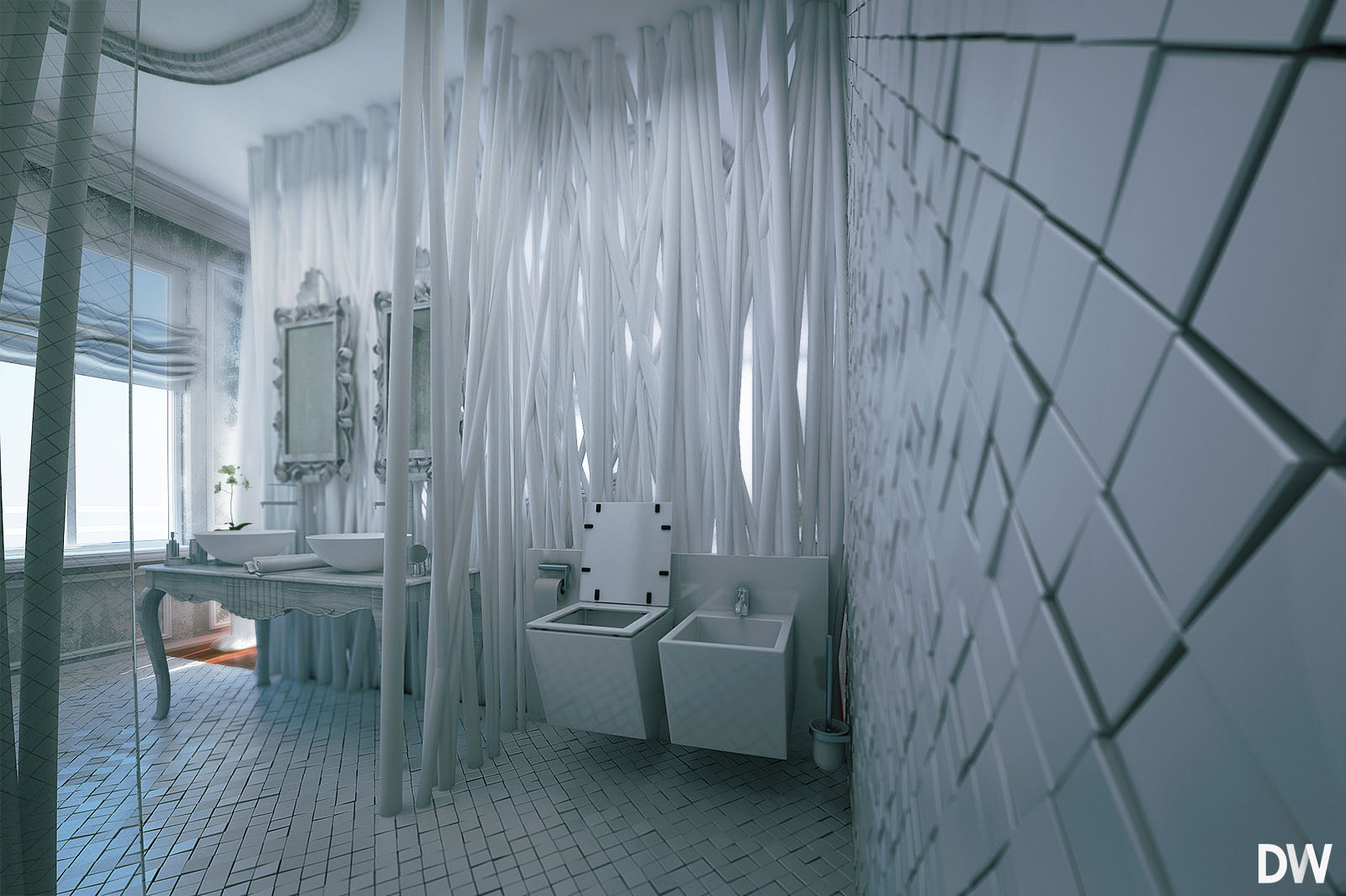
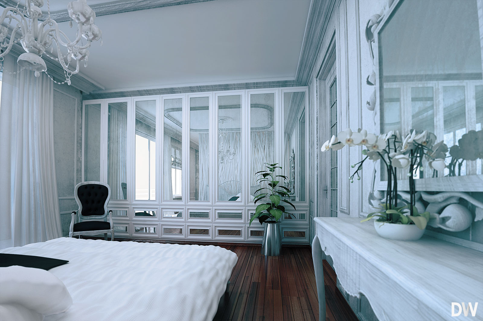
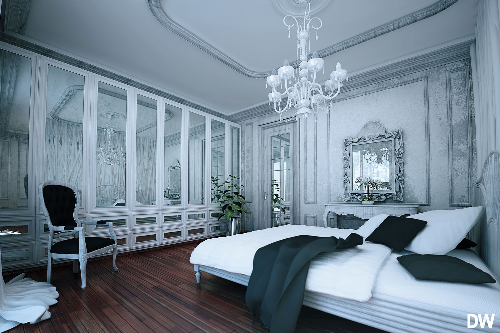
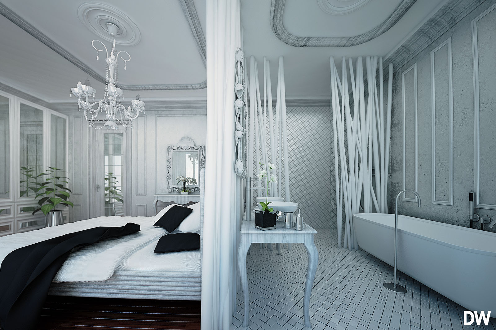
Let me try this with a white sealing.. I`ll get back to you... Thanks for the reactions so far. I apriciate it
Thanks for the reactions so far guys, I appreciate it.
About the sealing. I tried white first but it did not work for me because the room got to white overall and I missed the contrast in the views. I am now working on a full-out classical version because the client would like to see bought. When that Is done I will post it here.
Please if you have any suggestions about the design or questions let me know.
Kind regards,
Hai all.
it’s been some time ago sins my last post but here is a new one:
I am working on a new interior concept and using SketchUp and Vray as base software..
I was wondering what you thing about the impressions, client wanted to be classic.
C&C Most welcome
https://www.facebook.com/DirkdeJonghLeerdam
http://www.DWanimations.nl
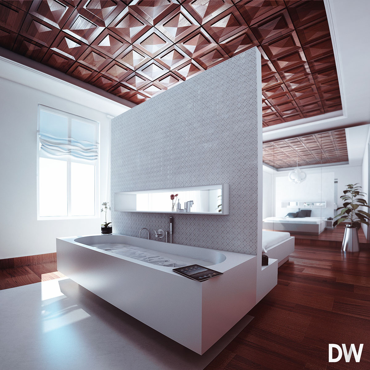
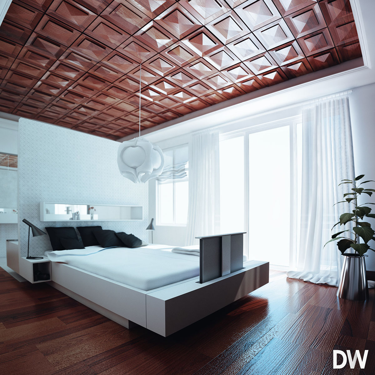
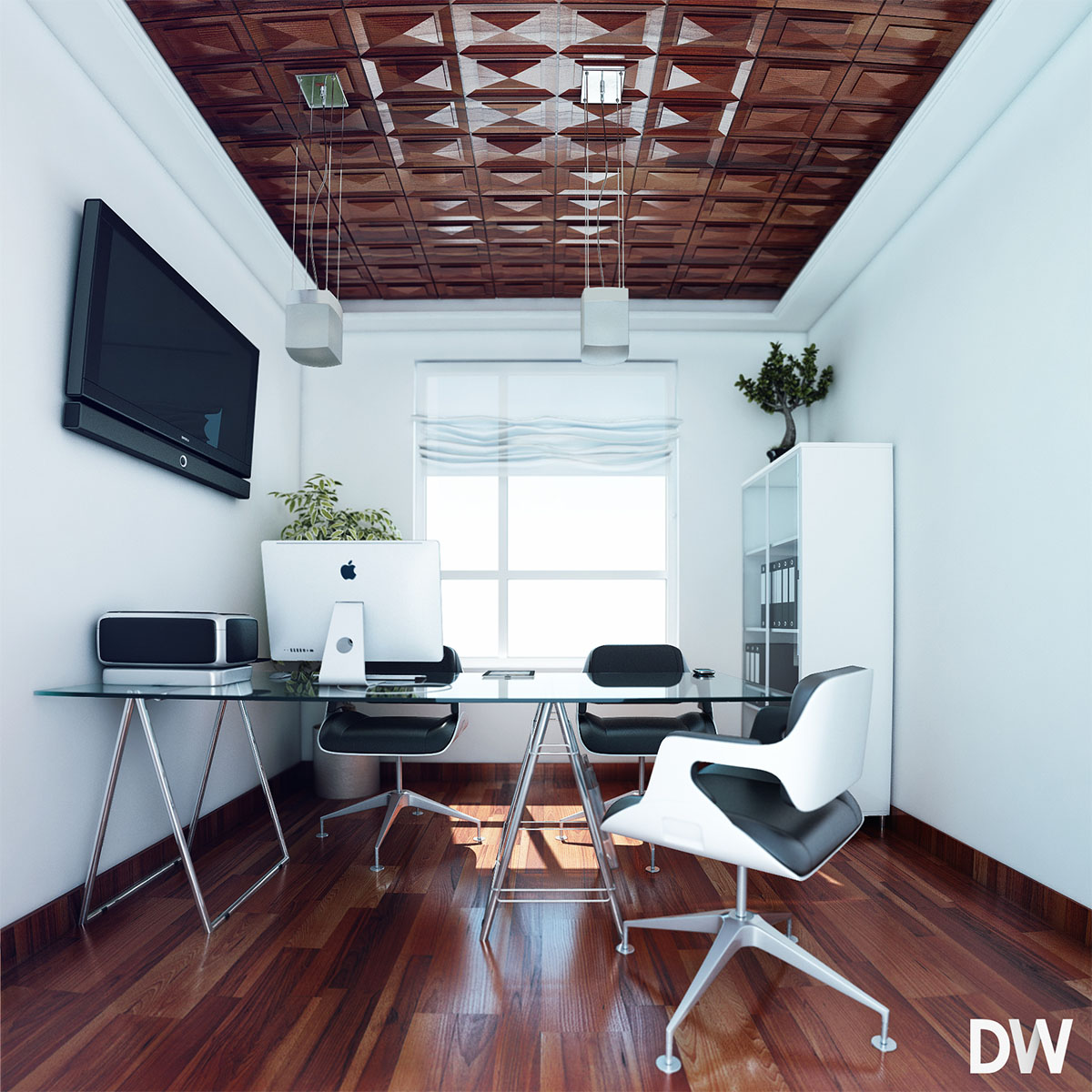
thanks for the reactions, I appreciate it a lot 
If you have some suggestions to improve my exteriors pleas say so... 
Thanks all
Hi all thanks for the kind reactions for the interior renders  ..
..
"ow trouwens flipya dat is de NOS inderdaad"
So I need to work on the exterior, about the people on the grass that is clients request. 
As some of you say I need the remove some reflection from the windows, Thats what I tried in this render.. Pleas let me know your reaction 
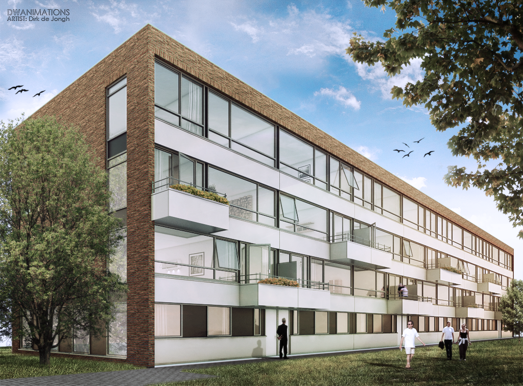
Hi all thanks for the reactions..
I want to post this one.. it a more clean render.
I decided to render the exterior whit some settings. and starded over in PS.. C&C most welcome + an interior view of the building
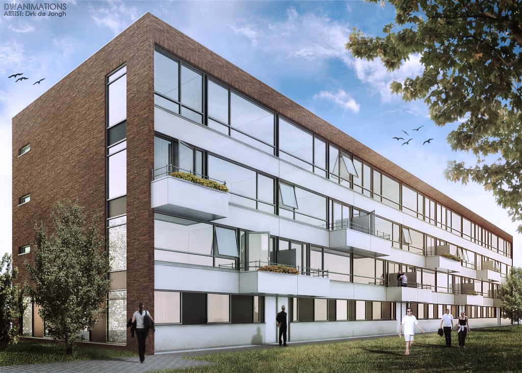
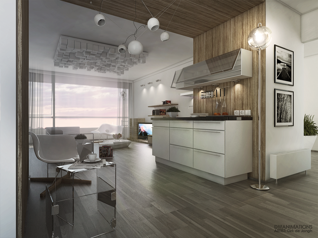
Hi Guys...
Would like to know what you all think about this render.. Pleas all C&C is welcome
like it. nice vibe  ...
...
ware did you find the car and plants? I would change the mist-lights on the car.. other than that it looks very nice.
could you tell something about the lights used in the house to aluminate it...?
best,
looking good. congrast... I wonder, ware did you find the plants ??? could you please give a link ware I can find them.
thanks
Hi All thanks your your great tips/compliments/critics...
I appreciate it. I was fine tuning the render a bit.
-changed some materials.
-tried to remove the spots on the sealing.(used HSph. Subdivs 999) :S
The carpet is done by the fur plugin and I have to say, if used correctly you can great a better effect than displacement.. but I am sting learning how to use it because is very hard for Vray to render it without crashing.
the textures of for the beams are from: http://www.cgtextures.com/
and the plant is from the 3Dwarehouse
Also I did a test in PS to create a evening mood without rendering a new picture... just using PS, pleas let me know what you think..?
For more work you can also look at our new Facebookpage  http://www.facebook.com/pages/DWanimations/118030554885929


aahh thanks, well maybe the AA is not looking so good Beconase this is a scaled down version 800x600 original size 1600x1200.. 
What do you mean with "AA"...?
Hi all here is my first (small) commercial project that I did whit the new Vray using:
-Ambient occlusion
-The new fur plug-in for SU
-Using a new material to create the light effect on the lamps in the living room (a first try)
C&C most welcome, hope you like it

