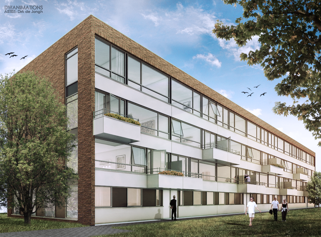
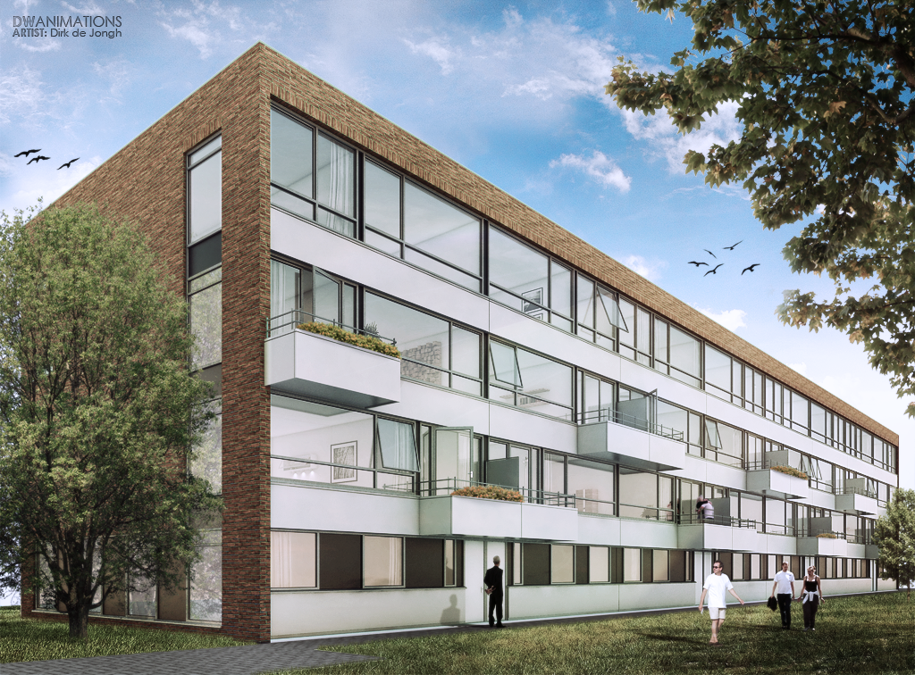
DWanimations exterior render
-
I can't see the original exterior anymore but if memory serves me right I liked it better. People on the grass still odd. The interior's really great, absolutely love it! I never dare to go for such a pale low-contrast image but it really works...
Is that the intro to NOS Journaal on the TV?
-
Very nice interior there mate, the only thing that i'm not sure of is two eames chairs in scene seems a bit out of whack!
Camera angle is a REAL winner for this shot! And the timber feature wall a real eye catcher!
-
Great images.

-
Hi all thanks for the kind reactions for the interior renders
 ..
..
"ow trouwens flipya dat is de NOS inderdaad"So I need to work on the exterior, about the people on the grass that is clients request.

As some of you say I need the remove some reflection from the windows, Thats what I tried in this render.. Pleas let me know your reaction

-
yeah I like it without the reflections more
-
Looks good/ziet er goed uit.
-
-
thanks for the reactions, I appreciate it a lot

If you have some suggestions to improve my exteriors pleas say so...

Thanks all
-
well down the far end of the building it doesn't look right, it might be too bright, idk, it just looks funny
-
ahh thanks,
what do you think about this

-
Much better yeah
-
wow! great work, i visited your web page you have been doing some great images, this are not the exception, the combination of cold and warm glass on the exterior looks really good, the interior has it´s own mood too, i like them a lot!
-
I like the style.
Hello! It looks like you're interested in this conversation, but you don't have an account yet.
Getting fed up of having to scroll through the same posts each visit? When you register for an account, you'll always come back to exactly where you were before, and choose to be notified of new replies (either via email, or push notification). You'll also be able to save bookmarks and upvote posts to show your appreciation to other community members.
With your input, this post could be even better 💗
Register LoginAdvertisement


