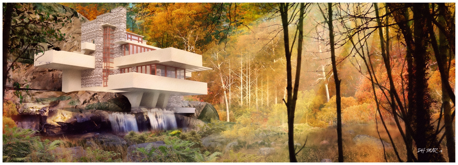
An NPR of falling water from a Thea render,based on a very basic model downloaded from the net.
(with apologies to Frank Lloyd Wright)
An NPR of falling water from a Thea render,based on a very basic model downloaded from the net.
(with apologies to Frank Lloyd Wright)
Below are 2 books which are invaluable to me:
Color and Light - James Gurney
This is primarily a painting and light tutorial but looking at some of the pages available on line,its remarkable how simple it makes things(Ive purchased it on line from amazon and its been a revelation)
LIGHT - a detailed tutorial - part available at site below
http://www.itchy-animation.co.uk/light.htm
Heres a few more with the raw THEA render attached.
many more of my NPRs available here:
http://dhrenders.blogspot.ie/
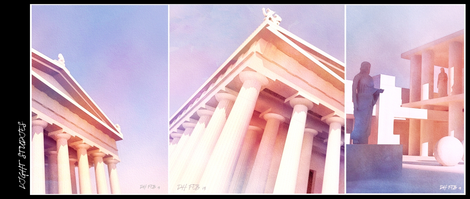
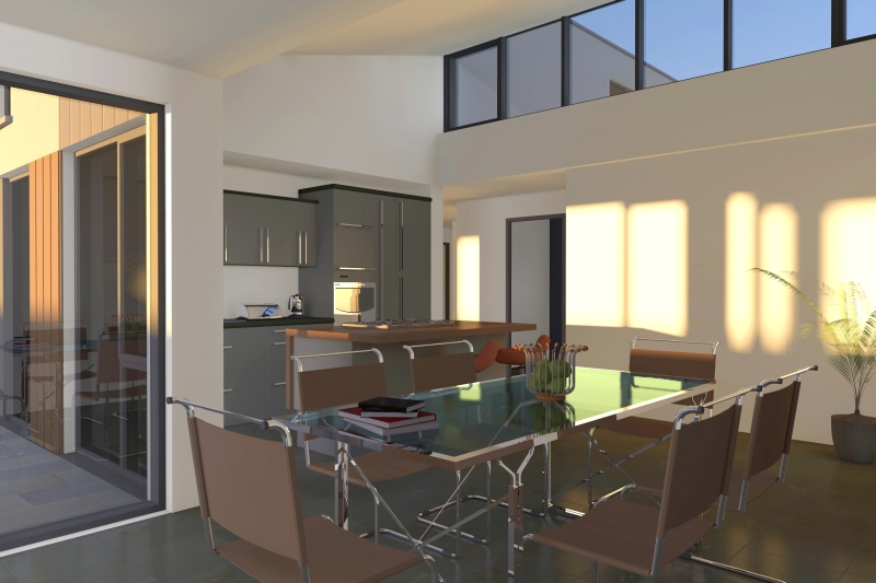
Attached are 2 very stylised images in 2 very different styles.
The first is an NPR watercolour based on a model I downloaded from 3d warehouse, renedered in Thea and post processed in photoshop.
I wanted to play around with 2 very basic colours,orange and blue and combine them to create different depths in the shadows.
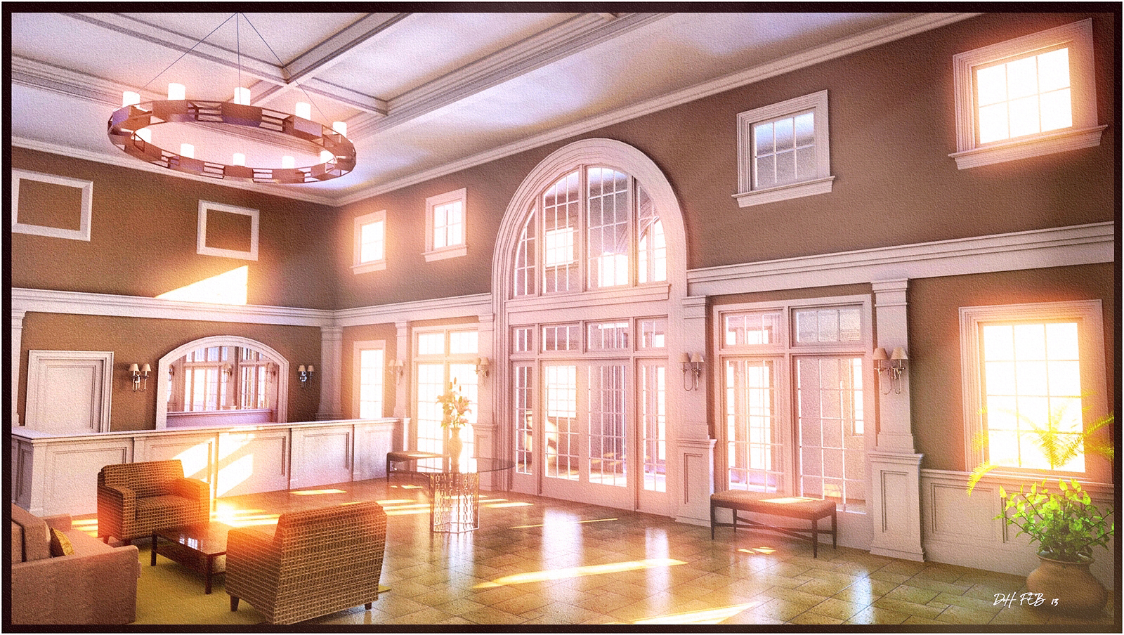
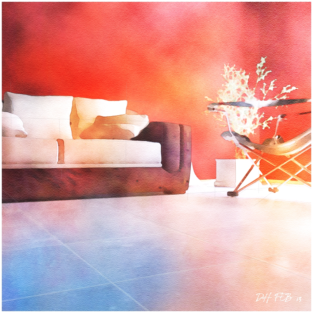
The second is from a project I worked on last year but really wanted to blow out the light coming thru the windows and see how far I could saturate the image without destroying it.(modeled in sketchup and rendered in Thea)
Brilliant stuff Rich,very elegant and simple.
Simplicity is a hard thing to get right, ironically enough.
(I think the first one is my favourite)
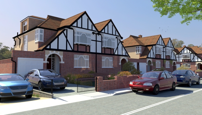
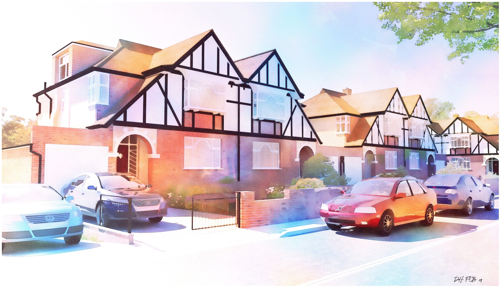
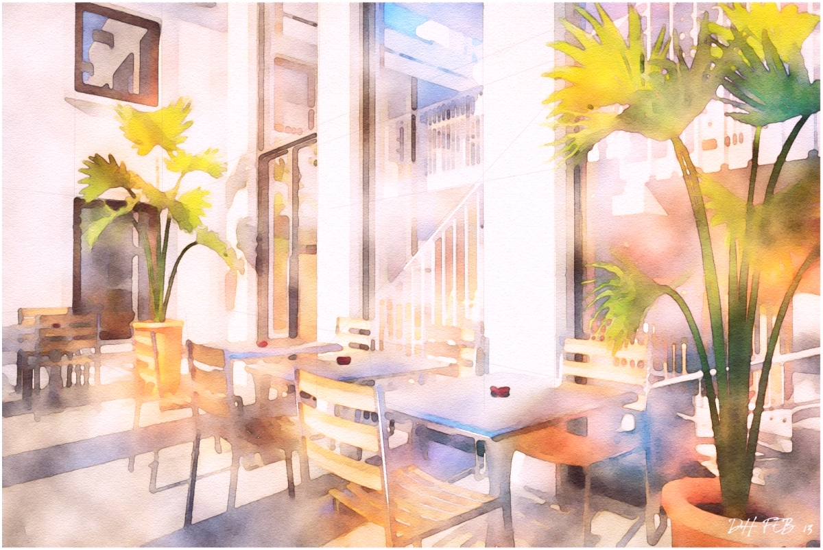
Here's a streetscape I rendered a while back in Thea.The original Thea render is much darker than the final watercolour so I had to increase brightness and saturation before starting the main process.
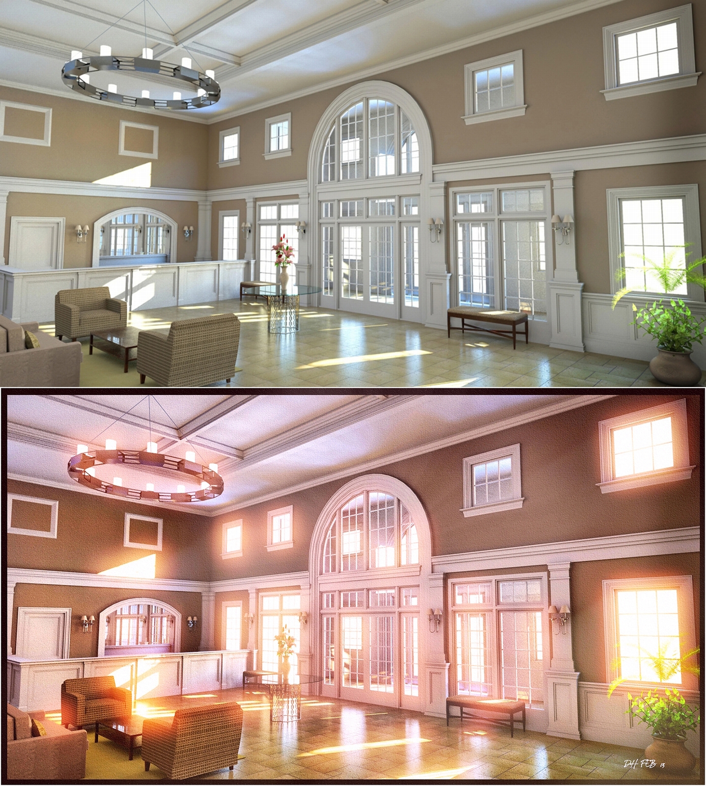
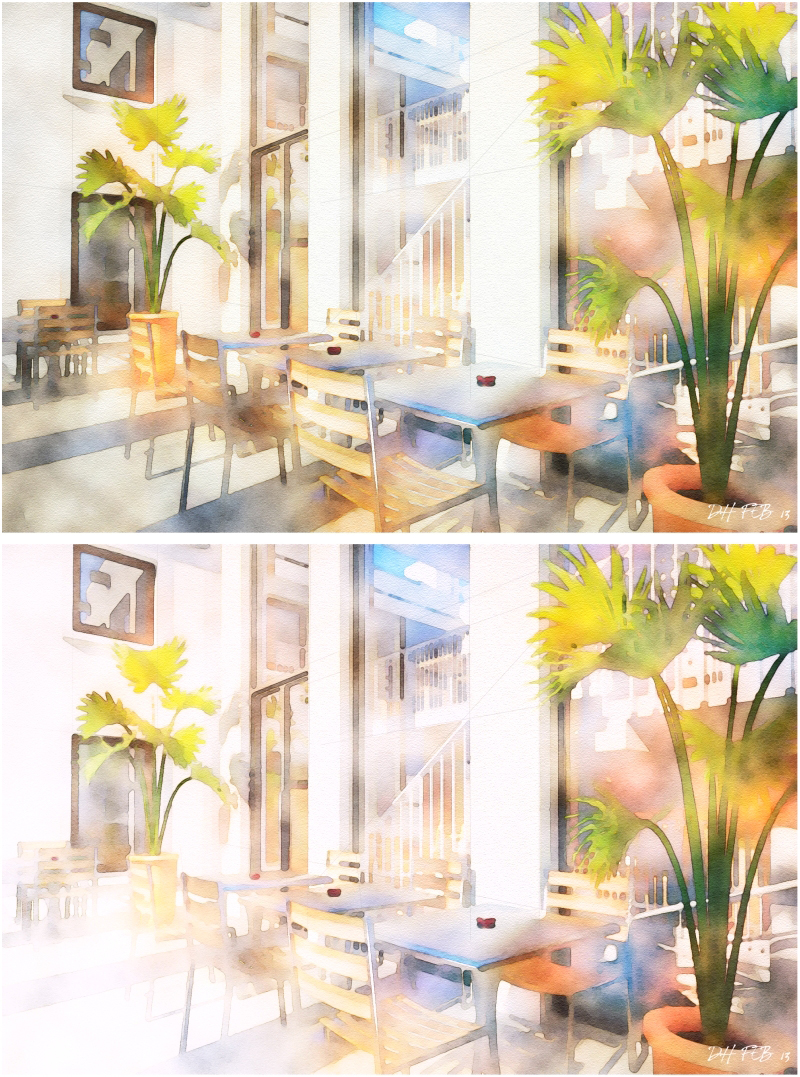
Heres an example of how increasing the brightness of one part of the image can really make a difference.Attached are 2 versions of an image I recently uploaded but decided that the original(the top image) was too murky and too busy.
I greatly increased the brightness on the left to reduce the murkyness and the image is much better.It also helps give the impression of blank paper,and a more looser,sketcheier feel to the image.
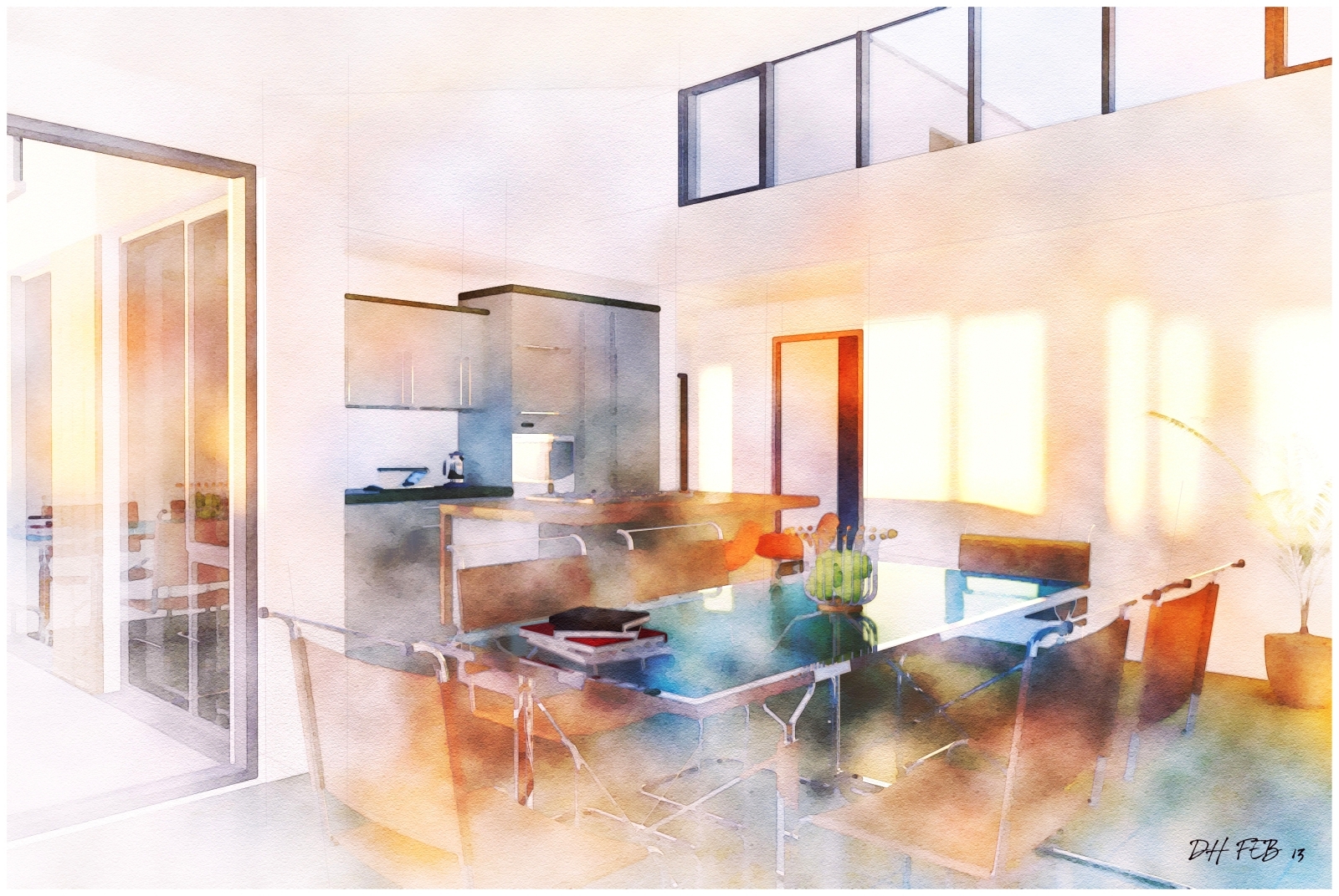
2 more based off original Artlantis renders(the original artlantis render for the kitchen is attached).I added faint lines in photoshop using the line tool with a very low opacity in the layer so they dont stand out.
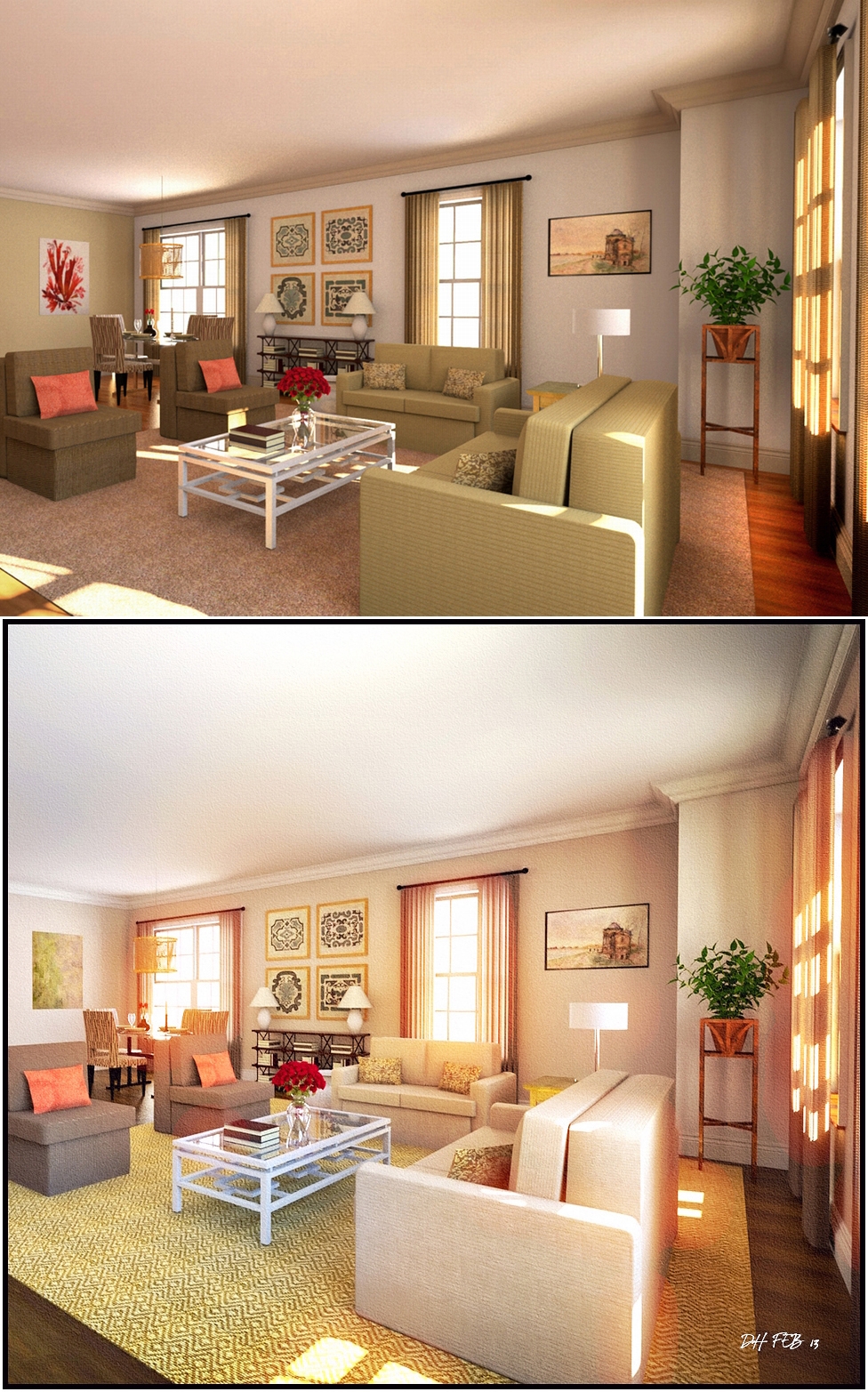
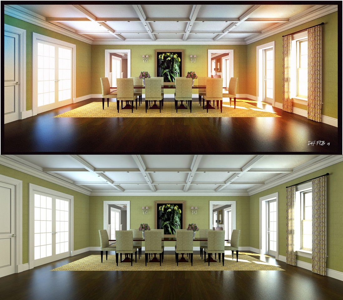
I found the key to getting a better final image is to brighten the original render considerably or the result can look quite dark.
Thanks guys,
The effect is done purely in photoshop using standard filters with colour overlays.Its an effect I have been working towards for quite a while and is probably as close as I can get to a digital watercolour effect .
2 more,one a night shot ,the other an internal dayshot.
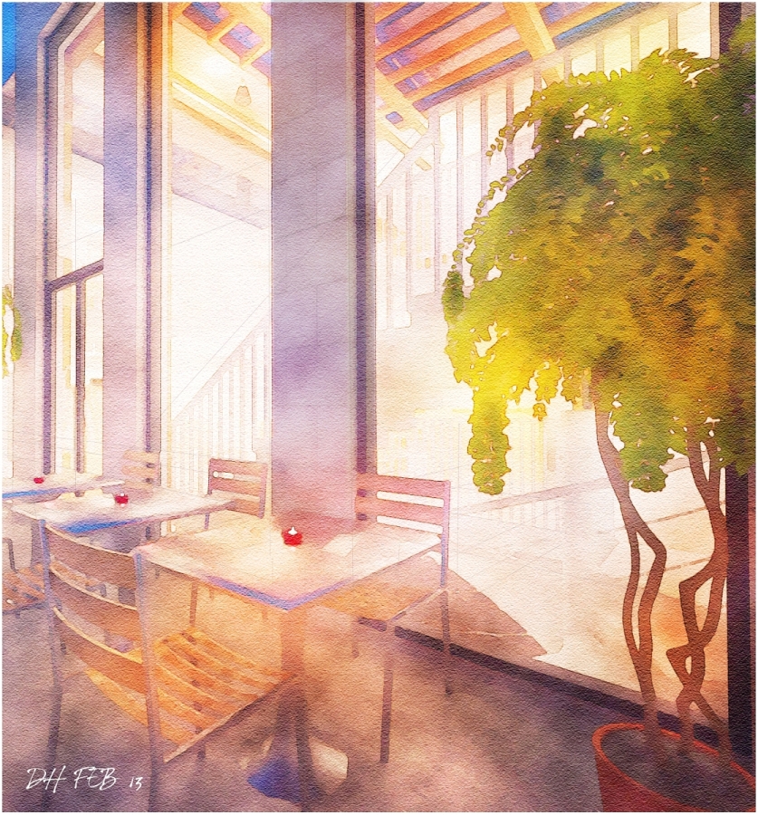
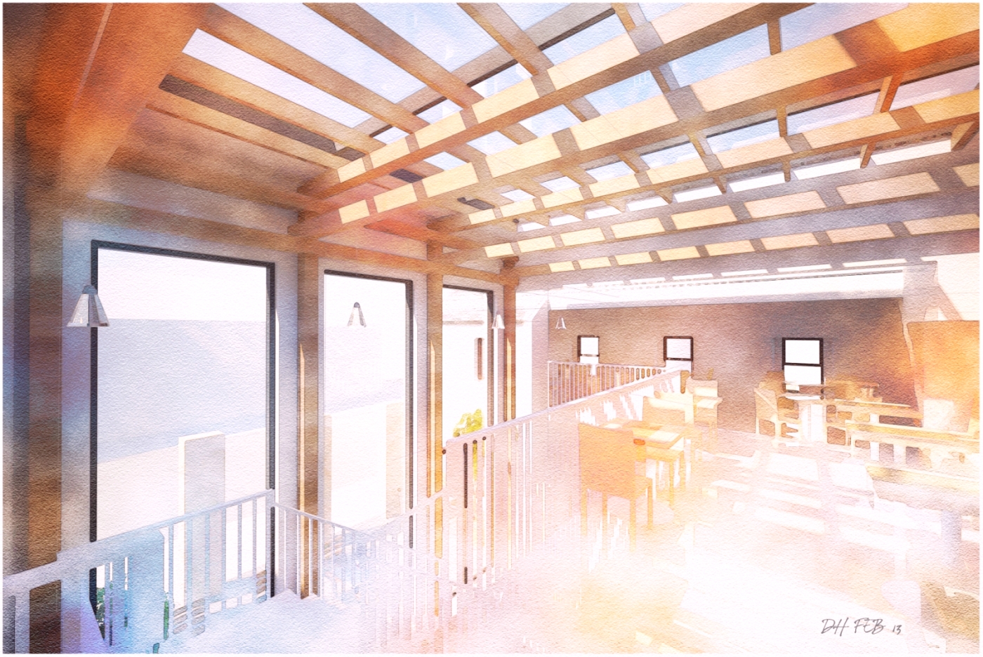
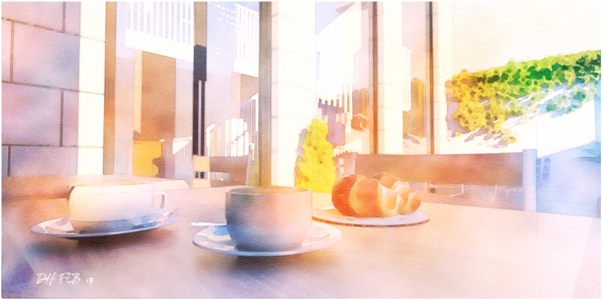
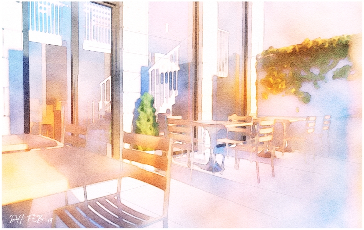
Attached are a few photoshop watercolours based on a refurb of a small cafe,modelled in sketchup and rendered before post pro in Thea render.
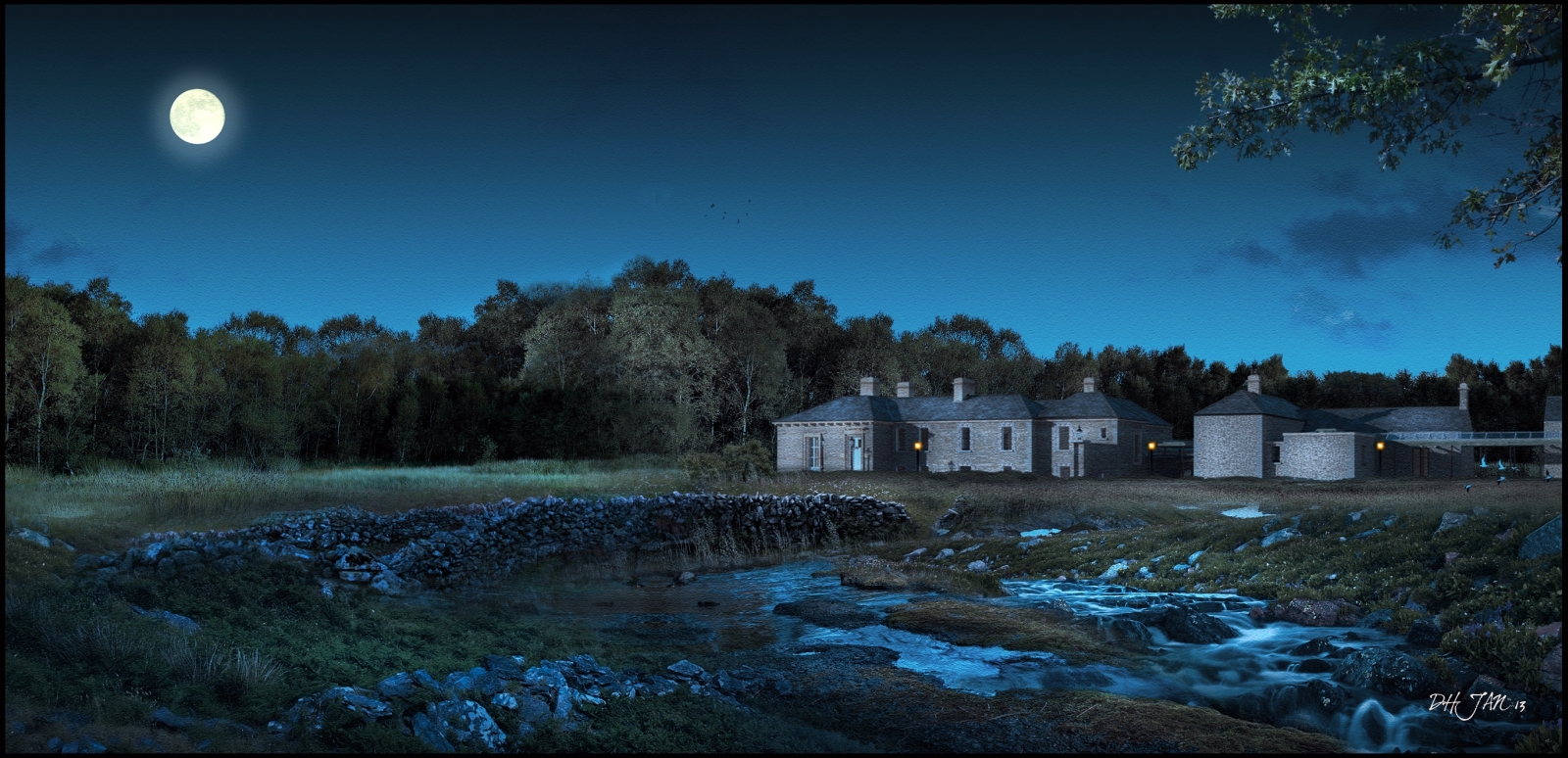
A night shot using the technique in the post processing tutorial section of the forum for turning day to night.
The treeline to the left is the same as that behind the house,just mirrored and cloned to break up the main repeating patterns and the highlights burned in using the "Dodge" tool in photoshop.
Thanks guys,every image I do is done because I love playing with photoshop and particularly light,and for every image I upload here,I have 3-4 versions that didnt quite work.
What I try to do is create an environment or a world that exists alongside the building,giving it a life history beyond the render.
Most of my images are based on the surrounding landscape using everything such as photos, entourage from Dosch or Evermotion or Xfrog etc or rendering out from a program such as THEA,which is now my rendering software of choice.
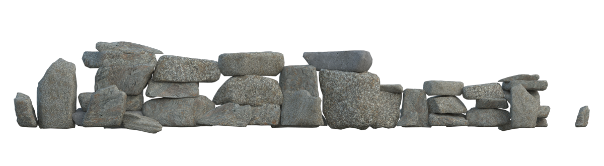
I have attached a small stone wall ,modeled in sketchup and rendered in Thea in .png format which you can use in your images.
Also I set up a blog today just for NPR renders where I will upload images and in time,add step by step instructions.
http://dhrenders.blogspot.ie/
Attached is an assembly of some of the images I recently uploaded along with some new versions.
My images are really all about trying to evoke moods either thru strong colours or strong contrasts with the light.
But I always find myself having to restrain myself and stop adding elements,whereby the image can become overworked.
The middle image is unusal for me as it really is quite spartan in detail but I think works quite well.
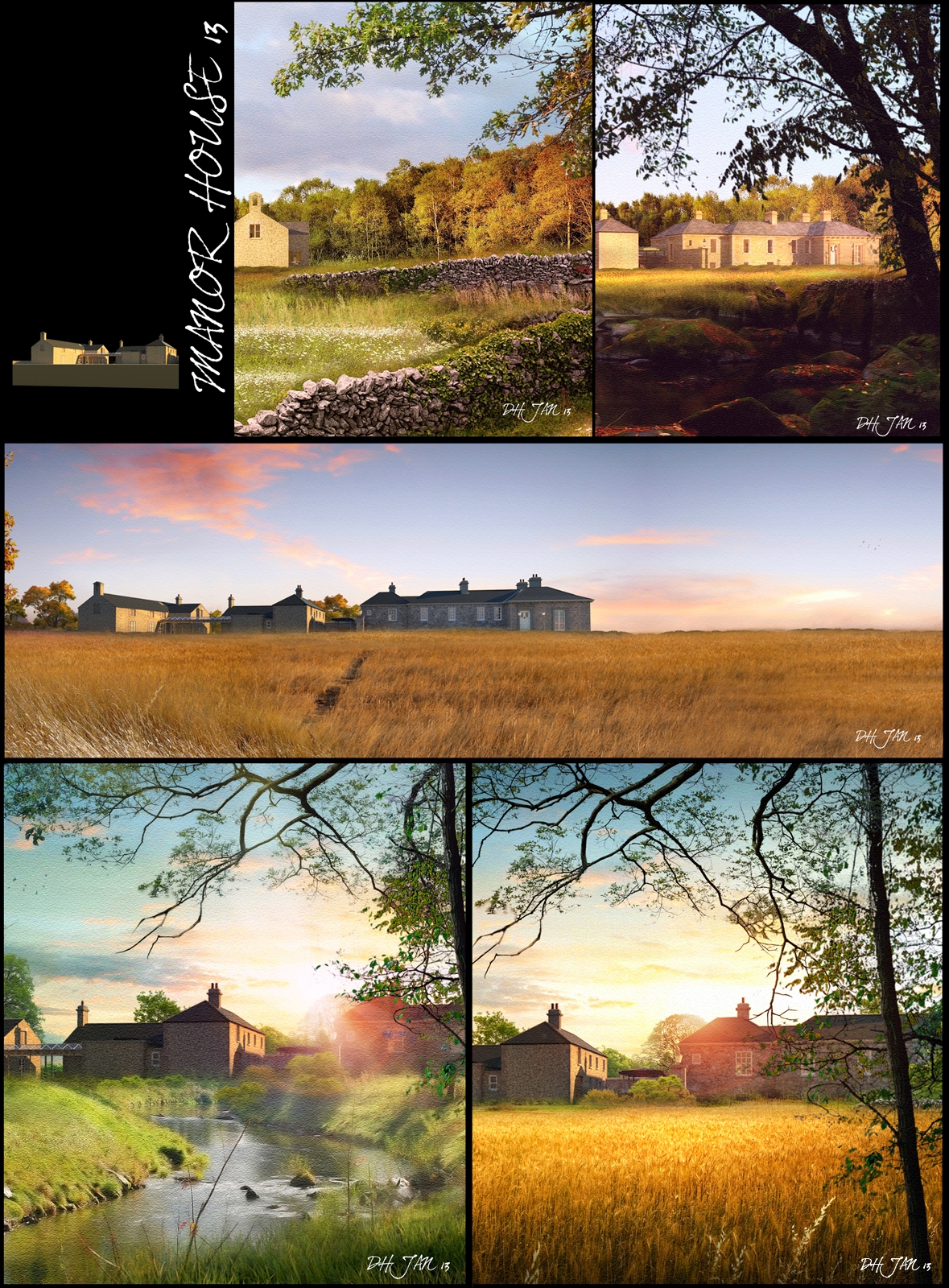
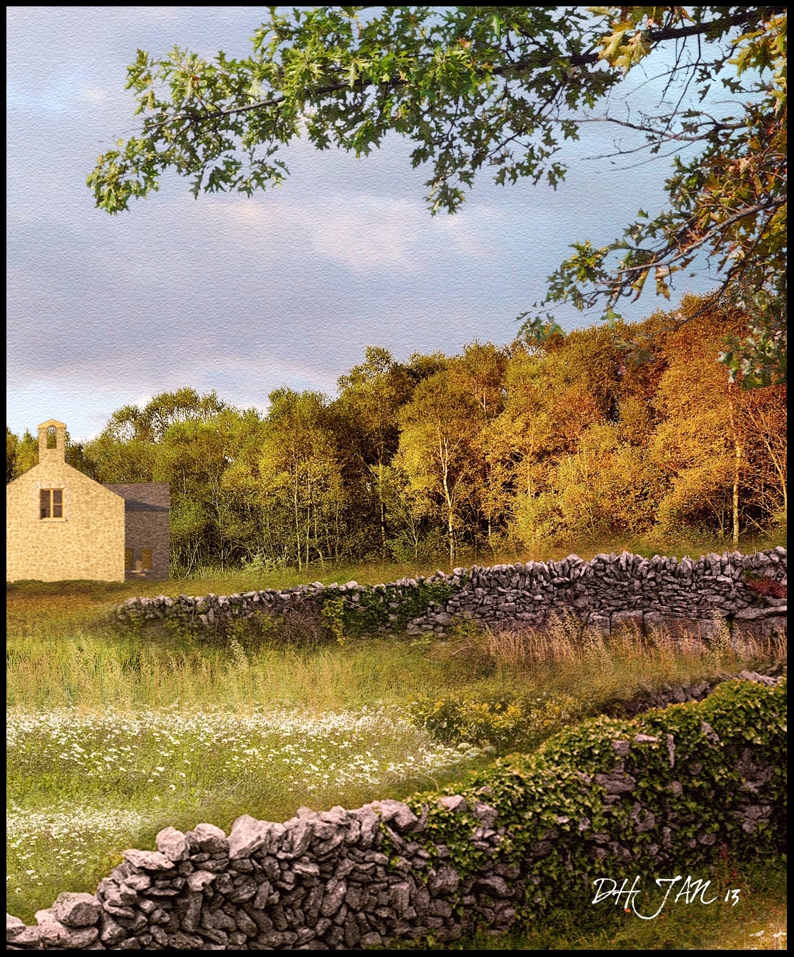
The building is from a project I did a while back.I previously uploaded some NPR images back in 2011(http://sketchucation.com/forums/viewtopic.php?f=81&t=41810) which also show some of the sketchup model.
A fifth version(!).Here I used the entire jpeg of the previous image uploaded,flipped it horizontally and added the foreground trees,water and rocks.I also brightened up the main house image by burning additional highlights to try and get a better contrast between the dark woods and the bright,sunlit field.
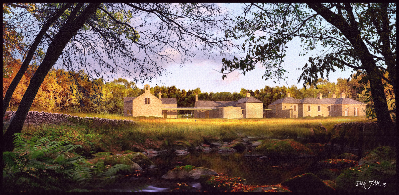
A fourth view using the same bascic render as the last 2 but with some colour toning to make it sit better with the surounding landscape colours.
I have also attached a cropped part of the full size image which is 2845x1480 pixels,too big to upload here.(A lot of the smaller detail is lost when its resized to 1600 pixels wide)
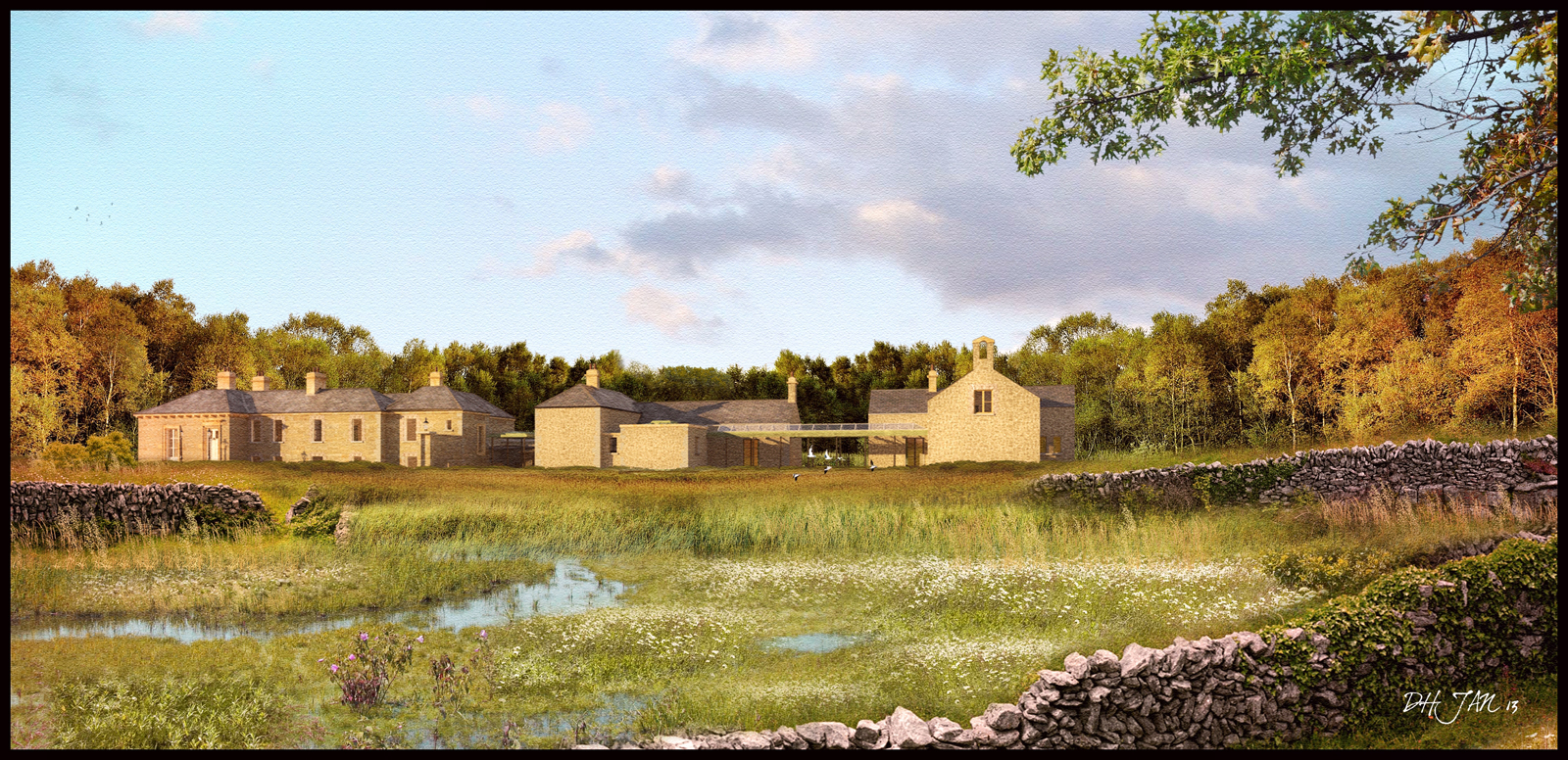
I use a combination of elements, a lot of entourage such as Dosch trees,plants etc.I also render out certain trees and more organic shapes such as rocks or stones and then add additional materials/textures to these rocks in photoshop.
Most of the Ivy on the stone wall in the second image is rendered in Thea from different angles which allows me to add multiple variations of the same plant when post processing.
Its really all about layering and layering and layering in order to try and get the chaos that normally exists in nature.