NPR Colourful landscape -includes basic steps
-
David,
Wonderful. Thanks for the steps explanation! Always enjoy your posts. I see your park bench in the Thea video (but in chrome
 ?)
?)Peter
-
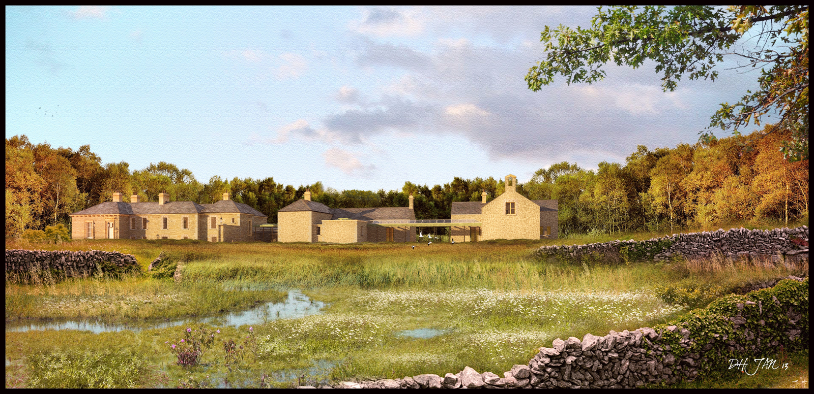
A fourth view using the same bascic render as the last 2 but with some colour toning to make it sit better with the surounding landscape colours.
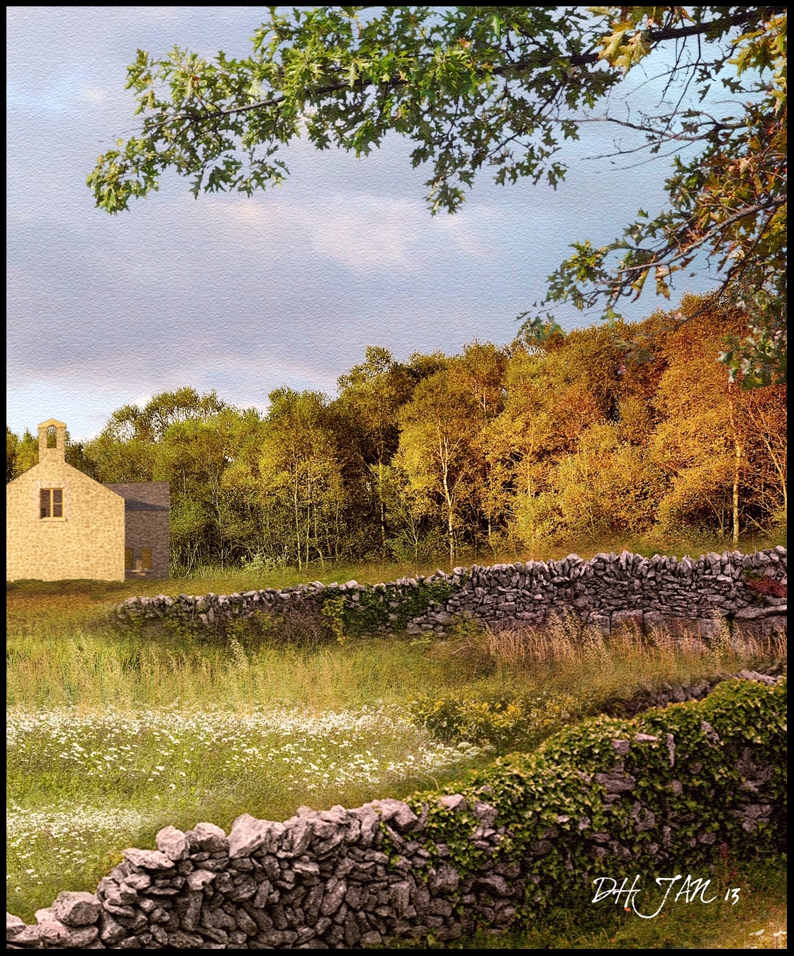
I have also attached a cropped part of the full size image which is 2845x1480 pixels,too big to upload here.(A lot of the smaller detail is lost when its resized to 1600 pixels wide)
-
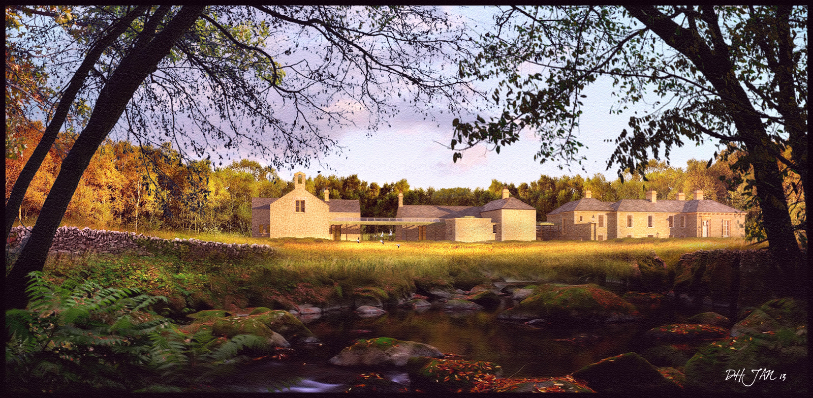
A fifth version(!).Here I used the entire jpeg of the previous image uploaded,flipped it horizontally and added the foreground trees,water and rocks.I also brightened up the main house image by burning additional highlights to try and get a better contrast between the dark woods and the bright,sunlit field.
-
Very inspirational post!From pure curiosity - the buildings are from some real place or yours?
-
The building is from a project I did a while back.I previously uploaded some NPR images back in 2011(http://sketchucation.com/forums/viewtopic.php?f=81&t=41810) which also show some of the sketchup model.
-
Masterful, thanks very much for showing and telling.
-
David I could look at these all day long, lovely style if only I could......
John -
Thanks for taking the time to explain the process a bit, David... always really cool to see the elements individually since you blend them so seamlessly in the final image.
-
Do you use some special plugin or soft for that rocks in the wall?
-
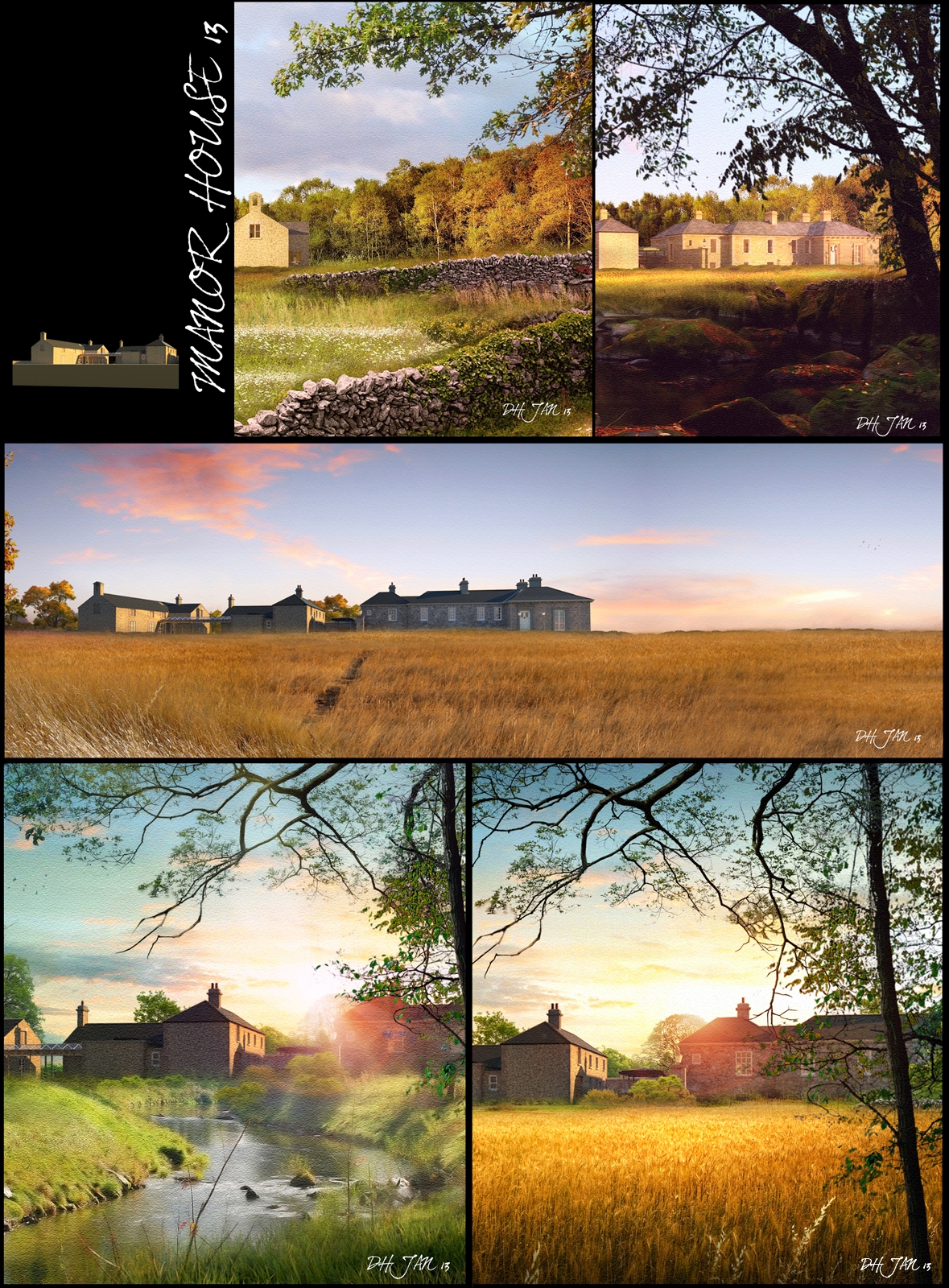
Attached is an assembly of some of the images I recently uploaded along with some new versions.
My images are really all about trying to evoke moods either thru strong colours or strong contrasts with the light.
But I always find myself having to restrain myself and stop adding elements,whereby the image can become overworked.
The middle image is unusal for me as it really is quite spartan in detail but I think works quite well.
-
Brilliant.
-
Yes. These keep getting better. The last two are dramatic, but all have different moods. I how you can use light effects while keeping it fresh and not schmaltzy, if you know what I mean.
-
Thanks guys,every image I do is done because I love playing with photoshop and particularly light,and for every image I upload here,I have 3-4 versions that didnt quite work.
What I try to do is create an environment or a world that exists alongside the building,giving it a life history beyond the render.
Most of my images are based on the surrounding landscape using everything such as photos, entourage from Dosch or Evermotion or Xfrog etc or rendering out from a program such as THEA,which is now my rendering software of choice.I have attached a small stone wall ,modeled in sketchup and rendered in Thea in .png format which you can use in your images.
Also I set up a blog today just for NPR renders where I will upload images and in time,add step by step instructions.
http://dhrenders.blogspot.ie/

-
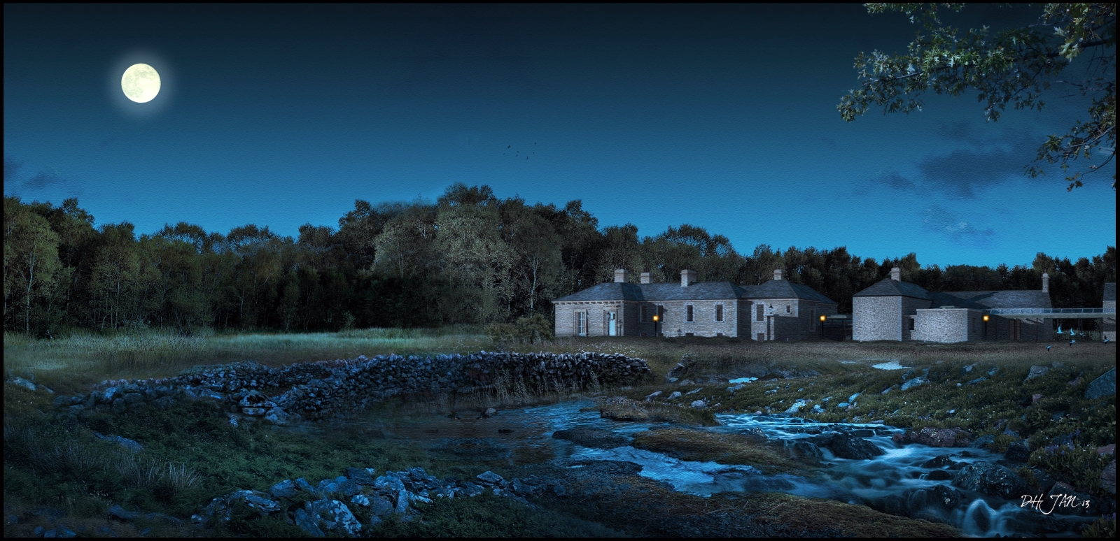
A night shot using the technique in the post processing tutorial section of the forum for turning day to night.
The treeline to the left is the same as that behind the house,just mirrored and cloned to break up the main repeating patterns and the highlights burned in using the "Dodge" tool in photoshop.
Hello! It looks like you're interested in this conversation, but you don't have an account yet.
Getting fed up of having to scroll through the same posts each visit? When you register for an account, you'll always come back to exactly where you were before, and choose to be notified of new replies (either via email, or push notification). You'll also be able to save bookmarks and upvote posts to show your appreciation to other community members.
With your input, this post could be even better 💗
Register LoginAdvertisement


