Perspective, FOV and other interesting stuff (I hope)
-
Perception is so dependent on context and social norms. People brought up in jungles under very primitive conditions literally cannot read perspective in a photo until they are acculurated to right angle architecture and open space with a horizon.
Most of us do not pay much attention to the tops of tall buildings because we spend 99% of our time dodging traffic and reading peoples faces. I think this has a lot to do with our discomfort with strong 3 point perspective.
We are a people forced to keep our eye on the road and our nose to the grind stone.
I think I am pretty sophisticated about perspective, but something that happened to me made me rethink the power of the mind on perception. I wanted to give my wife a little well deserved vacation so I arranged to go to a Bed and Breakfast, an incredibly scenic vacation spot in Arizona. It was a Friday and she had to finish work so we we didn't get there till well after dark. We checked in an then asked the owner for directions to a good restaurant. We drove to our room in the dark to wash up. I didn't bother turning the headlights on. When we left I stepped out of the romm to enjoy the view. You could see tall pines framing a distant mountain maybe three miles away. The mountain was steep sided almost like Half Dome in Yosemite. On top was a fantastic mansion, a large circular mansion with lights blazing all around the perimiter. Just a wonderful composition in the night sky. Again I drove off without lights until I got to the main highway. At dinner we assked the waitress about the mansion on the dome shaped mountain. She did not recognize our description but we kept raving about the building and wondering how anyone could drive to the top. She said she had heard the Elvis had purchase a large hilltop mansion that he finished but never visited very often.
We drove back, to the B&B and it was late so I tuned my lights off as we entered the drive so as not to disturb other guests.
In the morning I crawled out of bed and went outside. When my wife came out I was pointing to a dome shaped building about 50 yards from our room. The "mansion" was some sort of circulation vent about two feet in diameter that also allowed light from the widowless building to escape to the outside.
What can I say, we bought the illusion 100 percent with no doubts other than we figured they must use an elevator to get to the top of the mountain. We had no doubts. It was a reality. In the day it was a bad example of some church camp architecture we could have thrown rocks to.
Seeing is believing even if it is not true. We laughed a lot and still ask each other. "Do you remember Elvis' place." Elvis ahd left the building. The mind controls our sight and our experience.


-
This is really great information. I know I started the thread, but I don't have anything of worth to say! I just know I needed more information and I'm gleening from all your wisdom

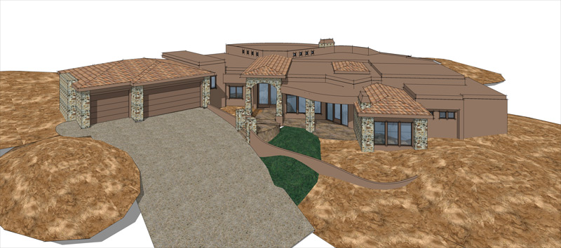
Susan, here is another stab at "committing" to a higher angle

-
Great story, Roger. I'm very curious about where you were in AZ, I lived there for years and am pretty familiar.
I find this topic fascinating. A favorite book of mine is called 'Topophilia, A Study of Environmental Perceptions, Attitudes and Values' by Yi-Fu Tuan. It examines the cultural and social differences in the ways we interpret our surroundings. It's a great read on this subject.
One story he relates is about a visit to an indigenous people living in a dense forest. None of them had strayed far from their village for generations, nor had any of them left the forest. The author then takes one of them to the edge of the forest to a vast plain where they could see for miles. The man asks the author about a figure he sees on the horizon, to which the author replies it is an elephant. The man breaks into hilarious laughter and tells the author not to be so silly and that everyone knows that elephants are enormous animals, not small like insects. (recalled from memory so please excuse any inaccuracies, it's been a while but you get the idea)
-
Tina, that is looking interesting. Do you have permission to get closer in? Can you cut some of the property, just some, so that you can get a closer overhead view? I think that is what worked so well in the Jamieson painting I posted: from above but close in.
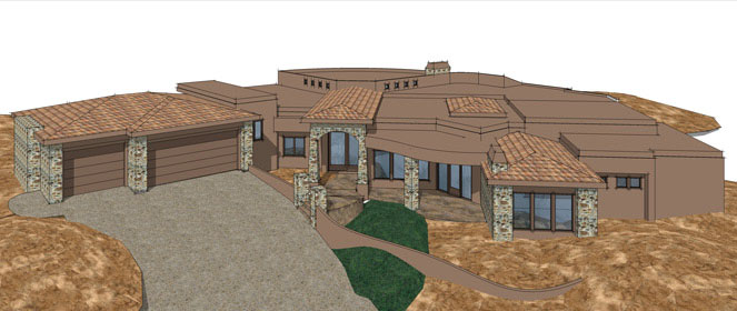
Definitely will need something in the foreground for depth. I wonder what it would look like if you employed 2 point perspective?
-
Susan, the drawing is set up as 2-pt. I did finally get some feedback from the client yesterday. The client wants the entire house in view, so not sure how to get closer in or at least have the "appearance of".
-
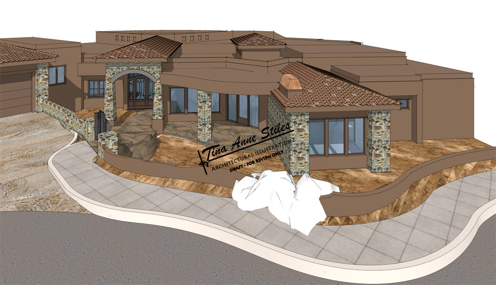
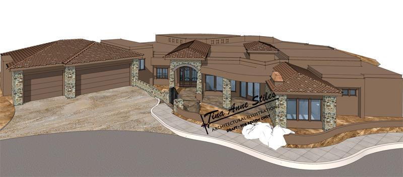
Tina I think the first one of the 2 is the more interesting. Or maybe not. I think I see a little distortion. What is the white stuff?
-
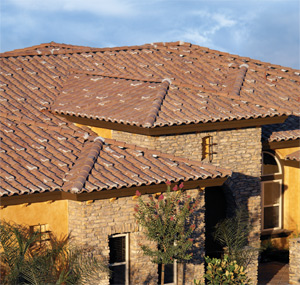
LOL, the white stuff is a WIP. The roof tiles are "boosted". So I'm still trying to figure out how to make that happen. I also need to work on the water feature and grading, but I agree with you. I like that one better too, but it will take some talkin' to make that happen

The distortion may be that I was playing with the FOV. It is set at 55d (making sure not to go over the 60-65d that I re-learned from the conversations from this post) odd the important things we forget from school

-
@tinanne said:
...The roof tiles are "boosted". So I'm still trying to figure out how to make that happen...
Tina, I was actually going to ask what roof tiles you are using and how you solve the high-poly problem if they are modelled. And what do you mean by "boosted"?
I have been experimenting with these Roman looking tiles and to keep it lower, I use section cuts instead of really intersecting the ones on the slanting edges - but unfortunately this does not work in some renderers like Kerky or other applications).
And sorry for going offtopic...

-
@gaieus said:
Tina, I was actually going to ask what roof tiles you are using and how you solve the high-poly problem if they are modelled. And what do you mean by "boosted"?
Boosted is when they use more mortar under a portion of the tile to make it look raised. It's really pretty when done right. You'll find it alot in Mission Architecture. I'm sure someone out there has the whole history and origin behind it
 I am a woman of few words (which my husband appreciates
  )
)
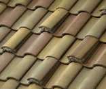
The component is from FF and it is very taxing. I usually wait until the last minute (if I can) to put them on and of course have to turn those layers off if I actually want to continue working in the file.
 But the effect on the finished rendering is very nice. Not so flat and when you start playing around with the sketchy styles the roof really starts to "pop".
 -
OK, thank you.
Maybe I'll post something about my techniques to save file size... -
@gaieus said:
Maybe I'll post something about my techniques to save file size...
That would be GREATLY appreciated!

-
-
Bruce, yes I did know that but still a great tip.

-
Maybe others can share some of their favorite "funky" angles?
-
Tina,
Don't know if this will be helpful, but I often find that you can use more extreme perspectives for aerial and worms-eye views. Once you move away from 'realistic' eye levels I think the mind accepts that the view is no longer 'real' and will tolerate more exaggerated perspectives.
In the case of your project, I'd go for a more radical perspective (60 - 70 degree FOV) on the aerial view. I'd also be tempted to try a view from low down on the approaching driveway (which looks to slope up towards the building), putting the foundations almost at eye-level. This won't show the whole building (which I know your client wants) but could be a nice 'persuasive' illustration.
Hope that's of some help. Don't really feel qualified to comment too much, as my industry is traditionally a lot more tolerant of extreme perspectives (style over substance!! )
AndyC.
-
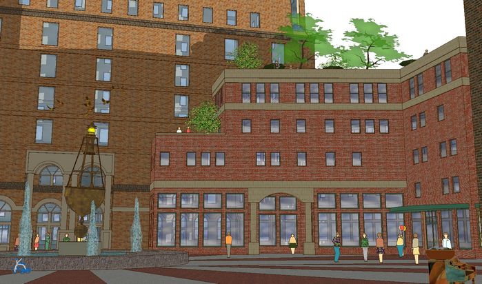
Been following this thread with great interest...just starting to play around with such myself (totally in the dark until now...but my eyes haven't yet adjusted to the light :`) Here's a couple of images for discussion if you will, both look a bit strange to me when I look at them this way...
FOV at default 30 (outer edges and peeps look distorted):
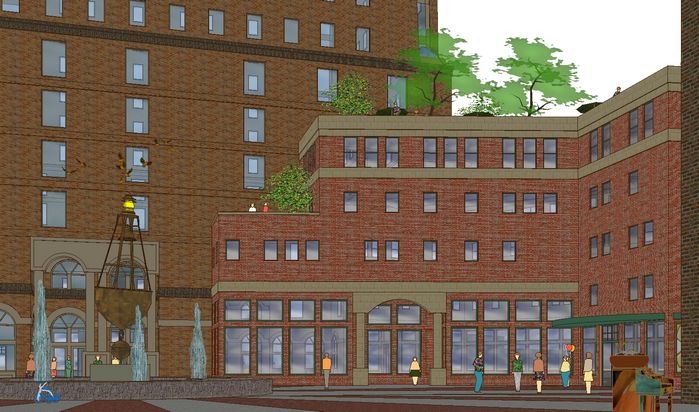
Same FOV in 2 point perspective (inner verticals look distorted):
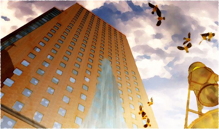
Just for fun:
-
Tom, your "just for fun" is fantastic. The ceiling lights inside the windows caught my eye... brilliant

This would make a great wallpaper. -
tom,
for what it is worth, for normal views i prefer the 2-point, but the ones looking up need the converging lines for effect. your "just for fun"pic is really good.
-
Eric...gotta admit: just a happy accident. You're looking at the upper windows on the other side of the building...though you give me an idea about how to create the effect intentionally.
Edson...yeh, starting to prefer 2-point too, especially for distance views. And better for this view as well, I think...because of the near building frame, but I still think it looks distorted in the middle at this stage. Will experiment next filling in with lots of foreground "eye-busy" to see if the intensity of it goes away...?
-
I often use exaggerated views for site signage, one of my main investors actually insists in them for when he approaches his bankers for funds, he calls it 'dynamic angles'
I agree about the 'just for fun' one...it will sell the concept quicker than the corrected ones.
Hello! It looks like you're interested in this conversation, but you don't have an account yet.
Getting fed up of having to scroll through the same posts each visit? When you register for an account, you'll always come back to exactly where you were before, and choose to be notified of new replies (either via email, or push notification). You'll also be able to save bookmarks and upvote posts to show your appreciation to other community members.
With your input, this post could be even better 💗
Register LoginAdvertisement


