Another house render
-
@tuna1957 said:
Overall I like this one a lot….
 Just a couple of comments.. not a big fan of the “up lights” along the front wall, it’s just a personal preference thing, have never much liked them… also curious about the drive, it seams the texture is pretty repetitive although that may be your intent. Still a really nice job
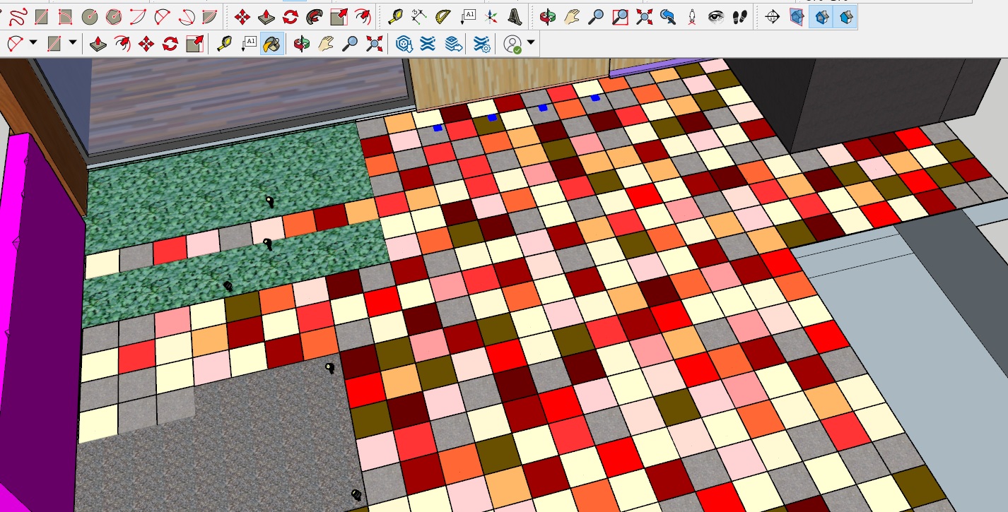
Fair enough about the light also. The repetative (Not a driveway) is all geometry, individual 400x400 pavers.
-
@l i am said:
@tuna1957 said:
Overall I like this one a lot….
 Just a couple of comments.. not a big fan of the “up lights” along the front wall, it’s just a personal preference thing, have never much liked them… also curious about the drive, it seams the texture is pretty repetitive although that may be your intent. Still a really nice job
Fair enough about the light also. The repetative (Not a driveway) is all geometry, individual 400x400 pavers. However when I think about it if it reads as repetative, it reads as repetative
 I am going the give all the tiles different materials to my paving so I can control the texture more. It is ironic that in me effort for detail I made it look like a poorly tiled material. Thanks I will correct that
-
Thats why I post here, constructive critism is gold
 Tuna here is my resonse to your observation. Should have picken up on that myself

-
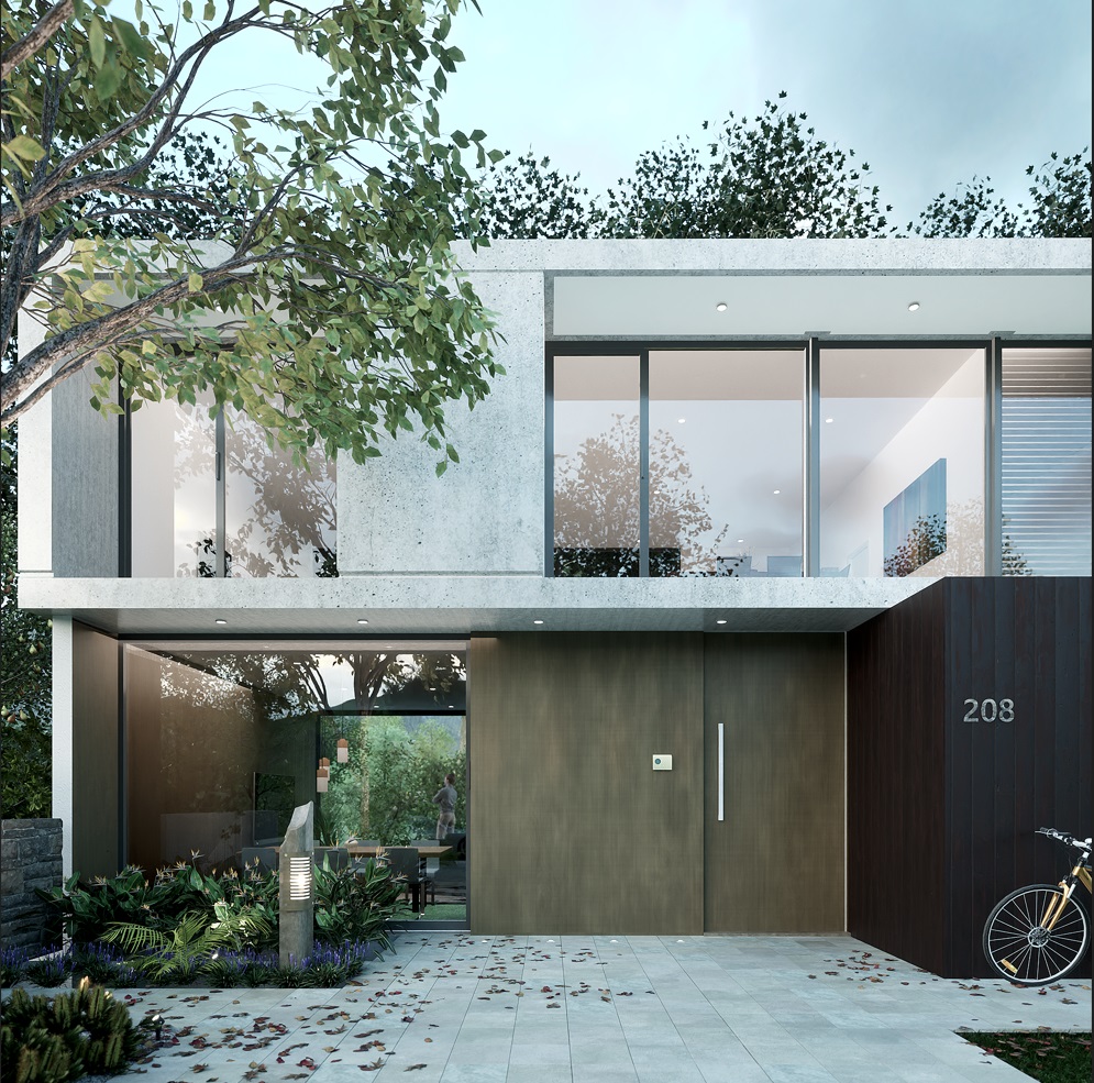
I vetually did the pavers bit by bit, and moved the uplights a suggested

-
This last image really “hits on all cylinders” for me.

-
Very very nice.
-
If there was such a thing as more perfect, this would be it.

-
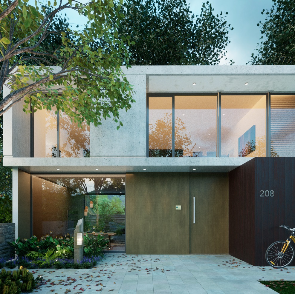
As seems usual for me I have updated. If you look trough the house you will see the owner in the back garden. There was a scaling issue fixed and rear wall with stretched material removed, other plants added to the rear. Denoiser turned on for a less grainy result overall.........welcome to my neurosis


-
Excellent!


-


-
Very nice to see your photography lessons worked out well worth the time, Is that a Canon Eos for those shots?


Hello! It looks like you're interested in this conversation, but you don't have an account yet.
Getting fed up of having to scroll through the same posts each visit? When you register for an account, you'll always come back to exactly where you were before, and choose to be notified of new replies (either via email, or push notification). You'll also be able to save bookmarks and upvote posts to show your appreciation to other community members.
With your input, this post could be even better 💗
Register LoginAdvertisement


