Alphabet to sketch(up)
-
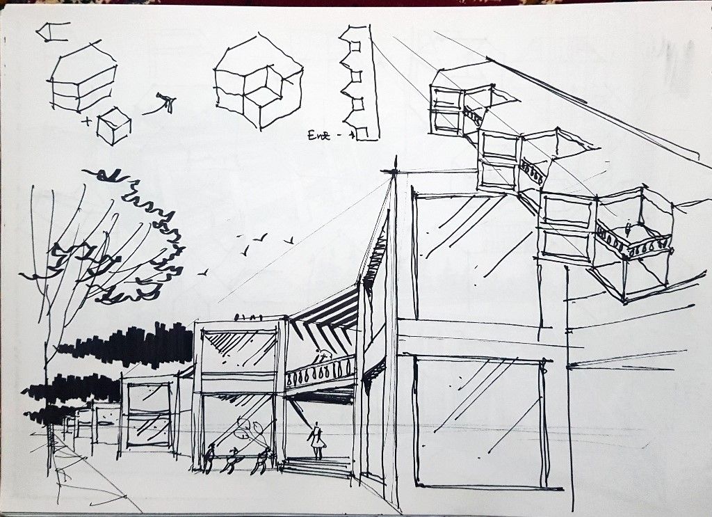
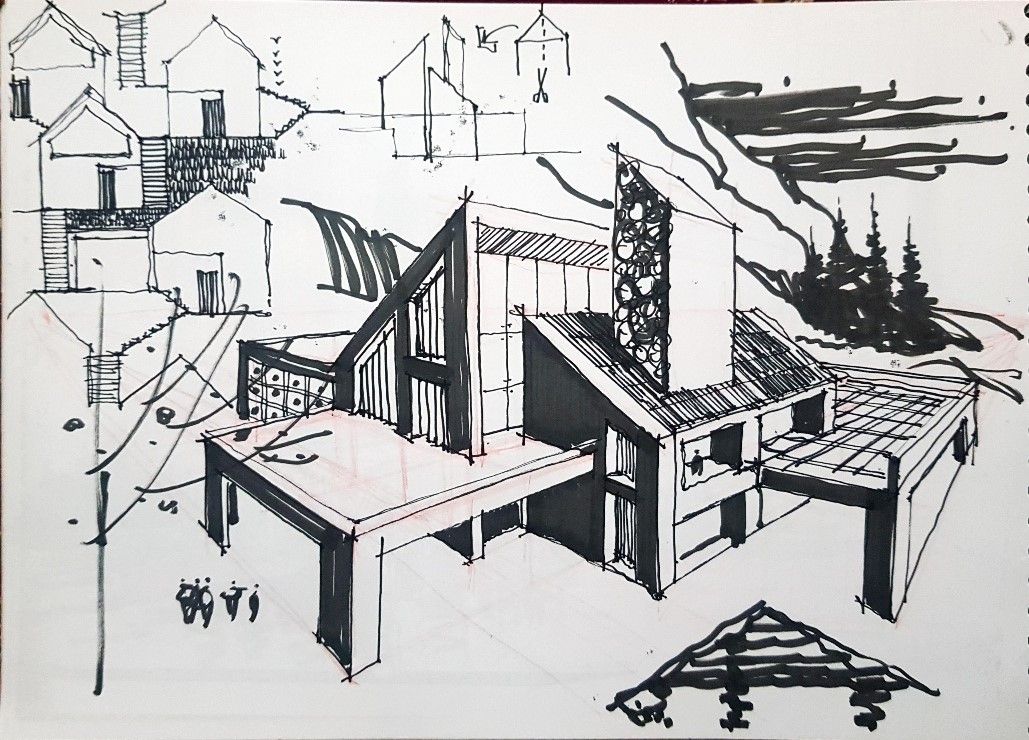
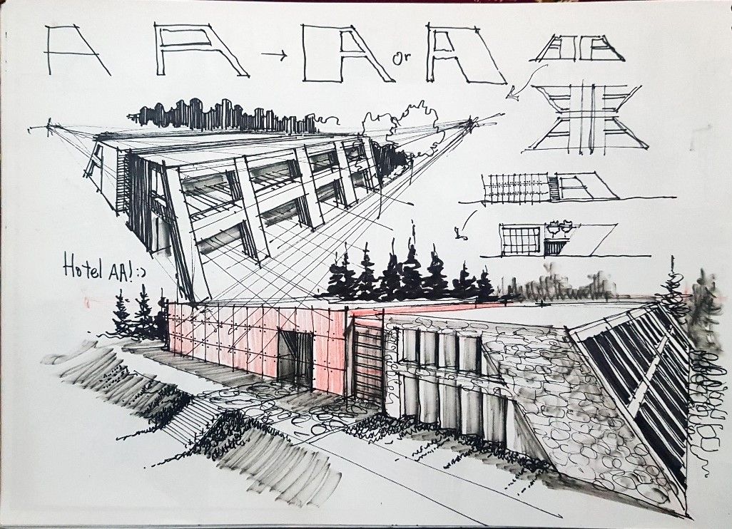
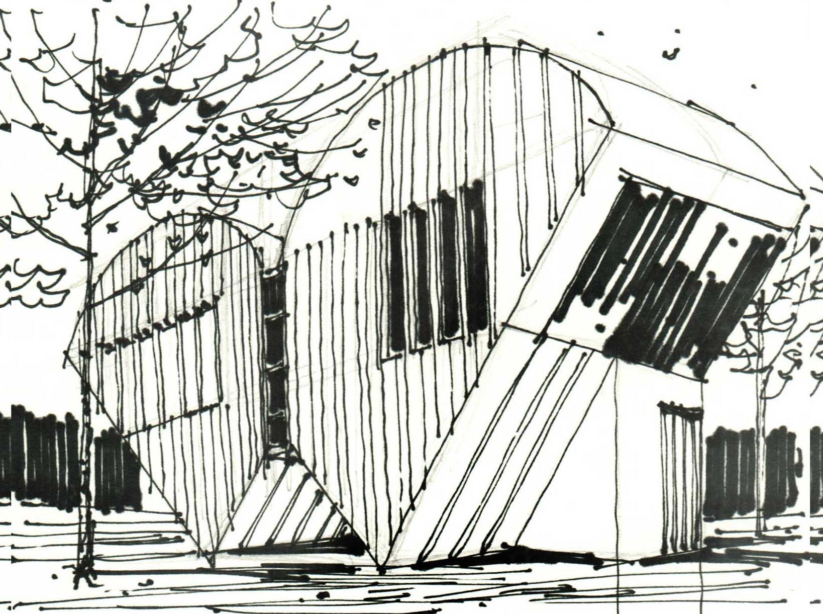
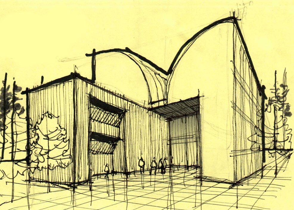
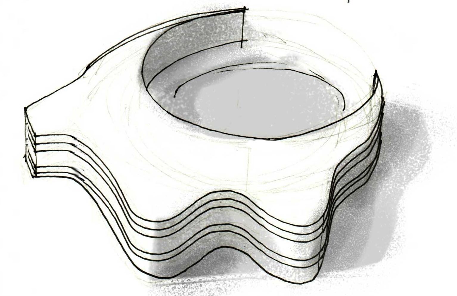
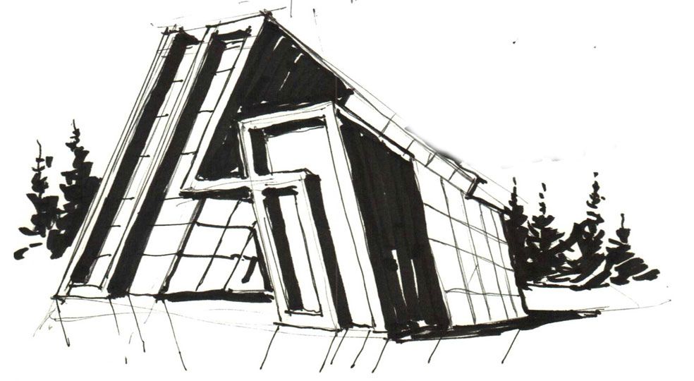
Just recently I realized that I have dropped some sketches and here are some of those ones all based on the letter "A":
https://www.linkedin.com/feed/update/urn:li:activity:7203677325886902272/ -
Nic work Majid. I do not have an indeed account so I could not see them but I assume several were from your book.

-
@ntxdave
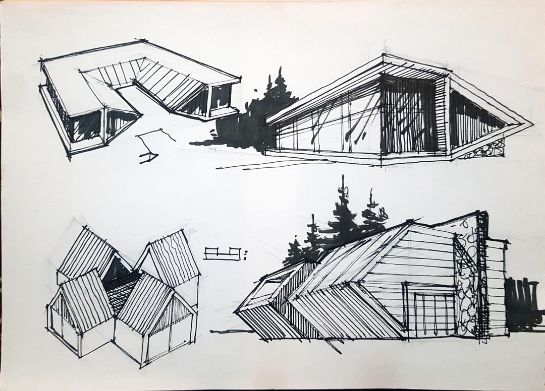
As the internet speed drops sometimes I cannot share those sketches here. I think those sketches are not involved in my book and that is why I shared them. -
Here are some of them:
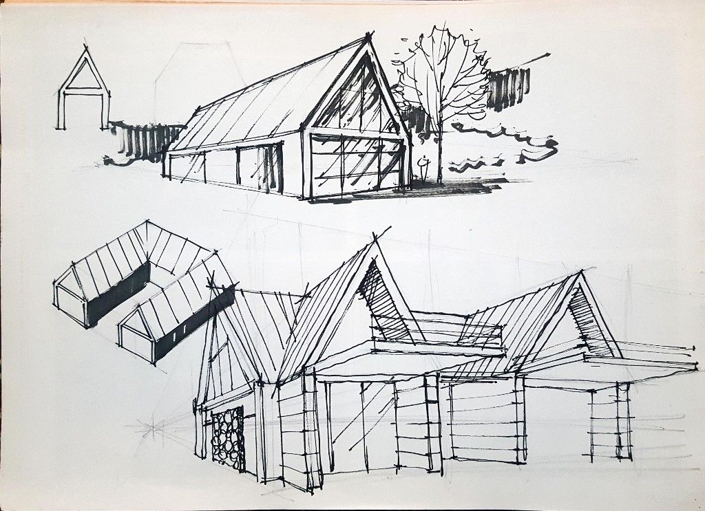
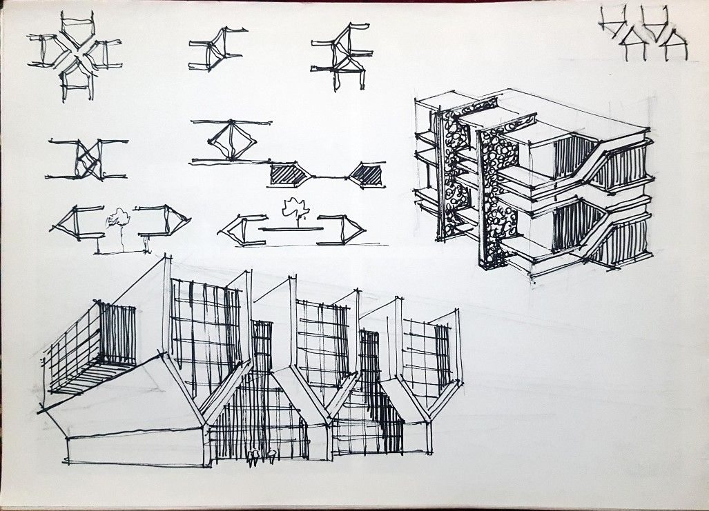
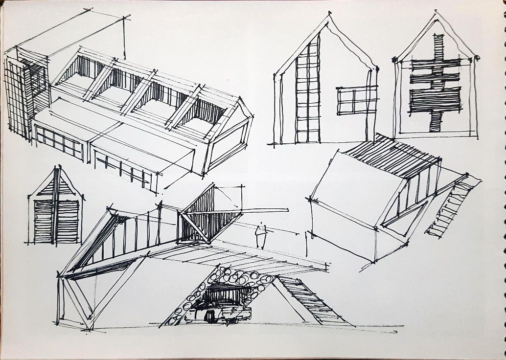
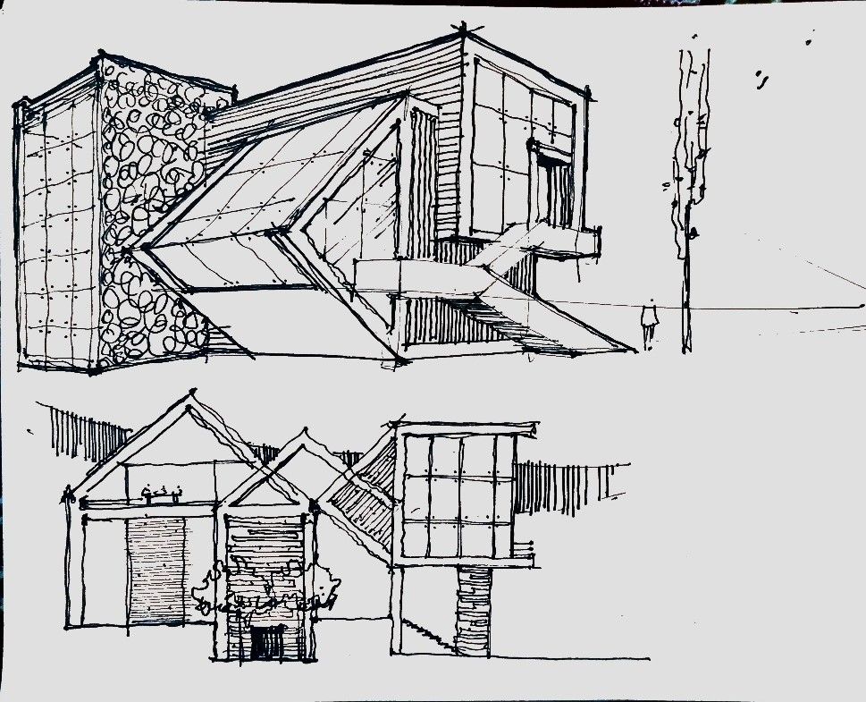
-
@majid Thanks for sharing.


I wish I had talent and a brain to come up with stuff like this. Maybe this is what happens as we age.

-
-
@majid More neat work.


-
Just messing around with the Prome ai sketch-rendering tool.




-
@majid This stuff is neat.

I went to your link but really did not see anything about the software other than the few examples. Is there some place to see some details about it?
-
@ntxdave Ah yes, you are right my friend. Here is the link
https://www.promeai.pro/blender -
Another subscription, seems to be the norm these days.
They certainly know how to charge for the product.....
-
@Mike-Amos Maybe they are using AI to study human behavior regarding making money for themselves. I used to use the free plan.
-
Why not use Vizcom in free? https://www.vizcom.ai
You have no limit of image! (all is keept)
A team of 2 users (Workbench)
Import export 3D possible !
"Infinite workbench"
Style image can be loaded
Sketch drawing inside
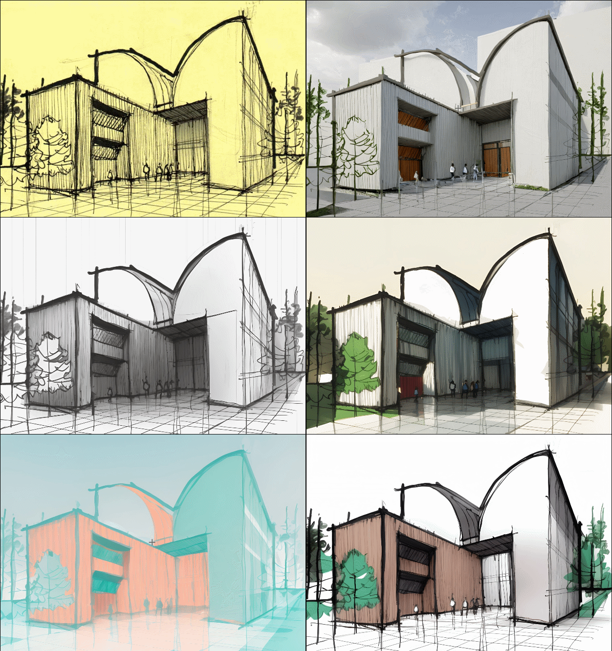
The limitation is only one generation at time! (Pro =4) and team (Pro >2...)Here the 8 renders without prompt (so some can be rustic)
-
With some simple prompt, parameters, image style etc...

-
@pilou I prefer to see Majid's natural talent for hand painted and sketched output than some AI generated stuff.
-
Yep but seems he uses himself the Promeai ?

https://community.sketchucation.com/post/1609397sure the sketch tool... but you have also one inside Vizcom!

-
Agreed. IMHO, the ai generated 'stuff' is crap.
-
@Mike-Amos said in Alphabet to sketch(up):
Agreed. IMHO, the ai generated 'stuff' is crap.
That makes three of us.


-
Maybe today but in 10 years ?

if the planet is still alive! -
@pilou said in Alphabet to sketch(up):
Maybe today but in 10 years ?

if the planet is still alive! This whole environment is about drawing/designing skill OF THE USERS/PARTICIPANTS
At least that is my opinion!
Hello! It looks like you're interested in this conversation, but you don't have an account yet.
Getting fed up of having to scroll through the same posts each visit? When you register for an account, you'll always come back to exactly where you were before, and choose to be notified of new replies (either via email, or push notification). You'll also be able to save bookmarks and upvote posts to show your appreciation to other community members.
With your input, this post could be even better 💗
Register LoginAdvertisement
