Rendering Tips
-
 Hello everyone!
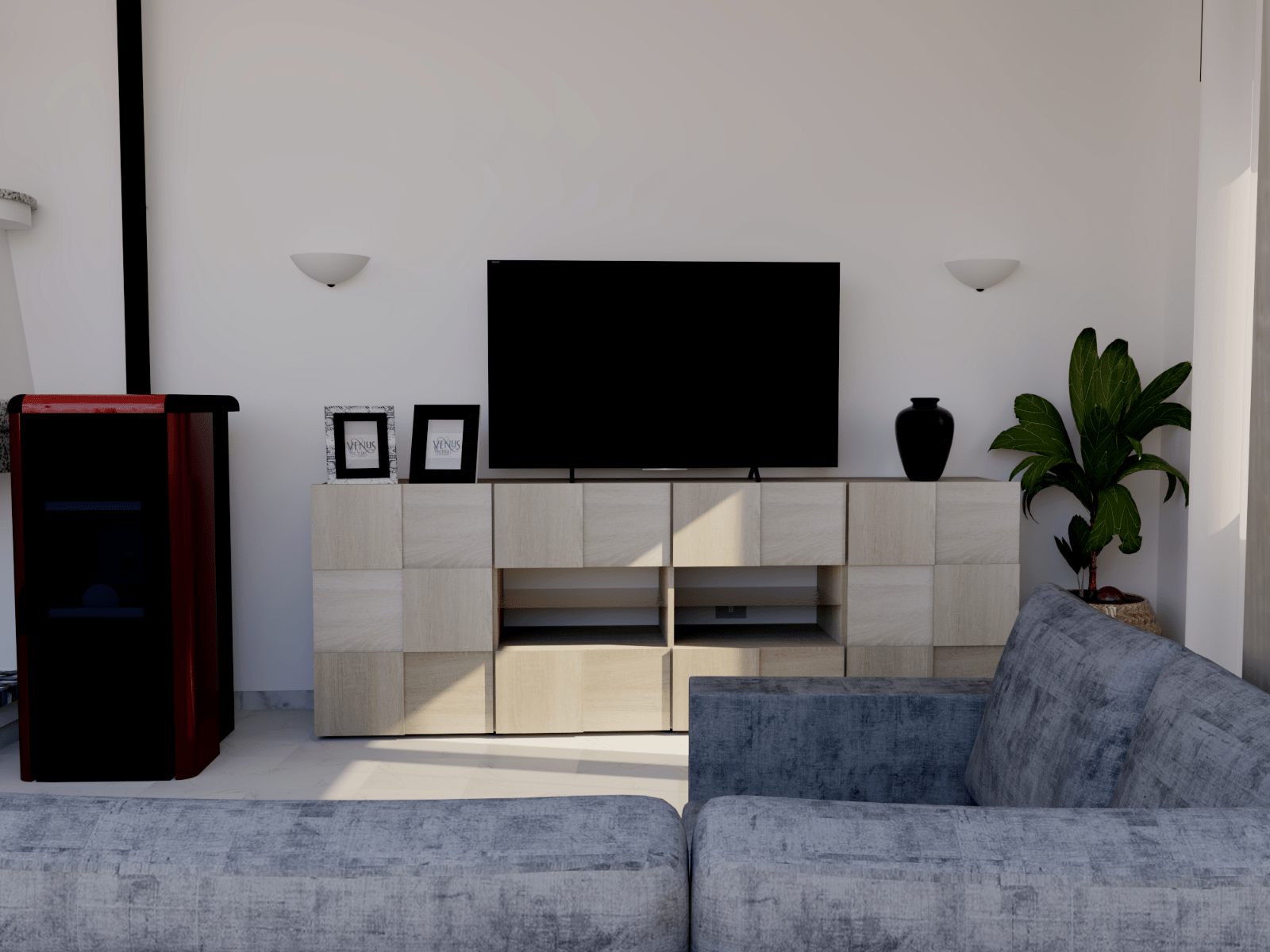
I've finally managed to complete my first render and would like to know if you have any tips to improve it...! I'm a little undecided on the lighting and POV.... (50 degrees)...
If anyone would like to help me improve I will be very grateful. If you want i can attached the SketchUp file
Thank you!
-
I think uyou may have better luck if you specify your render engine. For instance I may say "use an area light' but your platfom may not have one.
-
Nice!
I'd just say the camera location looks static and a little odd. It could be you have a specific view in mind. I'd look at professional interior photographs (or renders) that are designed to show-off or describe the space (realty and interior design pictures). This picture seems to be attempting a frontal view of the TV cabinet, as you might want for the cabinet maker, but not a picture of the room. I get an uneasy sense that there's no telling how high the ceiling is, because the picture goes up about to where I would expect the ceiling, but one can't see it. You might try views off-center, from the corners of the room to encompass the space differently (which also makes it feel more dynamic as a consequence of converging lines created in perspective).
Though it is a day scene you might try some low interior lighting to add interest, making the lighting less homogeneous.
Good work. Hope to see more!
Hello! It looks like you're interested in this conversation, but you don't have an account yet.
Getting fed up of having to scroll through the same posts each visit? When you register for an account, you'll always come back to exactly where you were before, and choose to be notified of new replies (either via email, or push notification). You'll also be able to save bookmarks and upvote posts to show your appreciation to other community members.
With your input, this post could be even better 💗
Register LoginAdvertisement


