Eeny, Meeny, Miny, Moh!
-
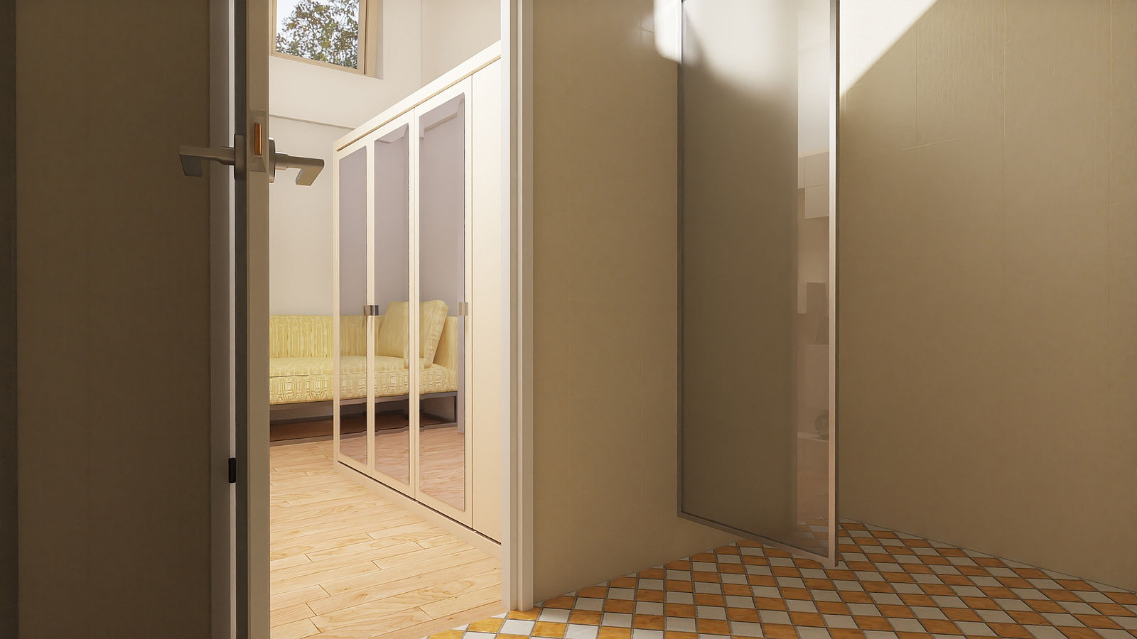
The smaller of the trio. 10' by 20'. Looking in to the sleeping area from the bathroom.
-
Nice!
But Mike, the original design is posted in another section of the board. Could you post it here?

-
@mike amos said:
... Looking in to the sleeping area from the bathroom.
a good render with good scene illumination!
 - however, I don't grasp the shown scales: for example the size of the door compared to the size of the wardrobe or the size of the window, which seems to be very very big compared to the sofa underneath it and also so very far up in the bedroom´s wall...
[funny : "Ene, Mene, Muh (und raus bist du)" - this similar turn of phrase as a "counting rhyme" we also have in D)
 -
Thanks folks, angle and DoF in effect here, that and the mirror on wardrobe doors reflecting light.
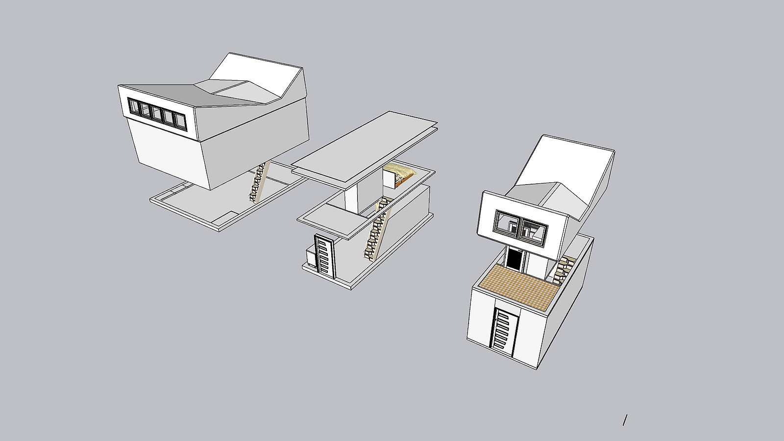
I shall add a copy of that concept view here for a Giraffe.
-
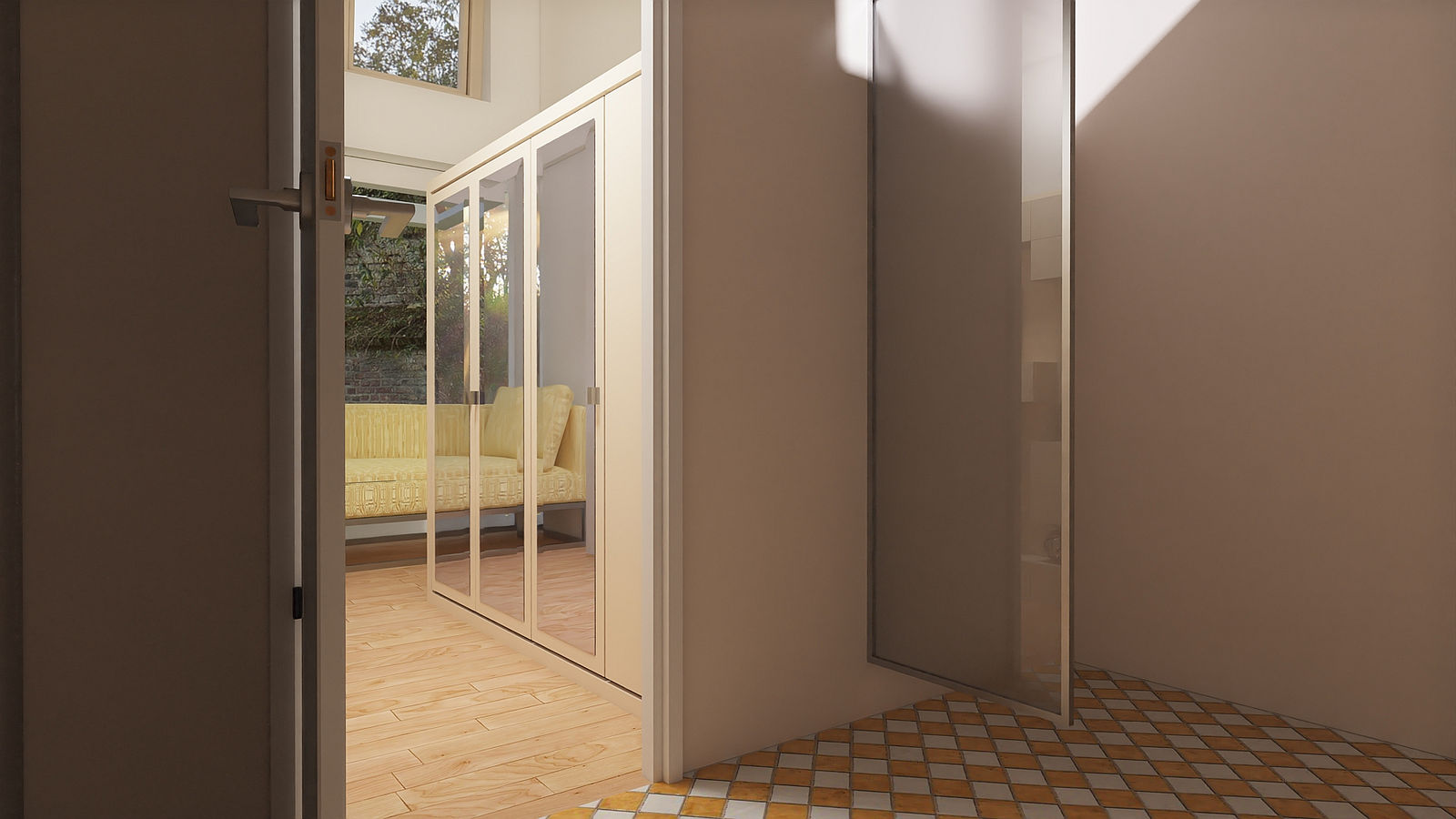
There is no detail to it yet but the far wall opens, I have opened this to show the background and give a better scale to the property and contents.
-
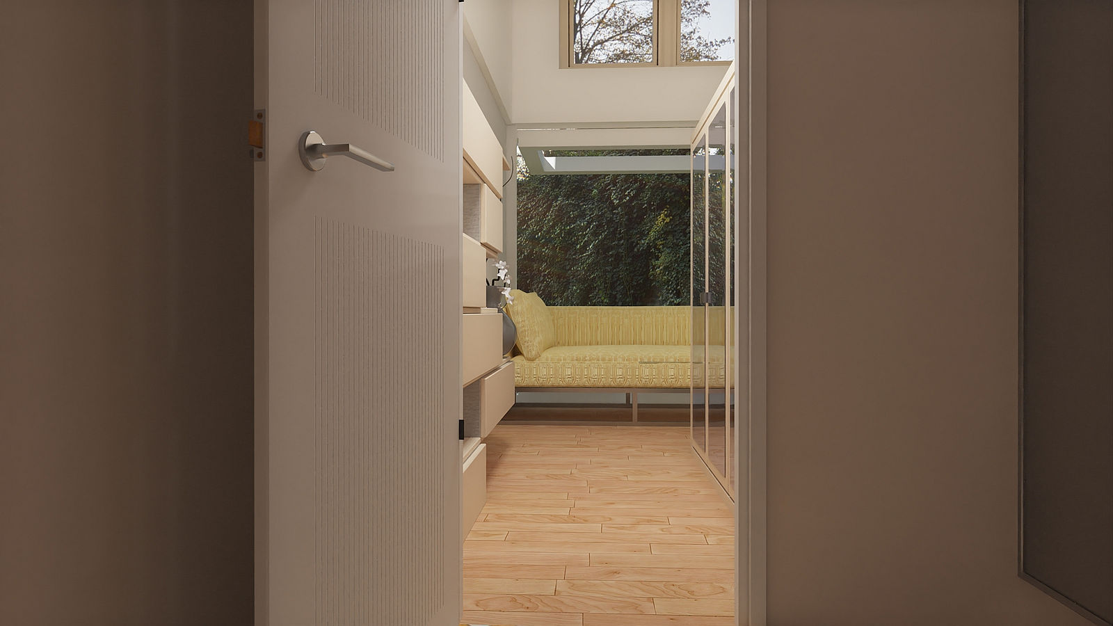
Just to say that I have slightly altered the render angle to show the width of the room and better place the minds eye for scale. The bed is smaller but the reflection repeats the end with it's cushion/pillow. Not ideal and I'm looking to make something a bit better. I may also alter the centre portion layout slightly. The stairs are space savers and right behind the wardrobe.
The name references a child rhyme for a game of hide and seek, it goes back to well before my 5th year on planet earth. Bryan, you are the go to guy for tech stuff, any suggestions for mechanism to move the opening wall sections?
You can also see the scale of the roof windows/skylights and they are less than 3' wide and about four feet high, the bottom moves out within the frame for ventilation.
-
That's looking really good!
-
Ta mate, I'm moving it on. Dropped a clanger with some of the walls by offsetting the shadow catcher (A small cutout at the base of the wall to exaggerate the base of the wall) the wrong way. Driving me up the wall putting it right.
-
@mike amos said:
Ta mate, I'm moving it on. Dropped a clanger with some of the walls by offsetting the shadow catcher (A small cutout at the base of the wall to exaggerate the base of the wall) the wrong way. Driving me up the wall putting it right.

-
I know, pun intended but sometimes we take a short cut and it ends badly.

-
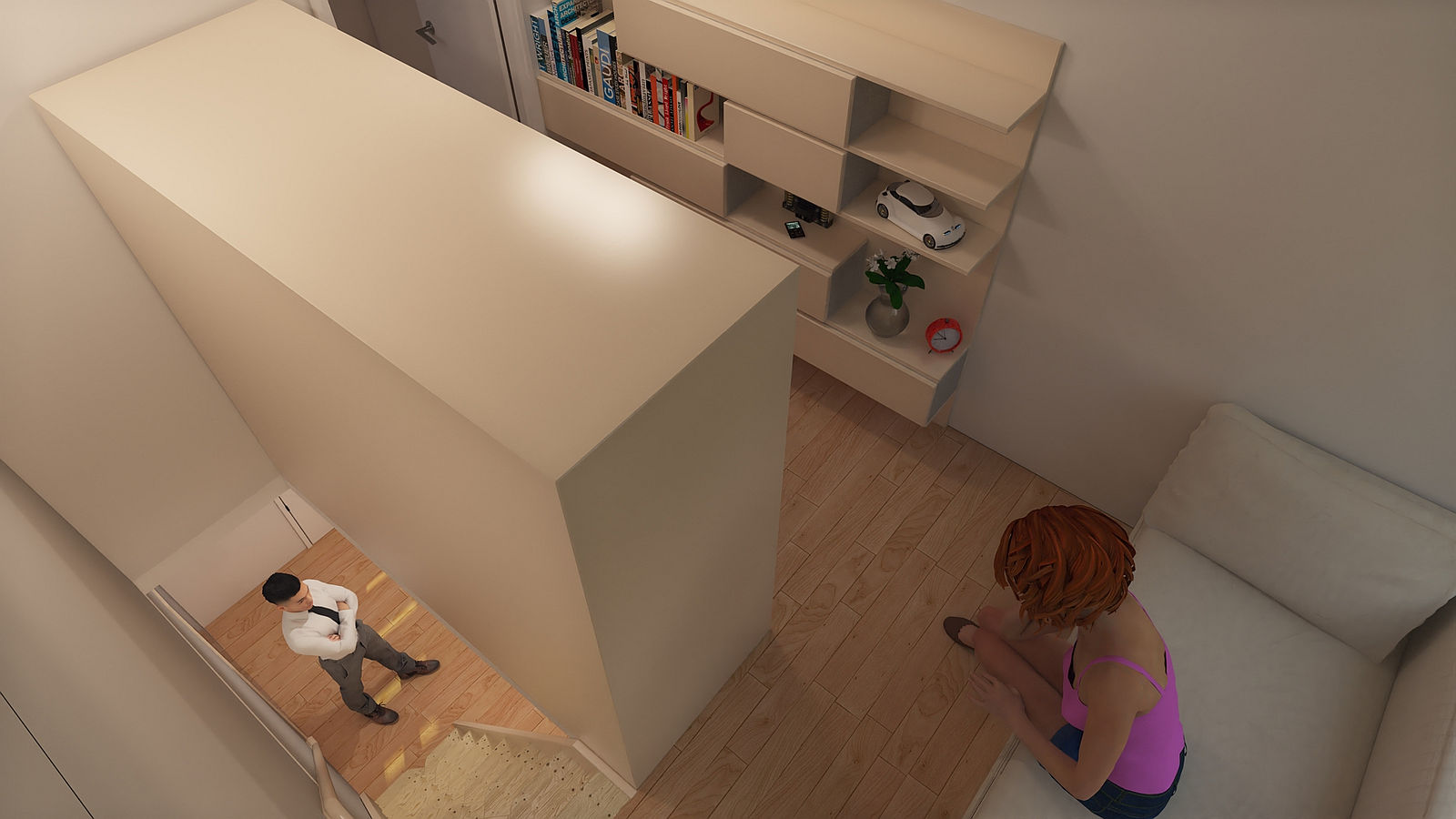
Interior looking down from the extended ceiling level. This is still getting light levels etc correct and I hope to find a good bleached Oak for the woodwork or another light wood to keep the airy nature I am going for.
-
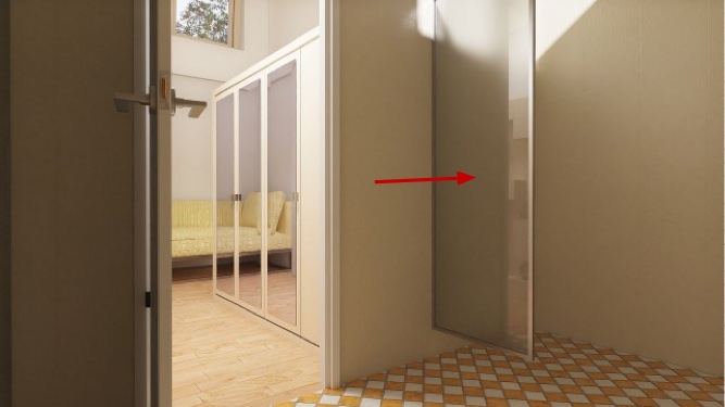
Really like what you’ve been doing with this . One question though, just what is the mirrored panel on the right side of the doorway in your first posted image. I must be slow or something it just looks like it’s kind of floating in the air. I can’t figure it’s purpose ? You commented about better wood textures, have you tried out Rich’s “Deluxe Long Grain” wood pack that’s available in the store. If memory serves its free to premium members.

-
Thanks mate, I had forgotten those. Mind like a brush some days. The mirrors are on the wardrobe doors as a method of boosting light in the space, with the high ceiling it seems to work.
-
Mike , I get the mirrors on the closet doors. What I can't figure out is the "mirror" that is to the right of the open door. It looks like it is mounted on the wall and sticking out at a ninety degree angle into the room ?
-
Well, I'm sorry, another senior moment. The thing you pointed out is a glass shower screen.
I feel like a proper Rodney mate.

-
@mike amos said:
Well, I'm sorry, another senior moment. The thing you pointed out is a glass shower screen.
I feel like a proper Rodney mate.

No worries Mike. I was the one having the “doh” moment. Just couldn’t make “hide or hair” out of what I was looking at !


-
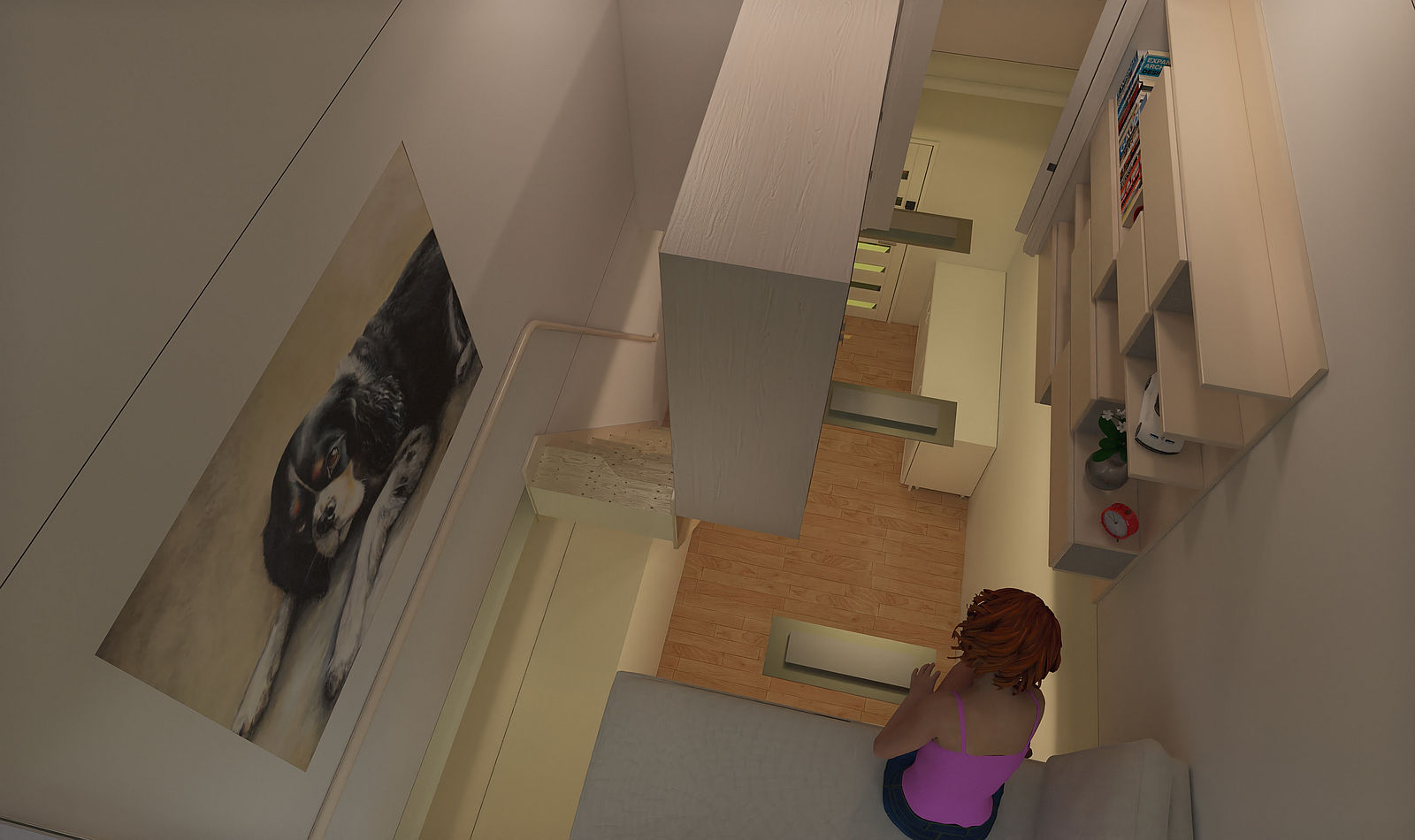
Another view with characters.
-
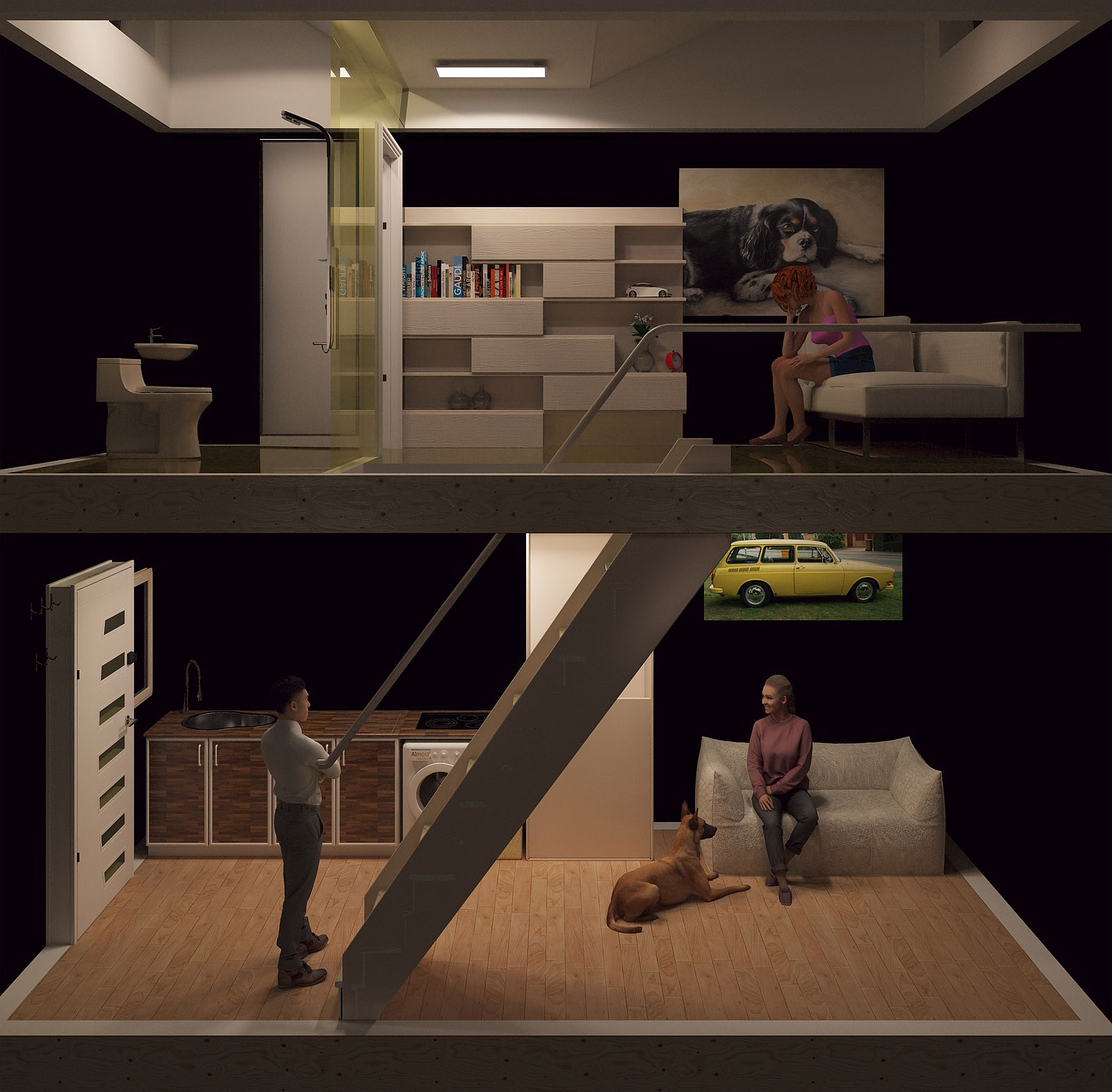
A variation to show the internal layout. No natural light or hdri involved. I have been advised that the rear wall should have been retained but not sure, I'll kip on it and go from there. The dog belonged to the girl upstairs on the sofa bed. The dog is not around any more and therefor missed. Trying to add a subtle story in these but perhaps a bit too subtle.
-
Nice!

-
Ta mate.
Hello! It looks like you're interested in this conversation, but you don't have an account yet.
Getting fed up of having to scroll through the same posts each visit? When you register for an account, you'll always come back to exactly where you were before, and choose to be notified of new replies (either via email, or push notification). You'll also be able to save bookmarks and upvote posts to show your appreciation to other community members.
With your input, this post could be even better 💗
Register LoginAdvertisement


