Old Downtown
-
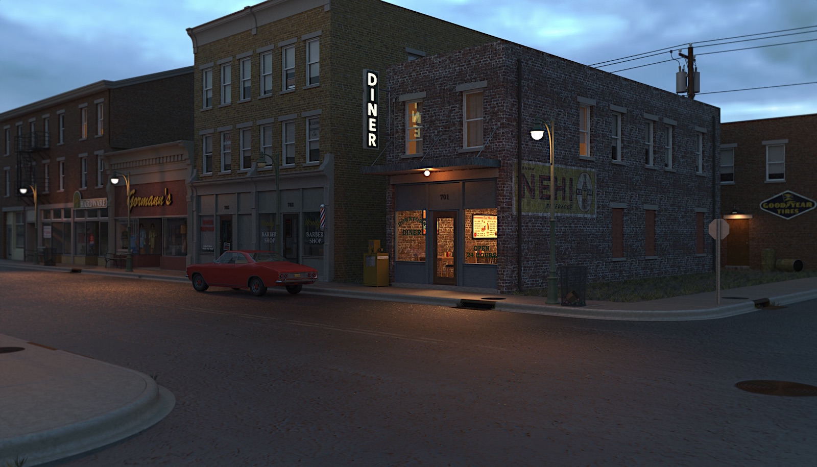
Bryan , alvis thanks gents. Posting another test render. This one I used a sunrise HDRI for the environment. Rendered at a larger size than earlier test. Of course I had to do a bit of messing about with Gimp..... Far from perfect but I think I'm making progress.

-
Nice work and definately progressing, the thing I like is that you are moving forward and not just saying that is good enough. That experimenting is what sets aside an OK render from an exellent render. If I can say one thing it is the left botom kerb it looks to pristine. I would expect to see some cracks and or rubbish.......leaves, a coke can or scrunched up paper bag etc. Keep up the good work

 And you say you have an old computer. You have patients to burn
-
That's looking good enough to call it done.

Better and better!
-
Thanks L i am, Bryan. Still have a way to go with this thing. Gave some thought to trying to do some damage to the curb, haven't come up with anything yet that "looks right" to me yet. The lack of grass scattered about is on purpose. This things sort of a time machine for me, back to a time when people didn't trash everything up and you weren't stepping on shitty disposable diapers in every parking lot.....


-
This is so excellent! All around great work. If you are not tired of it, I, for one, enjoy seeing the polishing up of elements! The different time scenes and black and white!


I had a different thought independently though. I too was looking for a little trash. People in the mid century US did throw a lot of trash. At first it didn't seem to matter then built up with more disposables. That's why litter laws were invented. But then it would be random paper and tin cans. There are so many more people now and there is so much more plastic, that even with greater awareness areas get trashed. And which parking lots are you frequenting?!
The weeds are perfect though!
-
In reference to the modeling and rendering Thanks pbacot !
On another note I figured I might be opening a can of worms with my "trash comment". Lets just say this is my observance and my point of view...... I'm just not going to be able to "trash" up this scene. My observance growing up and being around places such as I'm depicting I just never saw a lot of litter in these main street areas. Out along the roads and highways was a different matter. As for the shitty diaper comment I've seen this in store parking lots big and small all over this country. Easier to toss it on the ground then keep it in the car until they get home I guess.

I'll stop my ranting now and get back on topic...
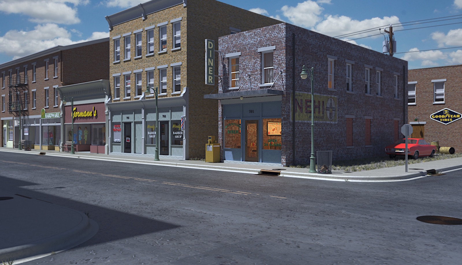
 . Posting a daytime render I ran last night. Rendered at a higher resolution than previous efforts. I told the cook to move his car out back ! As usual rendered in Twilight and post pro in Gimp. I did put the sky image in post pro. Well back to tweaking textures... If you all get tired of my craziness just tell me to stop !


-
I like it.


If I saw anything that could use some adjustment (which is not really necessary) you might dull the Good Year sign a little. Given its location a little farther back and somewhat subdued, it would probably not stand out as much as it currently does.
-
Looking good.

-
Thanks ntxdave, and don't disagree the "goodyear tire" sign is a little too bright in that test. It's catching a lot of strong light in that particular set up. If I repeat that view would need to fail the "shine" down a bit.
Thanks Bryan. I think I need to take a short break with this one to regain my "perspective". It's starting to make me a little crazy !!!! -
I reckon you are almost 'there' mate, you do make a cracking render.
-
Thanks Mike
-
Coming along very nicely

-
Thanks loco. Hope to have some finished renders soon.....
-
I am loving this one.
-
Thanks Eric. Posted the final two renders of this in the "Gallery". Here's the link.
https://sketchucation.com/forums/viewtopic.php?f=81&t=73718 -
What makes an impact on me is seeing the progression to the end. Wonderful progress. Bravo.
Hello! It looks like you're interested in this conversation, but you don't have an account yet.
Getting fed up of having to scroll through the same posts each visit? When you register for an account, you'll always come back to exactly where you were before, and choose to be notified of new replies (either via email, or push notification). You'll also be able to save bookmarks and upvote posts to show your appreciation to other community members.
With your input, this post could be even better 💗
Register LoginAdvertisement


