Marketing Brochures the Full Job!
-
Sometimes I wouldn't trade my job for anything!
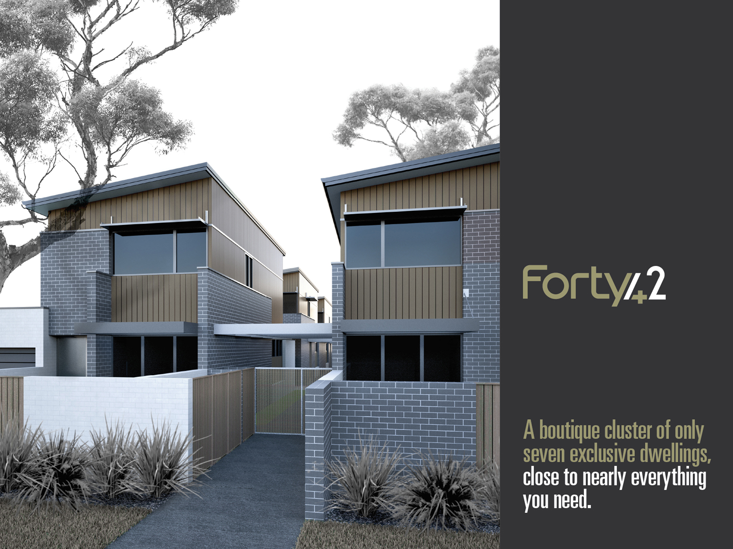
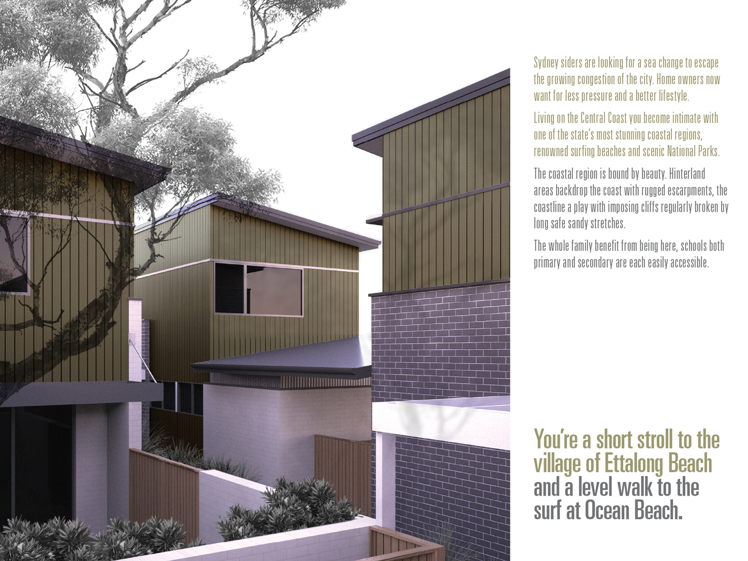
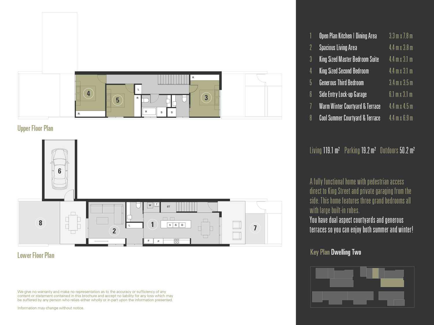
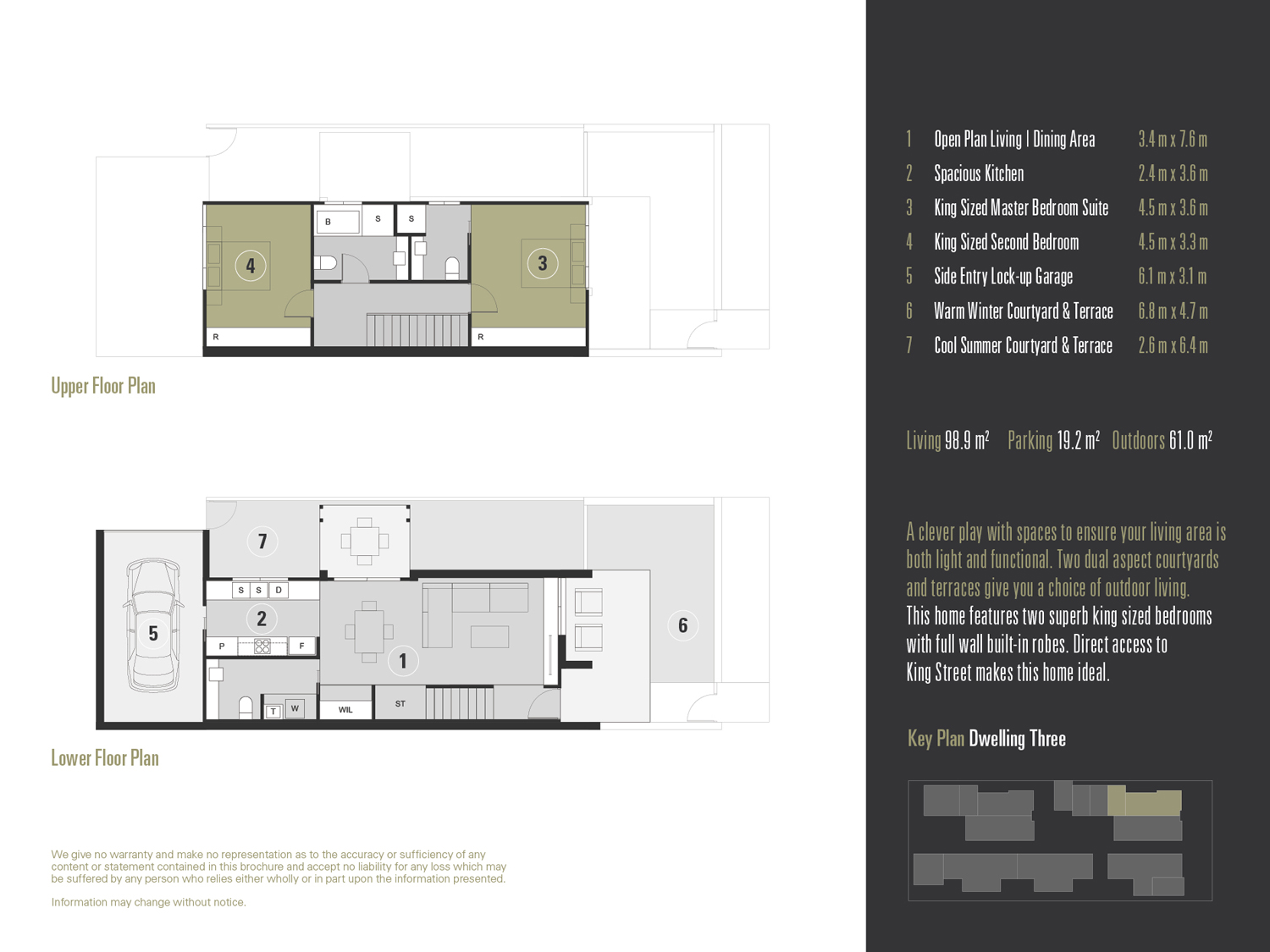
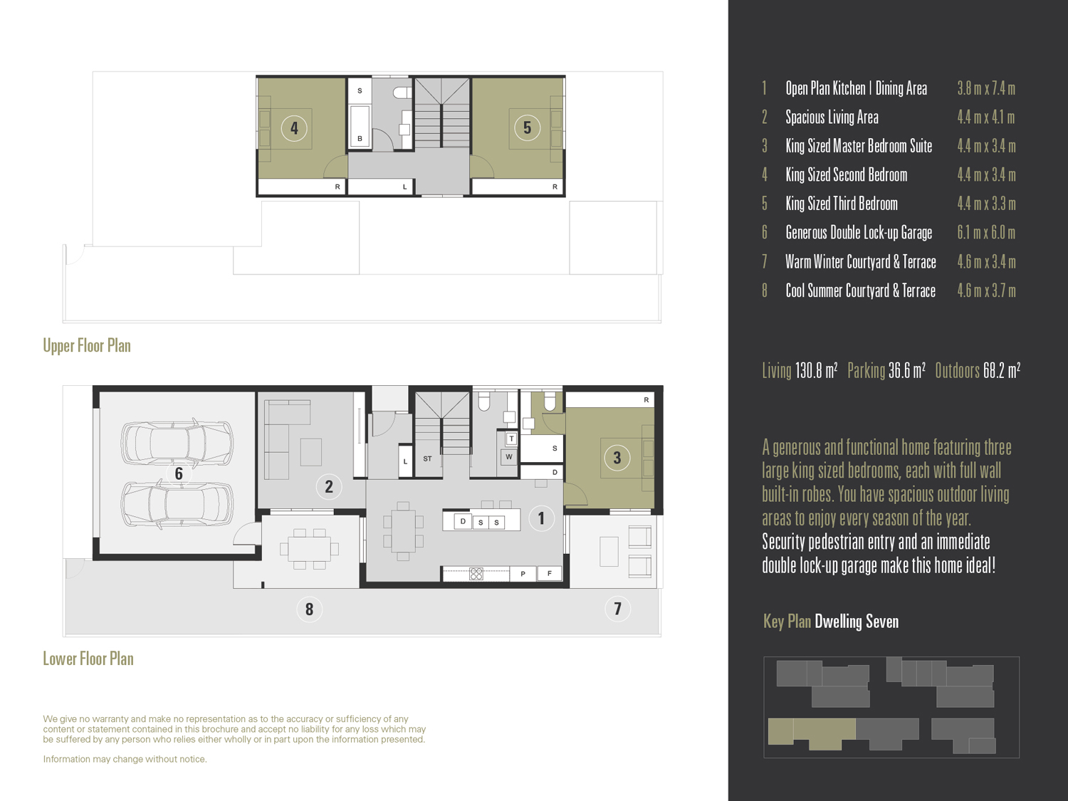
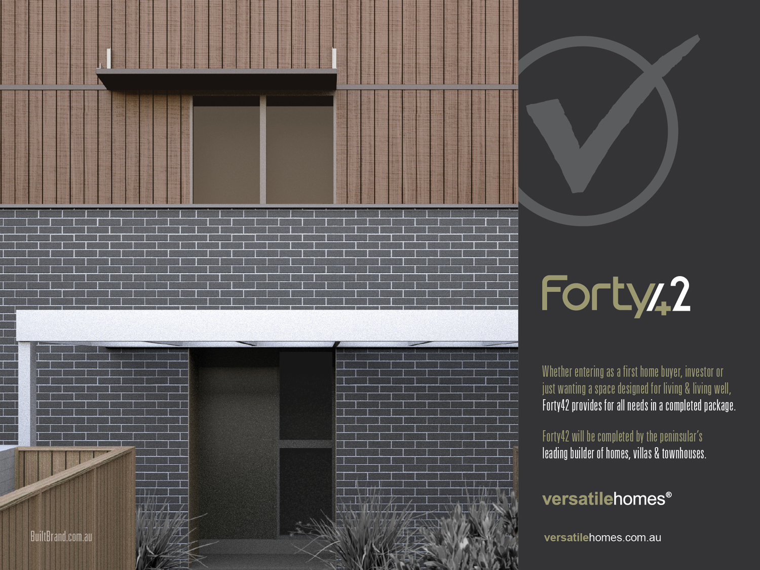
I've just completed this townhouse job in Australia, it was the complete stack of work: Designing, planning, rendering and developing the marketing brochures! Other designers considered for the project could only achieve 6 units maximum, the client eventually gave me a call. Whilst doing all his brochure works I rarely get invited to complete designs as I only provide concepts (I couldn't be stuffed documenting).
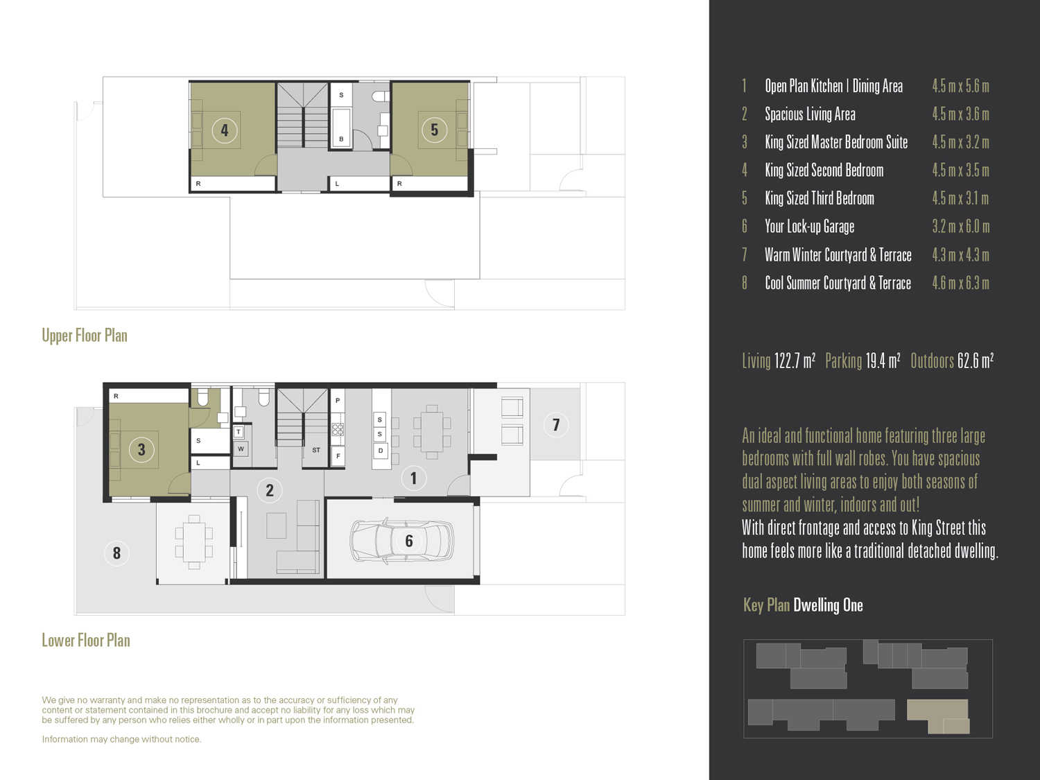
While the units are relatively small (100-130m2), there are 7 units (5 x 3 bed, 2 x 2 bed) each with 3 bathrooms and generally, all bedrooms are king sized. Each unit also has two courtyard areas, many facing alternative aspects.
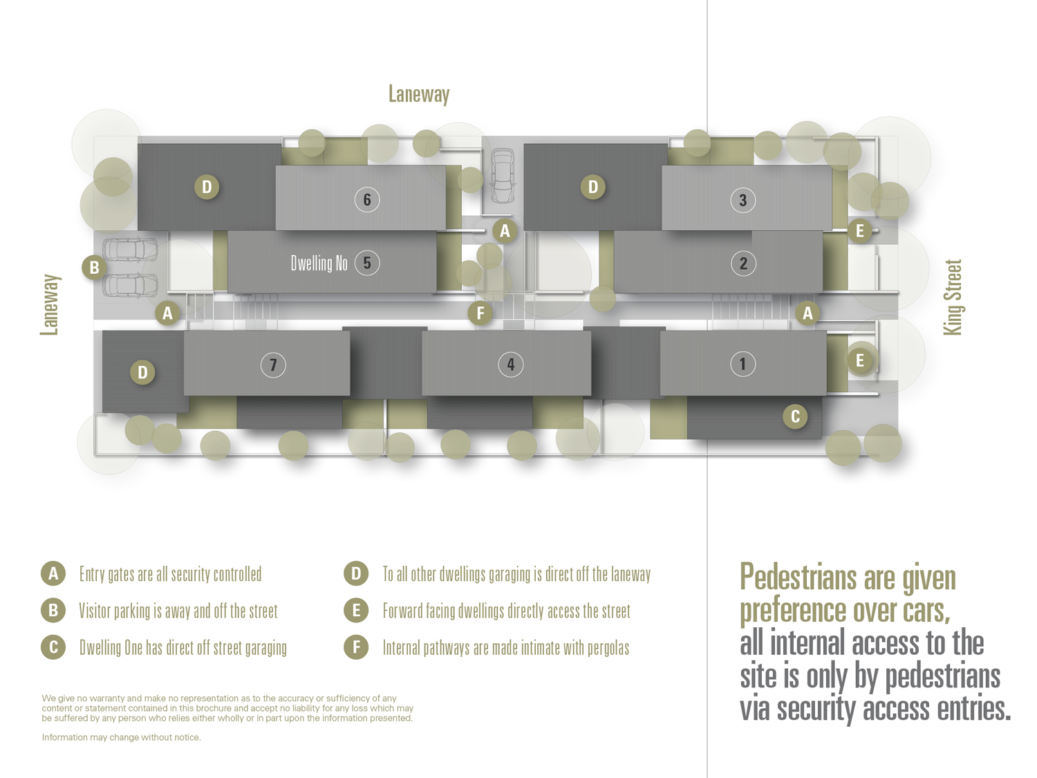
The client is rather stoked, he hasn't seen a development like this where all internal access is by pedestrians only.
Tools used: SketchUp, Maxwell Render, Photoshop, Layout (producing plans), Indesign (compiling brochure).
-
So nice! Congratulations! Always great to see your work. I was just thinking of you today and something you shared a long time ago (my brain pulled it up somehow as aa rendering tip).
-
As always, big thanks mate! BTW I think my rendering tips are all very old school now. As you can see, I've become a very lazy renderer, just doing the very least that I can!
-
Nice work mate
 I thought those trees looked familiar then I found out you were in Australia.
 -
Great job Richard, what is needed without excessive fripperies. Akin to the actor who does a Shakespeare for a thirty second commercial.
Clarity, a very fine thing to have in a presentation.
-
As I told you. Really a beautyfull work, especially the colors!
-
Clean, uncluttered with light effect that doesn't seem natural but is believable, if you get my drift! Excellent graphics, thanks for sharing.
-
Most excellent !

-
@l i am said:
Nice work mate
 I thought those trees looked familiar then I found out you were in Australia.
Thanks mate, strangely when I was in India a few years back - there are gum trees everywhere! Supposedly imported in the early days of trade!
-
@mike amos said:
Great job Richard, what is needed without excessive fripperies. Akin to the actor who does a Shakespeare for a thirty second commercial.
Clarity, a very fine thing to have in a presentation.
As always thanks Mike!!! Funny, the render style is normally what I do on plans going to council. On the previous job I did for this same client he suggested he loved the render style and preferred it for marketing. Hence it has since become my best friend!!!!
-
@jo-ke said:
As I told you. Really a beautyfull work, especially the colors!
As one fan once said to another,"Thanks man"!
Seriously gem of a project, it tested my skills and ability to argue variations to council policy!
-
@shawb said:
Clean, uncluttered with light effect that doesn't seem natural but is believable, if you get my drift! Excellent graphics, thanks for sharing.
Cheers mate! Yeah I quite like the lighting too, it is just a simple sky dome with no sun or additional lights. It is seriously as lazy as one can get! The subtle tree shadow that adds just that bit of truth is just the tree copied over, blurred and opacity reduced and cropped to the alpha image.
Using greyscale for the landscape again just reinforces my laziness, all sorts of errors there are covered up!
-
-
First rate! Your work is so clean and yet compelling.

-
@bryan k said:
First rate! Your work is so clean and yet compelling.

Thanks Bryan, totally funky job to do!!!!
Hello! It looks like you're interested in this conversation, but you don't have an account yet.
Getting fed up of having to scroll through the same posts each visit? When you register for an account, you'll always come back to exactly where you were before, and choose to be notified of new replies (either via email, or push notification). You'll also be able to save bookmarks and upvote posts to show your appreciation to other community members.
With your input, this post could be even better 💗
Register LoginAdvertisement


