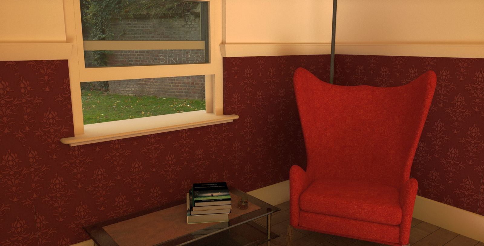
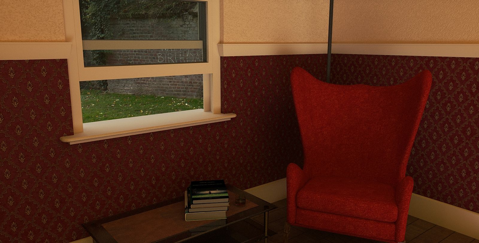
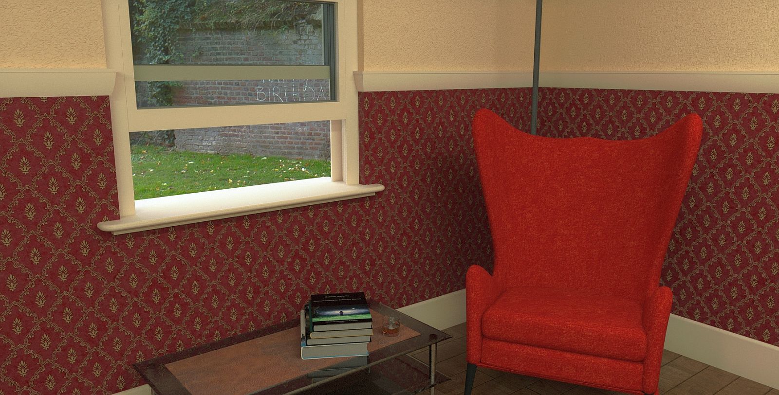
Reading Room.
-
Apart from the darker wall paper, I am reasonably happy. Twilight render.

-
Changed wall paper.

-
... a good resault
 a great wallpaper
  and super textured armchair!!
for the upper lighter wall I suggest to use the less textured material setting you used in your first render... -
Hi Mike, could I suggest using the sun in sketchup and ajusting so the light streams in through the window onto the chair or whatever looks good and then rendering that?
-
Thanks guys, I already came to much the same conclusion. The sunlight idea may not work for a reading room though, glare would be a problem.
-
I like the framed Birthday graffiti!
-
Pure chance but I could not change the view when I spotted it. Sometimes I get lucky.
-
I altered the light colour a few times for effect but have ended up going back to the original. Better I think.

-
perfect
 - at least for me
-
Thanks, thought I had lost the plot for a while.
-
Good Show

-
Ta mate.
Hello! It looks like you're interested in this conversation, but you don't have an account yet.
Getting fed up of having to scroll through the same posts each visit? When you register for an account, you'll always come back to exactly where you were before, and choose to be notified of new replies (either via email, or push notification). You'll also be able to save bookmarks and upvote posts to show your appreciation to other community members.
With your input, this post could be even better 💗
Register LoginAdvertisement


