Trays in Sketchup 2016
-
Hi everybody! I am back after a long hiatus for me, because I wanted to start a discussion about one of the newest features of Sketchup 2016.
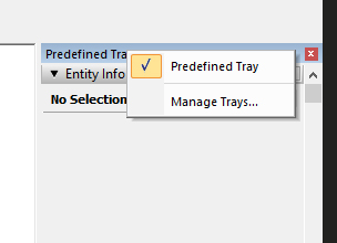
I don't know if you found about it yet, but when you right click on the predefined tray you get a command that says: "Manage Trays"

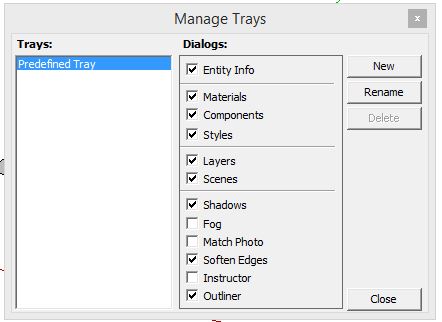
When you click you get this window:

In this window you can create a defined set of different trays, which you can then assign to different functions.
When you create more than one tray, you can then go from one another with a series of tabs that show up in the lower part of the tray.
So you can have, say, a Tray for model information, one for materials, another one for scenes and so on.
I find this really nice, it gives me a 3DS MAX feel in Sketchup and I like it a lot.
I am still working on how to assign trays efficiently, and I'd like to know if anyone else is using them, and how.
Take Care,
Michael -
Modern but old Menus were also not so bad!

-
Yes, I found that and have now configured 3 trays (which appear as tabs in the tray area): Main, showing Outline, Materials (for me these tend to be large); Info, showing Entity Info and Layers; Effects, showing Soften Edges, Shadows, and Styles.
I would like to have Entity Info in two places but the software won't allow it.
-
I agree with your comments. I also would like to be able to arrange them.
See this thread as well: http://sketchucation.com/forums/viewtopic.php?f=15%26amp;t=64200
-
"I would like to have Entity Info in two places but the software won't allow it."
I also want this and found I couldn't do it Why would someone implement this restriction? It makes absolutely no sense.


-
I would like the tabs to be at the top of the Tray instead of the bottom. It's just where my mouse naturally wants to go.
-
Can I vent about the introduction of trays in 2016? I hate the trays. I don't understand how this is a better way to work. What used to be simple has become cumbersome. What used to be intuitive and easy to access is now clunky and frustrating to access. This feels like a step backwards. I'm not sure why the developer is forcing this down our throats. The beauty and appeal of sketchup has been it's simplicity and uncomplicated ease of use. That is what makes it so wonderful and great to use. The introduction of trays is a fundamental departure from the uncomplicated and brilliant program. Tray's are out of sequence and seem not to belong. They are counter intuitive. We shouldn't have to jump hoops to access commands that were so simple to access prior to trays? Why? Why? Why? If it ain't broke - don't fix it!!!! This isn't about whining or bitching over a change. I'm all for improvements. If this change was an improvement I would be applauding. Not every program change is for the better. Please Please - Get rid of the trays - they are a hindrance. I hate using them - I've tried to get used to them. I want the old interface back. They take up screen space - they are clunky - ugly - awkward, backward, just really stupid.I fear for the future of this program. I don't even want to use the program anymore. Its scary to think a bunch of intelligent developers sitting around a table asking themselves - hey let's add this tray feature to sketch-up and change the way millions of users have been happily interfacing...and calling it an improvement - what next??? for the love of sketchup - I hope they don't continue to muck it up. Sorry - I just needed to get that off my chest...
-
Frankly I like the trays very much and I don't find them clunky at all. They keep the utility windows out of the drawing space and with custom trays, they can be organized into smaller groups if desired. The tray can be moved to a second screen for those who like that although I prefer to keep them on the same screen so I can use the second display for reference files and other applications. I laid out SketchUp in much the same way keeping my drawing window slightly narrower than the full screen and the utility windows stacked outside to the right. The bonus for me with the tray is gaining additional real estate for toolbars at the top.
Hello! It looks like you're interested in this conversation, but you don't have an account yet.
Getting fed up of having to scroll through the same posts each visit? When you register for an account, you'll always come back to exactly where you were before, and choose to be notified of new replies (either via email, or push notification). You'll also be able to save bookmarks and upvote posts to show your appreciation to other community members.
With your input, this post could be even better 💗
Register LoginAdvertisement


