sketchucation logo sketchucation
    • Login
    ℹ️ Licensed Extensions | FredoBatch, ElevationProfile, FredoSketch, LayOps, MatSim and Pic2Shape will require license from Sept 1st More Info

    A set of Plans (UPDATED)

    Scheduled Pinned Locked Moved Gallery
    30 Posts 18 Posters 3.1k Views 18 Watching
    Loading More Posts
    • Oldest to Newest
    • Newest to Oldest
    • Most Votes
    Reply
    • Reply as topic
    Log in to reply
    This topic has been deleted. Only users with topic management privileges can see it.
    • RichardR Offline
      Richard
      last edited by Richard

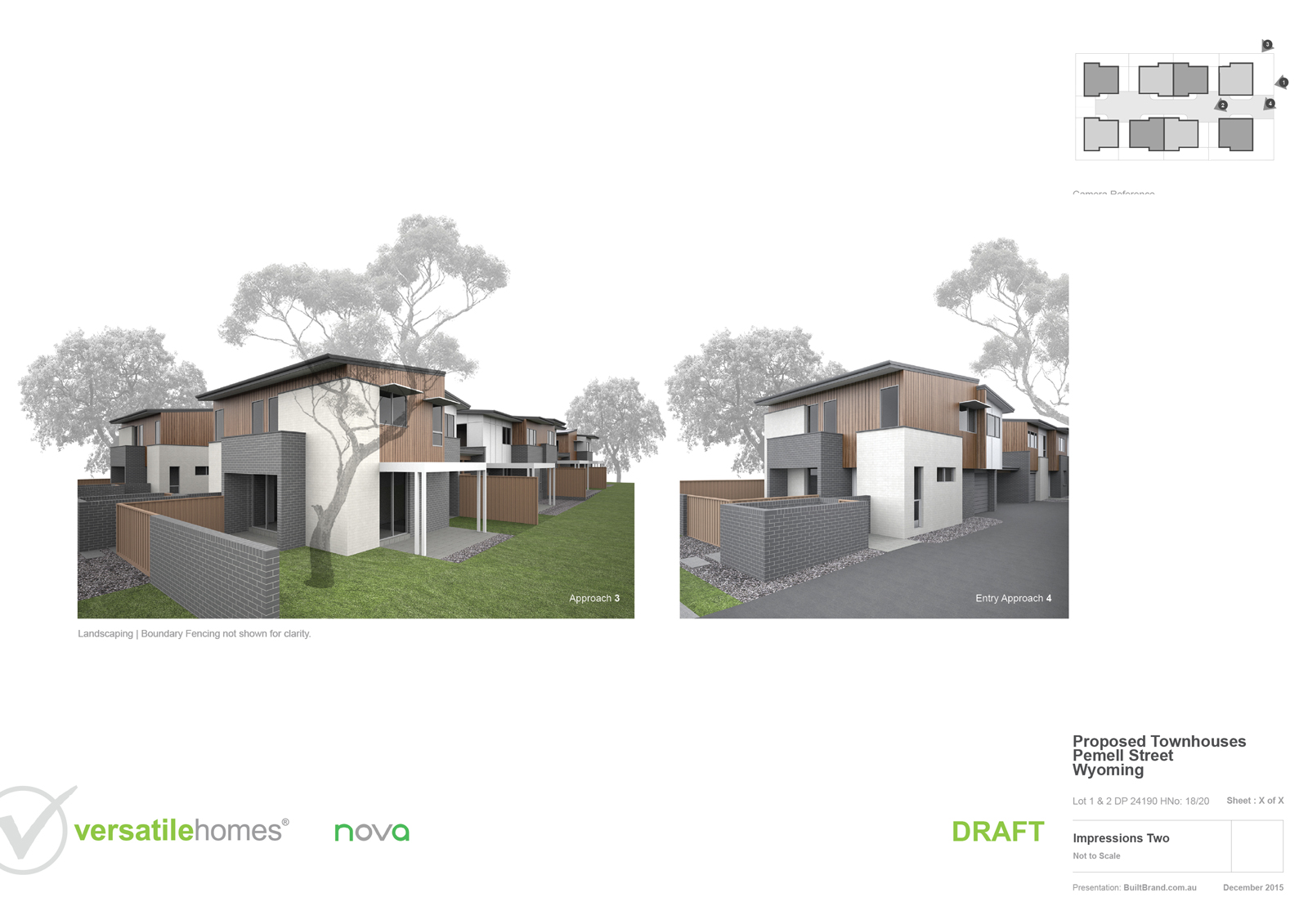
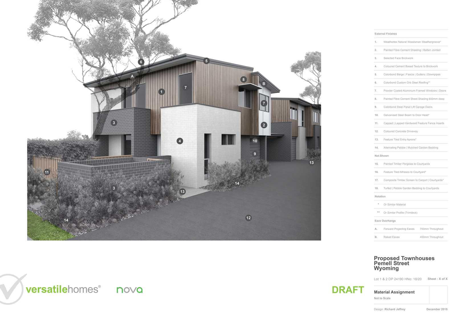
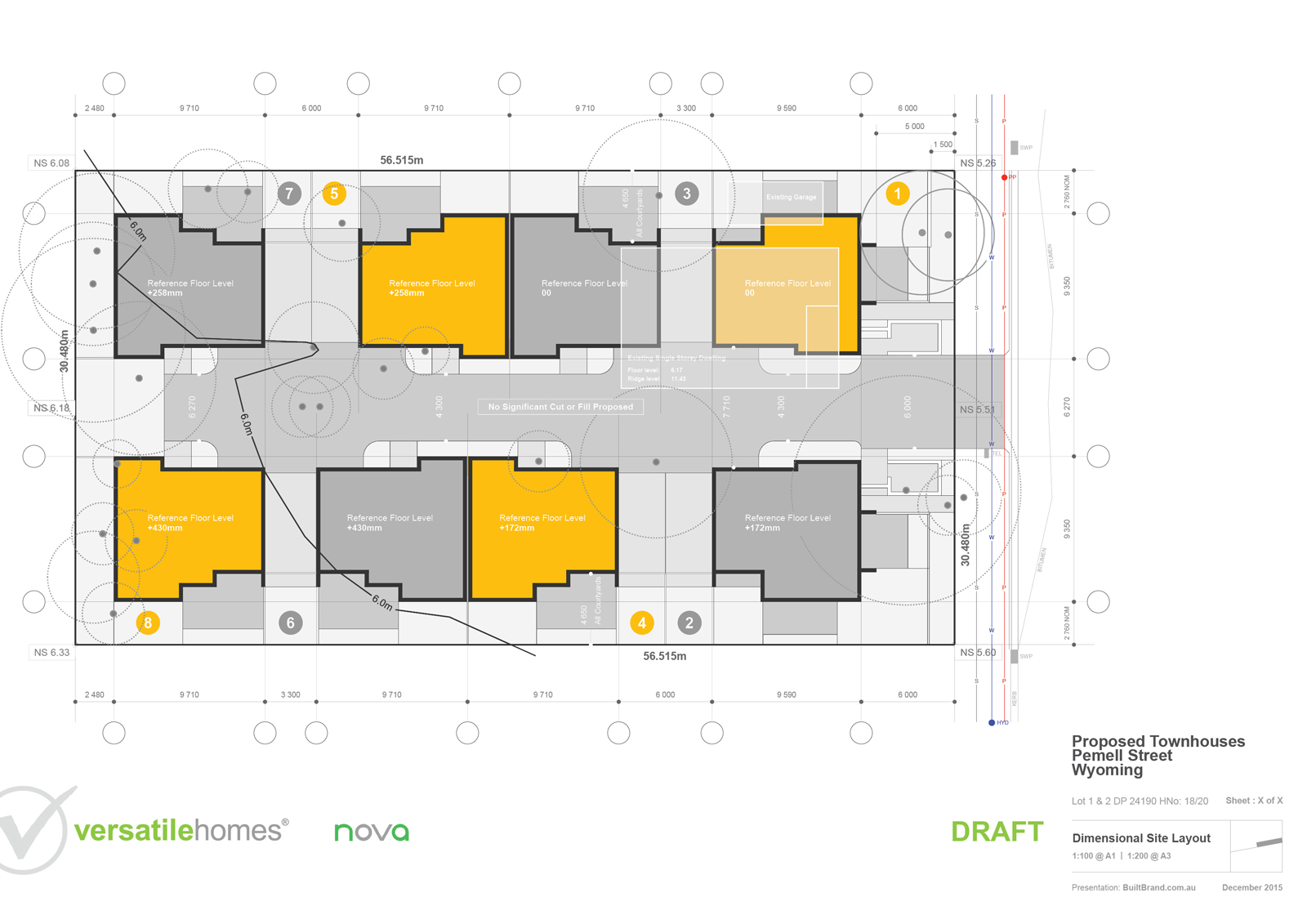
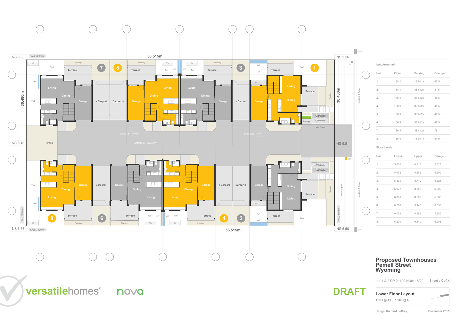
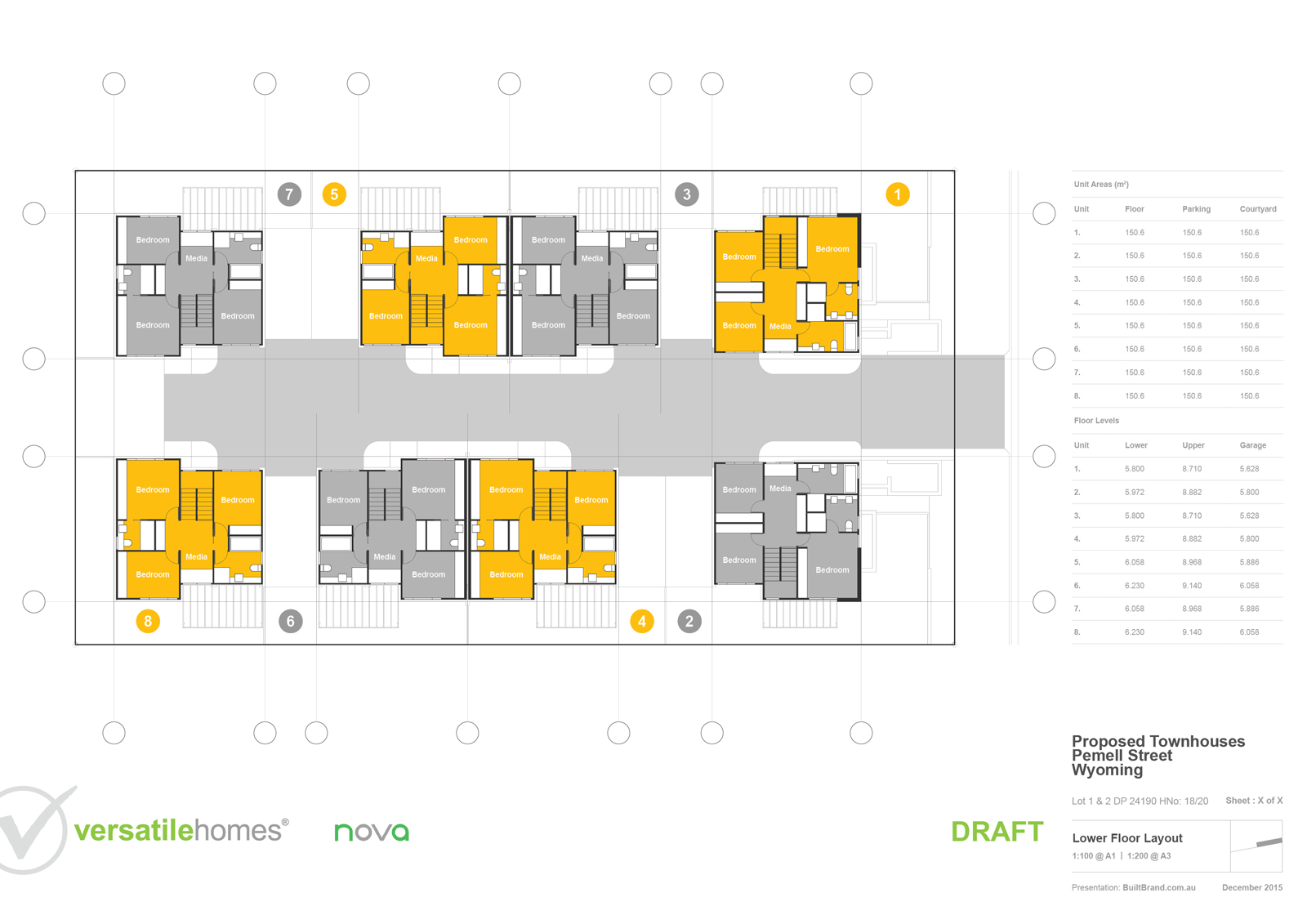
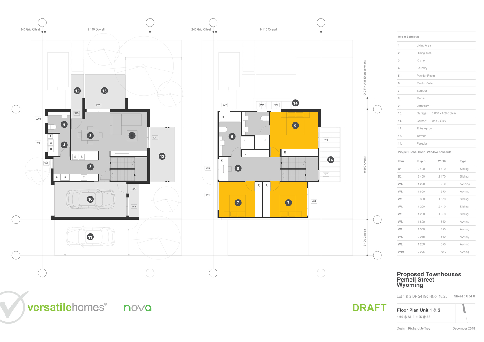
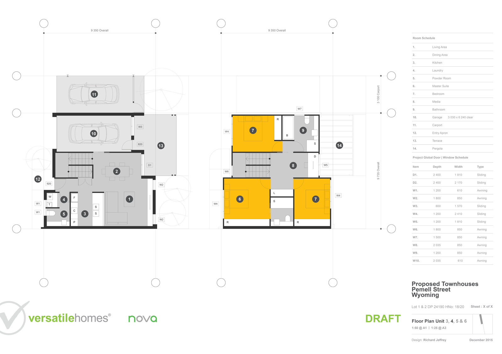
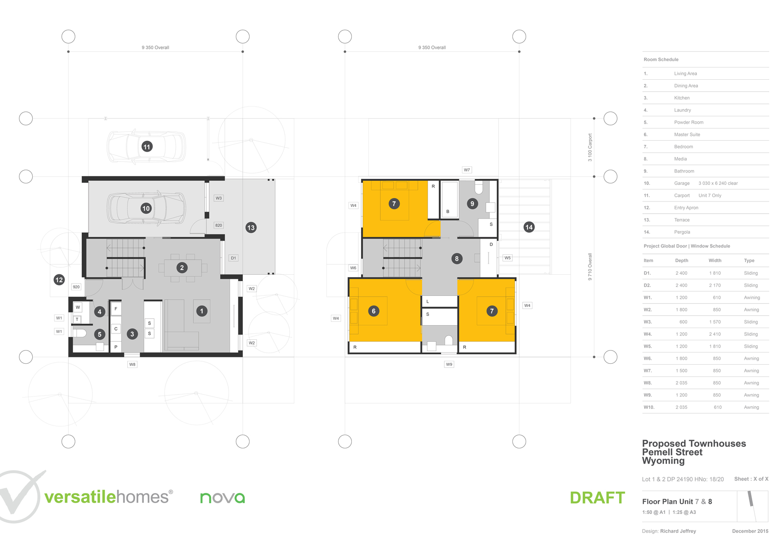
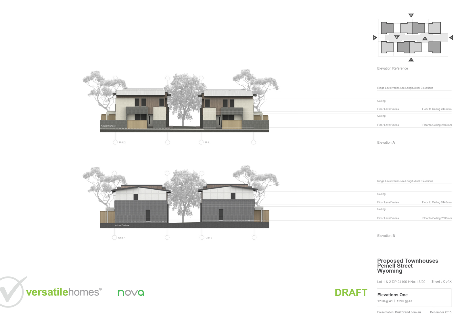
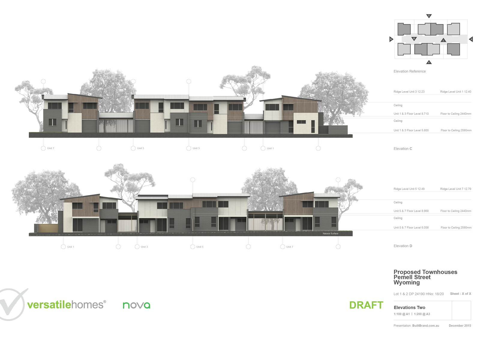
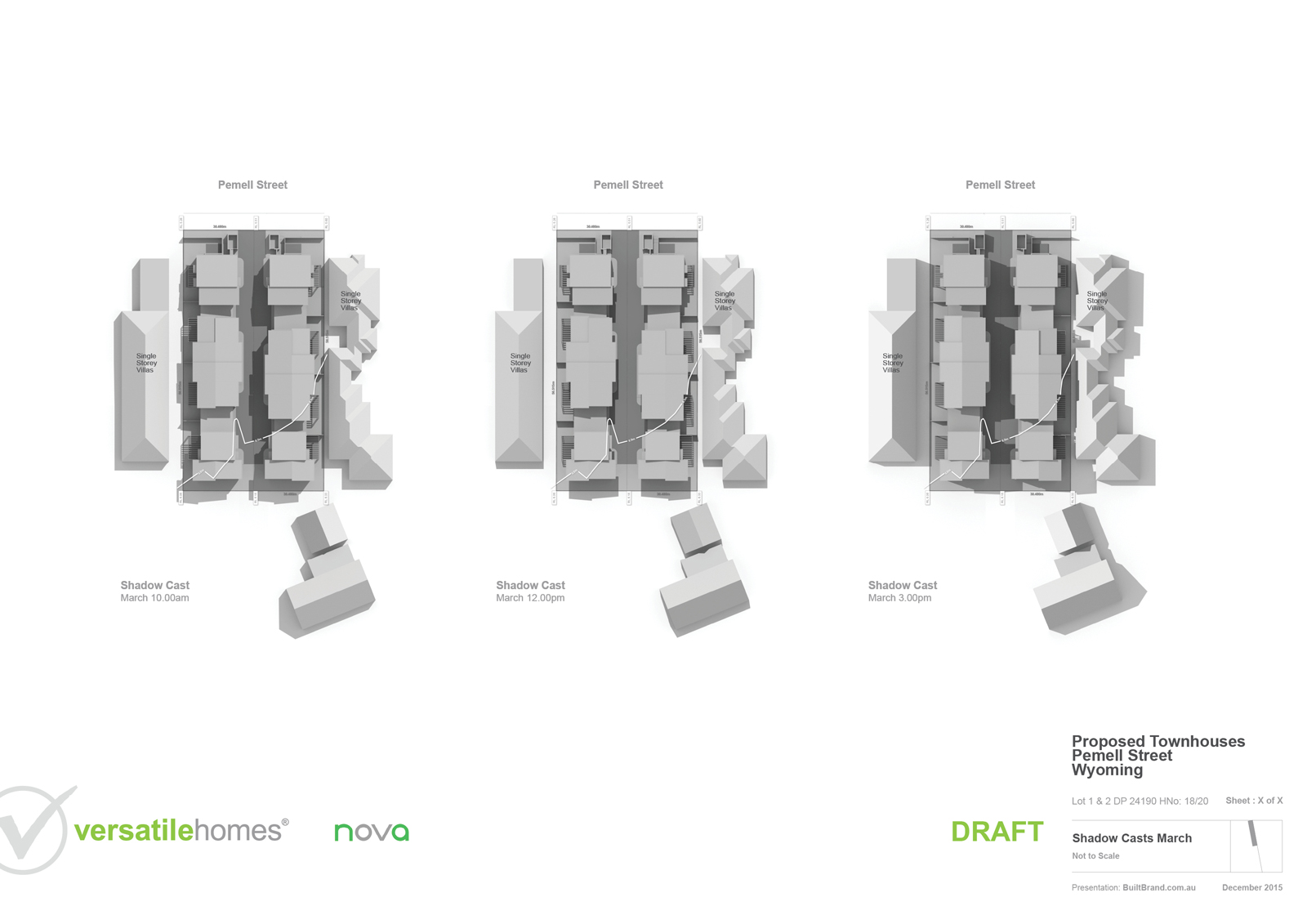
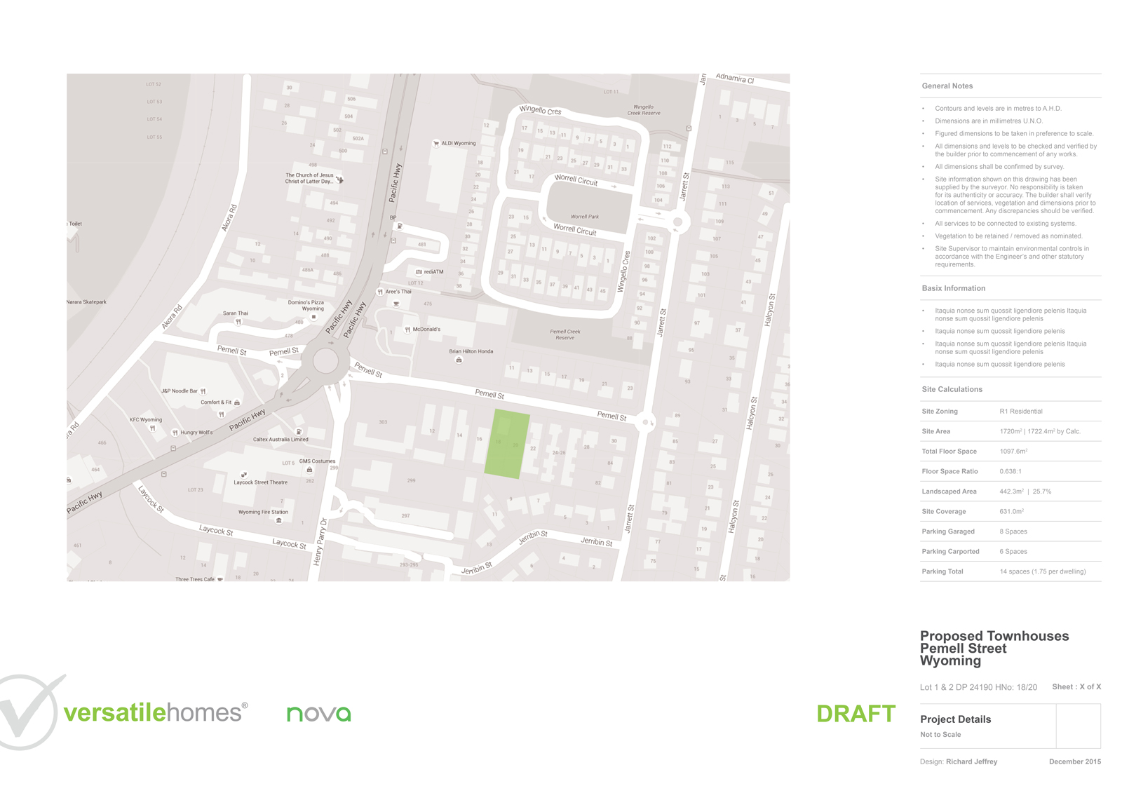
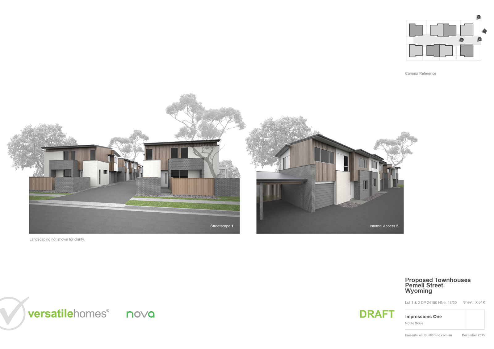
      8 Unit Affordable Housing Development. Still not complete, but almost there!

      Development planned in Layout > Modeled & Styled with SketchUp > Rendered in Maxwell > Image edited in Photoshop > Overlaid and Presented in Layout.
      1.jpg
      VH-WYOMING-.jpg
      VH-WYOMING-2.jpg
      12.jpg
      13.jpg
      VH-WYOMING-5.jpg
      14.jpg
      VH-WYOMING-7.jpg
      15.jpg
      16.jpg
      17.jpg
      VH-WYOMING-8.jpg
      VH-WYOMING-9.jpg
      VH-WYOMING-11.jpg

      [BUILTBRAND.COM.AU](http://builtbrand.com.au/)

      1 Reply Last reply Reply Quote 0
      • massimoM Offline
        massimo Moderator
        last edited by

        It's a pleasure to see works like this. Top quality images and extreme clarity at the same time. πŸ‘

        1 Reply Last reply Reply Quote 0
        • RichardR Offline
          Richard
          last edited by

          @massimo said:

          It's a pleasure to see works like this. Top quality images and extreme clarity at the same time. πŸ‘

          Thanks mate! As you'd well know, sometimes a site when represented at scale doesn't lend it's self well to a page layout (the want for surrounding "white space"). This was one of those, that at it's extreme, always put up a fight with sheet size! Grrr!

          [BUILTBRAND.COM.AU](http://builtbrand.com.au/)

          1 Reply Last reply Reply Quote 0
          • DanielD Offline
            Daniel
            last edited by

            The project looks great all around, Richard.

            My avatar is an anachronism.

            1 Reply Last reply Reply Quote 0
            • cottyC Offline
              cotty
              last edited by

              Very nice (as always)!

              my SketchUp gallery

              1 Reply Last reply Reply Quote 0
              • U Offline
                unearthed
                last edited by

                Very effective and clean Richard, thanks

                Growplan - People ∩ Plants ∩ Place

                windows 7 64b, 4GB RAM, SU 8.0.16846
                Gimp, QGIS, Vectorworks 12, Bricscad 11

                1 Reply Last reply Reply Quote 0
                • pbacotP Offline
                  pbacot
                  last edited by

                  These look very good! The choice of styles works well for the presentation. Did you use the model at all for the floor or site plans, or all the plans done directly in LayOut?

                  MacOSX MojaveSketchUp Pro v19 Twilight v2 Thea v3 PowerCADD

                  1 Reply Last reply Reply Quote 0
                  • jo-keJ Offline
                    jo-ke
                    last edited by

                    I like your simple and clear style.
                    Very good work

                    http://www.zz7.de

                    1 Reply Last reply Reply Quote 0
                    • RichardR Offline
                      Richard
                      last edited by

                      @pbacot said:

                      These look very good! The choice of styles works well for the presentation. Did you use the model at all for the floor or site plans, or all the plans done directly in LayOut?

                      Thanks mate! The Site and Floor plans are all straight out of Layout and ALL on the same page with Layer management only to export versions.

                      I just find this workflow less painful and produces very clean results.

                      [BUILTBRAND.COM.AU](http://builtbrand.com.au/)

                      1 Reply Last reply Reply Quote 0
                      • RichardR Offline
                        Richard
                        last edited by

                        Thanks all for the positive comments. Its been a fun job as it's so tight.

                        [BUILTBRAND.COM.AU](http://builtbrand.com.au/)

                        1 Reply Last reply Reply Quote 0
                        • utilerU Offline
                          utiler
                          last edited by

                          Lookin good mate, you have a knack with being able to tell a story with images....

                          Question though. 'Affordable Housing'? It is the buzz phase and has been for some time now. Pollies love it! πŸ‘Š πŸ‘Š πŸ‘Š

                          But it always prompts me to ask the question, 'what is an affordable range?'

                          Is this a strata project for public sale? If so where do they sit in the market?

                          purpose/expression/purpose/....

                          1 Reply Last reply Reply Quote 0
                          • HornOxxH Offline
                            HornOxx
                            last edited by

                            @jo-ke said:

                            ...I like your simple and clear style...

                            I like it as well - this style is exemplary πŸ‘

                            never trust a skinny cook

                            1 Reply Last reply Reply Quote 0
                            • pmolsonP Offline
                              pmolson
                              last edited by

                              I love the simple numbering system for calling out exterior materials. It allows the building to be the star.

                              1 Reply Last reply Reply Quote 0
                              • daleD Offline
                                dale
                                last edited by

                                Hey Richard
                                This is a top end example of how to extract the most important details of a project and present them in a manner that can easily be reviewed by a projects clients, planners/ bureaucrats, investors, and potential buyers.
                                Clean, simple, exacting, and yet composed visually,in a way that makes the concepts simple to grasp.
                                Makes it easy to overlook the mastery it takes to accomplish what you have here.

                                Great work.
                                Would love to see the final document with the "ipso facto" replaced, particularly to see the sheet discussing volumes, view corridors and prevailing winds.
                                I have learned a great deal from your work over the years Richard.
                                Thanks for sharing.

                                Just monkeying around....like Monsanto

                                1 Reply Last reply Reply Quote 0
                                • StinkieS Offline
                                  Stinkie
                                  last edited by

                                  @hornoxx said:

                                  @jo-ke said:

                                  ...I like your simple and clear style...

                                  I like it as well - this style is exemplary πŸ‘

                                  I agree. πŸ‘ I feel that the renders could do with a little more warmth, though.

                                  1 Reply Last reply Reply Quote 0
                                  • RichardR Offline
                                    Richard
                                    last edited by

                                    @pmolson said:

                                    I love the simple numbering system for calling out exterior materials. It allows the building to be the star.

                                    Yeah it works for me this way and quicker! Better that covering it with ugly leader lines!

                                    [BUILTBRAND.COM.AU](http://builtbrand.com.au/)

                                    1 Reply Last reply Reply Quote 0
                                    • RichardR Offline
                                      Richard
                                      last edited by

                                      @utiler said:

                                      Lookin good mate, you have a knack with being able to tell a story with images....

                                      Thanks man, I've always been a believer that making a proposal easy to digest gives you maximum favor in assessment, not just for the proposal in hand, but each time there after that the same planner is on an application!

                                      @utiler said:

                                      Question though. 'Affordable Housing'? It is the buzz phase and has been for some time now. Pollies love it! πŸ‘Š πŸ‘Š πŸ‘Š

                                      But it always prompts me to ask the question, 'what is an affordable range?'

                                      Is this a strata project for public sale? If so where do they sit in the market?

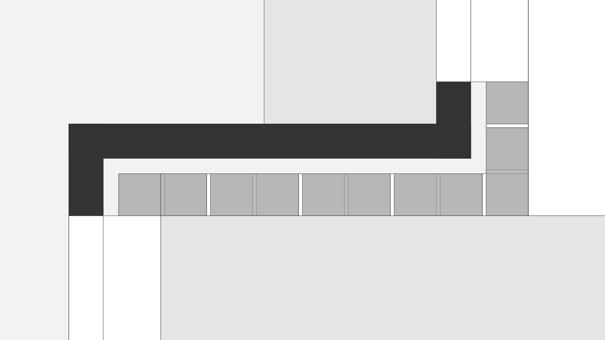
                                      In all honesty Andrew, it is NOT an application to be made under the NSW provisions for "affordable housing". More so, that the design solution is "affordable" in the sense of maximising density whilst ensuring good amenity at minimal cost of construction. Seriously Andrew, this is NAILED on construction costs. There isn't a brick cut! All standardised sizes and elimination of all excesses including lots of painting, yet still achieving what I'd think an acceptable aesthetic! Also, all planned around efficient furniture layout and minimum loss in circulation, the layout is tight!.

                                      I trialed something new in LO for this design, detail planned at 1:10 with a funky pre-made string of LO objects for brick guides, it's a funky workflow I need to chat with A.Dwight about!

                                      As having an intimate knowledge of the quality of the available stock and local design competition, these will pull the highest achieved in this precinct and even a few more upper levels. As this site is of dimensions that are most common in the area the option is there for duplication of the model.

                                      From an outer Sydney view point these will still in fact be "very affordable".

                                      For your own Aussie interest mate these are likely in the 550 range albeit that they are probably around 20 sq.m down on the average size.
                                      Untitled-1.jpg

                                      [BUILTBRAND.COM.AU](http://builtbrand.com.au/)

                                      1 Reply Last reply Reply Quote 0
                                      • RichardR Offline
                                        Richard
                                        last edited by

                                        @dale said:

                                        Hey Richard
                                        This is a top end example of how to extract the most important details of a project and present them in a manner that can easily be reviewed by a projects clients, planners/ bureaucrats, investors, and potential buyers.
                                        Clean, simple, exacting, and yet composed visually,in a way that makes the concepts simple to grasp.
                                        Makes it easy to overlook the mastery it takes to accomplish what you have here.

                                        Great work.
                                        Would love to see the final document with the "ipso facto" replaced, particularly to see the sheet discussing volumes, view corridors and prevailing winds.
                                        I have learned a great deal from your work over the years Richard.
                                        Thanks for sharing.

                                        Thank you Dale! Some nice observations and compliment there mate!

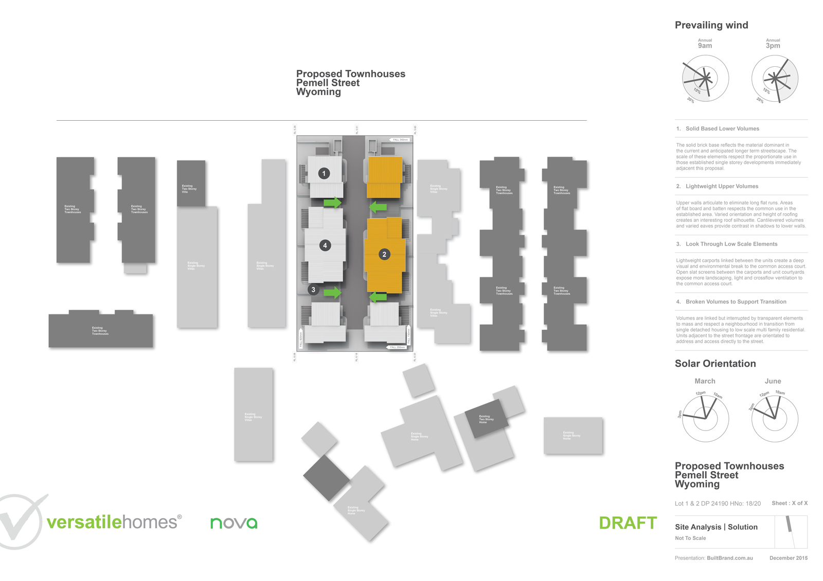
                                        Here is the analysis page as updated, it's something we just have to do to demonstrate we have considered the site attributes.
                                        VH-WYOMING1-.jpg

                                        [BUILTBRAND.COM.AU](http://builtbrand.com.au/)

                                        1 Reply Last reply Reply Quote 0
                                        • RichardR Offline
                                          Richard
                                          last edited by

                                          @stinkie said:

                                          @hornoxx said:

                                          @jo-ke said:

                                          ...I like your simple and clear style...

                                          I like it as well - this style is exemplary πŸ‘

                                          I agree. πŸ‘ I feel that the renders could do with a little more warmth, though.

                                          Thanks mate! These are a only for planning approval (demonstration of the concept and how it fits with controls) and of course finance.

                                          The fluffy, pretty pics will come with the marketing.

                                          [BUILTBRAND.COM.AU](http://builtbrand.com.au/)

                                          1 Reply Last reply Reply Quote 0
                                          • pbacotP Offline
                                            pbacot
                                            last edited by

                                            @richard said:

                                            @stinkie said:

                                            @hornoxx said:

                                            @jo-ke said:

                                            ...I like your simple and clear style...

                                            I like it as well - this style is exemplary πŸ‘

                                            I agree. πŸ‘ I feel that the renders could do with a little more warmth, though.

                                            Thanks mate! These are a only for planning approval (demonstration of the concept and how it fits with controls) and of course finance.

                                            The fluffy, pretty pics will come with the marketing.

                                            Keeping the elevations light and understated with simplified, even washed-out colors works well for documents that are bound to become busy with all the informational overlay. These DO look like a foggy or cloudy day--so a little "blue". Sharper shadows?. Exemplary (in the true meaning of the word)!

                                            MacOSX MojaveSketchUp Pro v19 Twilight v2 Thea v3 PowerCADD

                                            1 Reply Last reply Reply Quote 0
                                            • 1
                                            • 2
                                            • 2 / 2
                                            • First post
                                              Last post
                                            Buy SketchPlus
                                            Buy SUbD
                                            Buy WrapR
                                            Buy eBook
                                            Buy Modelur
                                            Buy Vertex Tools
                                            Buy SketchCuisine
                                            Buy FormFonts

                                            Advertisement