Layout Printed Line Thickness
-
For me line thicknesses only mean something when measured in mm. Layout uses Pt for line thicknesses.
I am trying to figure out the best way to convert Pt line thickness to mm printed line thickness or better still is there a way that I can use mm for line thickness in Layout.
Do any Layout users have any advice on this matter.
-
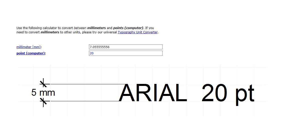
Currently the only option for setting line weight is in points. There are plenty of converters available online and I expect you could find a table you could print out as a handy reference. Here's the first hit from a quick Google search.
-
Thank you Dave. I never stop learning.
-
@seasdes said:
Thank you Dave. I never stop learning.
You're welcome. It's a good thing you never stop learning. You should only stop when your pump finally quits.

-
That's the way that I think.
-
-
-
@dave r said:
Currently the only option for setting line weight is in points. There are plenty of converters available online and I expect you could find a table you could print out as a handy reference. Here's the first hit from a quick Google search.
I thougth it would apply to text size too.
It didn´t work for me
I wonder if text should be converted by other method
Thanks

-
You might find it useful to do some reading about font design. The font height includes some space above and below the glyphs. some of that space is for ascenders and decenders and then there's some additional space on top of that.
-
Fonts seem to occupy their own universe. If you look at five different fonts, all at 20 pts, they will all be different heights. You will have to decide which font you want to use, determine what its actual height is relative to your required point size and adjust the point size accordingly.
-
@krism said:
Fonts seem to occupy their own universe. If you look at five different fonts, all at 20 pts, they will all be different heights. You will have to decide which font you want to use, determine what its actual height is relative to your required point size and adjust the point size accordingly.
Cheap or freely sourced fonts do have this tendency! Fonts from reputable foundry tend to follow proper protocols!
Hello! It looks like you're interested in this conversation, but you don't have an account yet.
Getting fed up of having to scroll through the same posts each visit? When you register for an account, you'll always come back to exactly where you were before, and choose to be notified of new replies (either via email, or push notification). You'll also be able to save bookmarks and upvote posts to show your appreciation to other community members.
With your input, this post could be even better 💗
Register LoginAdvertisement


