New Housing Model - A year in design
-
To suggest a simple yet effective concept in housing took a year to design might sound strange to many, but my head was swimming around and around with this concept.
I probably in fact started it about 2-3 years ago, but the original concepts just weren't coming together. It was started then dropped, picked up in a few months and dropped again. In the last 12 months though I really knuckled down into the concept and finally over came the brain drain and finally nailed it.
Full time, I'd suggest I've spent 3-4 months on this design.
REGULATIONS
Several states in Australia permit a "Granny Flat" (smaller secondary dwelling) as part of any existing or new home. In general these are limited to around 60-70 sq.m depending on the state. The aim of the provisions nation wide is to meet the growing demand for affordable rental accommodation.
Currently we are building 10% less housing than the demand and this is compounding.
SUSTAINABILITY
I've always been a strong believer that "Sustainability" in housing does not so much lie in the materials and efficiency but in longer term "adaptability". I'm also a strong advocate of the need for privacy and a feeling of individuality and lets call it "ownership". By this I don't so much mean that one "has" to own the home as much as the "right of place", they need to own the address and access rather than the current model of a Granny Flat being accessed down the side (to the backyard).
CONCEPT
The overriding concept was to deliver a housing model that was truly "adaptive" in part to meet demand, but also my own motivation that there must be a design model that can encompass all needs, from the housing shortfall to a method by which one can enter the market with some level of co-financing arrangement (either but sharing accommodation or subletting part).
By "adaptive" meaning a model that through the homes longer term lifespan can morph to the tenancy. Be it two disassociated or the larger extended family, as demand would have it.
WHY DID IT TAKE SO LONG?
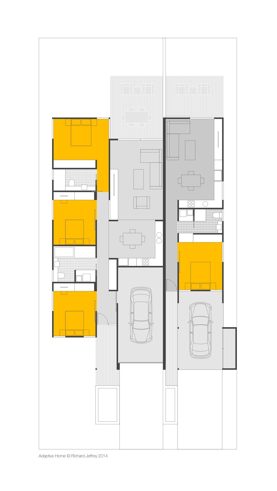
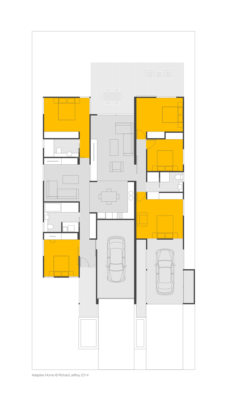
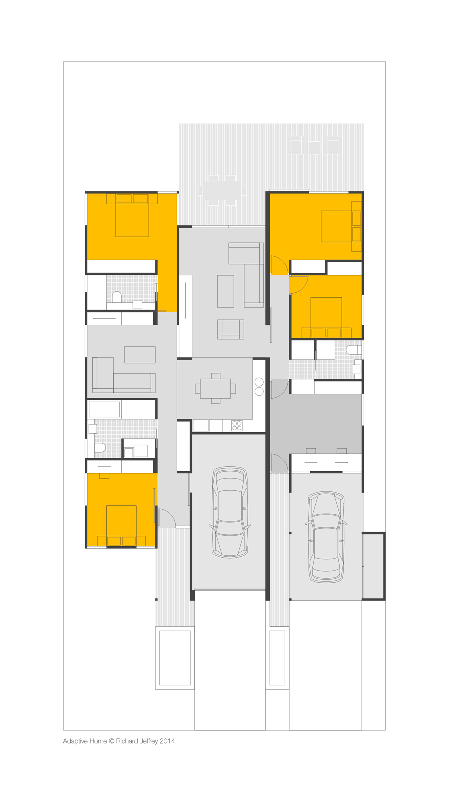
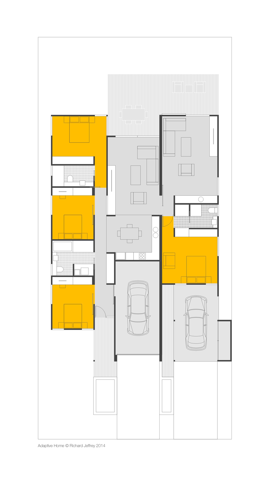
The crux of the concept was meeting the "right of place" or access issue. In the end the solution seems quite simple, a carport to expose the entry and frontage of the second dwelling. And then to rationalise an internal arrangement of efficient spaces to allow for the homes future adaptation.
SOLUTION
The result is a home that, for the first home buyer gives them a one bedroom granny flat they can accommodate whilst renting out the larger portion. On creating a family they swap accommodations until the family is larger where they may take over the whole home with the option to reconfigure the home in retirement downsizing / funding. Whilst also allowing for changes is lifestyle or employment.
Although the modifications to adapt the home over the longer term aren't achieved by the simple movement of walls etc, the aim was to keep the modifications to around $5,000 at any time, consistant with them occurring at around 10 year intervals.
THE BIG NEWS
The effort spent hasn't been in vain, this week one of our major material suppliers, when presented with the concept, have indicated interest in backing the concept to sponsor the first prototype / display home!


-
Thanks for sharing. Looking forward to more. Great to get the background on the design. Sort of Usonian.
-
@pbacot said:
Thanks for sharing. Looking forward to more. Great to get the background on the design. Sort of Usonian.
Thanks mate, the explanation is a little verbose but wanted to outline the rationale for those who are solution driven. Still in a bit of shock how long this took to get right.
-
Great stuff mate.
I'd like to see a 3d model to get a feel for the interior, I just cannot get 2D the way most folk can I need to feel depth and space, distance, width etc. (hard to explain but looking at the plan the passages feel so tight)
-
Richard,
One plan thing. in the combined plans, where the place belongs to one family group, you might blow out some of the wall dividing the carports (leave some closet or workbench in the center though). It feels funny if you are tinkering in one carport and wanting to go to the other or to another part of your house or property, you have to walk all the way out to the front.
-
Well, those are just amazing what with the thought going into the variation and all. You know this is going to be the standard, I just hope you can see that. Render challenge or is it too sensitive for future designs?
-
@solo said:
Great stuff mate.
I'd like to see a 3d model to get a feel for the interior, I just cannot get 2D the way most folk can I need to feel depth and space, distance, width etc. (hard to explain but looking at the plan the passages feel so tight)
Thanks Pete!!
Mate the hallways are narrow, in fact everything is pretty much planned on what I'd normally consider a minimum. The reason simply being that they have to work on a standard site width of 15m.
The hallways are currently at 900mm (roughly 3 feet), I've tried to counter this by providing larger (1500mm) sliding doors to the bedrooms hung on the bedroom side so even when closed that missing section of wall adds another 100mm to the hallway width.
I was somewhat concerned at first with the narrow approach width to the one bed flat, but as it's open along one side I'd confident its ok!
-
@pbacot said:
Richard,
One plan thing. in the combined plans, where the place belongs to one family group, you might blow out some of the wall dividing the carports (leave some closet or workbench in the center though). It feels funny if you are tinkering in one carport and wanting to go to the other or to another part of your house or property, you have to walk all the way out to the front.
Thanks mate, I do like that idea. One one of the earlier sketch concepts I did look at the option to make that side of the garage light weight construction so that it could on conversion be opened with swing doors to the carport. In that instance I proposed gates to the carport the the whole garage and carport could be opened up as a secure covered play area for the kids. I've just got to confirm the fire rating required for the division between the two parking spaces prior to suggesting this is an option.
Thanks again mate, for throwing back some ideas.
-
@mike amos said:
Well, those are just amazing what with the thought going into the variation and all. You know this is going to be the standard, I just hope you can see that. Render challenge or is it too sensitive for future designs?
Thanks Mike!!!!! I certainly hope it does become the new standard for homes here in Australia at least. It certainly ticks almost all the prerequisites I'd set for the exercise.
As we have an insurmountable housing shortage (even currently) and a growing issue with housing affordability this model certainly helps address these social issues. I've had discussions with several brokers to gauge the likely attitude of lending authorities - their opinions are that almost anyone would be granted finance given part of the home can always be used to generate an income to part fund the mortgage.
Also given that the Granny Flat is much a fully independent entity as opposed to the current model it will always achieve maximum rental levels and higher occupancy levels. There is also some market concerns with the current model (granny flat to the rear) that the home could suffer in resale, and this concern is legitimate, though this concept counters that with the option of re-purposing the home at time of sale to meet the market demand.
I might hold off on a render challenge just for now!
-
Very clever design!
-
-
Well done mate. And congratulations in getting someone interested in helping get a display up and running.
We have a dumb planning rule in SA which pops up in every Council's Development Plan now....they require garages and carports to be set back behind the face of the building (generally it is 500mm and for some councils it is 1200mm)...!
Anyhow, it's nice to know someone is thinking about Granny...!
-
@gareth said:
Well done mate. And congratulations in getting someone interested in helping get a display up and running.
We have a dumb planning rule in SA which pops up in every Council's Development Plan now....they require garages and carports to be set back behind the face of the building (generally it is 500mm and for some councils it is 1200mm)...!
Anyhow, it's nice to know someone is thinking about Granny...!
Thanks mate! I totally agree with you on the STUPIDITY of that planning regulation of garages setback beyond the frontage, in fact for a number a design AND environmental reasons!
The most STUPID thing about it, I live in one of Sydney's most exclusive suburbs (only renting mind you), but seriously the homes and beauty of the place (Mosman) are stunning, you wont pick up a detached home under probably $3mil. And almost ALL the garages and carports are built to the boundary. How is it so that a place like this can be judged as one of Australia's most beautiful and sought after suburbs if this aspect would be considered "unattractive"???? Grrrrr Frekin Grrrrr!
Don't worry mate, if I get a builder in SA keen to license these designs (NSW, WA and TAS so far) I'll be going to the planning minister! But seriously I find in other states where similar regs stand, it's just a case of arguing the merits.
-
Can't wait to see some 3D, as well. Although, I always love your simple, graphic 2d presentations.
-
Let me know if you need some contacts in Adelaide
-
@gareth said:
Let me know if you need some contacts in Adelaide
Thanks mate, I may well take you up on that once I've got the whole concept better documented.
Hello! It looks like you're interested in this conversation, but you don't have an account yet.
Getting fed up of having to scroll through the same posts each visit? When you register for an account, you'll always come back to exactly where you were before, and choose to be notified of new replies (either via email, or push notification). You'll also be able to save bookmarks and upvote posts to show your appreciation to other community members.
With your input, this post could be even better 💗
Register LoginAdvertisement


